MOCA Brand Identity Project
AR Wasil

Brand Overview
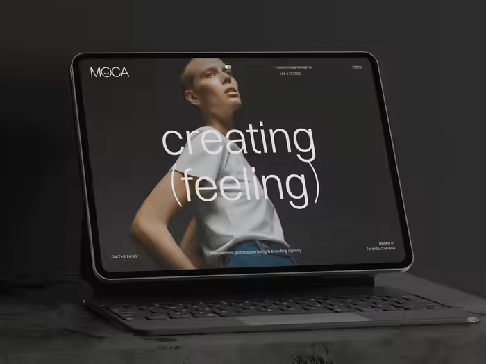
MOCA is an independent global advertising and branding agency built on the foundation of clarity, emotion, and modern design sensibility.
This identity project was rooted in expressing MOCA’s unique position, balancing rational thinking with emotional storytelling. The result is a brand that doesn’t overstate itself, but rather invites attention through quiet confidence, timeless visuals, and empathetic nuance.
The brand system is designed to reflect MOCA’s forward-thinking approach and belief in shaping culture through creative excellence.
Project Goals
Position MOCA as a global creative agency with emotional intelligence
Build a modular and scalable visual system across digital, print, and physical spaces
Achieve a look and feel that is understated yet memorable
Align the brand with modern creative values: empathy, clarity, and timelessness

Identity Concept
At the heart of MOCA’s identity is a philosophy of intentional minimalism.
We employed:
Clean, geometric typography
Monochrome palette
Precise spatial structure
These choices communicate a sense of calm clarity, mirroring MOCA’s commitment to craft, intelligence, and empathy.
🔁 The most distinct feature is the modified “O” a subtle curve that resembles a smile or an open gesture. This single form softens the grid-like structure and introduces human warmth into the identity an embodiment of MOCA’s belief: Creativity begins with connection.


Typography & Color System
We crafted a typographic hierarchy using:
Switzer for headlines: contemporary and structured
Helvetica Neue for body: neutral and timeless
Combined, the typography ensures both clarity and adaptability, capable of expanding across global communication needs.
The color palette spans five tones from Obsidian Night to Pale Dawn, designed to maintain legibility while supporting multiple physical and digital applications. Each color was chosen for its ability to complement content without overpowering it.

Brand Applications
The visual identity was applied across various mediums:
Website and digital touchpoints
Stationery and print systems
Merchandise (tote bags, badges, hats)
Social media and campaign templates
Environmental graphics and billboards
Throughout all applications, we preserved the brand’s DNA:
Consistent typographic rhythm
Centered, calm compositions
Spacious layouts to let content breathe
This design restraint gives prominence to people, ideas, and creative content, not just the brand.


Strategy & Insight
While many creative agencies chase loud visuals, MOCA chose quiet design with purpose.
Our strategic insight stemmed from a recurring pattern in the industry: agencies overexpressing identity to appear relevant, often sacrificing coherence.
MOCA wanted the opposite.
We pursued a brand that:
Speaks through feeling, not noise
Feels intelligent without arrogance
Commands respect without spectacle
Influenced by modernist design roots, we adopted a design ethos of:
Clarity of structure
Purposeful restraint
Humanized minimalism
The final identity is both global and personal, designed to attract clients and collaborators who believe that emotion is the strongest form of strategy.

Like this project
Posted Oct 10, 2025
Crafted MOCA’s minimalist brand identity rooted in emotional storytelling and timeless modernist design.
Likes
1
Views
29
Clients
MOCA