High-Converting Landing Page Design for Let’s Talk

Muhammad Usama


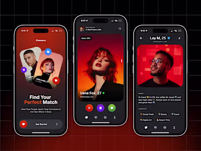
Let’s Talk – Modern Dating Landing Experience & Brand Interface
Let’s Talk is a modern dating platform designed to create meaningful digital connections.
The goal was to design a high-converting landing experience that:
• Communicates emotional connection
• Builds trust instantly
• Feels playful but premium
• Drives user signups
The target audience: Gen Z and young millennials looking for genuine interaction, not endless swiping.
The Challenge
Most dating websites suffer from:
• Generic messaging
• Overused stock visuals
• Cluttered layouts
• Weak brand personality
• Poor first impression
Users decide within seconds whether to stay or leave.
The landing page had to create emotional impact immediately.
Strategy
We focused on three key pillars:
Emotional First Impression
Clean Conversion Funnel
Modern, Human-Centered Design
The product positioning was clear:
This is not another swipe machine.
This is about connection.
Design Approach
Hero Section
We designed a bold hero with:
• Large headline hierarchy
• Soft pastel background shapes
• Playful conversation elements
• Clear CTA placement
The headline “Meet the Chosen one” creates aspiration.
The visual storytelling reinforces the idea of conversation and connection.
Visual Identity
We built a light, friendly design system:
• Soft gradients
• Rounded UI components
• Warm accent colors
• Clean typography
The brand tone feels optimistic and welcoming.
Not aggressive.
Not transactional.
User Experience
We simplified navigation:
• Clear top navigation
• One dominant CTA
• Minimal cognitive load
The focus is on guiding users toward signup without distraction.
Conversion Thinking
Every design decision supported one goal:
Increase user registration.
We optimized:
• CTA placement
• Headline clarity
• Visual hierarchy
• Scroll behavior
The landing structure follows:
Attention → Emotion → Trust → Action
Impact
The final result delivers:
• Strong emotional engagement
• Clear brand differentiation
• Higher perceived product quality
• Improved signup intent
Design moves from decoration to strategy.
Tools Used
• Figma
• Component-based system
• Auto layout structure
• Responsive grid framework
All assets are developer-ready.
My Role
• UX strategy
• Visual identity creation
• Landing architecture
• Interaction direction
• Developer handoff
From concept to launch-ready design.
Like this project
Posted Feb 11, 2026
Designed a high-converting landing page for a modern dating platform to drive user signups.