Token Optix Branding
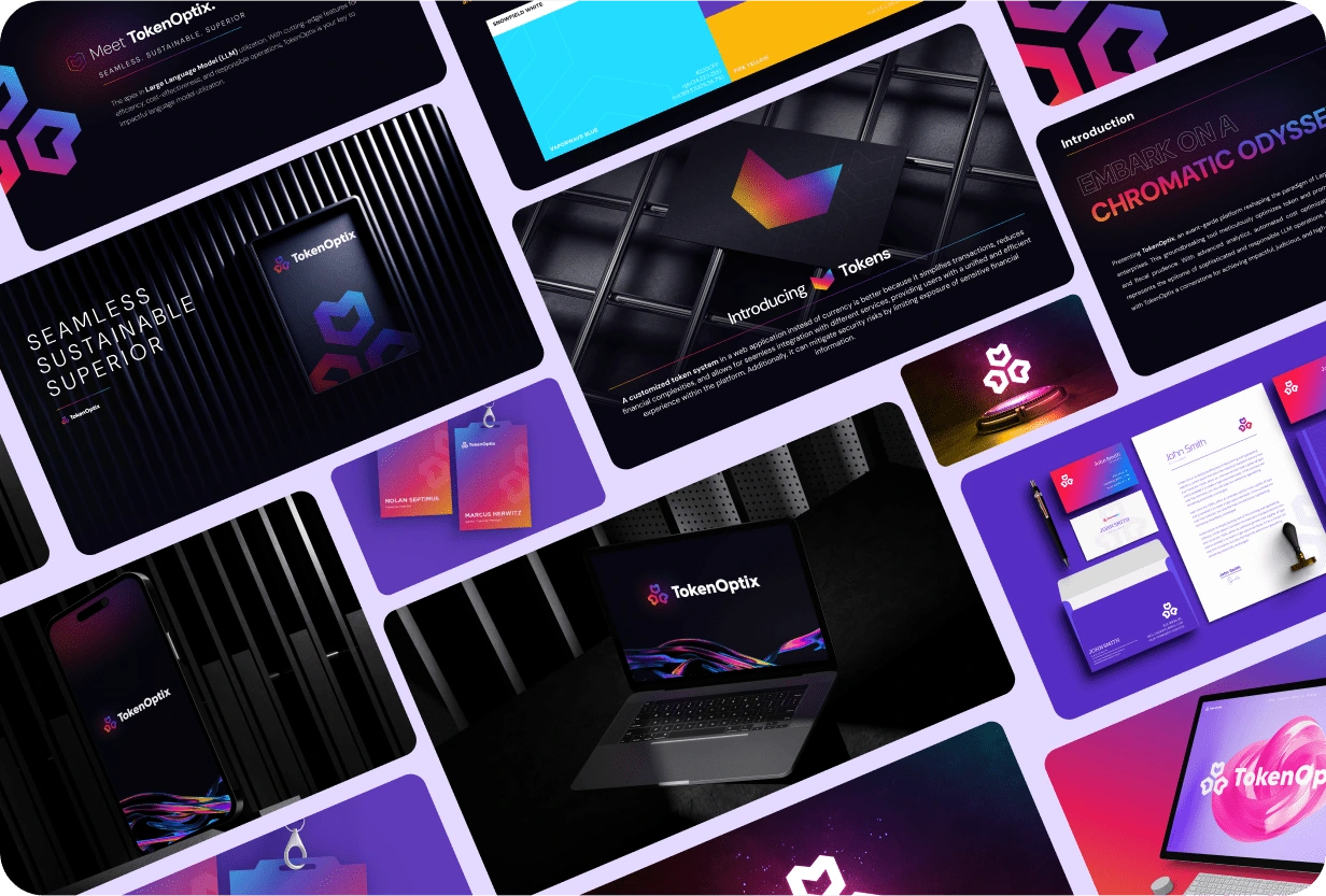
The Token Optix brand refresh focuses on modernizing and elevating the company's visual identity to emphasize its innovative and cutting-edge solutions. The approach combines contemporary typography, vibrant colors, and sleek design elements to reflect the brand's forward-thinking ethos.

Typography:
Hoglar Sans Display for Headings:
This typeface was chosen for its bold, modern feel, making a strong visual impact in headings. Its sleek lines and contemporary design align with the tech-forward nature of Token Optix’s solutions, helping to establish a confident and innovative tone.
Gotham for Body Text:
Gotham offers clean, versatile readability, creating a balanced contrast with Hoglar Sans Display. Its subtle sophistication ensures that the body copy remains approachable and professional while complementing the striking display type.
Stylescape and Color Palette:
The stylescape integrates blue, purple, dark pink, and yellow set against a dark background. This combination creates a bold, dynamic look, reinforcing Token Optix’s cutting-edge image while providing a visually engaging and energetic experience.
Blue: Symbolizing trust and technology, it provides a solid foundation for the design, aligning with the brand’s expertise and reliability.
Purple: Adds a sense of creativity and innovation, ideal for reflecting the forward-thinking solutions Token Optix offers.
Dark Pink: Injects energy and vibrancy, giving the brand a bold, modern edge.
Yellow: Bright and optimistic, yellow highlights key elements and adds contrast, making the design pop against the darker background.
Project Scope:
The refresh includes multiple aspects of the brand's visual identity:
Logo Redesign: The logo is being reimagined to reflect the modern and innovative direction of the company. It is designed to be sleek, recognizable, and reflective of Token Optix’s cutting-edge ethos.
Stationery Design: The brand's updated visual elements are carried through into stationery, ensuring consistency in all touchpoints, from business cards to letterheads.

The entire brand refresh is designed to bring Token Optix into alignment with its future-focused solutions, making a strong statement about the company’s place in the industry while providing a cohesive and engaging visual experience across all platforms.
Like this project
Posted Oct 15, 2024
Token Optix's brand refresh includes a vibrant palette of blue, purple, pink, and yellow, along with a new logo, stationery, and mockups.
Likes
0
Views
12


