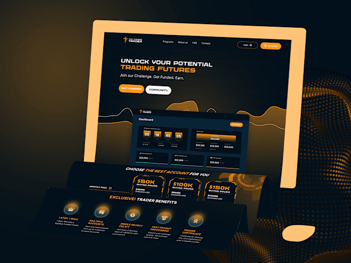
Veza Complete Re-branding: Leveraging Design for Client Success
The Client
Veza is a startup fintech company with a mission to revolutionize the fresh produce industry by helping wholesalers and up-cyclers access the financial resources they need to work more efficiently, reduce food waste, and ultimately contribute to a more sustainable food system. With a focus on social impact and sustainable practices, Veza is paving the way for a new era of responsible business in the fintech sector.
Project Overview
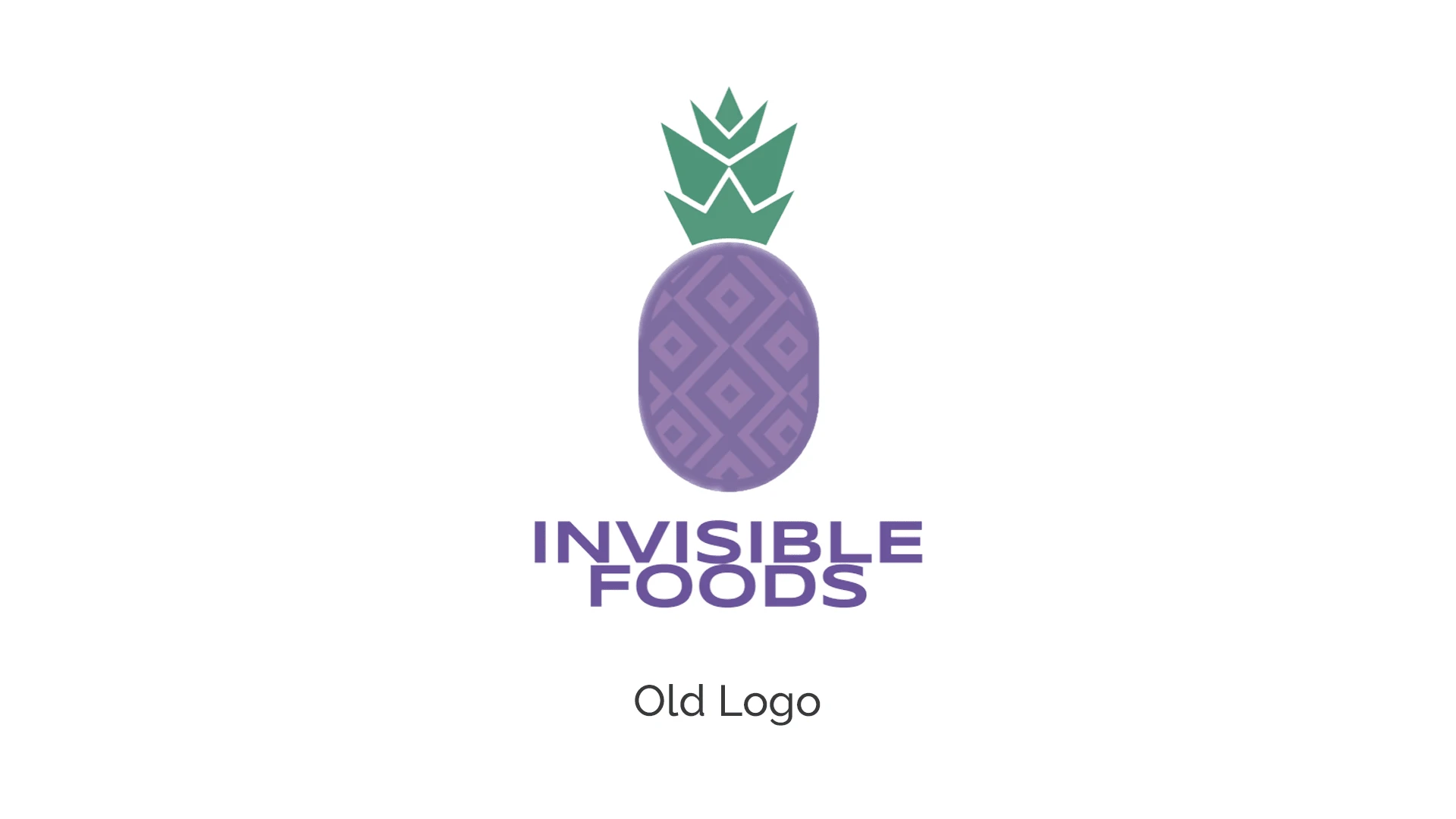
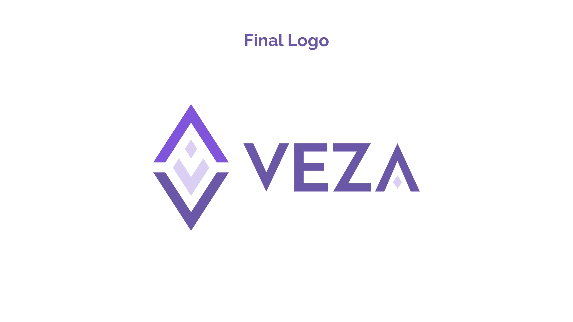
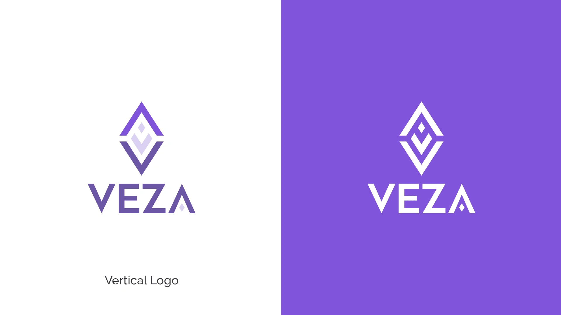
Veza, a forward-thinking company, sought a rebrand to modernize its image and enhance its brand identity. The project entailed creating a new, contemporary logo to replace the existing one "Invisible food". The new logo embodied Veza's values and vision while appealing to a modern audience.
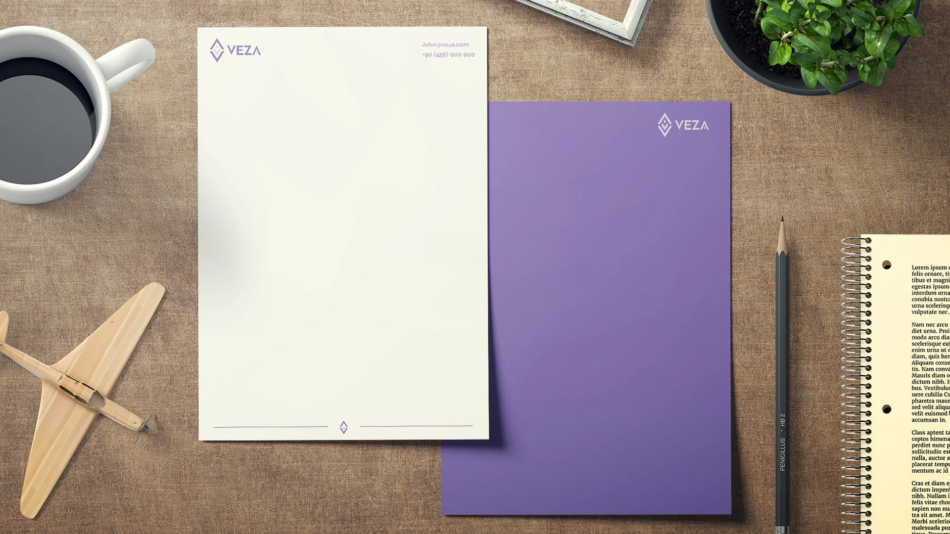
In addition to the logo redesign, the project included the creation of pitch decks that showcased Veza's new branding. These pitch decks were designed to impress and engage potential partners, investors, and clients.
Furthermore, the project involved redesigning Veza's website to reflect the new branding. The website was visually appealing, user-friendly, and optimized for both desktop and mobile devices. It served as a platform to communicate Veza's brand message and offerings effectively.
Overall, the rebranding project for Veza aimed to rejuvenate its brand image, strengthen its market presence, and attract new opportunities for growth and success.
Logo redesign process
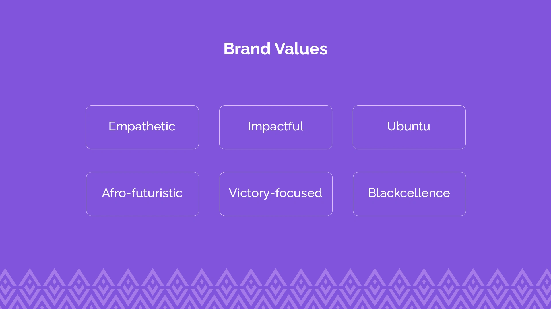
The logo design process for this project began with the client, Veza, filling out a detailed questionnaire. The questionnaire was designed to gather key information about Veza's brand, including its values, target audience, and desired aesthetic. This information guided the ideation process and helped ensure that the final logo design would accurately reflect Veza's identity.
After reviewing the questionnaire responses, the design team embarked on the ideation phase. This involved brainstorming and sketching out various concepts and ideas for the logo. The goal was to create a design that was not only visually appealing but also meaningful and representative of Veza's brand values.
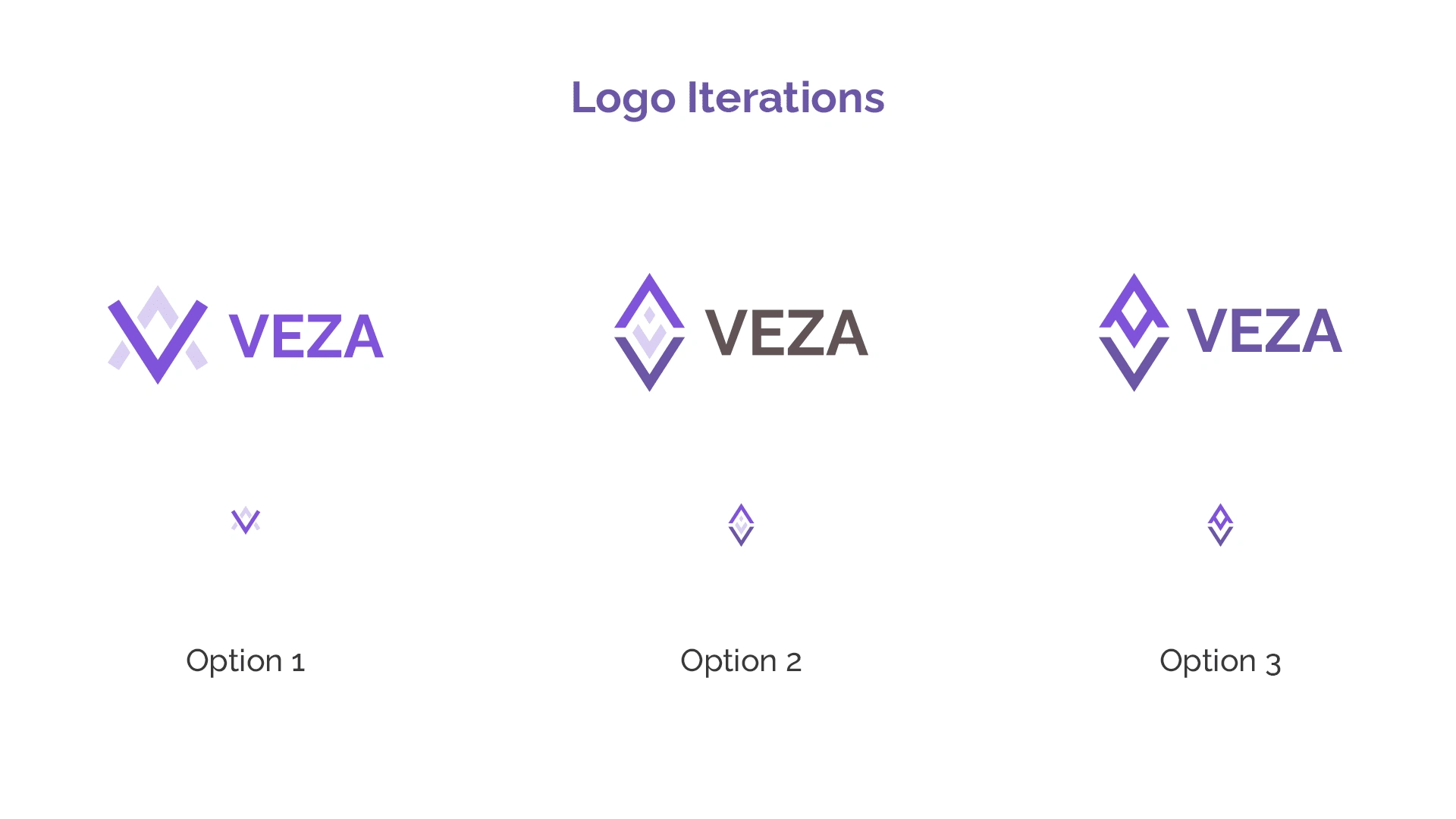
Once several concepts were developed, they were presented to the client for feedback. The client provided valuable input, which was used to refine and further develop the chosen concept.
Logo Rationale
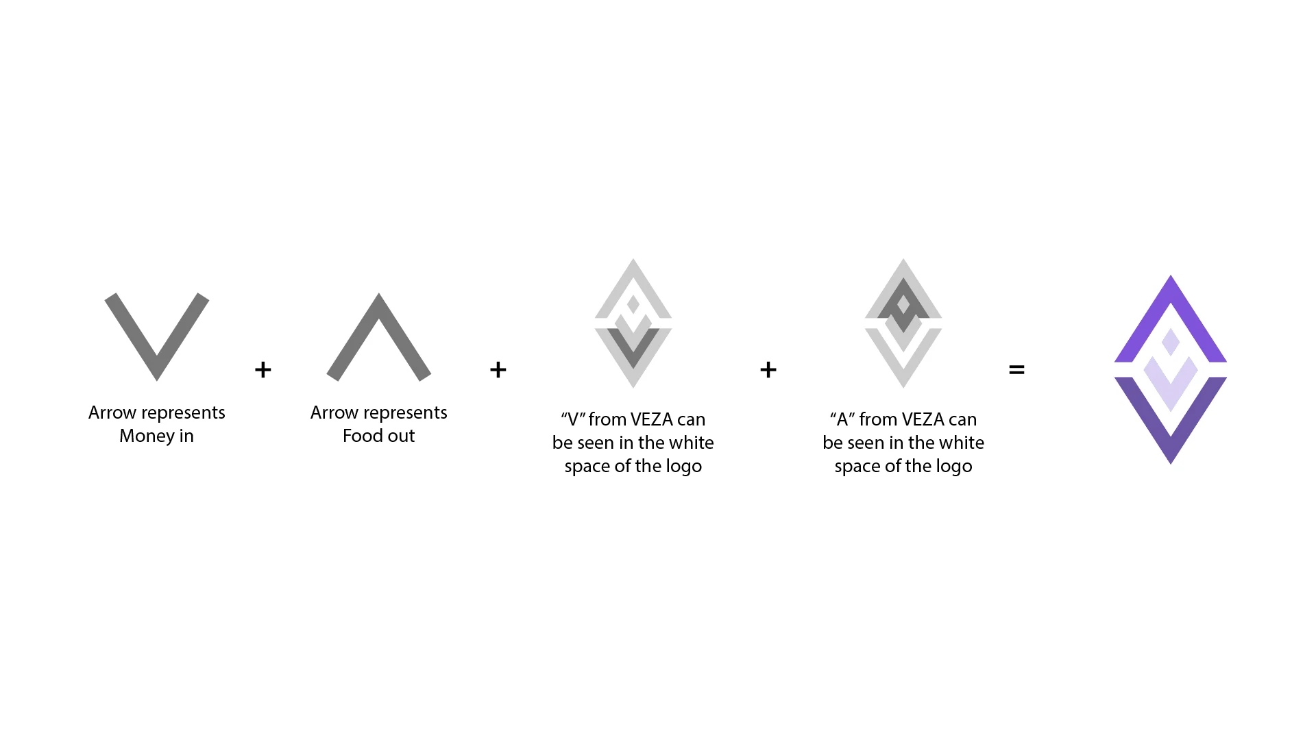
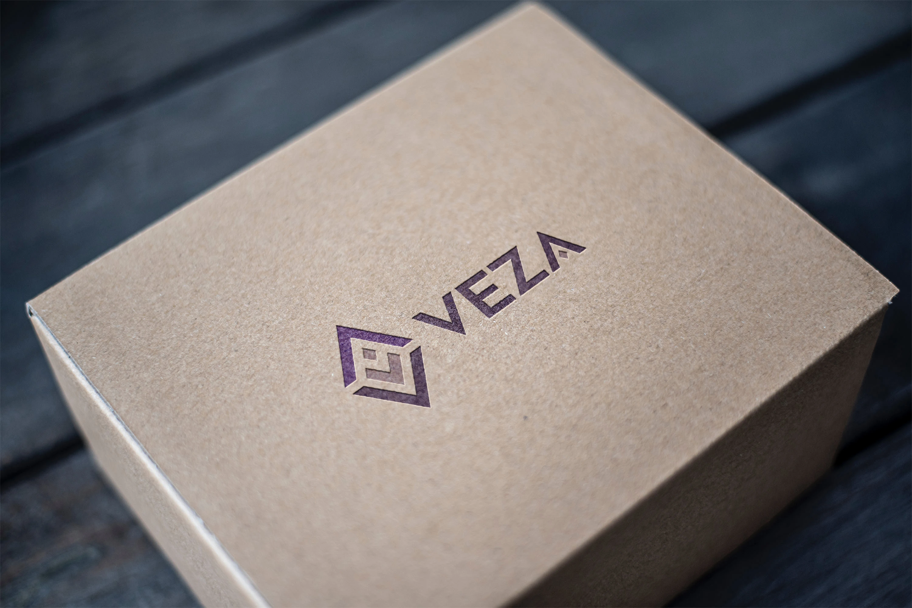
The logo icon is made of two opposite arrows up and down showing the in-flow of money and out-flow of food. the white space forms the letter V and A in the name VEZA.
Landing Page design

Like this project
Posted May 9, 2024
The project entailed a full rebrand of Invisible foods from its previous identity to the new one Veza.

