Built with Webflow
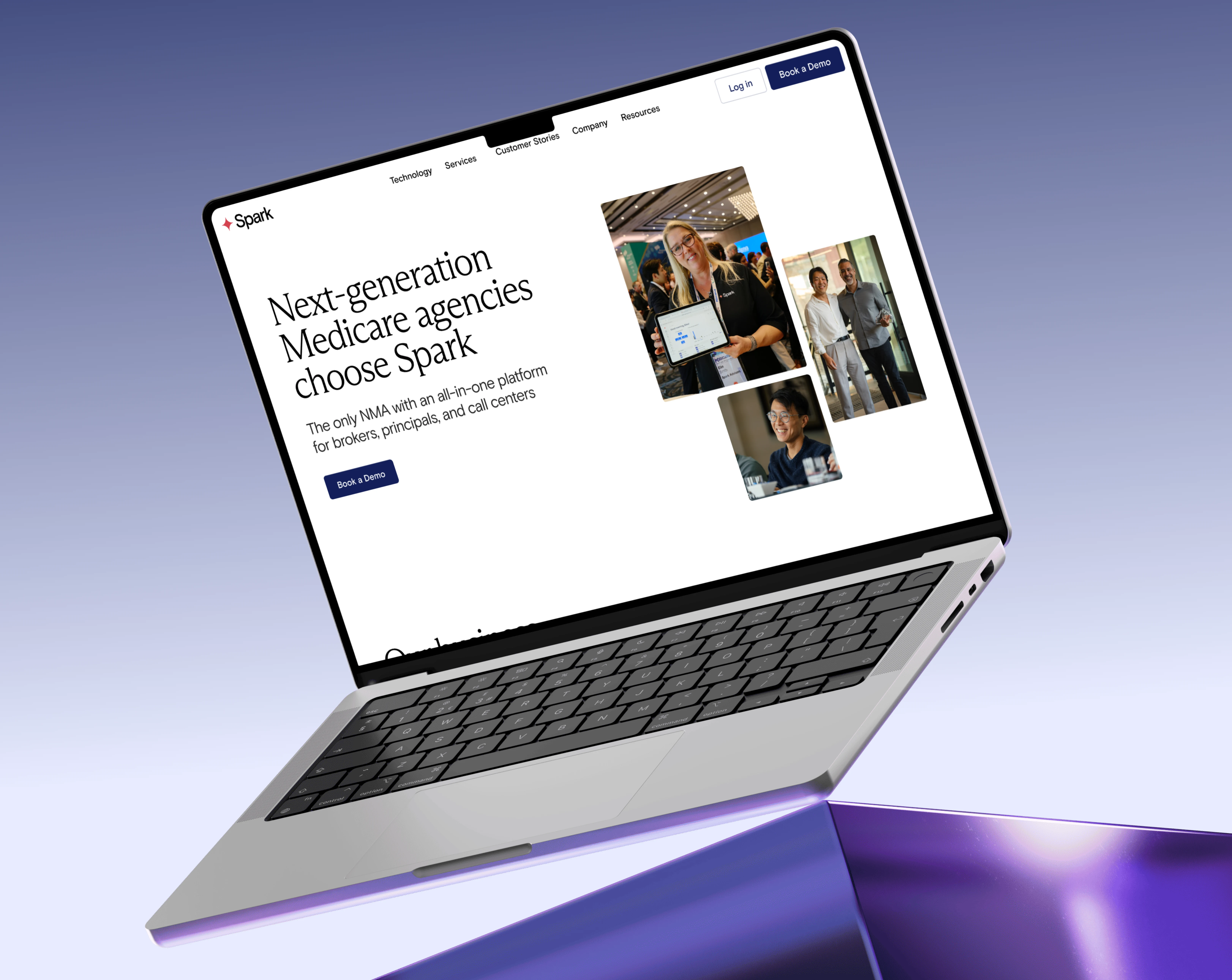
Spark Advisors — Figma to Webflow Development
Fahad Raee
Verified
Overview:
Project Details:
Website: https://www.sparkadvisors.com
Industry: SaaS / InsurTech / Medicare Services
Services Provided: Figma UI/UX Design, Webflow Development, CMS Integration, Conversion Optimization
Project Background:
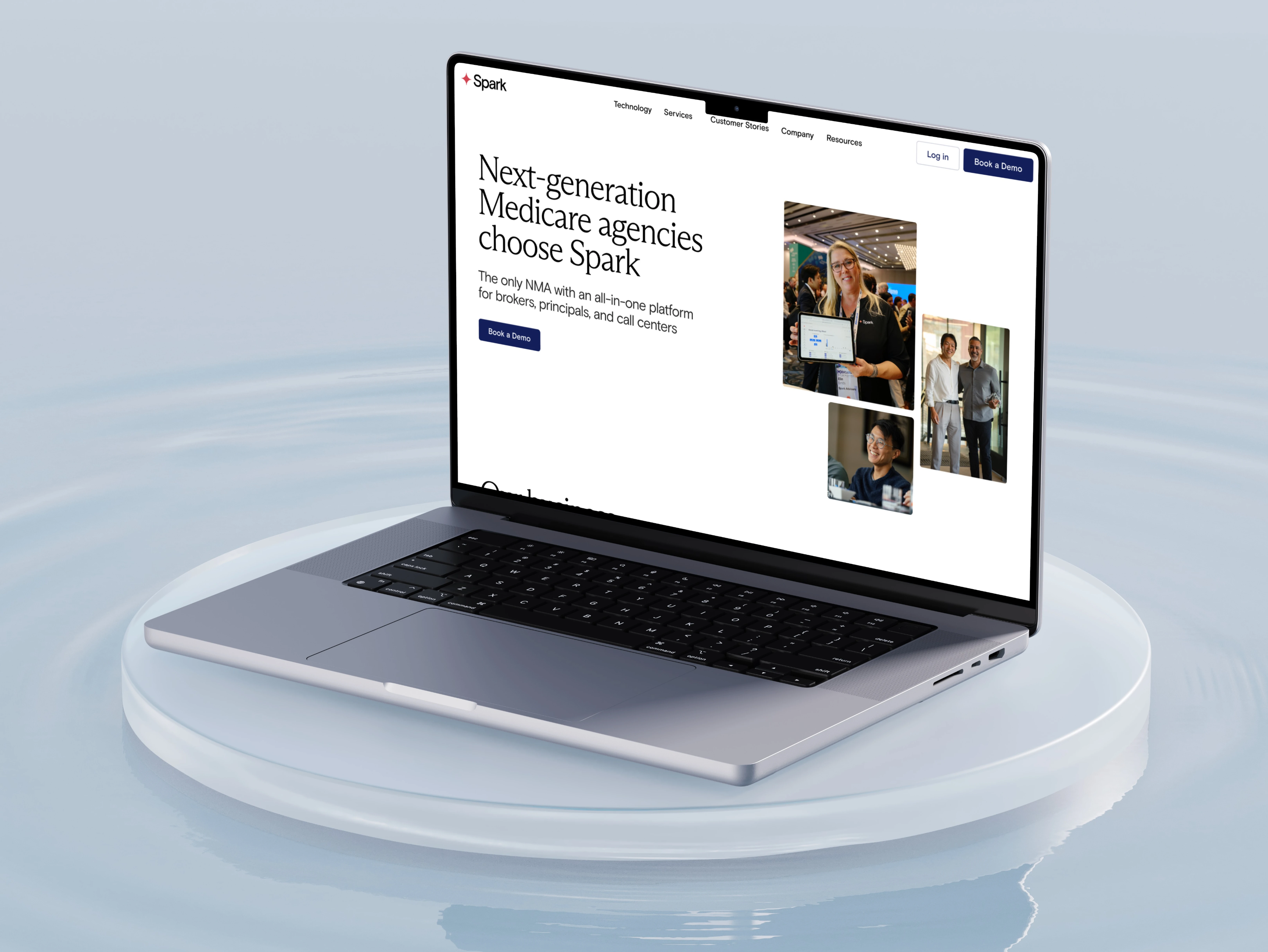
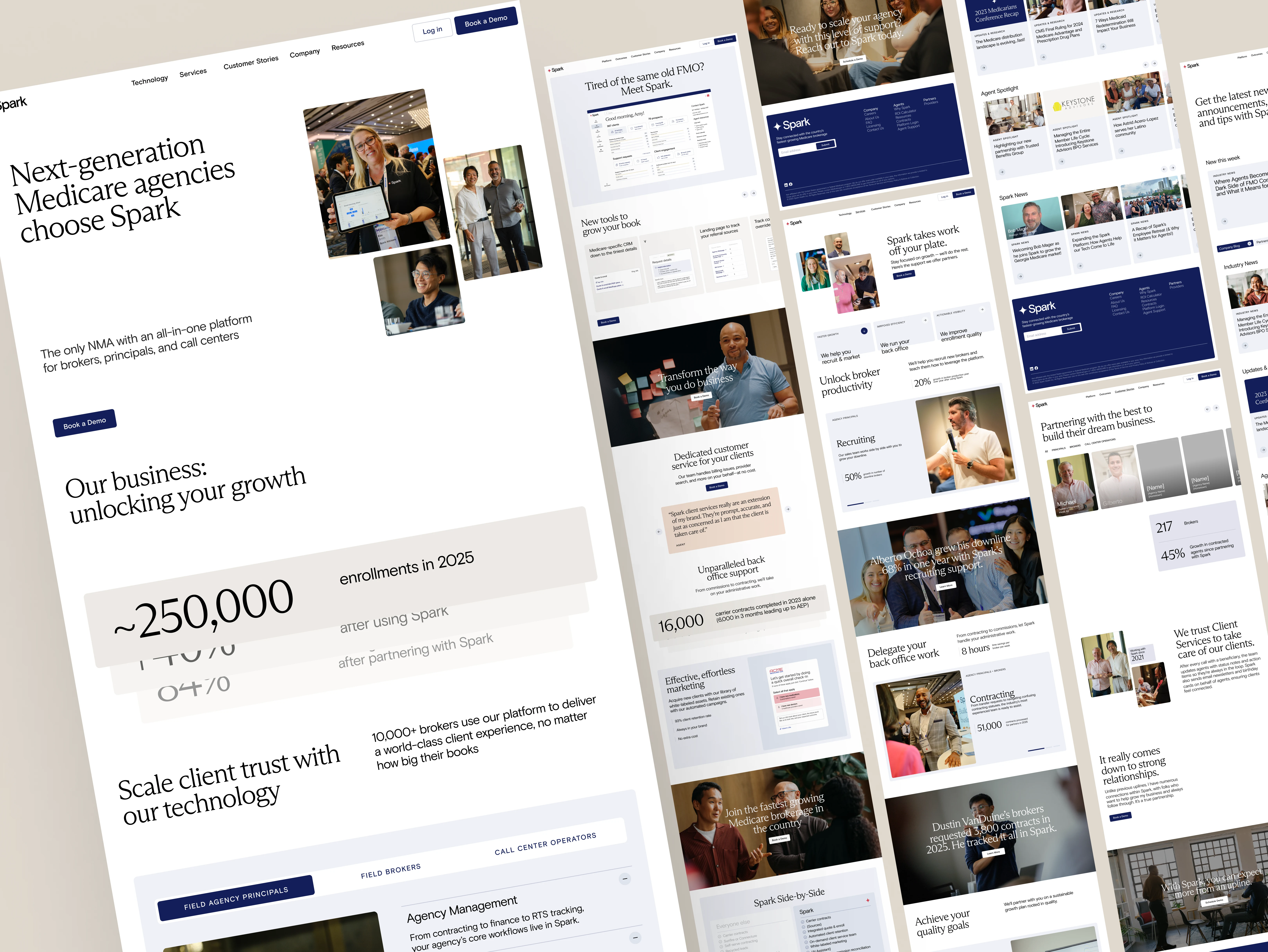
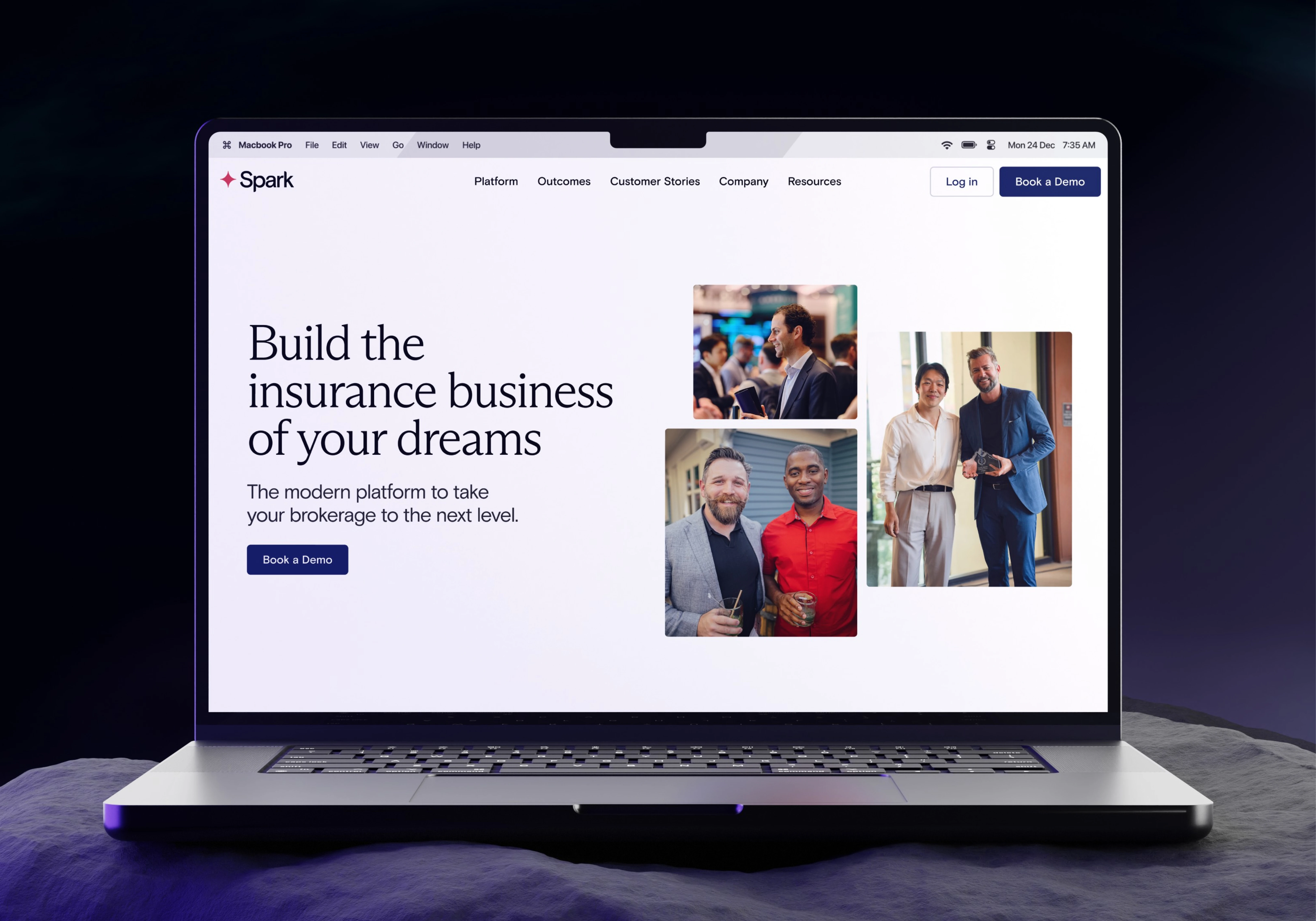
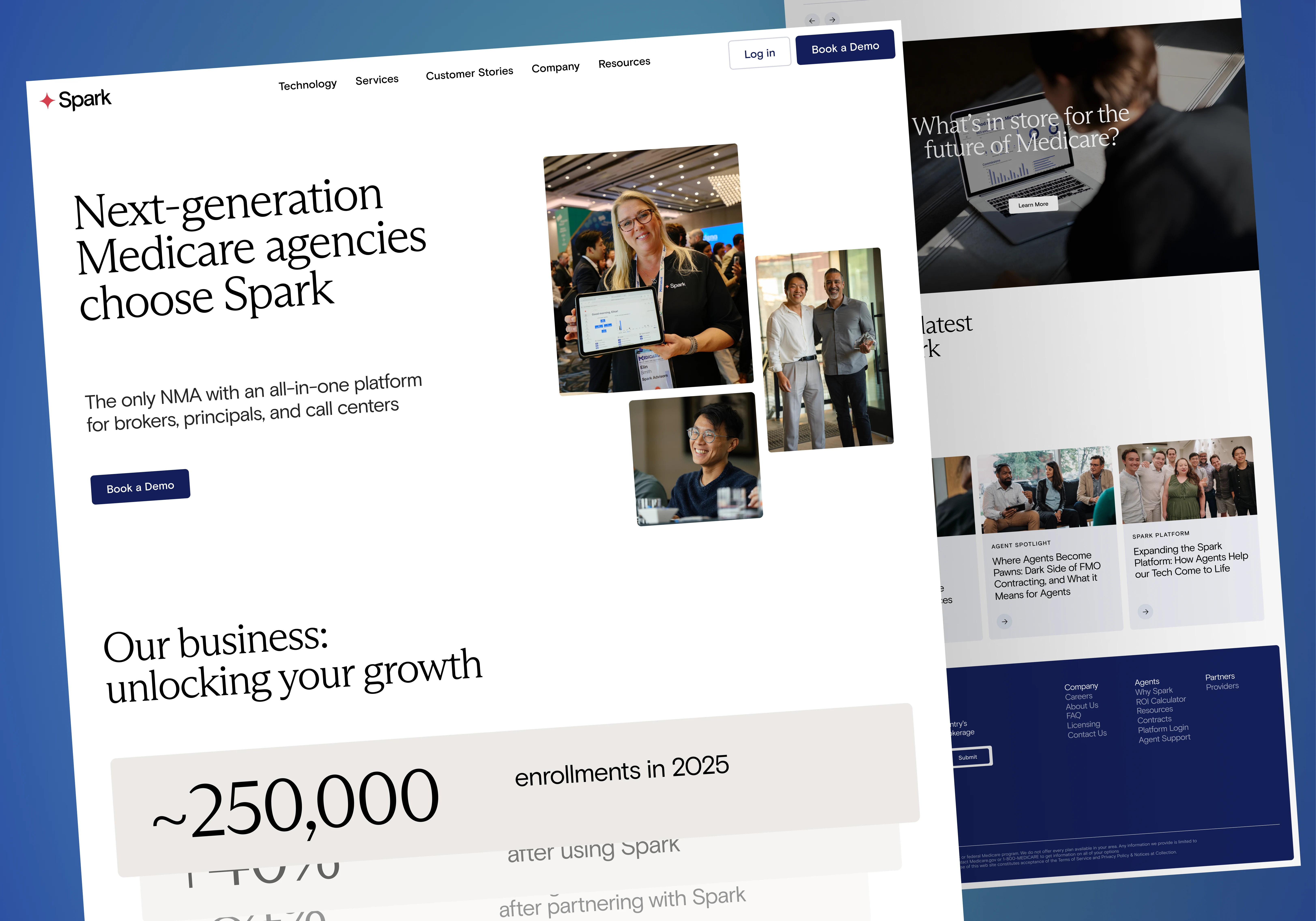
Spark Advisors is a technology-driven platform designed to help independent Medicare agents and agencies grow, manage, and scale their operations through a unified system.
The platform consolidates multiple critical functions, including CRM, quoting and enrollment, marketing automation, and contracting & commissions, into a single ecosystem, eliminating fragmented workflows and operational inefficiencies.
The objective of this project was to design a website that doesn’t just present features, but clearly communicates the platform’s value as an all-in-one growth infrastructure for agents and agencies.
The website was strategically built to:
Position Spark Advisors as a centralized platform, not a collection of tools
Simplify a complex product into clear, structured messaging
Build trust with a professional, product-focused presentation
Guide users toward key actions such as booking demos or exploring partnerships
From a UX perspective, the focus was on reducing cognitive overload by organizing features into logical sections and progressive layers, allowing users to quickly understand the platform without being overwhelmed.
The final delivery included a fully responsive Webflow website, supported by a scalable structure and CMS integration, enabling continuous content updates while maintaining consistency, performance, and clarity.
Challenge:
Highly complex product
→ Multiple systems (CRM, enrollment, marketing, support) needed to feel simple
Audience diversity
→ Agents, agencies, principals — different goals, same platform
Feature overload
→ Too many capabilities → risk of overwhelming users
Trust barrier
→ Financial/health-related platform requires high credibility
Conversion friction
→ Moving users from “learning” → “book a demo.”
Solution:
Layered information architecture
High-level clarity first
Deeper features progressively revealed
System-first messaging
Position Spark as one unified platform, not separate tools
Feature grouping
CRM / Enrollment / Marketing / Support → clearly segmented
Conversion-driven UX
Repeated but controlled CTAs (Demo, Partner, Learn more)
Trust integration
Metrics, testimonials, operational scale
Deliverables:
UI/UX Design (Figma):
Clean SaaS-style interface (light, structured, scalable)
Strong typography hierarchy for readability
Feature sections broken into digestible blocks
Visual balance between:
Product explanation
Benefits
Conversion
AI-Assisted Design (Used selectively, not blindly):
Used only where it actually adds value:
ChatGPT:
Refined product messaging clarity
Simplified complex feature descriptions into user-friendly language
Midjourney/ Image tools (optional support):
Helped explore visual directions for abstract SaaS sections (backgrounds, illustrations)
Figma AI:
(auto layout suggestions/content assist)
Speeded up wireframe structuring and component consistency
👉 Important: AI was used as a support tool, not as a design replacement.
Experience Design:
Clear top-down narrative flow
No overwhelming blocks of content
Feature storytelling instead of feature dumping
Smooth transitions between sections
Webflow Development:
Fully responsive build
Clean, scalable class system
CMS-ready structure (for blog/insights)
Optimized performance
Component-based architecture for scalability
Outcome & Impact:
Product Clarity
Complex platform simplified into a clear, understandable system
Improved User Experience
Reduced cognitive overload
Better navigation and content flow
Stronger Positioning
From “tool provider” → all-in-one growth platform
Conversion Readiness
Structured journey toward demo booking
Better alignment between traffic and intent
Scalability
Easy to expand product features, content, and pages
If your product is powerful but your website feels confusing, you're losing users before they even understand the value.
I design structured, conversion-focused SaaS websites that simplify complexity and drive action.
Let’s turn your product into a clear, high-converting experience.
→ Let’s fix your structure.
→ Request a Website Audit
Like this project
Posted Aug 21, 2025
Designed the website in Figma and developed it in Webflow with a focus on responsive layouts and a scalable structure suitable for a growing marketing agency.
Likes
1
Views
44
Timeline
Aug 19, 2025 - Aug 20, 2025
Clients
Artstak