Salt Sword: Branding
Natahsha Priya
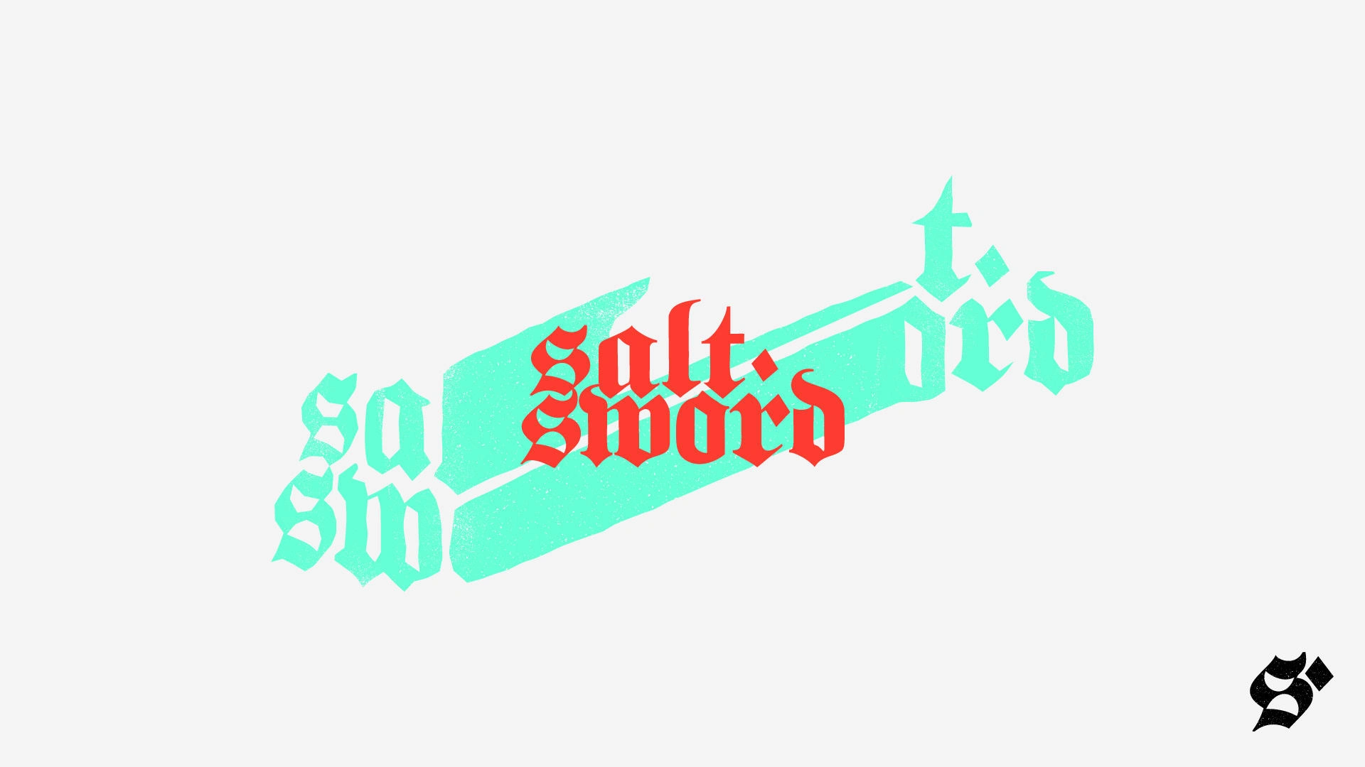
Here we worked on Salt Sword’s visual identity. The goal? Bridging the gap of the future and the nostalgic longing of the past. The bright colour palette is a direct contrast to the lettering – offering something bold, modern, and nostalgic.
This was created with manual scanning techniques, with a gothic typeface with customizations and added texture. The main logo went through manual scanning to create the stretch and pull of the design, and the digital part of the process refined the usability and readability, to make an impactful logo. The type itself is something of the past and the effects used are bringing it into the reality of the future.
Like this project
Posted Jan 4, 2024
The design is one of the kind, hard to replicate and perfectly captures @salt_sword‘s musical ability, taste and talents.
Likes
0
Views
17