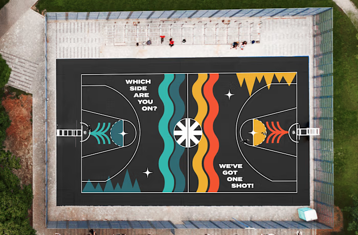
Verdant: Visual Identity (Chocolatier)


Client: Verdant Confections (Unused Brand Concept)
A custom illustrated icon and customized typography. Inspired by the Mackenzie Rivers quote - this leans into the adventure of flavour, pleasure and experience. This is something notable, memorable and is paving a way into a market - for those looking for more than just chocolate... they are looking for an experience.
Goals of the Project:
- Recognizable in all contexts - bold but playful but also is established and genuine.
- With a focus on the craft, this direction emphasize the need for handmade - looking at rounded edges, little details to remind people of the human touch.
Naming of the client's business also included in the scope.

Rationale

Variations & Alternates


0 likes · 8 views · Jan 4, 2024
Naming & Visual Identity for Verdant Confections (Unused Concept) to capture the joy and spark of flavour, taste and experience.