From Chaos to Clarity: Dashboard Redesign
George Ghobrial🌟
From Chaos to Clarity: The Dashboard That boosted Accountants Productivity by 40%
Practice Evolve is a legal and accounting software that targets Medium - Large law farm as their targeted users. Their accounting dashboard was overloaded with complexity, making core accounting tasks slower and harder to complete. Through deep user research and structured audits, we uncovered where the friction was—and why it mattered.
The redesign focused on decluttering the interface, prioritizing essential actions, and aligning navigation with how accountants actually work. The result: reduced task time, fewer dashboard-related support tickets, simplified reporting, and a more focused, efficient experience for every user.
Project Overview
The existing Practice Evolve dashboard was inefficient, causing accountants to spend more time than necessary on key tasks. Navigation complexity, visual clutter, and lack of customization led to frustration and operational inefficiencies.
We wanted to redesign the dashboard to:
🔄 Improve navigation & efficiency
Reduce the time spent on frequent and daily-used tasks by simplifying access to key features and minimizing unnecessary clicks.
🧠 Enhance readability & clarity
Minimize cognitive overload by removing distracting visuals and surfacing only the most relevant financial data.
⭐ Increase user adoption & satisfaction
Create a more intuitive and flexible interface that feels enjoyable to use—encouraging users to engage with key features and reducing support reliance.
The Challenge
Accountants Spent More Time on Tasks Than Necessary
Early feedback from users revealed that the dashboard was creating friction in day-to-day workflows. Common themes included:
🗺️ Navigation inefficiencies
Important features were buried in menus, increasing task time unnecessarily.
📖 Poor readability
Heavy text blocks, cluttered visuals, and a lack of prioritisation made it difficult for users to quickly identify what needed action — adding friction to already routine tasks.
😡 Low user adoption
Unused widgets and bloated layouts cluttered the interface and added no real value.
🎫 Operational impact
Inefficiencies drove up support queries, slowed workflows, and increased wasted effort. The dashboard was one of the top sources of support tickets
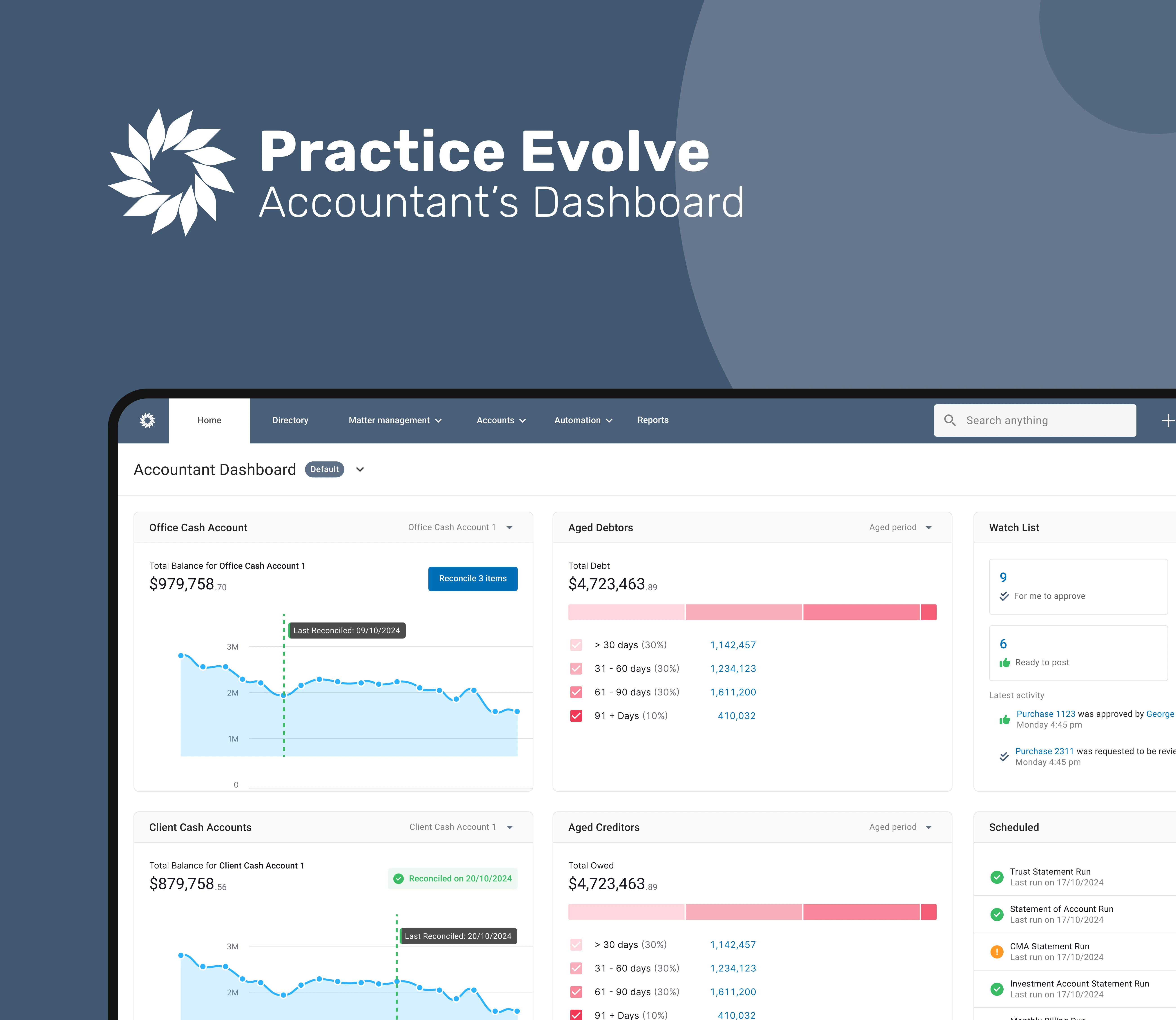
Old Dashboard
Redesign Process
Our design strategy focused on removing friction, reducing cognitive load, and making the dashboard more intuitive for daily accounting workflows. Each decision was grounded in user data and tested iteratively to ensure measurable improvements in speed and satisfaction.
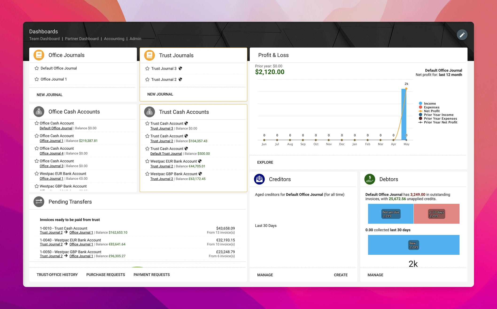
Redesign
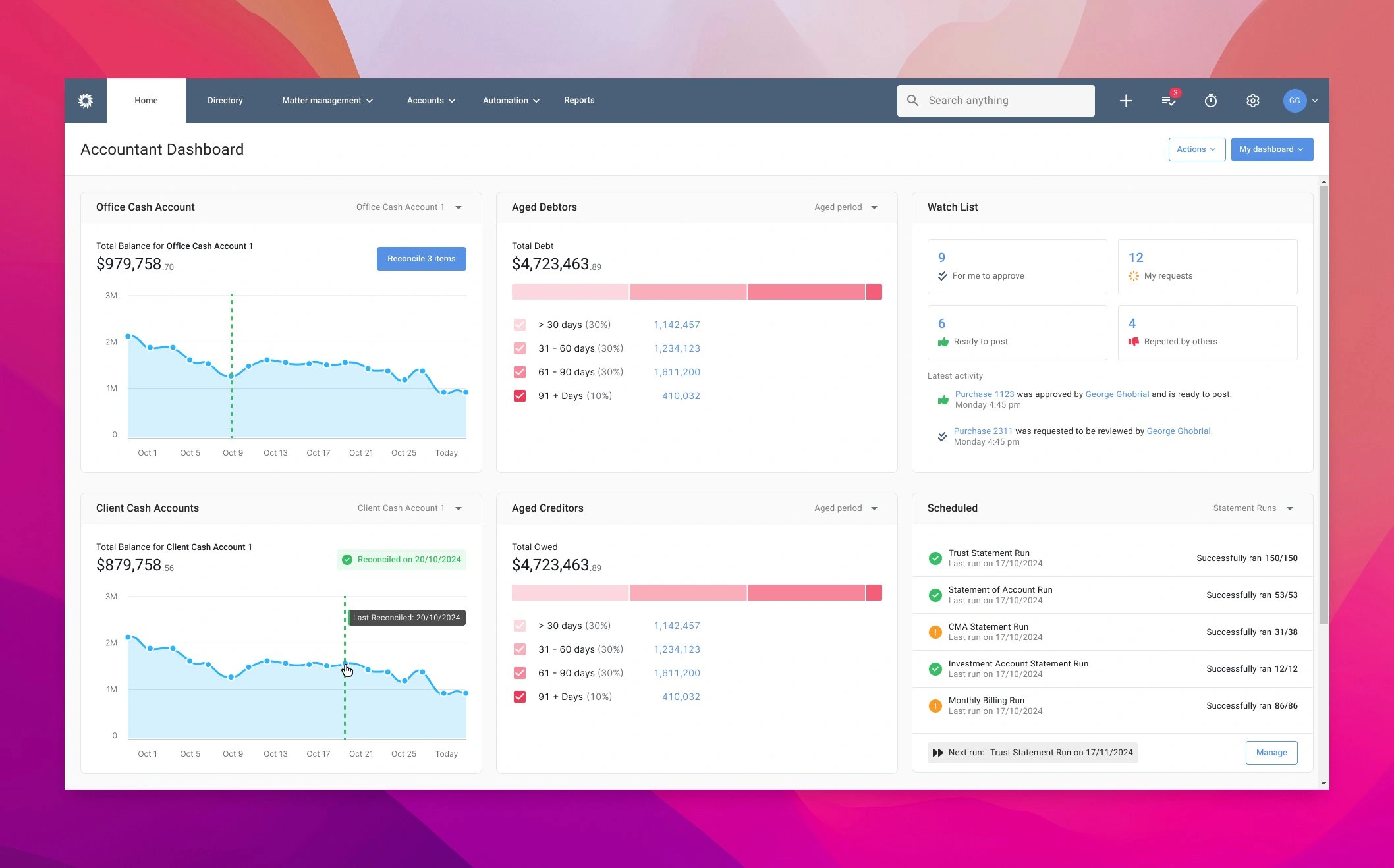
🎯 Clear Visual Hierarchy
We restructured the layout to surface the most critical metrics at a glance, applying consistent spacing, font weights, and colour contrast. This helped users scan for insights faster, improving task confidence and reducing the time spent searching for information.
🎯 New Widgets - More Efficiency
We introduced two new widgets; (1) Watchlist lets users action outstanding requests immediately. (2) Scheduled displays all automated reports sent to clients or suppliers, along with delivery status.
🎯 Streamlined Task Execution
We revamped key widgets like Cash Accounts, Aged Debtors/Creditors to centralise key information and actions, reducing friction and enabling faster task completion.
🎯 Better Data Visualisation
To reduce confusion, we replaced cash account visuals with daily line charts for clearer balance tracking. Aged Debtors and Creditors now use horizontal stacked bar charts to clearly show amounts by 30, 60, 90, and 90+ day brackets — a change driven by strong user demand.
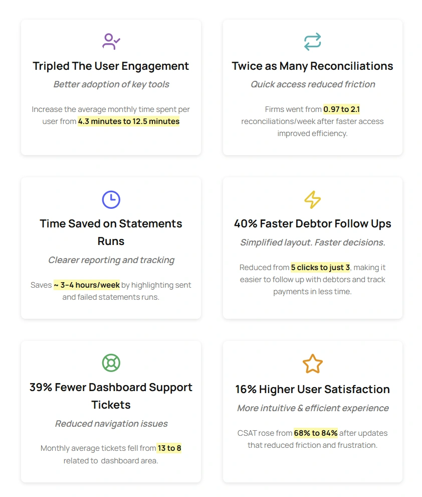
Business & User Impact
Like this project
Posted Jul 15, 2025
Redesigned Practice Evolve's dashboard to enhance productivity and user satisfaction.
Likes
1
Views
14
Timeline
Feb 15, 2024 - Ongoing