Trabr Landing Page Redesign
George Ghobrial🌟
Built for Builders: A Smarter First Impression for Trabr
Trabr had a powerful mobile app — but its landing page didn’t show it. The redesign transformed a vague, outdated homepage into a modern, high-converting experience that clearly communicated value, built trust fast, and guided users to action. The result? Lower bounce rates, more qualified leads, and a landing page that finally matched the product’s strength.
Project Overview
In the competitive world of construction project management, first impressions matter. Trabr, a mobile-first project control app, had an existing landing page that didn’t reflect its value, credibility, or usability. My role as a UX Designer was to rethink the landing experience to:
✅ Instantly communicate Trabr’s value proposition
✅ Increase trust and credibility with potential users
✅ Guide users to action more efficiently
The goal was to transform the landing page from a static, generic experience into a high-converting, trust-building introduction to the Trabr ecosystem.
The Challenge: Communicating Clear Purpose
Despite Trabr offering a powerful product, the old website failed to communicate its value effectively. The visual design, content structure, and messaging did not instill trust or drive action. The result was a disconnect between the company's offerings and the user's understanding.
Through competitor analysis and user feedback, I pinpointed specific breakdowns that were contributing to the website’s poor performance:
🔸 Information Overload – The website's content was poorly prioritized, making it difficult for users to grasp the product's core value quickly.
🔸 Disconnected Messaging – The headlines and taglines didn’t resonate with the target audience (builders, project managers), which led to confusion.
🔸 Visual Staleness – The design felt outdated, too corporate, and lacked a modern, user-centric approach, hindering the user experience.
🔸 Weak User Flow – Important information was scattered, causing users to spend unnecessary time scrolling and interpreting content.
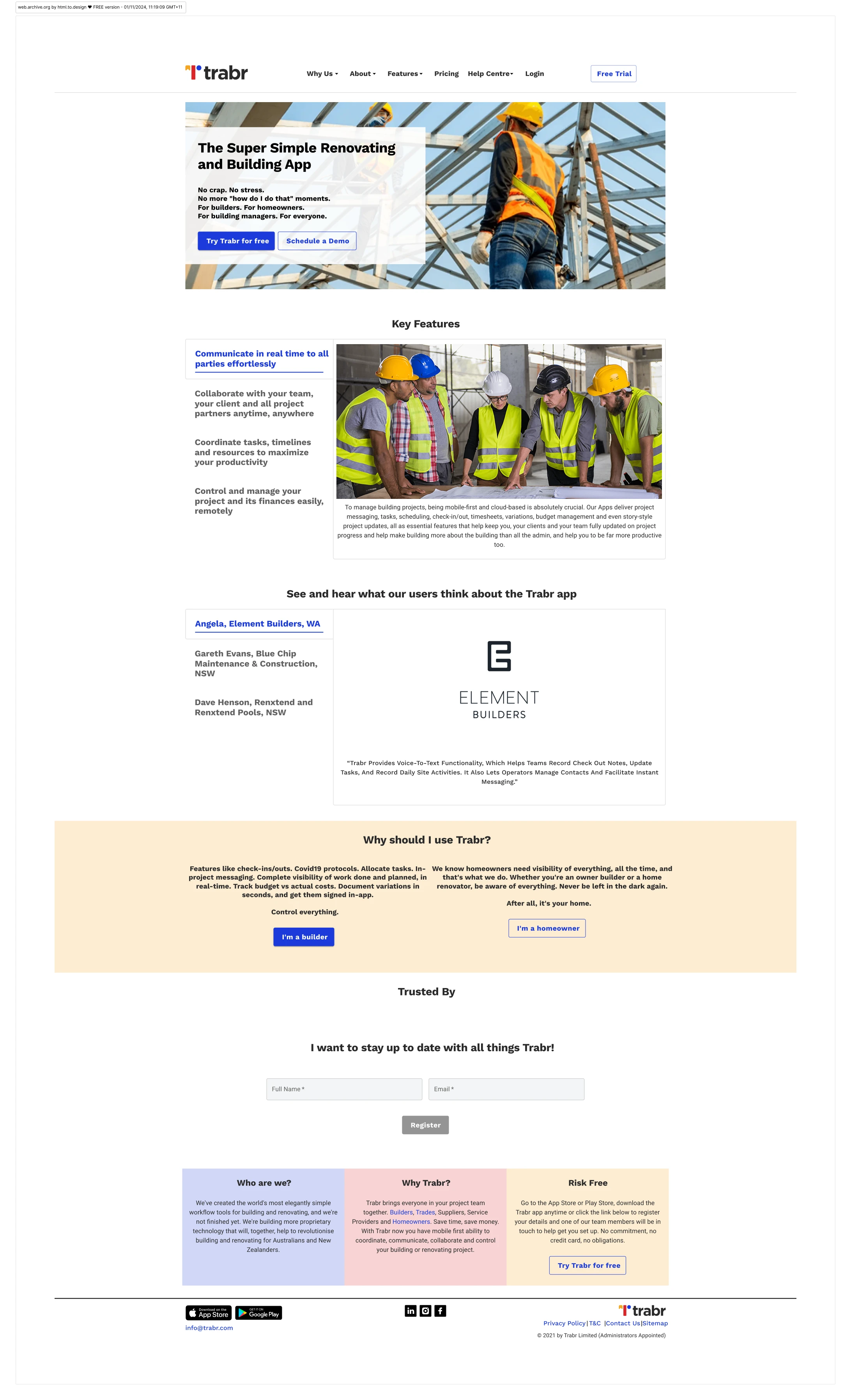
Old Landing Page
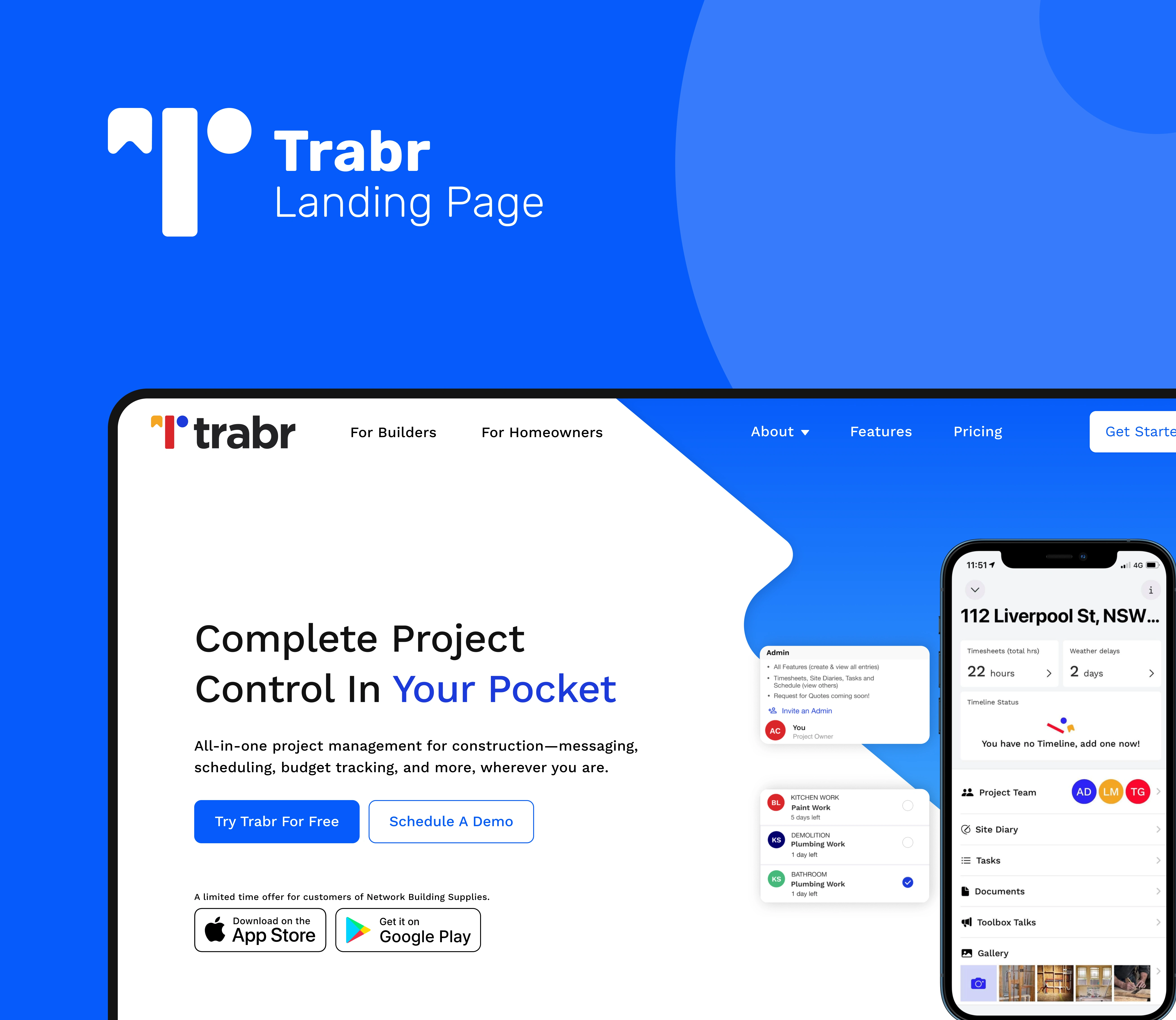
The Redesign
Market Analysis: Identifying Gaps & Opportunities
Competitive research showed that top-performing landing pages tend to feature:
🔹 Strong one-liners that explain the product
🔹 Early trust signals like logos and testimonials
🔹 App screenshots to show functionality
🔹 A clear CTA above the fold
Design Strategy: Clarity, Credibility & Conversion
To reframe the landing page, I focused on a strategic approach grounded in user behavior, trust-building patterns, and competitive positioning. The key pillars of the design strategy were:
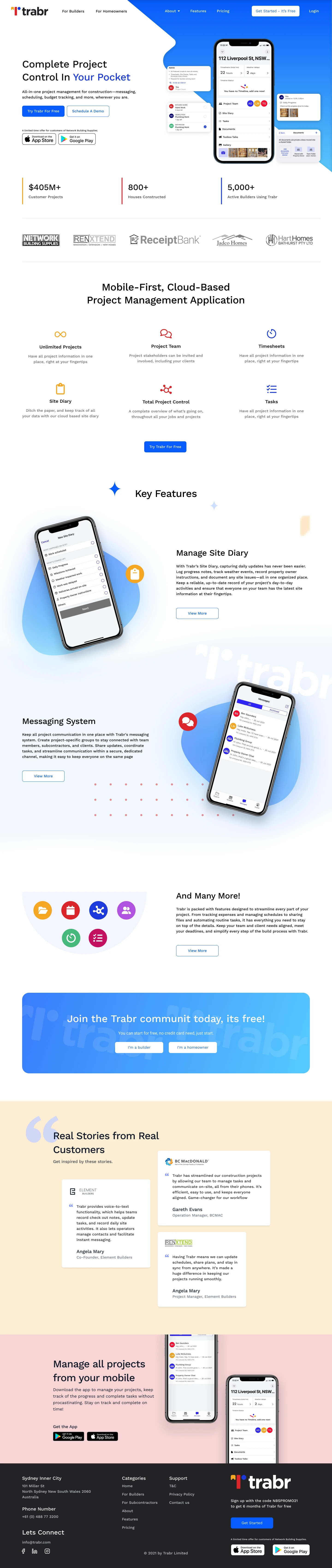
🎯 Refined the Hero Section – Introduced a clear headline ("Complete Project Control. In Your Pocket.") paired with mobile visuals to quickly establish purpose and value.
🎯 Elevated Trust Signals – Brought partner logos, app store ratings, and testimonials above the fold to build instant credibility.
🎯 Structured a Guided Flow – Each section answers a specific user question: What is this? Can I trust it? How does it work? What next?
🎯 Optimized the CTA Experience – Rewrote and repositioned the call-to-action to be benefit-focused and visible early on.
🎯 Modernized the Visual System – Introduced more white space, product-focused imagery, and consistent UI patterns for a more trustworthy feel.
Redesign Landing Page
Like this project
Posted Jul 15, 2025
Redesigned Trabr's landing page for better conversion and trust.