
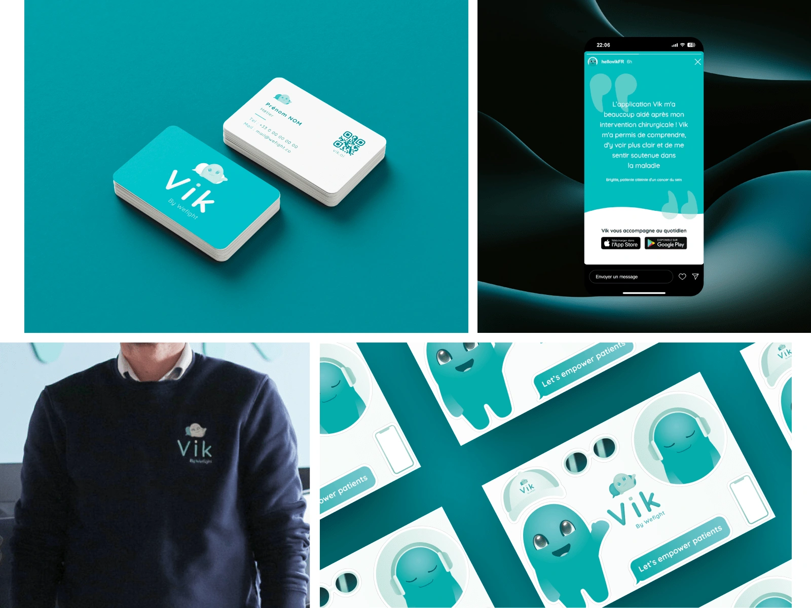
Brand identity - Vik
The challenge
Vik was a mobile app with a chatbot designed for patients and their caretakers, developed by the startup Wefight. The company wanted to stand out in the healthtech market, but its visual identity lacked consistency and impact.
Results
141% increase in mobile app users.
The mascot became the users’ favorite element.
1 / The mascot
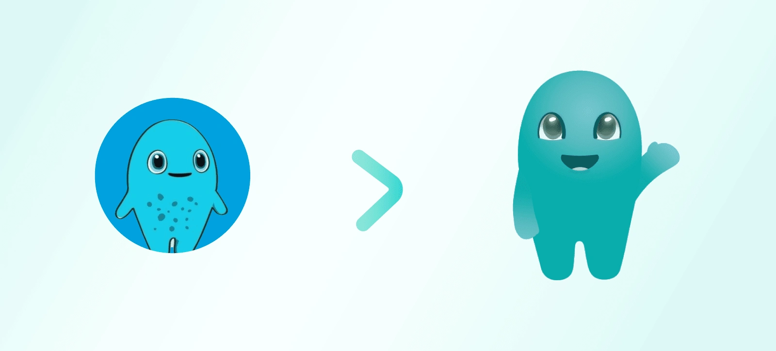
The mascot before and after
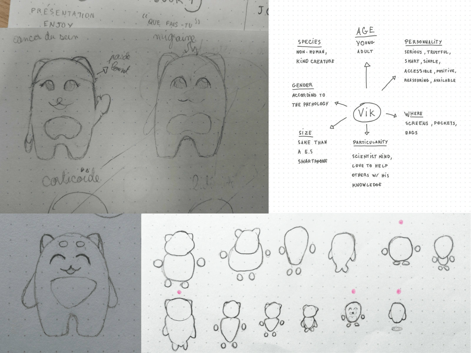
Background and silhouette tests
Research and modernization of the mascot for a more accessible style that reflects the technology. There was one per pathology, with their own characteristics

Vik CRC, Vik, Vik Depression, Vik Nasal Polyps, Vik Headache, Vik Multiple Sclerosis, Vik Prostate cancer, Vik Lymphoma
2 / Colors

Vik color palette
Primary green with blue accents to associate growth & health with intelligence & technology.
3 / Logo
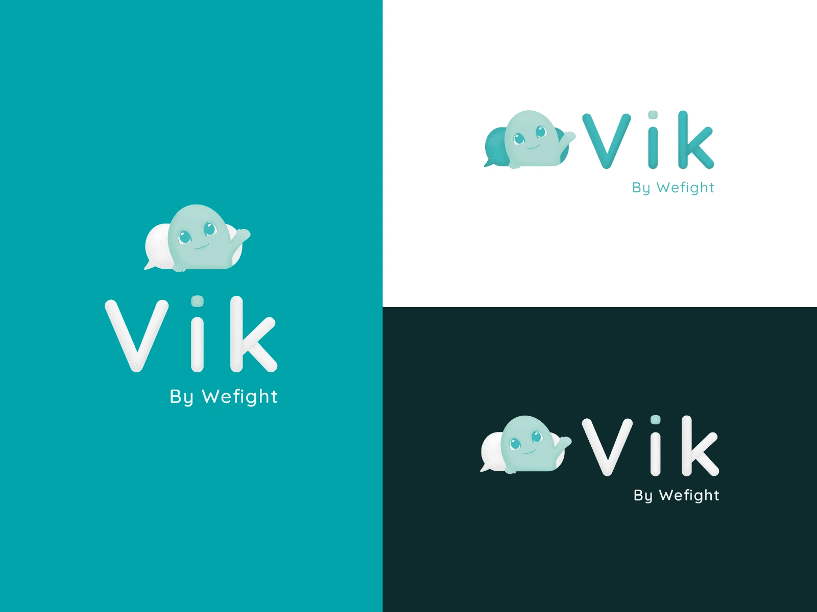
Redesign of the chatbot’s speech bubble, integrating health-related colors and the mascot.
4 / Website
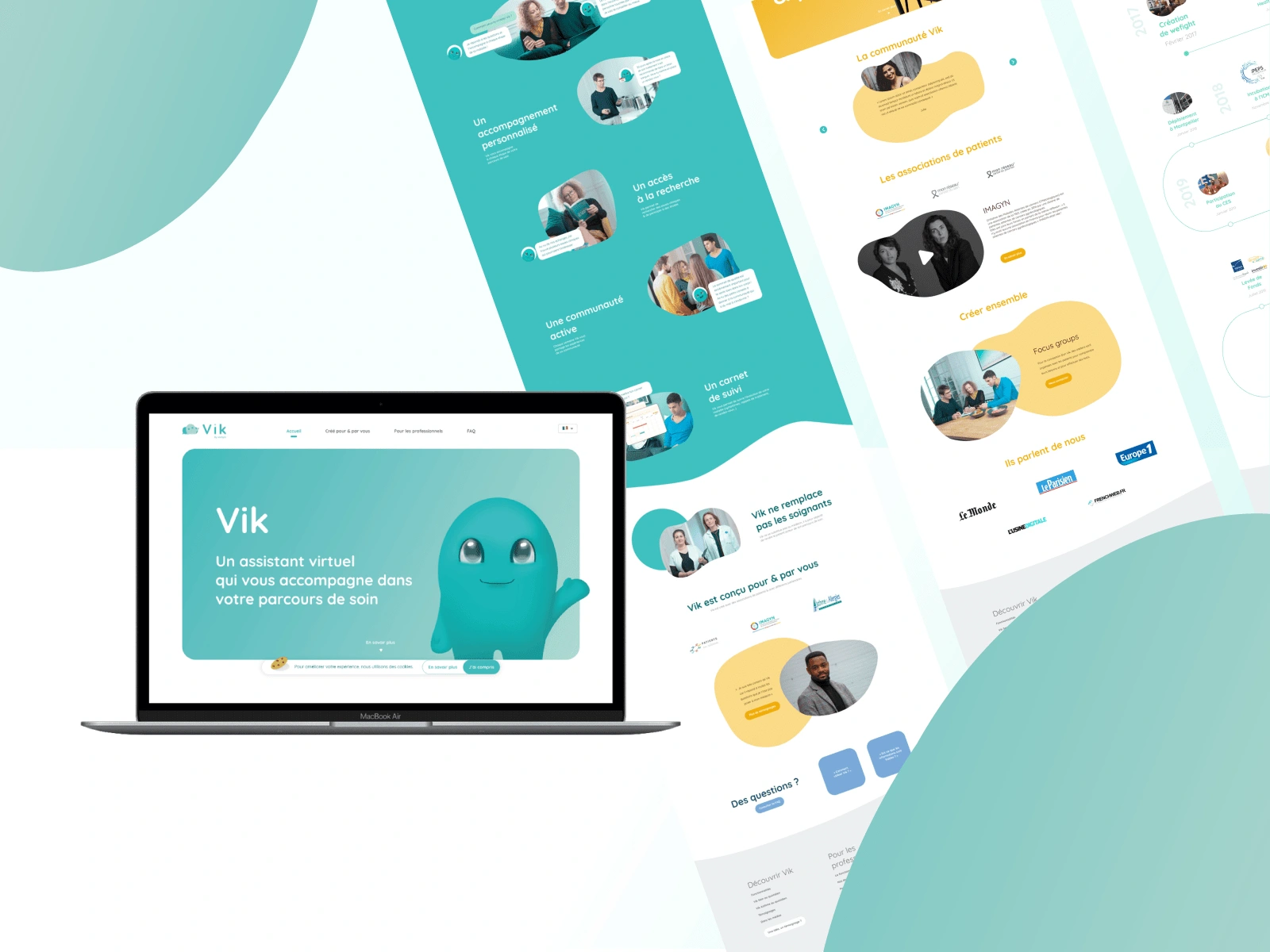
Website content adapted to meet the needs of patients and their relatives.
Feedbacks
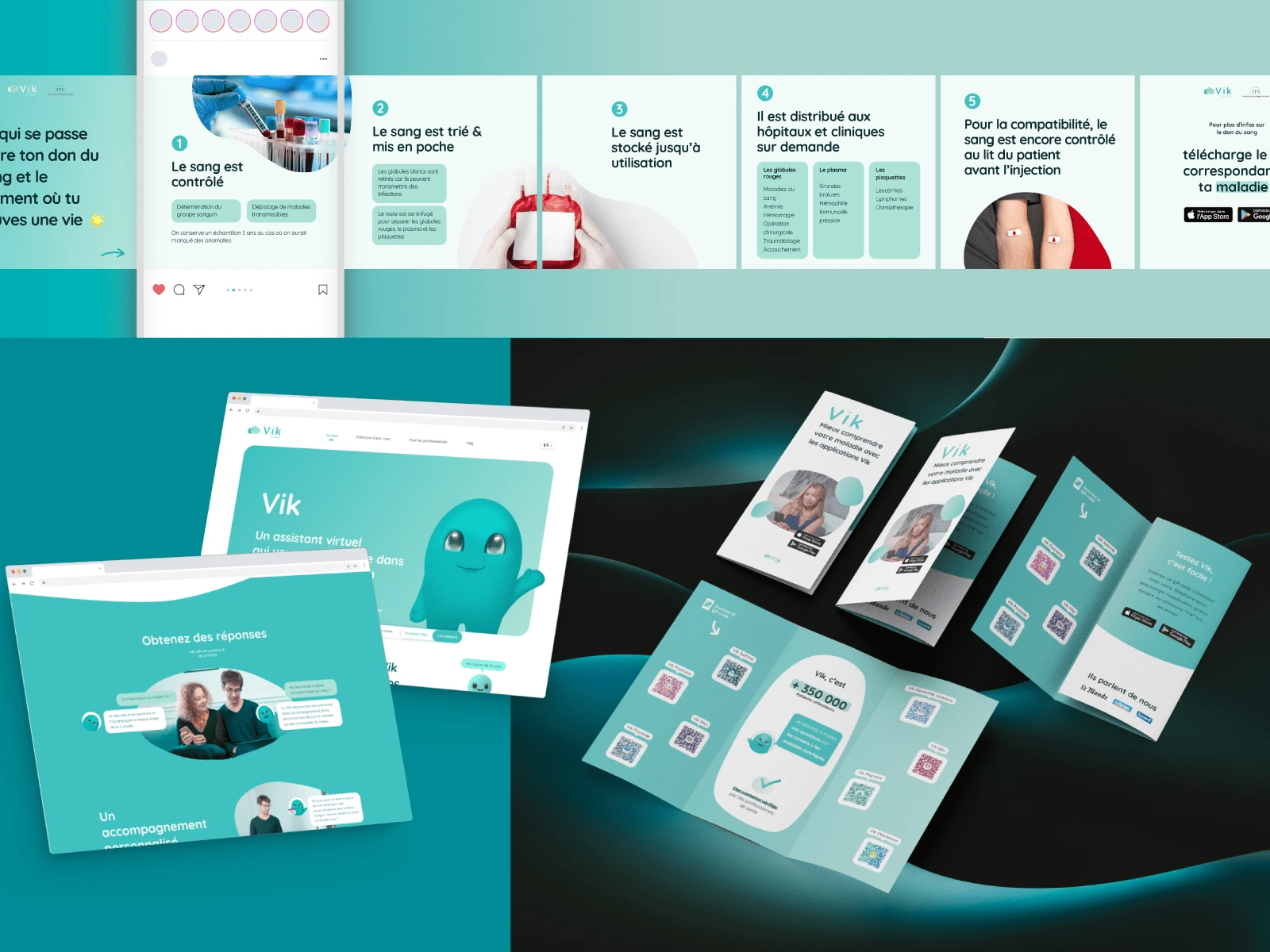
The Mascots made a lasting impression, and some clients I’m still in contact with continue to mention them
- Cynthia, Key Account Manager
Wether for designing our mascots, icons, illustrations, or other visual elements, Melia has consistently created assets that effectively communicate our brand identity and captivate our target audience.
- Fanny, Lead Product Designer
0 likes · 14 views · Feb 21, 2025
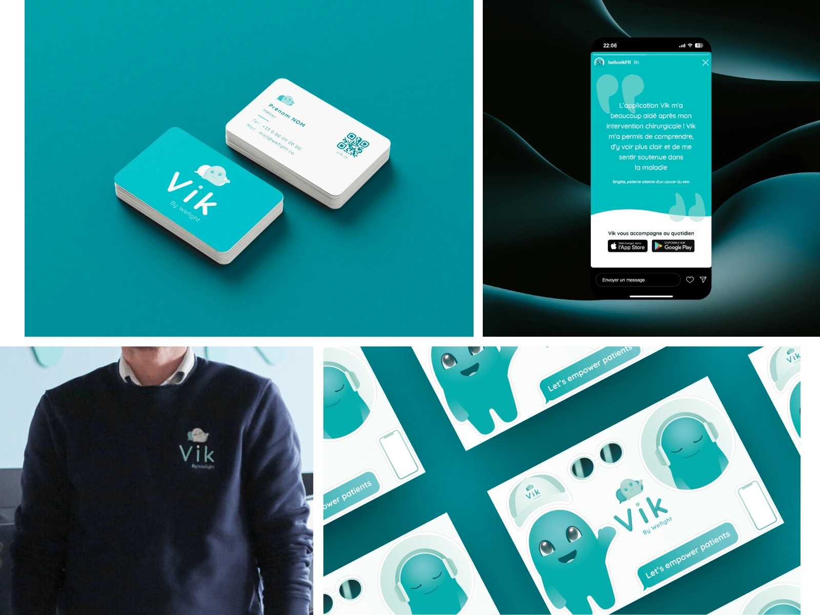
Vik, a chatbot app by Wefight, needed a strong visual identity. Result: +141% users, and its mascot became the users' favorite element.
Timeline
Jun 19, 2019 - Jun 28, 2023


