ROOTS UK / Plant-based eCommerce with lots of variants 🌱

Marion Morales


Introduction
As an already successful B2C plant retailer in the UK, Roots was at a point in its journey when it hoped to hype up and appeal to a more premium audience. They knew they needed to upscale their user experience regarding their branding and functionalities, and they needed someone to help them check all these new boxes.
Their main challenge was the page view, which was not satisfying. Their eCommerce's main entry point was the product pages via Google Ads. However, the issue they faced was that customers didn't navigate the website after landing on the product they had been interested in, which resulted in poor add-to-cart rates.
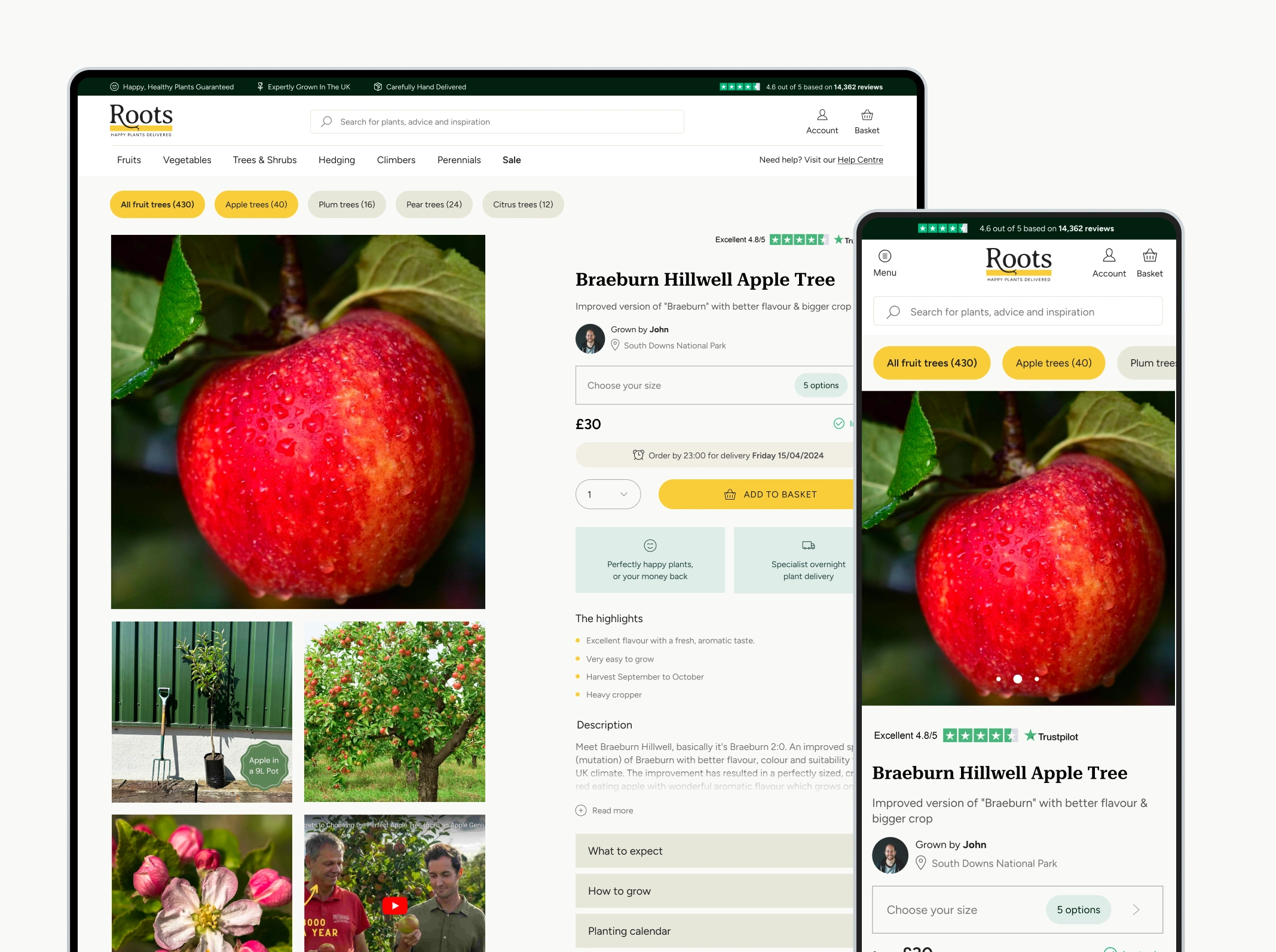
The new product page with its mobile version
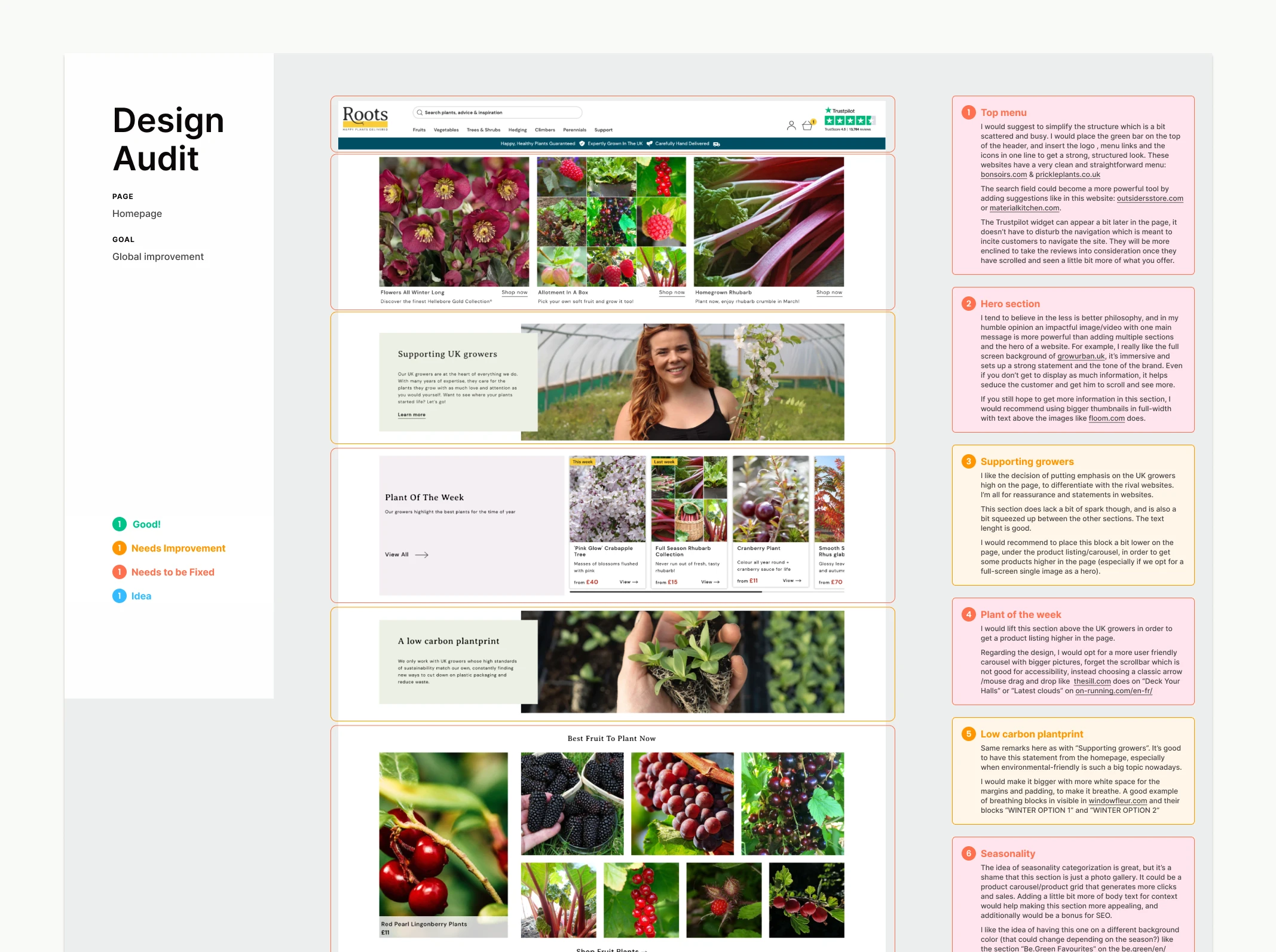
Excerpt of the UX audit
The Approach
We conducted a thorough UX audit and competitive analysis of the existing Shopify website to identify pain points. Based on our conclusions, we prepared an attack plan to address the issues we found.
Functionalities We updated the user flow from the landing page to the checkout page. For example, we added bullet lists on the product thumbnails to access more information in the cross-sell and listing without visiting the product page. We also added an easy-to-use drawer on the product page, which helps us quickly understand the differences between each product's variants.
Mobile first The website experience was not optimized. Because mobile is now the main source of traffic, we spent a fair amount of time reviewing and readapting the entire user flow, down to the small details that make a difference, like changing the product gallery to a carousel or dividing the main menu into three different steps.
Social proof The client already had a substantial database of positive testimonials and active social accounts. To ensure Brand trust, we added social media instances on the landing page with post embeds: testimonial blocks and reviews on every pivotal page of the shopping flow (landing, listing, product).
UI Design We refreshed the UI design, changing the colour code from a startup-ish bright green to a more elegant dark green and changing the plain white body background to a soft light beige. We added subtle elements like soft and discreet borders on the blocks and outlined icons. We operated a drastic picture selection only to keep carefully curated stock photography.
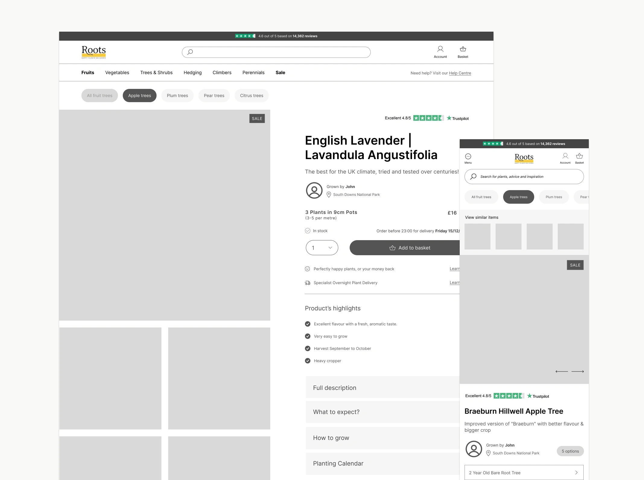
Wireframe of the product page
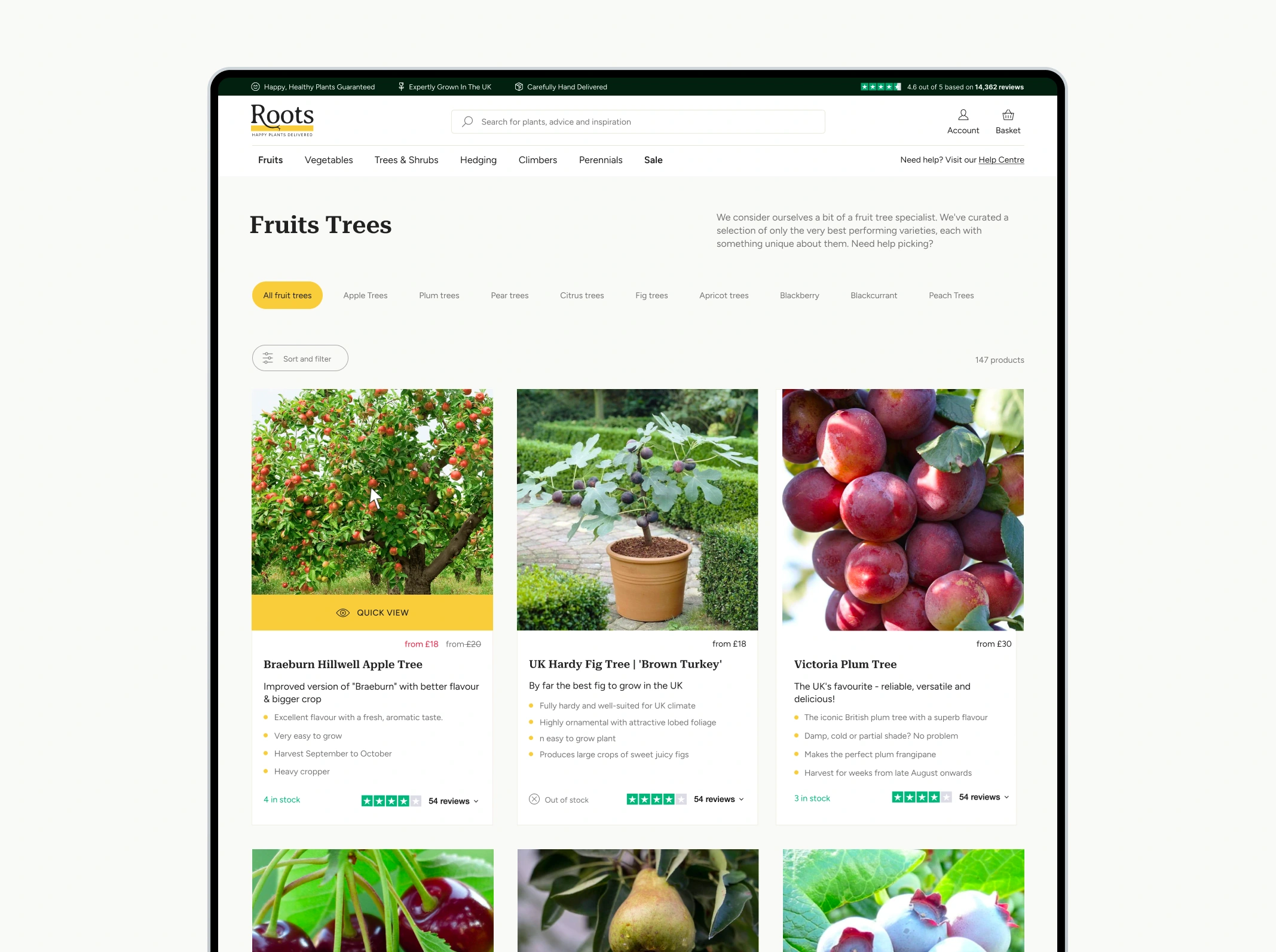
Listing page with a filter on a category
Deliverables
- UX research, including a competitive analysis
- High-quality Figma prototypes ready for hand-off to developers
- Brand guidelines with a premium
- A design system with UI guidelines and an icon set
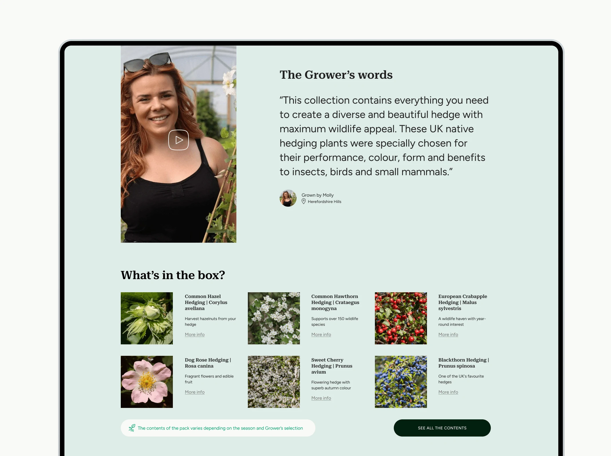
Product pack with its content
Website: https://www.rootsplants.co.uk/
Like this project
Posted Feb 7, 2025
How to transform the B2C e-commerce experience of one of the plant's UK retailer leaders to attract a premium audience and increase the add-to-cart rate.
Likes
0
Views
10


ZAK / Let's create this in-your-face fashion look 🕶️

AMG MEDICAL / How to scale a multi-brand B2B eCommerce ⚕️

OPAL / How to elevate an Education Programme awareness 🤸♀️

IMPARFAIT / Premium-ize an eCommerce experience 💎