NfN(Nurse for Nurse) - Logo Design
Akane Yabushita
Nurse for Nurse(NfN) is a Japan-based general incorporated association to help nurses connect, exchange information, and support each other in their career development. They observe the changing needs of societies, the needs and challenges of nurses, and create opportunities to discover new areas as well as themselves.
I worked directly with one of the founder to create a logo for the association.
Logo Concept
The initial brief was to visualise the concept of the association: ‘Connecting nurses around the world' in a simple, minimalistic approach yet professional look, with multiple colours in comforting tones that represents the nursing industry (As sense of security) as well as the diverse possibility (As hopes) in the future of nurses.
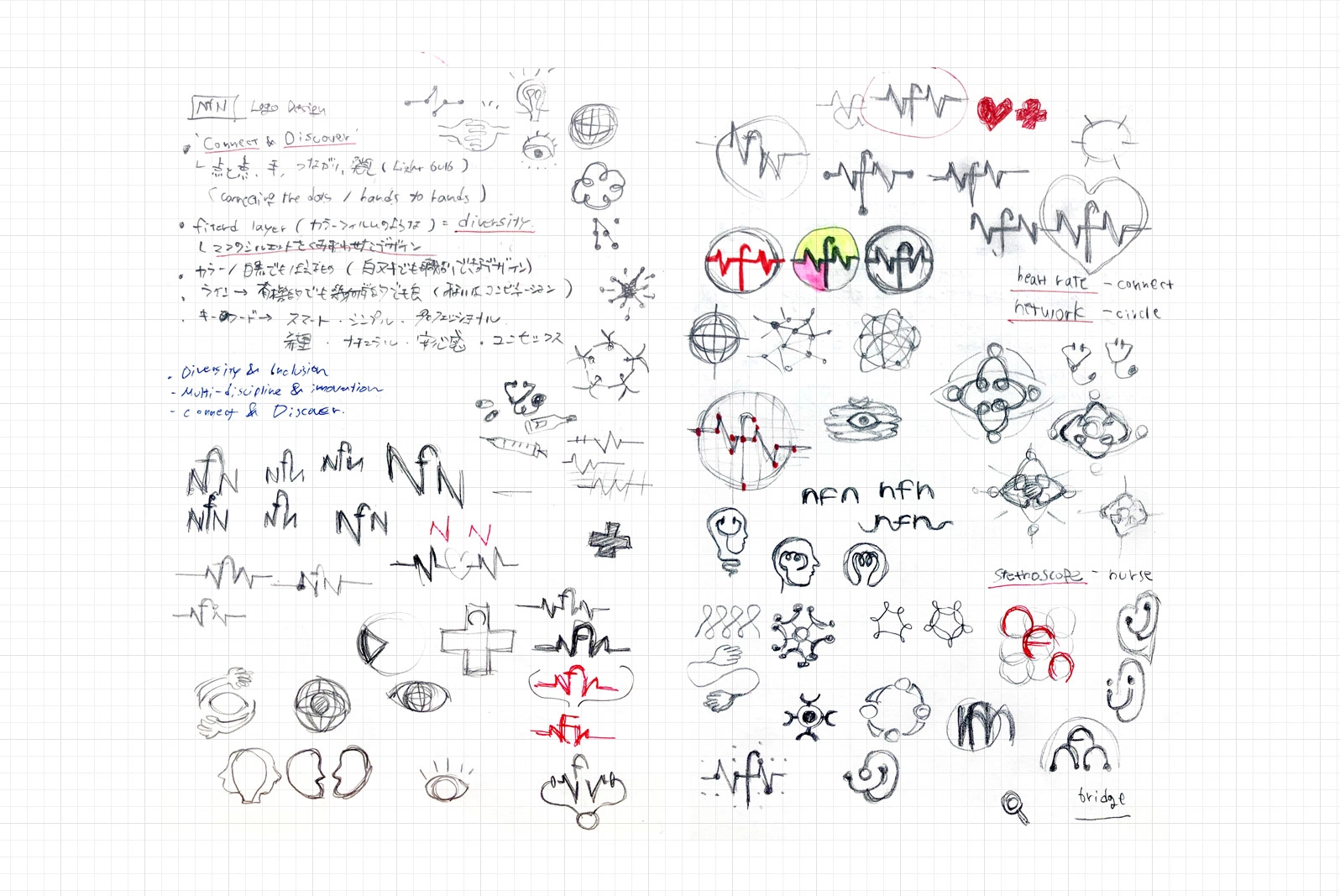
Cocept sketch #1
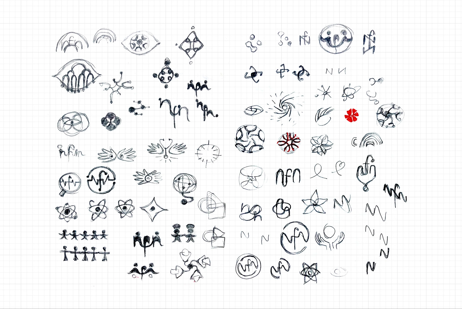
Cocept sketch #2
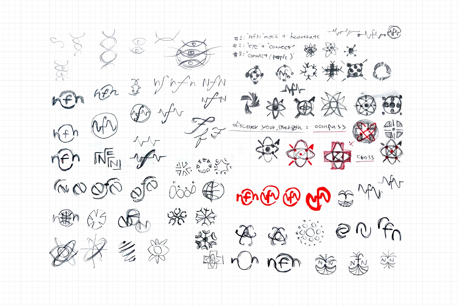
Cocept sketch #3
Concept Development
To explore ideas and seek possibilities that might lay underneath, I created some design drafts using motifs and elements that related to the mission and concept of the association.
After some discussion, we settled on one design sketch based on the concept of connecting nurses across the globe(as circle / community) through the dots(as nurses) in tip points of the alphabet letters 'NfN', and raising up with the whole community.
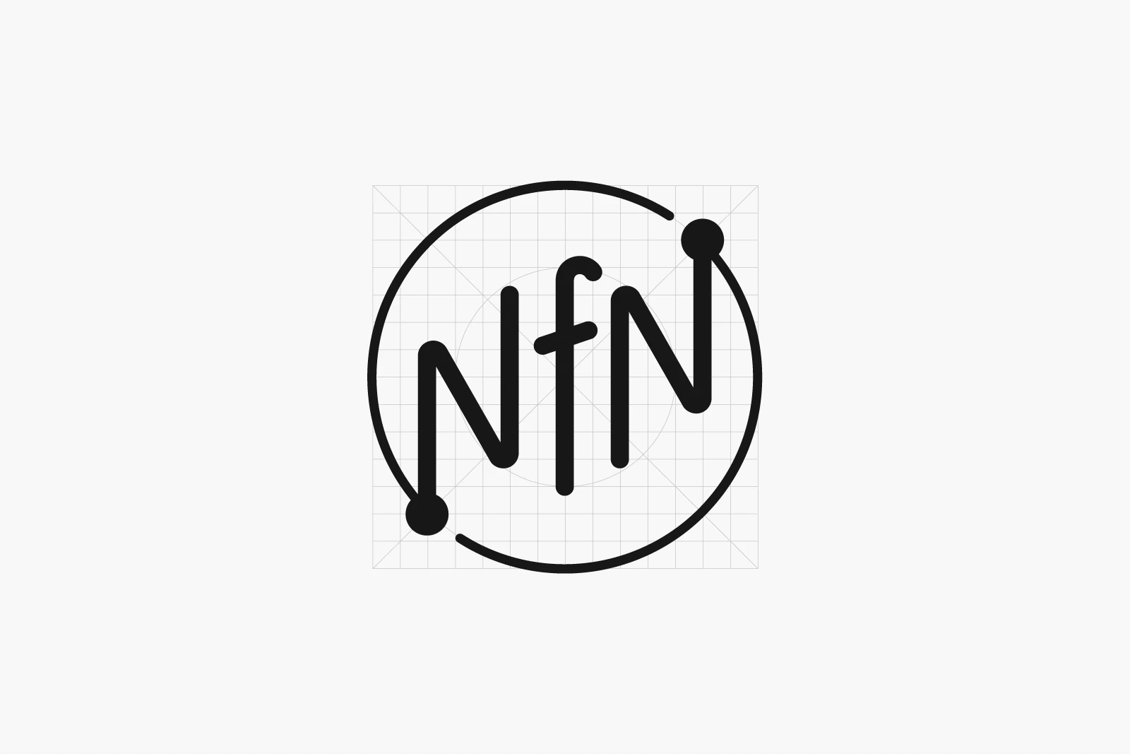
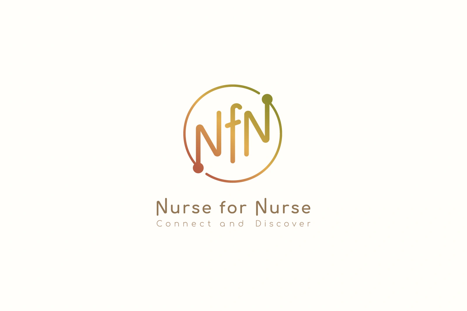
Logomark
Logotype
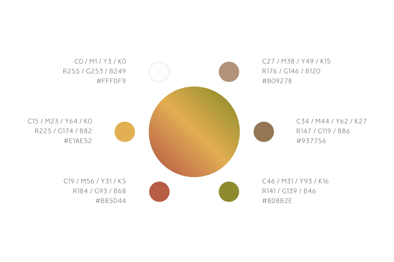
Typeface and Colour Palette
For the logotype I partly customised a minimalistic san-serif font with curvy body and rounded point. It enables to connect with each corner joints and point of the letters flexibly, in order to represent the concept of unity and solidarity.
As for the colour, I picked up natural shades in earth tone that represent what nurses contribute to our society - security, comfort and hopes, and also channels with their professionalism, passion and dedication. And the gradient colour speaks the three core values of the association, which is "Diversity, Equity and Inclusion".
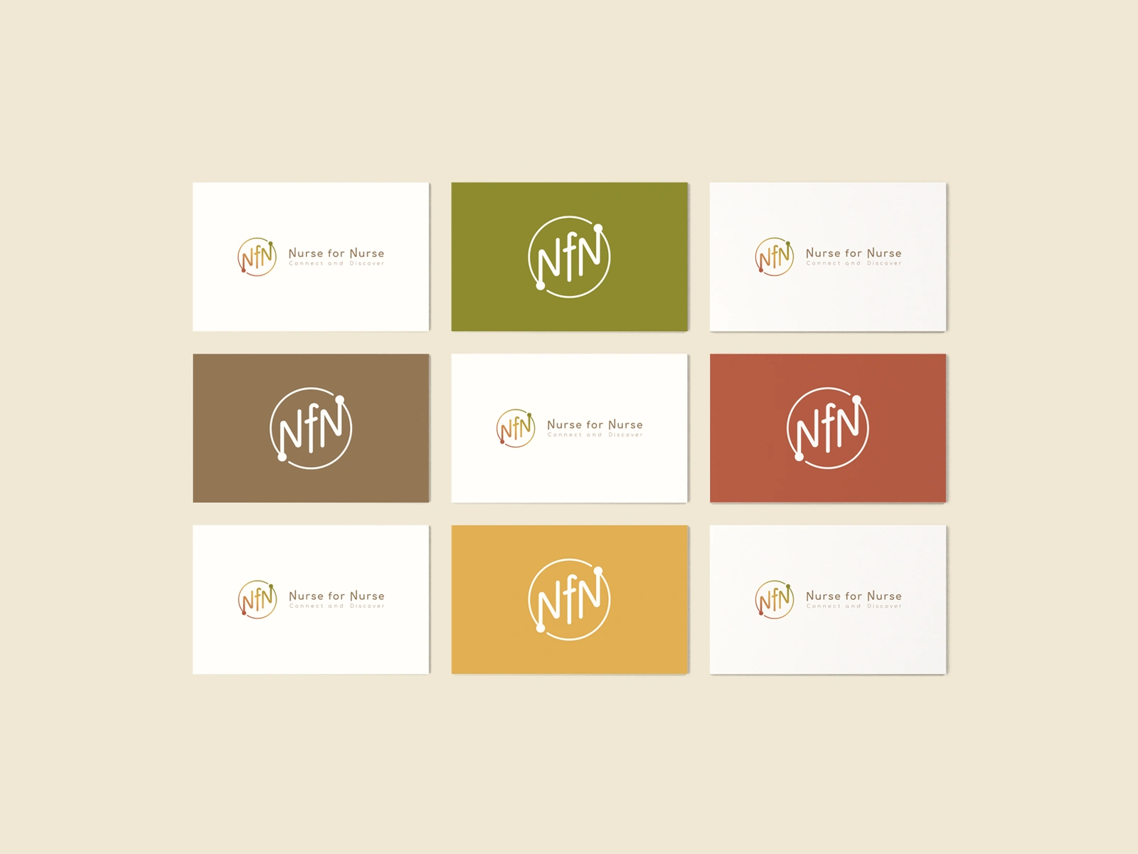
Final Deliverables
The final design was delivered in minimalist style on warm, earthy colour tone and gradient, with a wish for all who aspire to become a nurse, currently working as a nurse and who seeks future career opportunity from a nurse, to be able to engage long-lasting familiarity with. I hope it works as the catalytic symbol of generating diverse future possibilities as well.
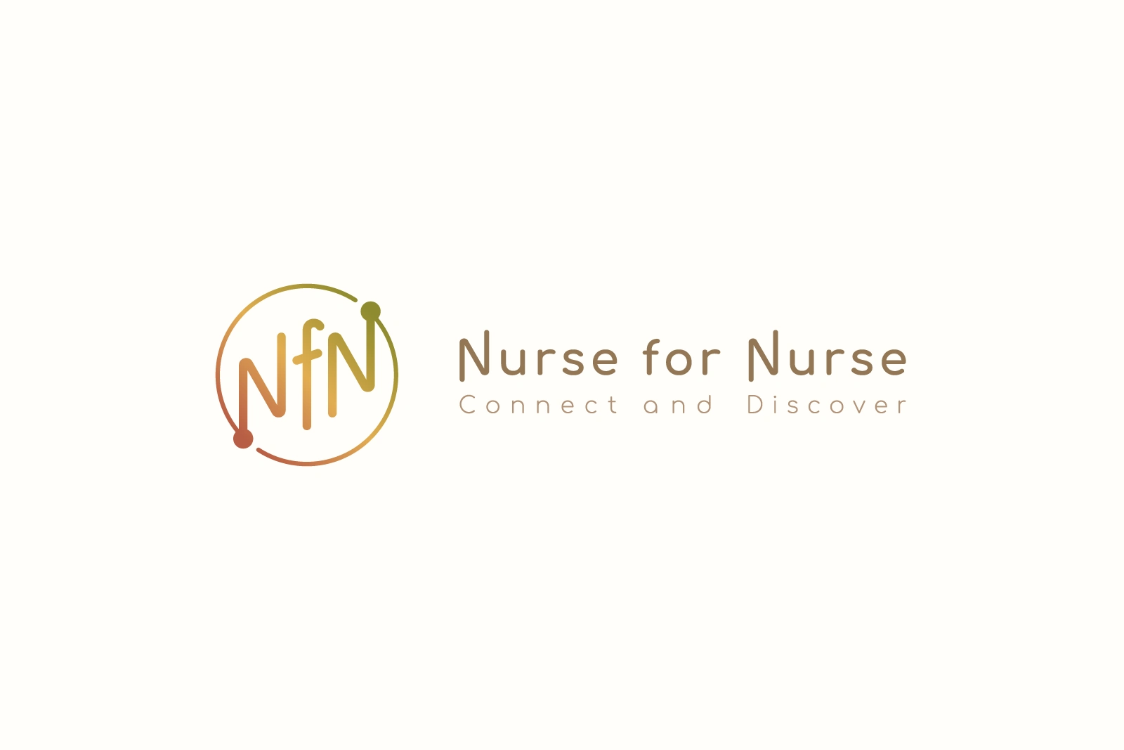
Horizontal logo

Square logo
Like this project
Posted Jan 12, 2026
Logo design for Nurse for Nurse (NfN), a general incorporated association and community dedicated to nurses worldwide to help their career development.
Likes
0
Views
0