UI/UX Website Redesign Concept for SoccerWire

Austyn McFadden


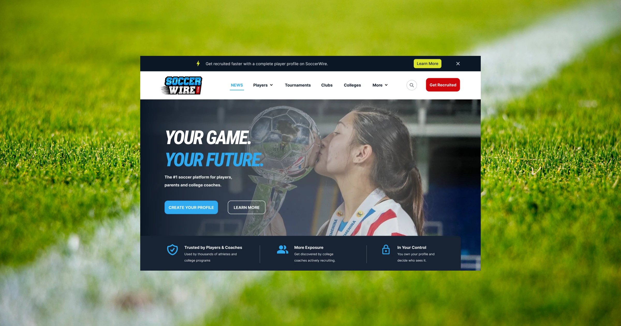
I redesigned the SoccerWire homepage as a personal UI/UX case study focused on improving user experience, visual hierarchy, and content clarity.
One of the biggest issues I noticed with the current experience was information overload. Users are immediately presented with articles, sidebars, ads, categories, and navigation elements all competing for attention at the same time.
Instead of removing content, I focused on restructuring the experience to feel cleaner, more intentional, and easier to navigate.
The redesigned homepage introduces:
• Stronger visual hierarchy to guide attention naturally
• Cleaner layout and spacing for improved readability
• Simplified navigation to reduce cognitive overload
• Better content prioritization for engagement and retention
• A more modern, conversion-focused UI experience
The goal was to create a homepage that feels easier to consume while still supporting the depth of content SoccerWire offers. More features and content sections are still part of the experience, just introduced progressively instead of all at once.
This redesign concept was created independently and was not commissioned by SoccerWire. It’s simply an exploration of how strategic UI/UX decisions can improve usability, first impressions, and long-term engagement for content-heavy platforms.
If you’re looking for a freelance UI/UX designer, website redesign expert, or modern web designer focused on conversion-driven experiences, this is the type of strategic product thinking I bring to every project.
Personal Instagram: https://www.instagram.com/ohioaustyn/
VAUGHN Instagram: https://www.instagram.com/wearevaughn/
VAUGHN Facebook: https://www.facebook.com/vaughndsgn
VAUGHN Website: https://www.vaughn.agency/
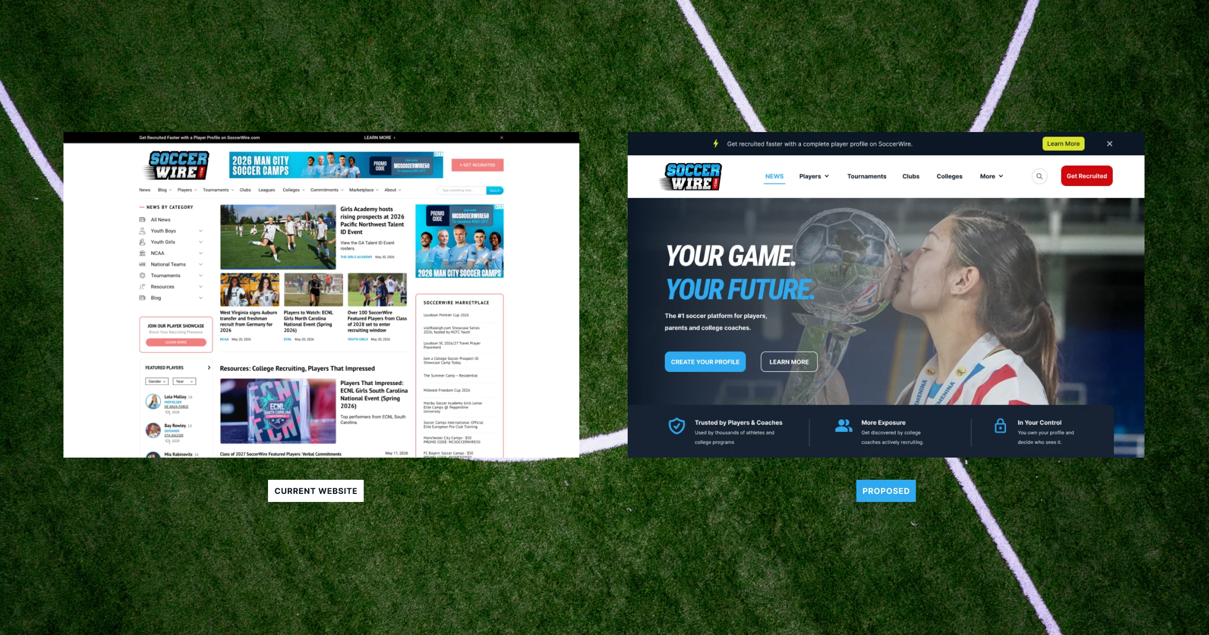
Current (Left) - Proposed (Right)
Like this project
Posted May 24, 2026
Sports news website redesign concept focused on UI/UX, visual hierarchy, content clarity, and conversion-focused web design improvements.