Whipped By Kamri - Brand Identity
Austyn McFadden
Whipped By Kamri — Brand Identity
A custom typography-driven identity built to feel soft, expressive, and instantly recognizable.
This project focused on developing a distinctive visual foundation through handcrafted lettering and a bold, modern presentation system. The goal was to create a mark that feels as smooth and refined as the product it represents, while maintaining strong visibility across a variety of applications.
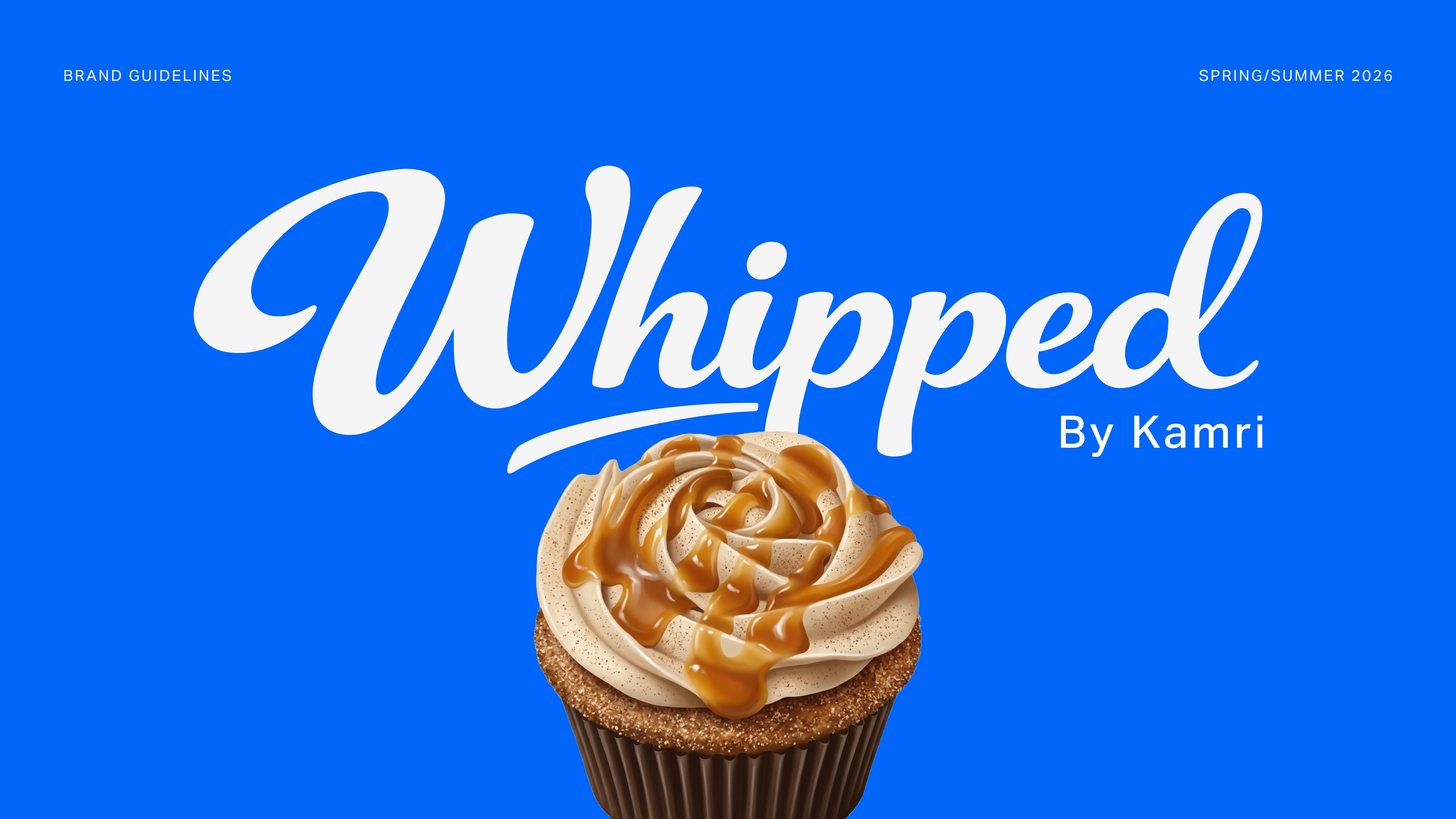
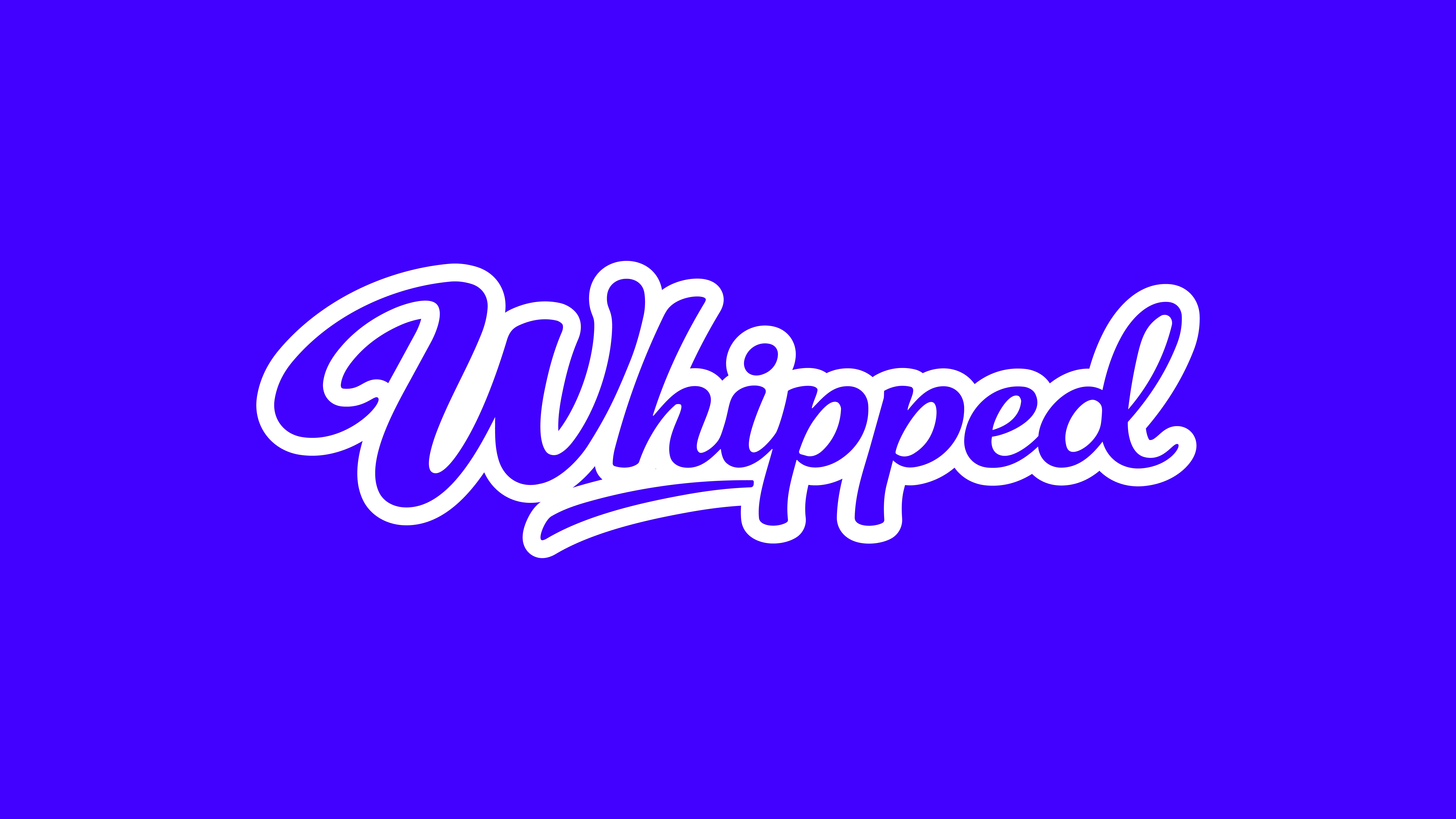
At the core of this identity is a custom logotype designed to feel fluid, cohesive, and full of personality. The lettering leans into soft curves and connected forms, creating a natural sense of movement that reinforces a light, whipped texture.
Every detail within the mark was intentionally shaped to feel approachable while still maintaining a level of polish that elevates the overall brand.
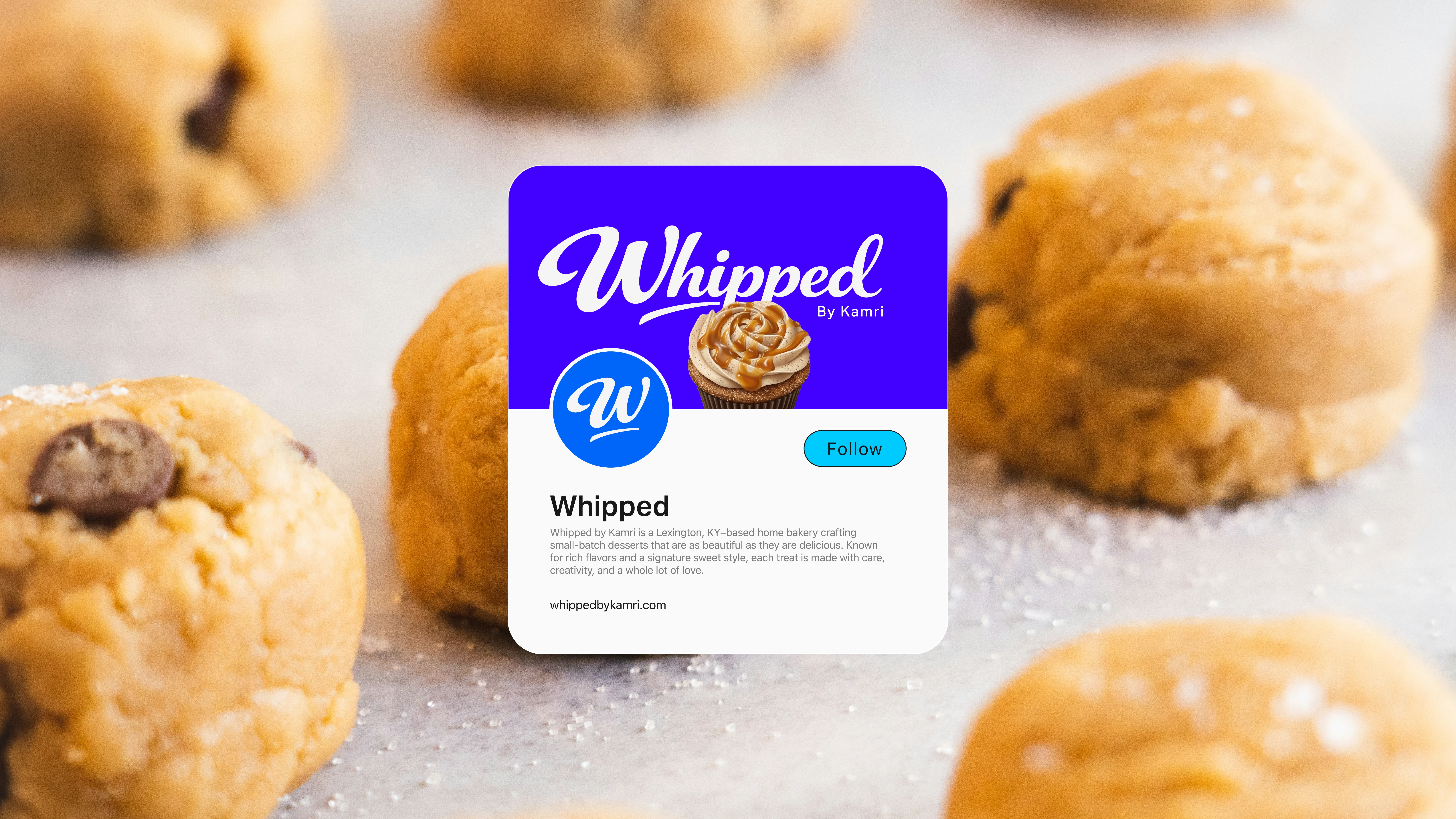
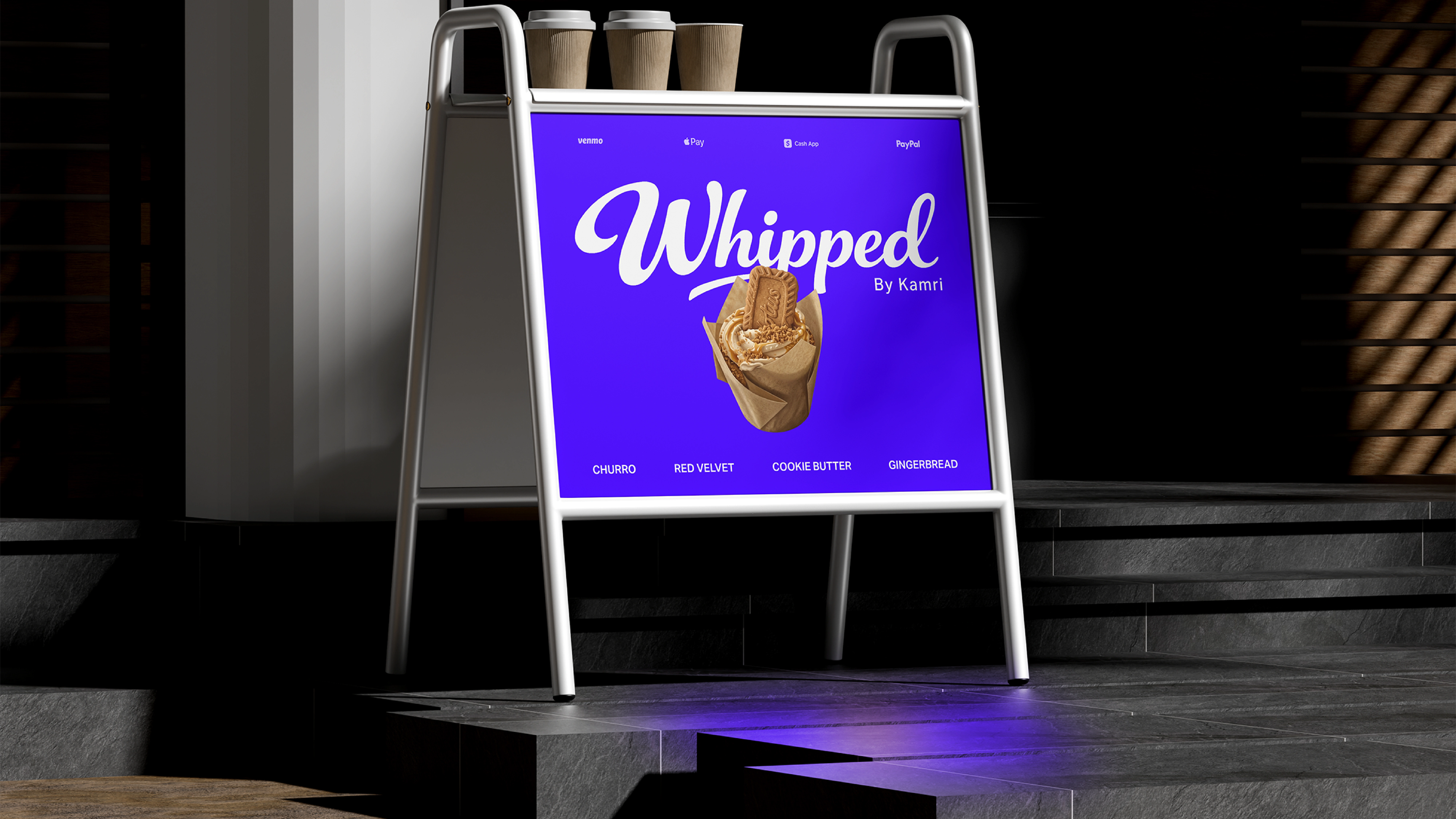
The identity system was built to balance softness with bold presence. While the forms are rounded and expressive, the scale and weight of the logotype ensure it holds its own in high-visibility environments.
This contrast allows the brand to feel both inviting and confident, making it adaptable across both intimate and large-scale applications.
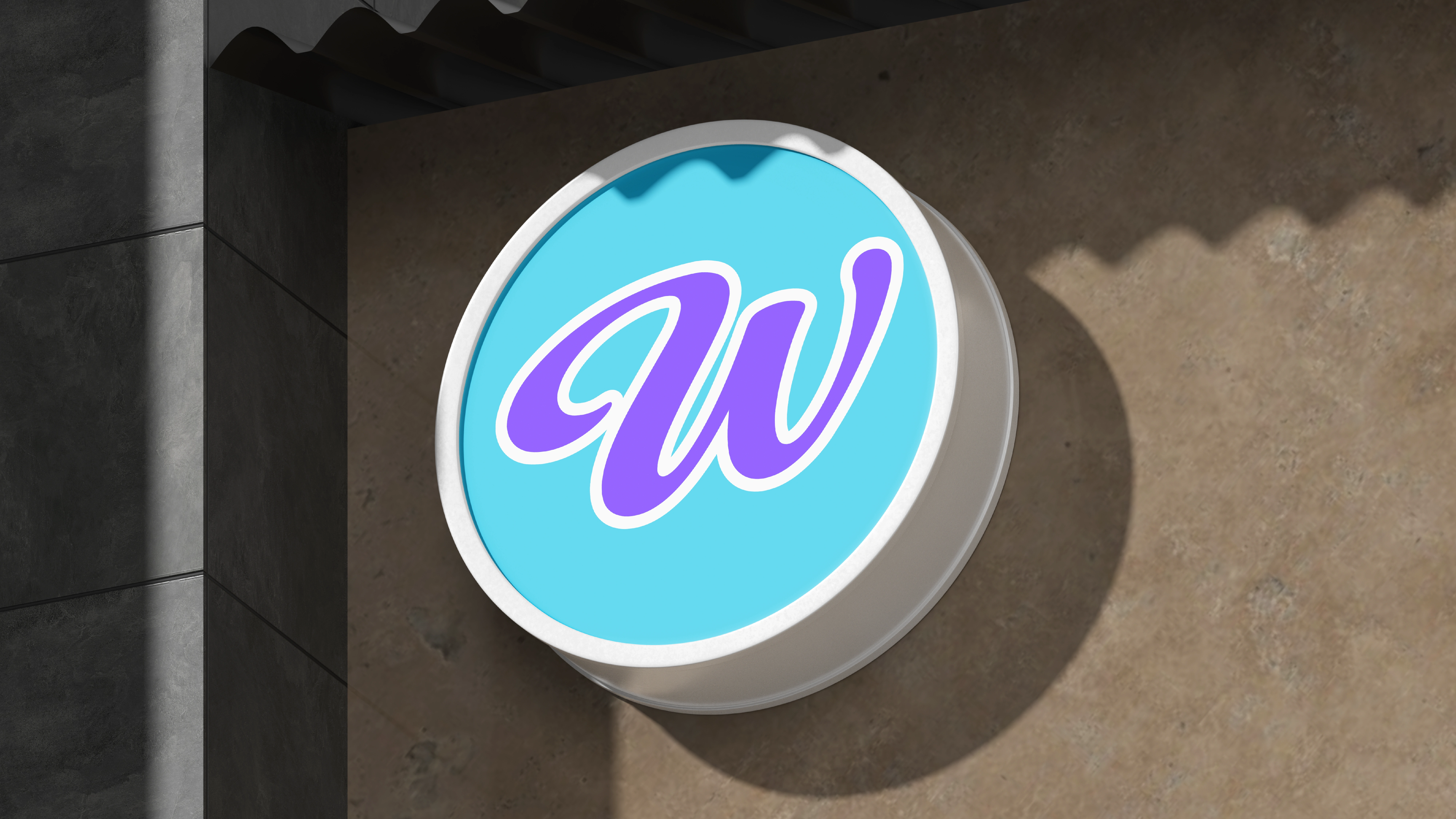
A key focus of the system was consistency across different lockups and presentations. The logotype was refined to maintain clarity and impact whether used as a standalone mark or paired with supporting elements.
Spacing, proportions, and alignment were carefully adjusted to ensure the mark performs reliably in a variety of formats without losing its character.
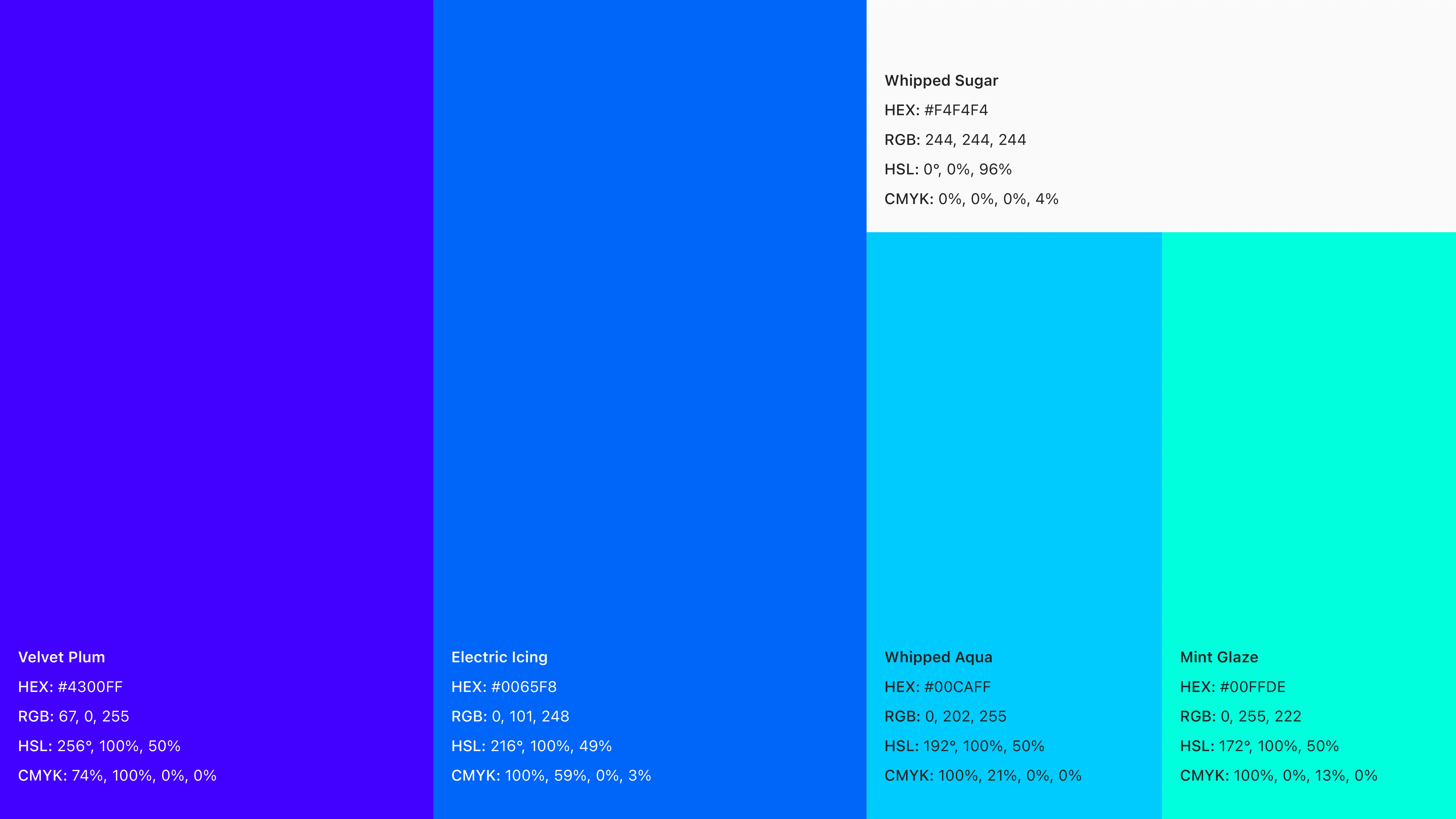
Color plays a major role in reinforcing the personality of the brand. The palette combines bold, high-energy tones with softer supporting colors, creating a system that feels vibrant yet balanced.
This approach allows the identity to stand out immediately while still feeling cohesive and controlled across different use cases.
Process & Iteration
The development of the logotype was driven by an extensive exploration phase focused entirely on custom typography.
Rather than settling on a single direction early, multiple concepts were created to test how different styles could influence the tone and perception of the brand.
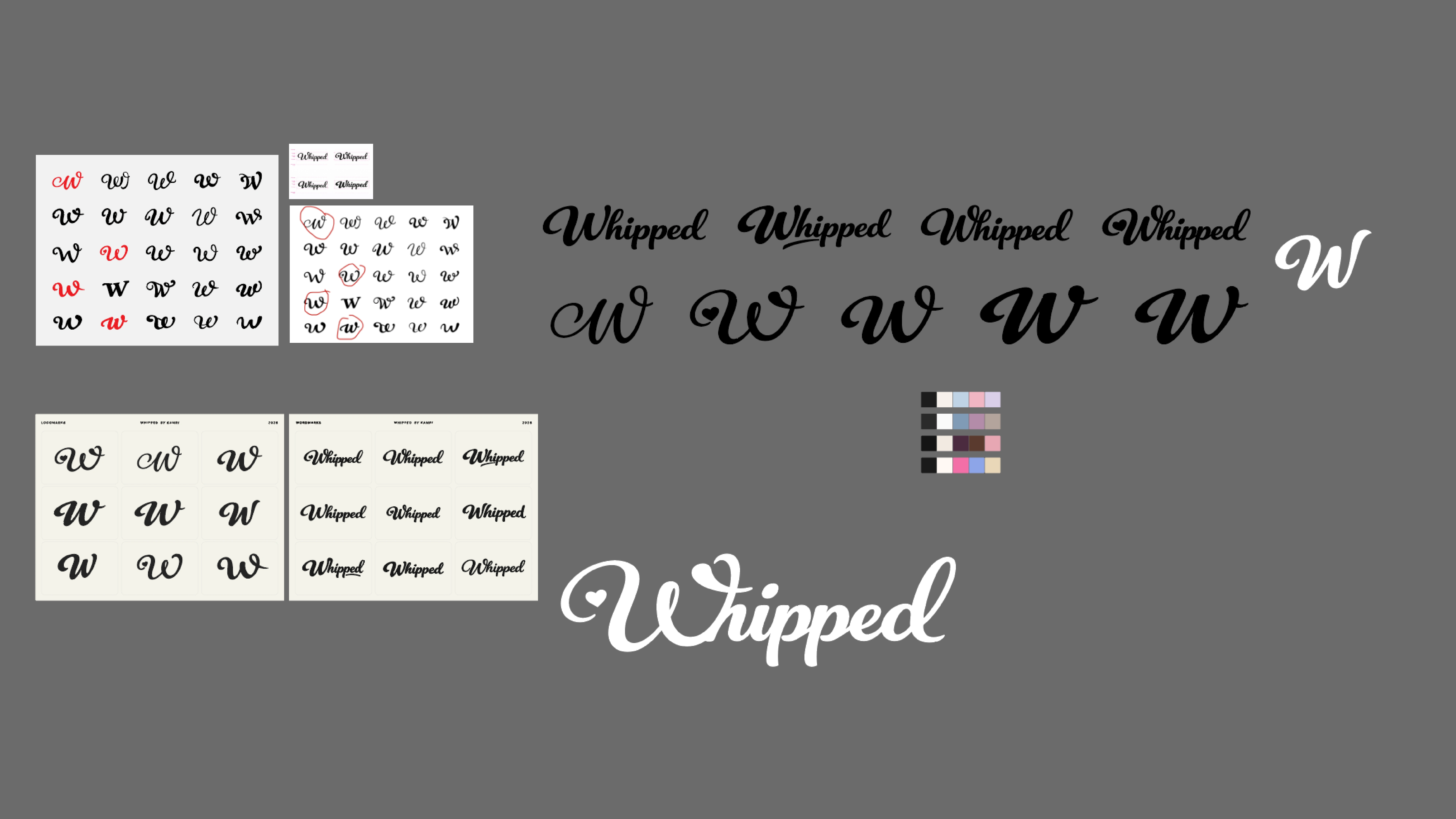
Initial explorations pushed a range of stylistic directions, from more structured and controlled forms to looser, more expressive lettering.
These variations allowed for a deeper understanding of how stroke weight, curvature, and letter connections impacted both readability and personality.
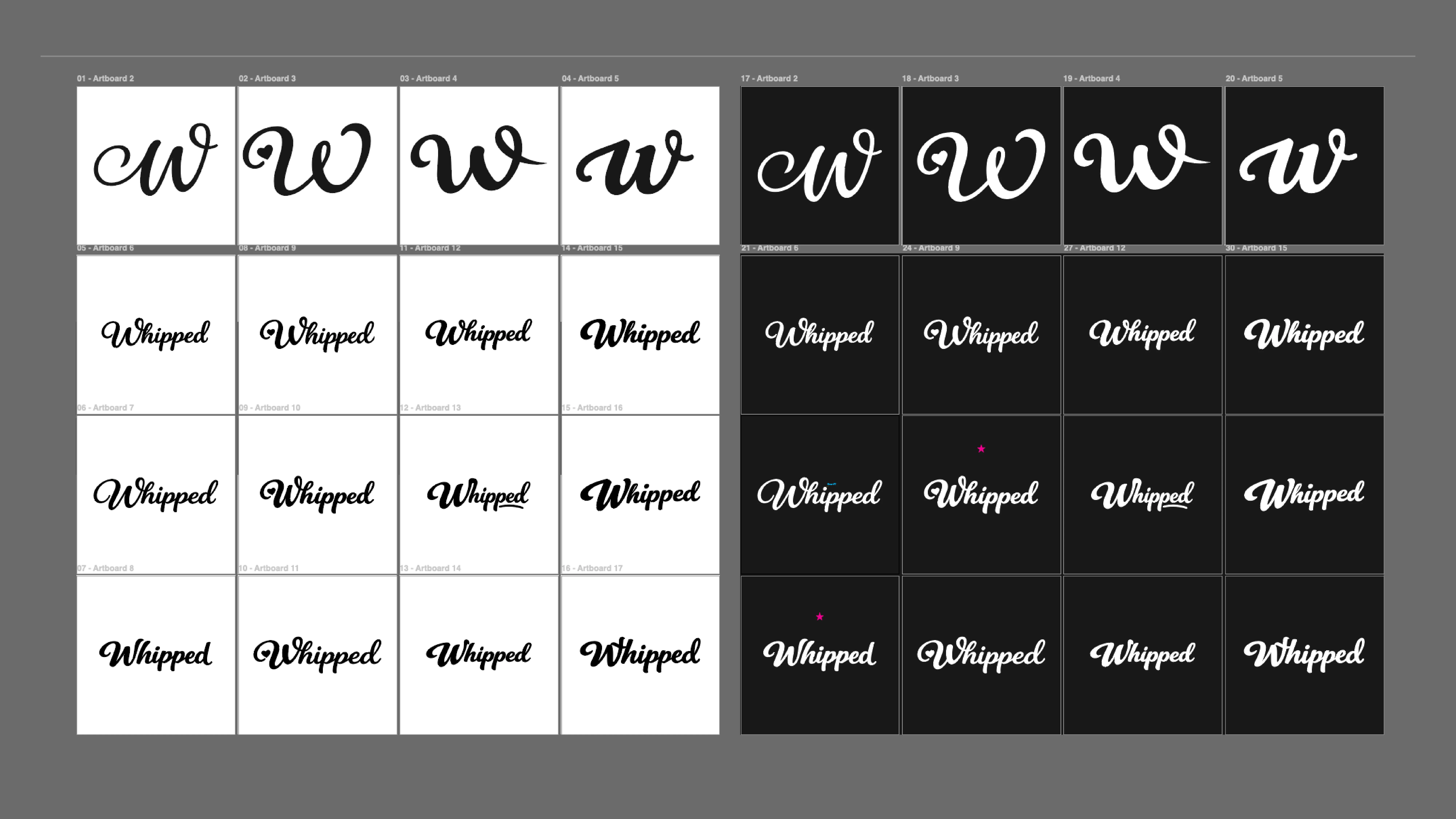
Through continuous refinement, the strongest elements from each direction were carried forward and developed further.
This iterative process helped shape a final mark that feels effortless and cohesive, while still being backed by intentional decisions around form, balance, and visual rhythm.
Like this project
Posted Apr 9, 2026
Custom brand identity and typography for Whipped By Kamri, featuring a bold, expressive logotype and vibrant visual system built for strong recognition.