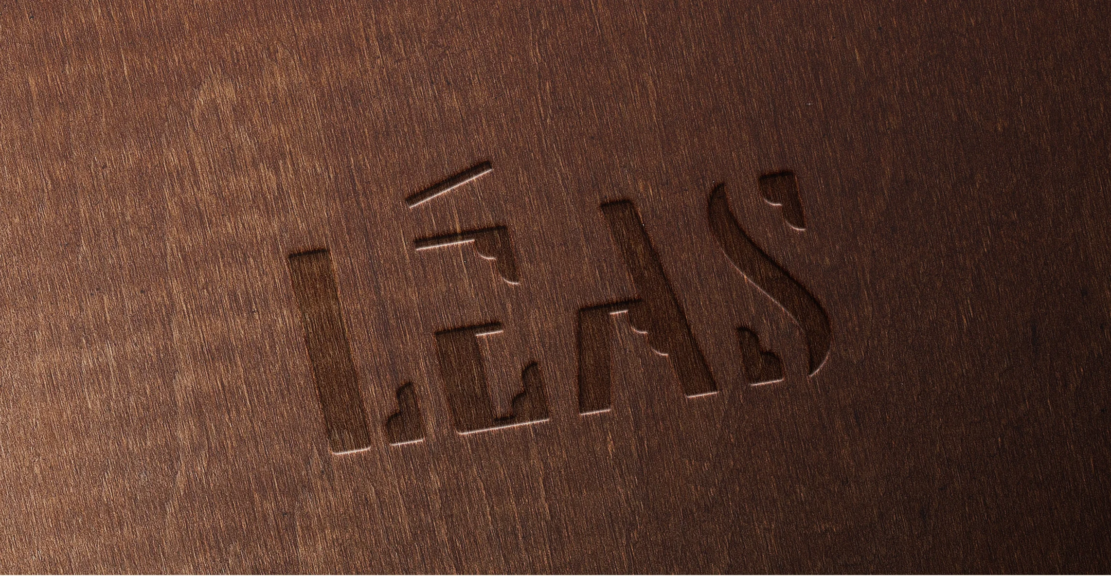
Leás Hotel Logotype
Minh Dang
Leás Hotel
Scope of work: Logo design, concept
Introduction
Leás, meaning “dancing lights” in Latin, is a Vietnamese hotel brand inspired by the vibrant soul of Vietnam, aiming to provide customers from other cultures with the most authentic Vietnamese cultural experience during their stay by transforming Vietnam's cultural values into immersive experiences.
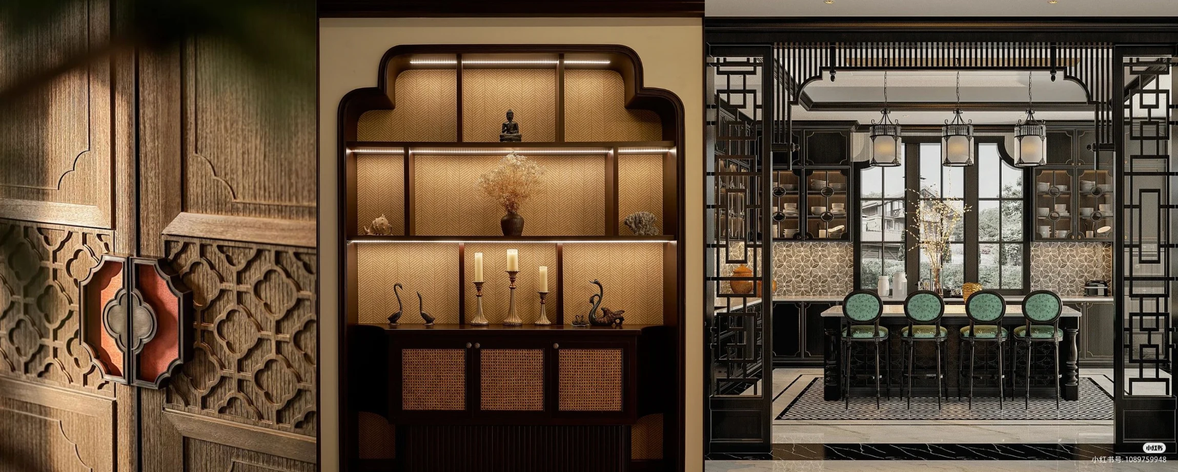
Each of their locations is designed as a living expression of Vietnam, where light, space, materials, and stories come together to create a sense of place that feels authentic and alive.
Rooted in local traditions and identity, Leás embraces Indochine style as its core aesthetic language. Blending Vietnamese heritage with subtle colonial influences, the Indochine style allows light, materials, patterns, and craftsmanship to interact harmoniously, creating spaces that feel both timeless and culturally rich.
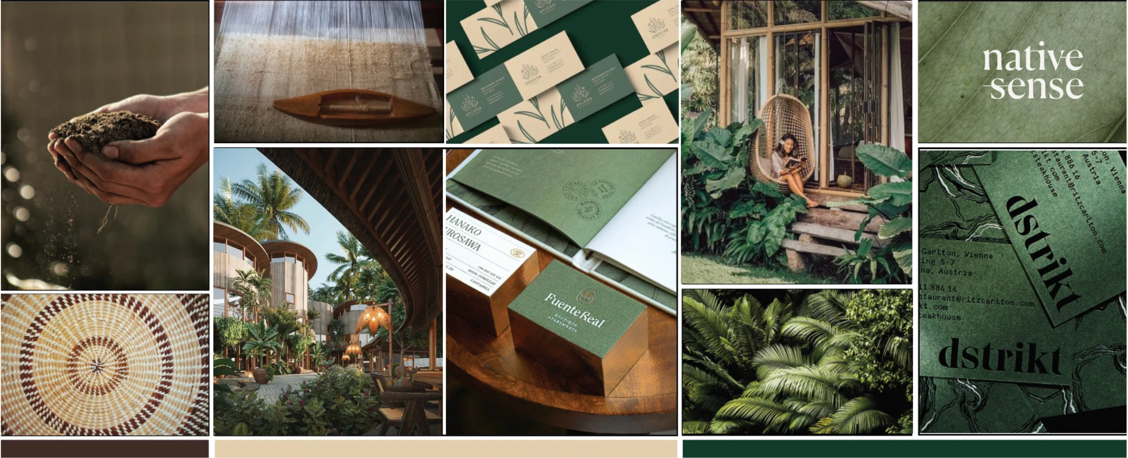
Moodbard
A typographic approach was chosen as the foundation of the logo to express clarity, elegance, and timelessness—qualities that align with Leás’s Indochine interior concept. Rather than relying on illustrative symbols, typography allows the brand to communicate sophistication while subtly embedding cultural character through form, proportion, and line.
Route #1: The Dancing Light

The typographic concept draws from the meaning of Leás - “dancing light.” Inspired by sunlight filtering through leaves, where edges appear softened and partially dissolved, this natural effect informed the logo’s visual expression and sense of movement.
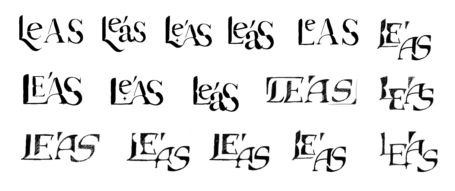
Route #2: The Indochine
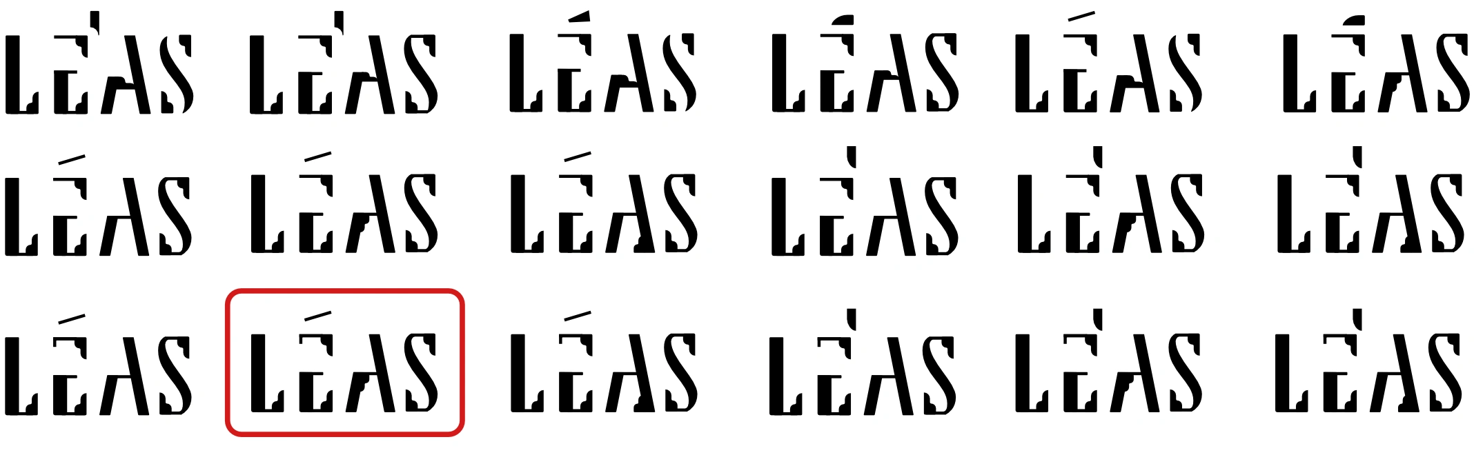
In the second design route, the typographic approach was developed based on the hotel’s interior design concept. The Indochine style, known for its distinctive motifs, ornamental geometry, and architectural details, served as a visual reference for shaping the letterforms.
These characteristic elements were subtly integrated into the typography through proportion, stroke contrast, and structural detailing, ensuring the type remained elegant and culturally grounded. At the same time, intentional gaps and interruptions were introduced within the letterforms to echo the “dancing light” effect. These negative spaces simulate light filtering through surfaces, creating a sense of movement while preserving readability.
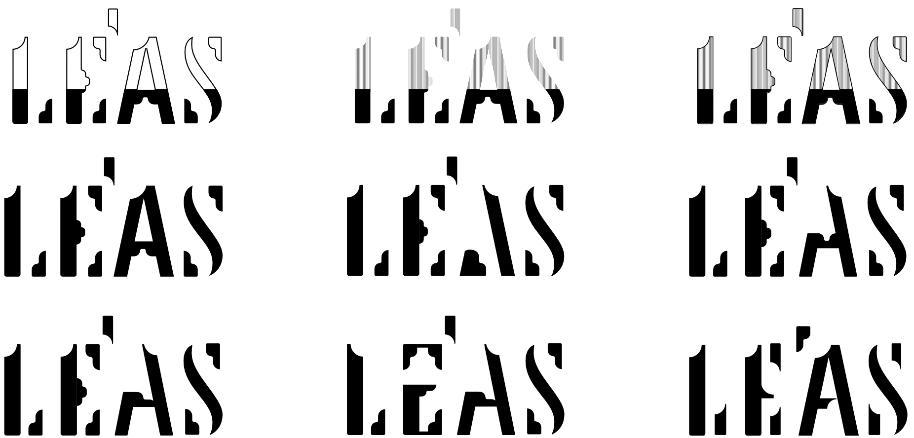
This approach allowed the design to balance cultural ornamentation with modern restraint. Further experimentation and refinement focused on adjusting the scale and placement of these gaps and the Indochine motifs to achieve harmony between Indochine influence and the dynamic light-inspired concept, ultimately guiding the development toward the final logo.
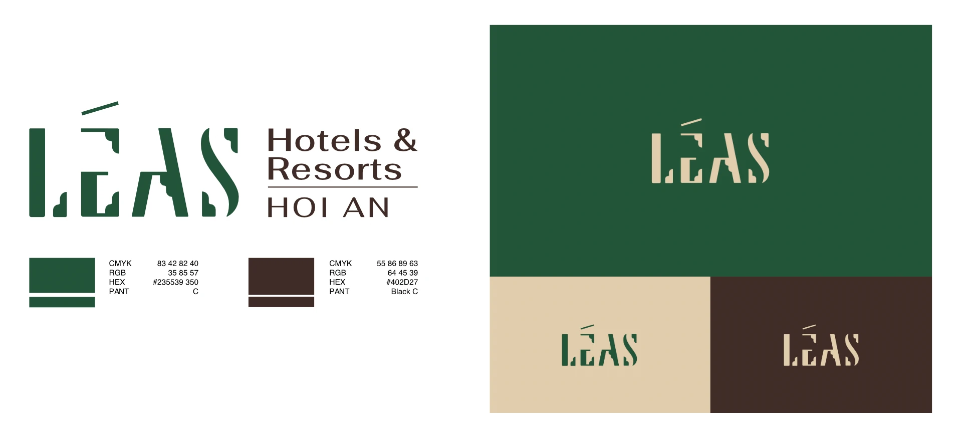
Overall, the chosen logo successfully conveys the Indochine and traditional style, capturing the cultural depth and elegance intended for LEAS.
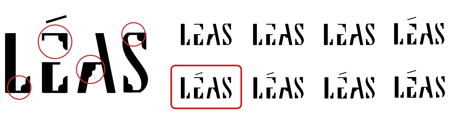
However, the letter forms felt heavy. The refinements, including removing a connecting line in L and S and softening corners of E and A, lightened the typographic expression, creating a more elegant and approachable identity for the hotel and retreat market.
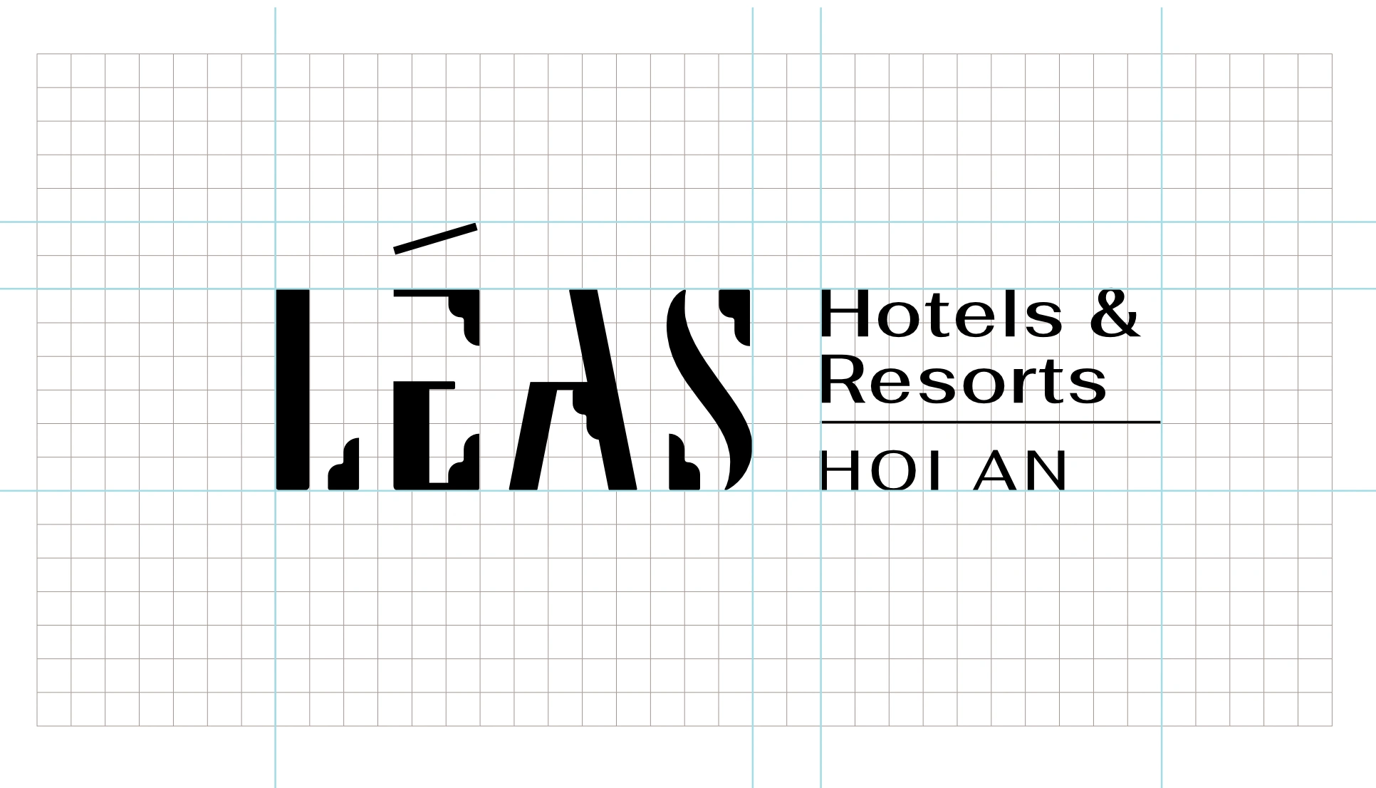
Final Logo on grids
Colour palette
Inspired by nature and Indochine interiors, the palette balances lush greenery, natural warmth, and airy neutrality, reflecting the brand’s cultural roots and serene hospitality experience.
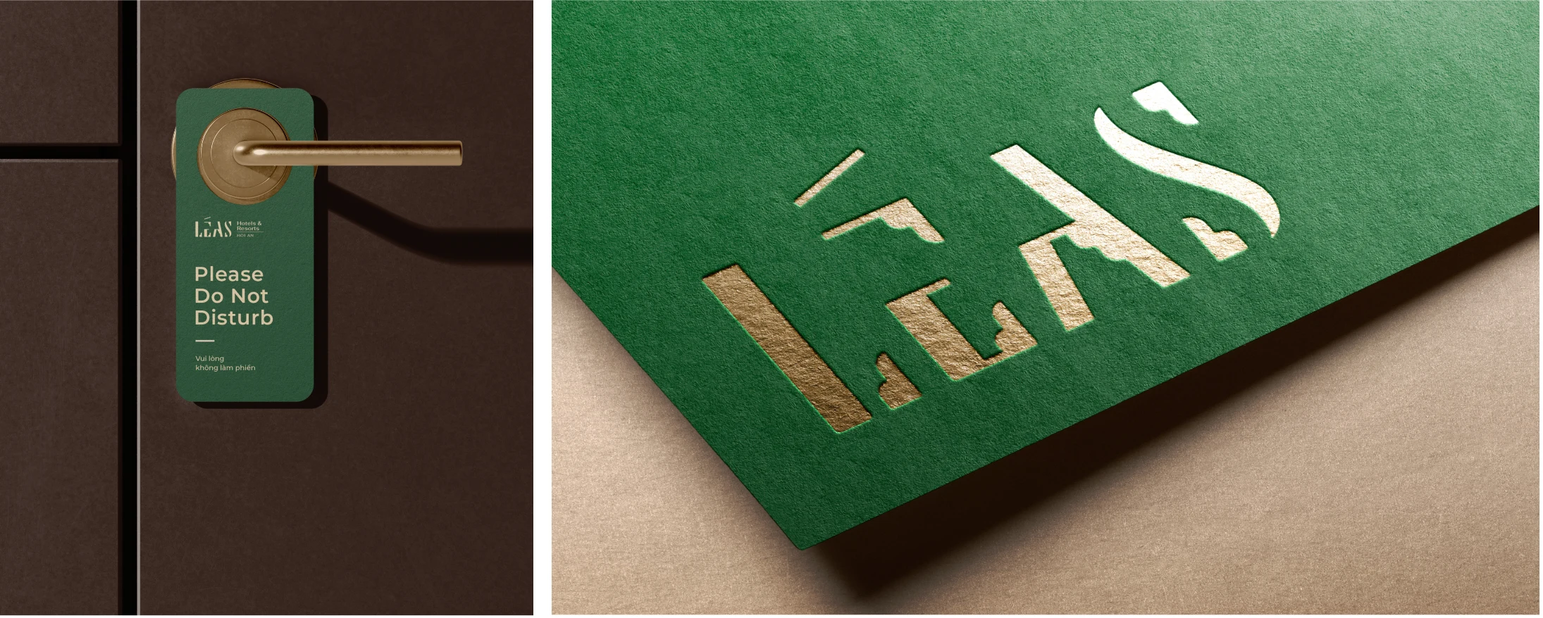
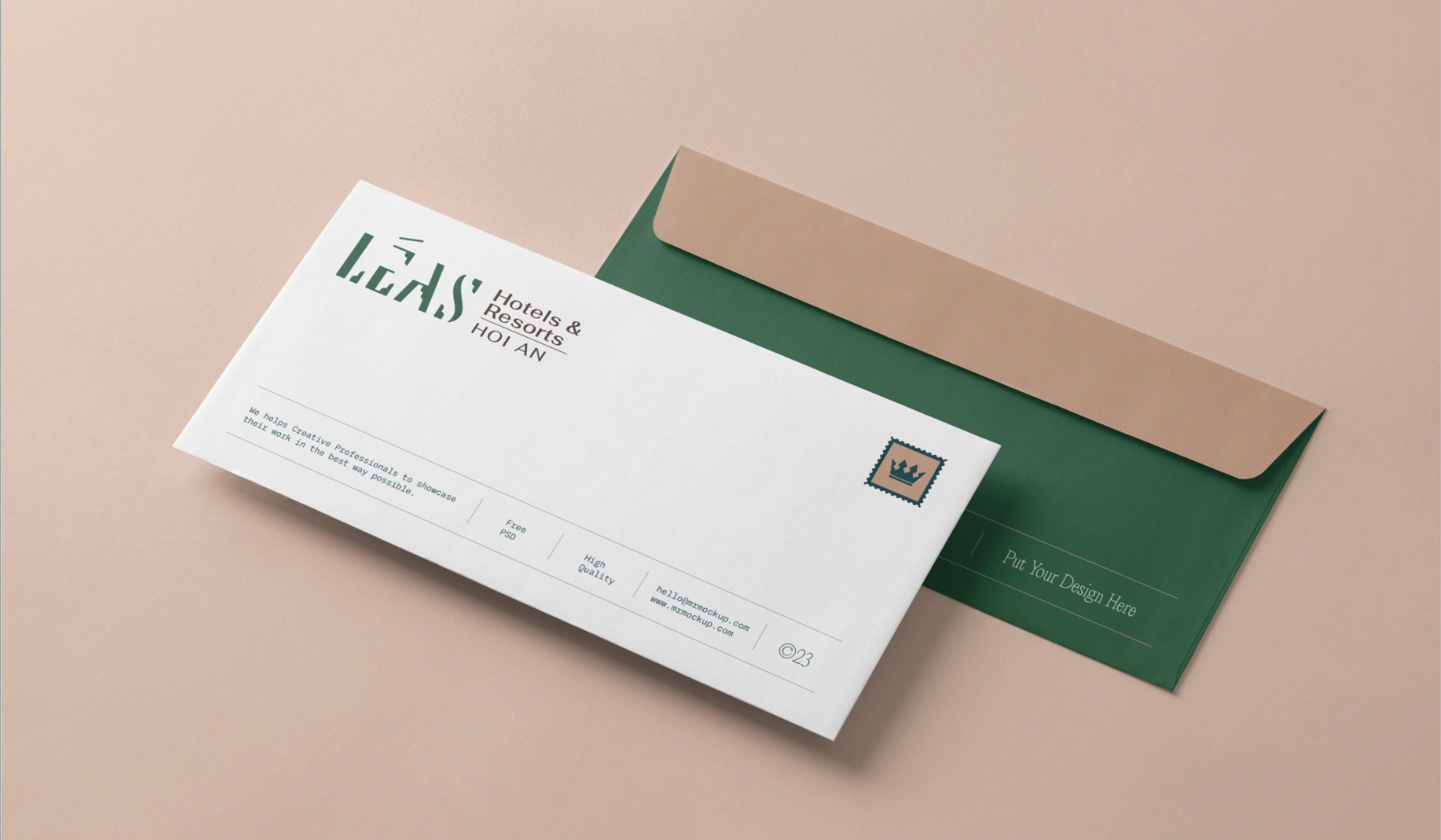
Mockup
Like this project
Posted Jan 4, 2026
The Leás logo blends Indochine style with refined, elegant letterforms, creating a culturally rooted and memorable identity for the Hotel and Retreat market.
Likes
0
Views
6