Norwegian Wood Cover Redesign for Penguin Awards
Minh Dang
Norwegian Wood cover
Scope of work: Book cover design
*Uni project
A book cover project from Penguin Awards 2017/18
The brief
The brief was to redesign the cover of Norwegian Wood for a new generation of readers. Murakami’s writing is described as vivid, experimental, and imaginative, so the challenge was to visually reflect that atmosphere while avoiding clichés that are already strongly associated with the book.
Because the story is very well known, the brief emphasised the importance of a fresh angle — something contemporary and literary rather than literal or film-based
Research
“I started with market research by analysing existing covers of Norwegian Wood across different markets and time periods.”
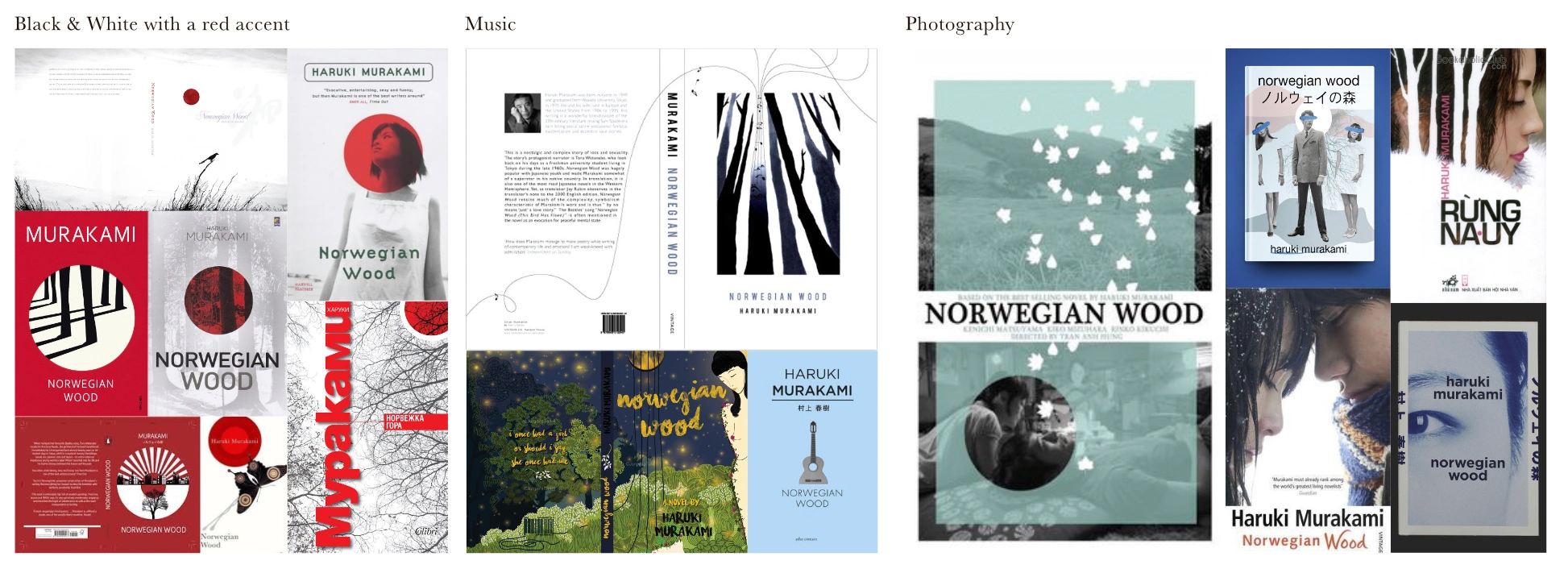
Based on this research, I decided not to rely on the most common visual clichés like red circles, forests, or literal photography. Instead, I looked for ways to express Murakami’s emotional and psychological atmosphere in a more abstract or unexpected way
The research helped me understand what already exists and what to avoid. Rather than copying successful solutions, I used the patterns I identified to deliberately move away from them and create a design that feels familiar enough to belong to Murakami, but distinct enough to feel new.
“With many little strokes, a large tree is felled.”
Japanese proverbs
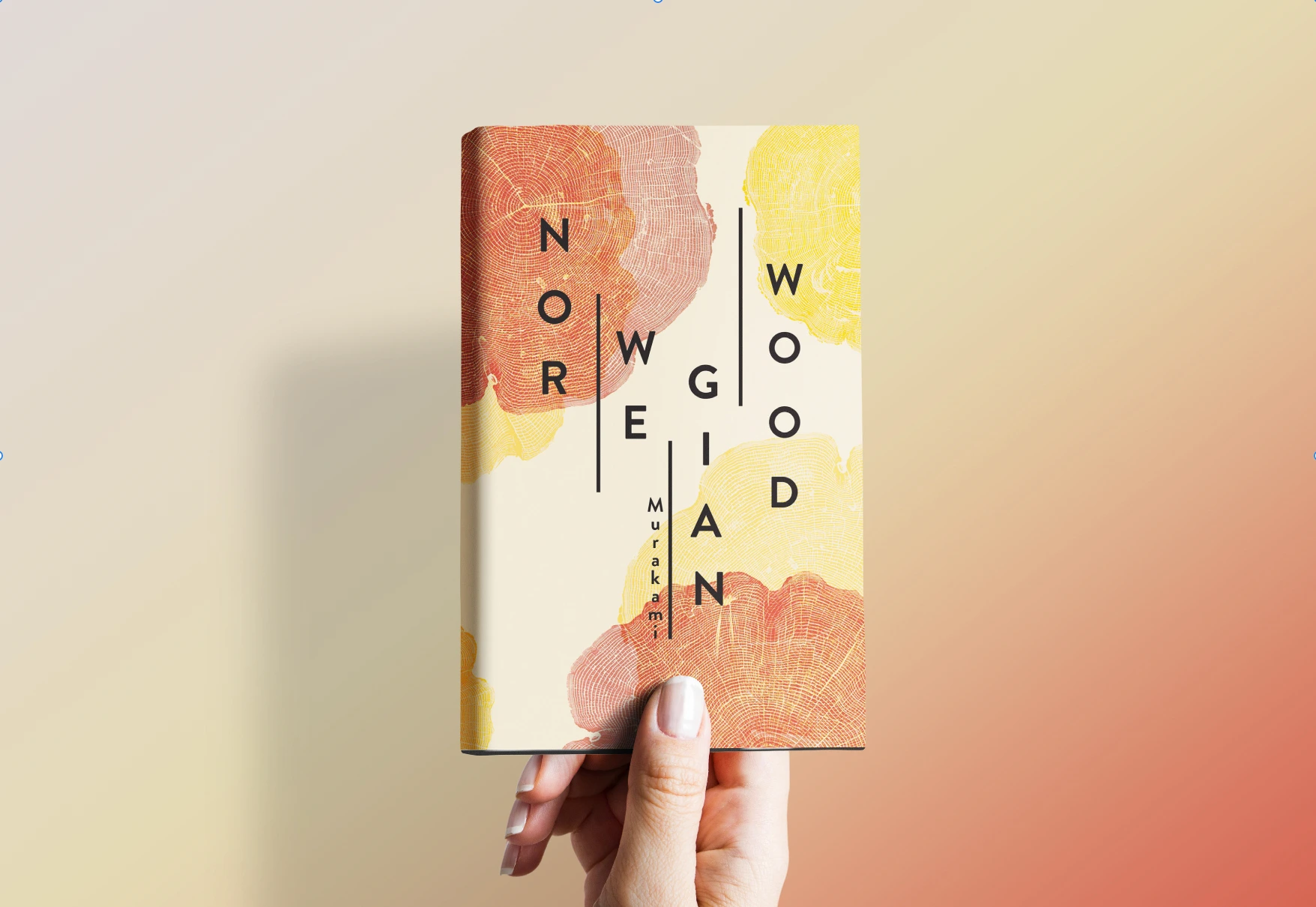
I ran into this proverb while looking into the Japanese culture, which gives me the idea of using the tree rings as the main visual concept for this cover.
This idea reflects how time, memory, and emotion in Norwegian Wood are not shaped by single dramatic moments, but by the accumulation of small, quiet experiences. In the same way that tree rings form through gradual growth over time, the emotional weight of the story is built layer by layer.
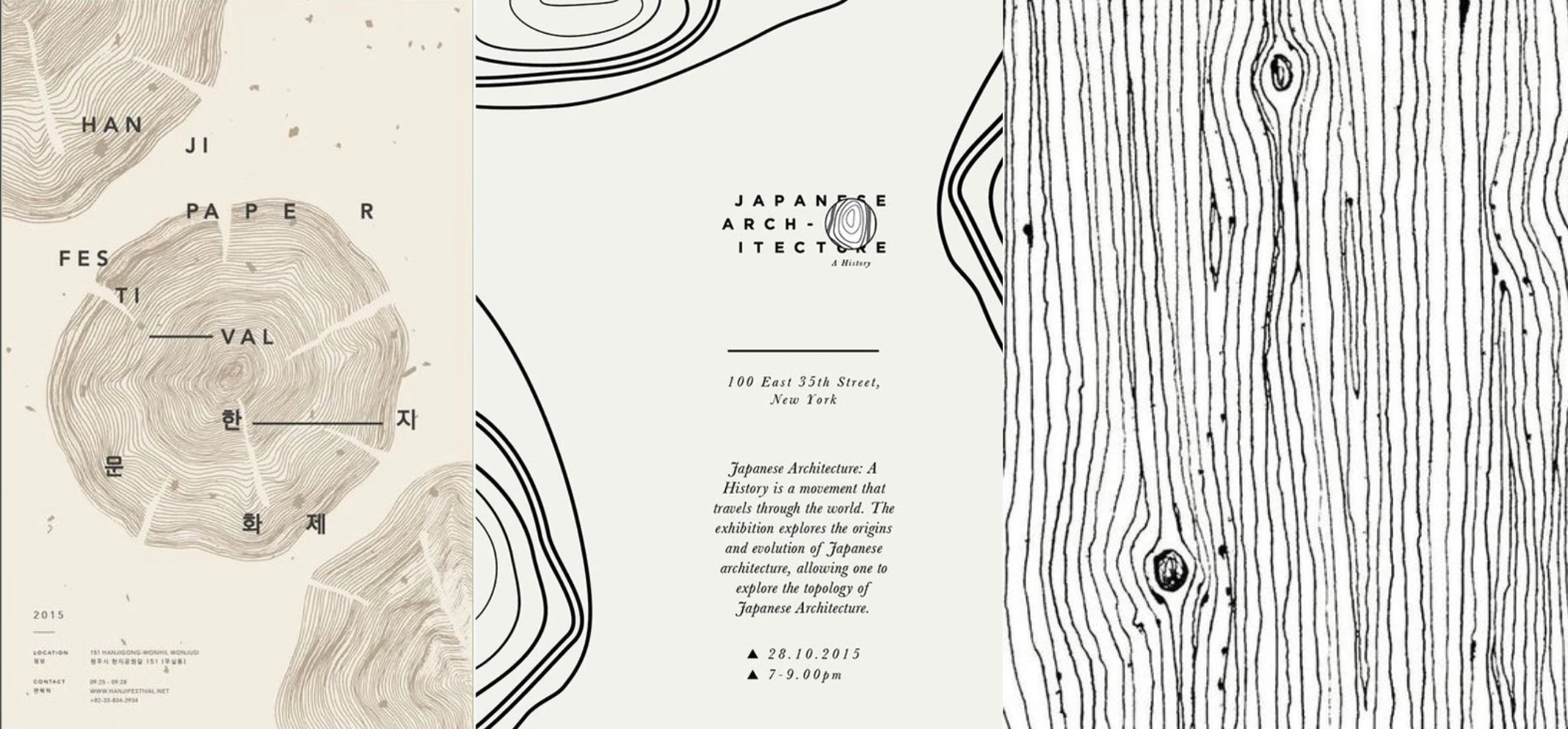
By abstracting the idea of “wood” into tree rings, the cover avoids literal forest imagery and instead uses a symbolic representation of memory, time, and psychological depth. The visual language draws from woodcut textures and organic line work, echoing the repetitive, meditative nature of both the proverb and Murakami’s writing.
Experiemtation
Most other Norwegian wood cover designs focus on the visual, and the typography is fairly basic, so instead of simply selecting a typeface for the book’s title and making it stand out, I opted to perform some typography work on it.
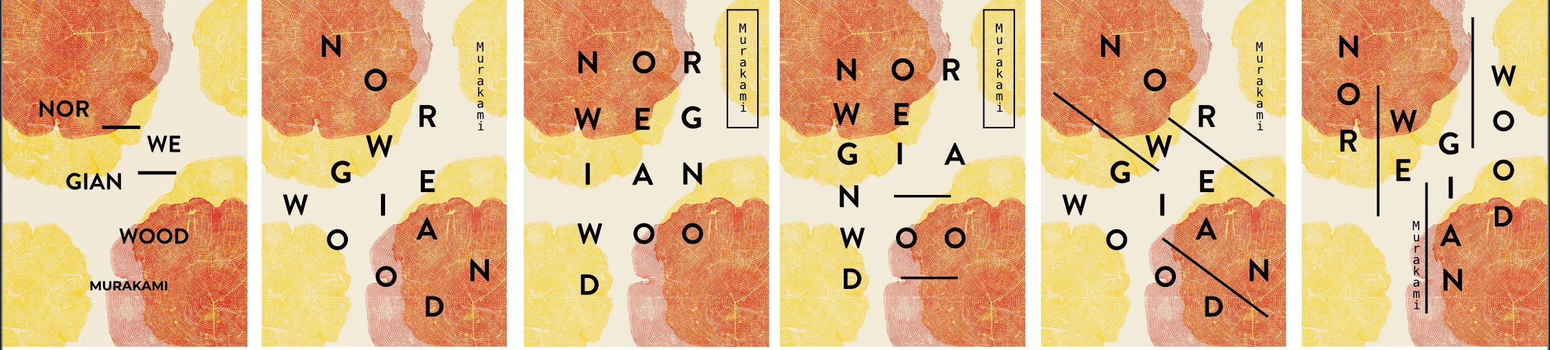
By moving away from immediate, literal imagery, the cover differentiates itself from existing editions and invites curiosity, encouraging readers to pause and engage more deeply with the design.
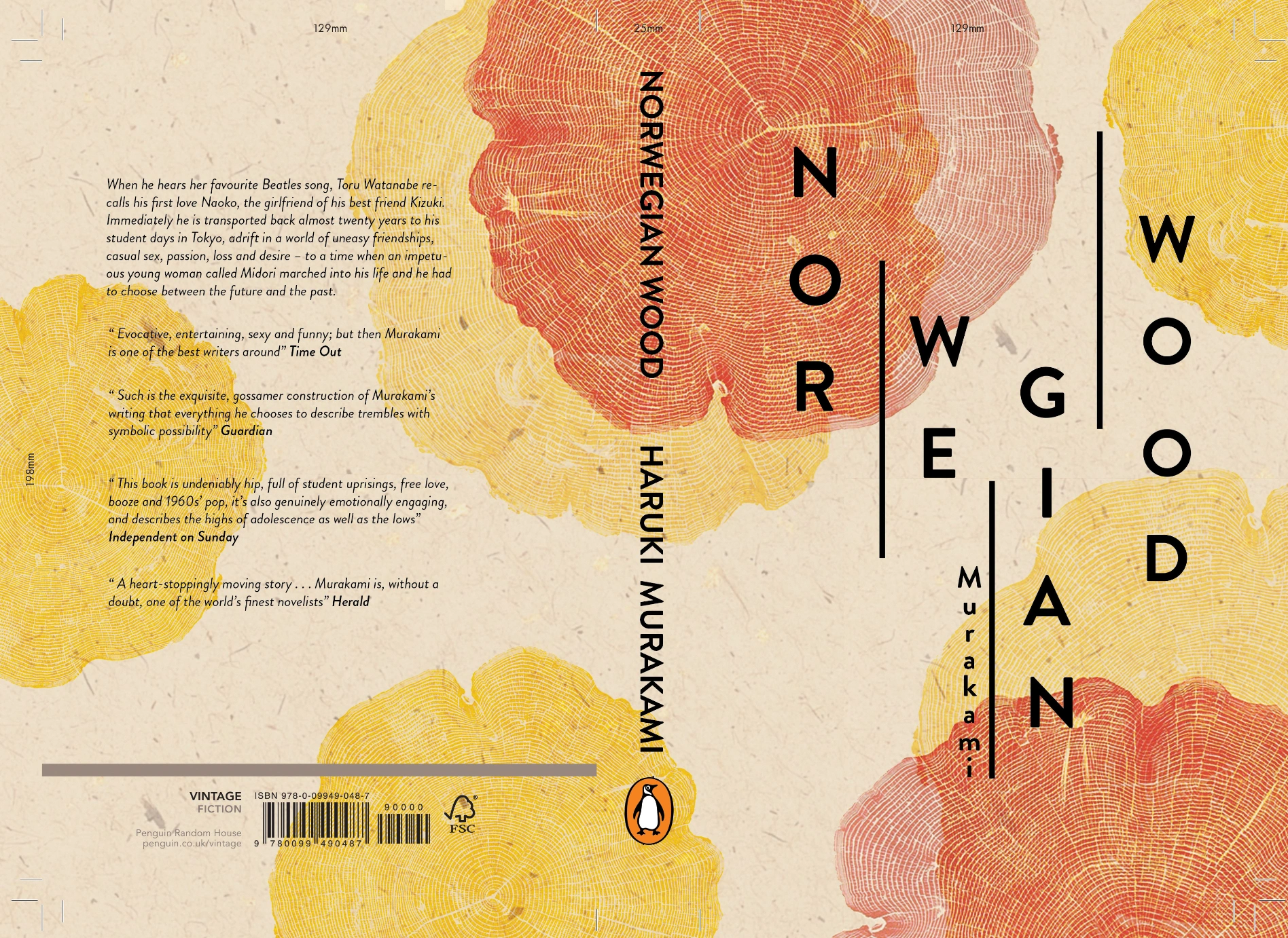
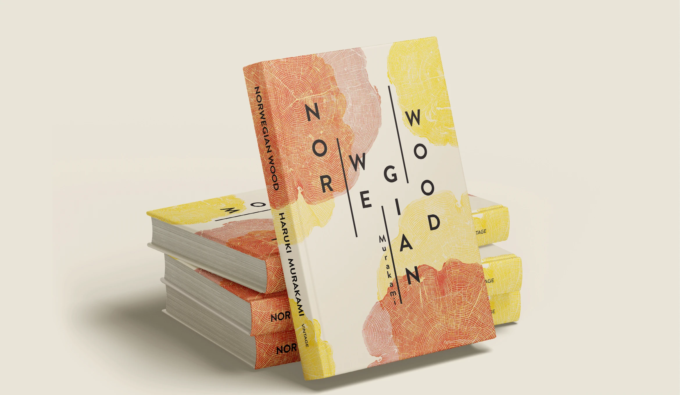
Final Design
Like this project
Posted Jan 5, 2026
Redesigned Norwegian Wood cover to reflect Murakami's style.
Likes
0
Views
7
Timeline
Jan 1, 2017 - Jan 1, 2018