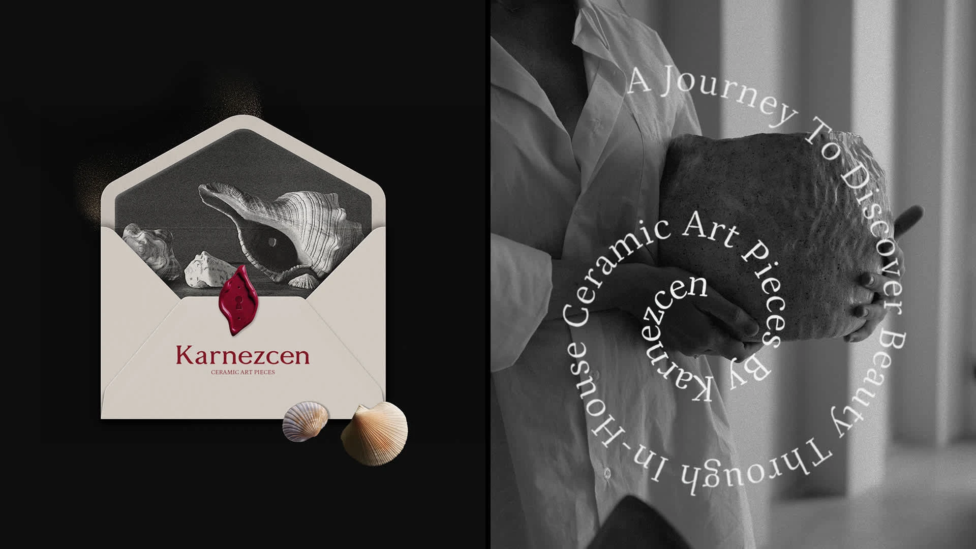
Karnezcen Brand Identity Design
Moa Design
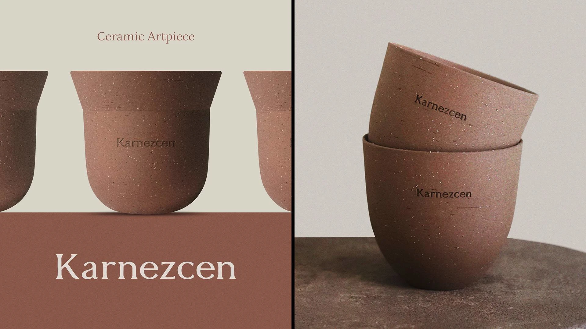
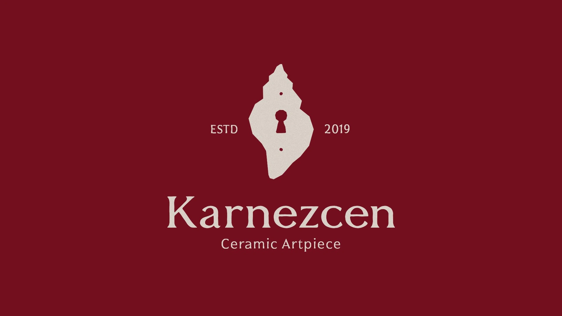
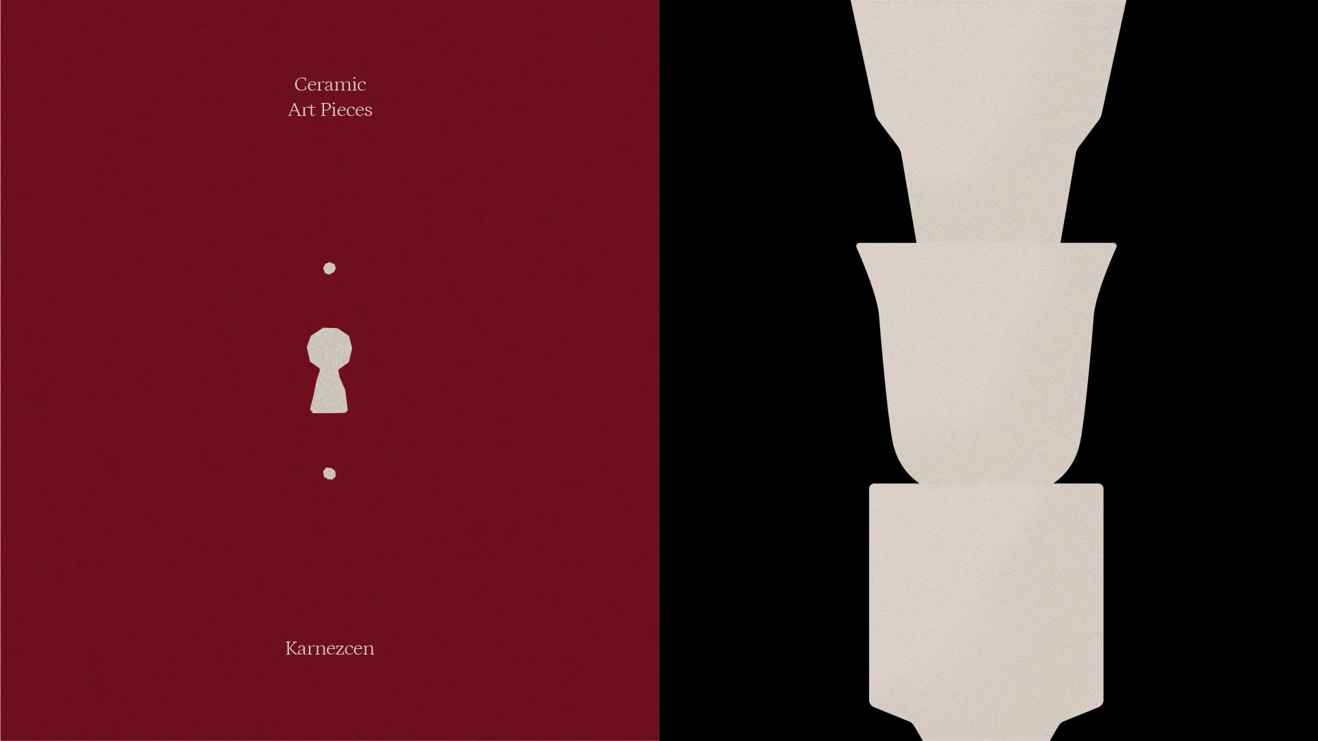
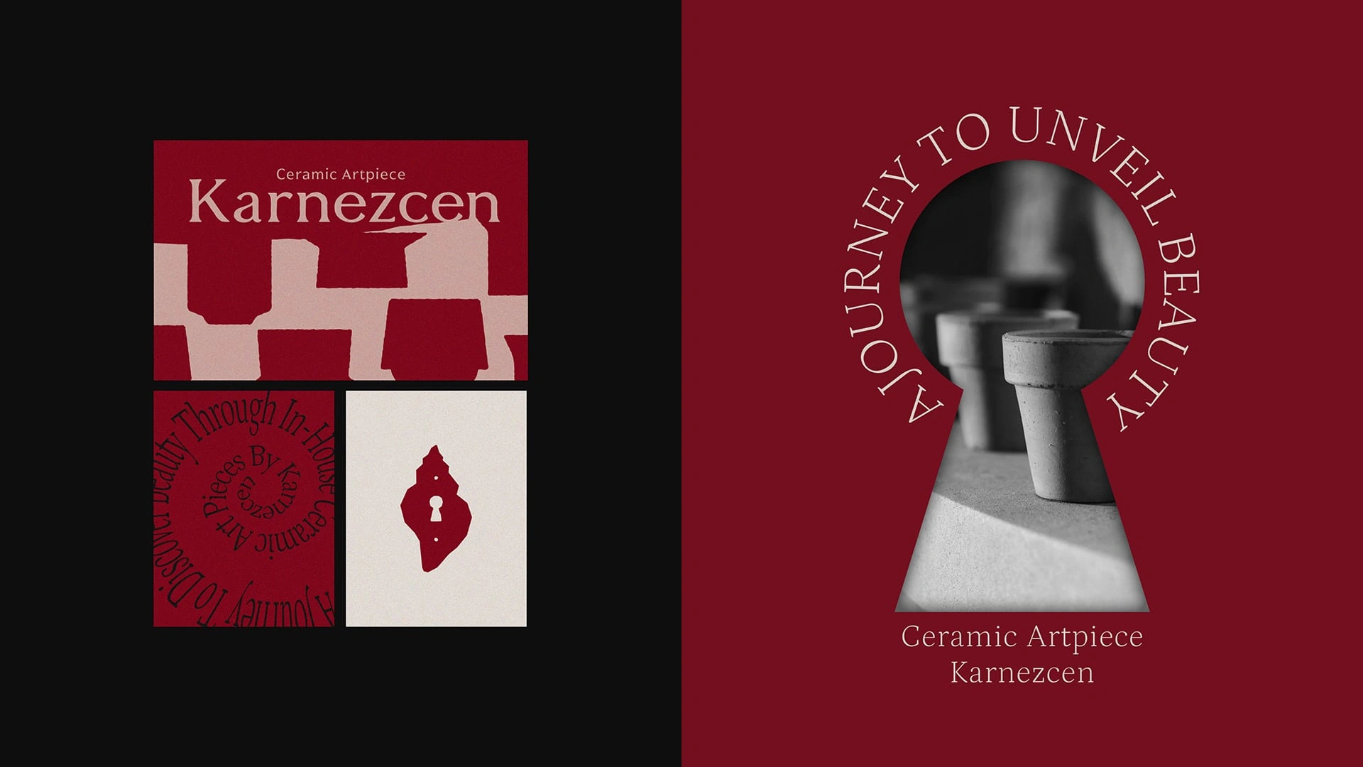
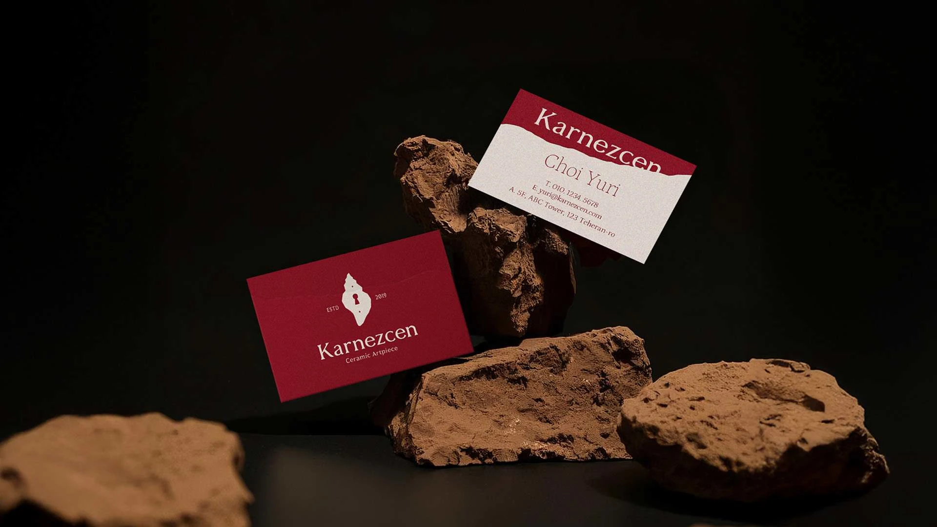
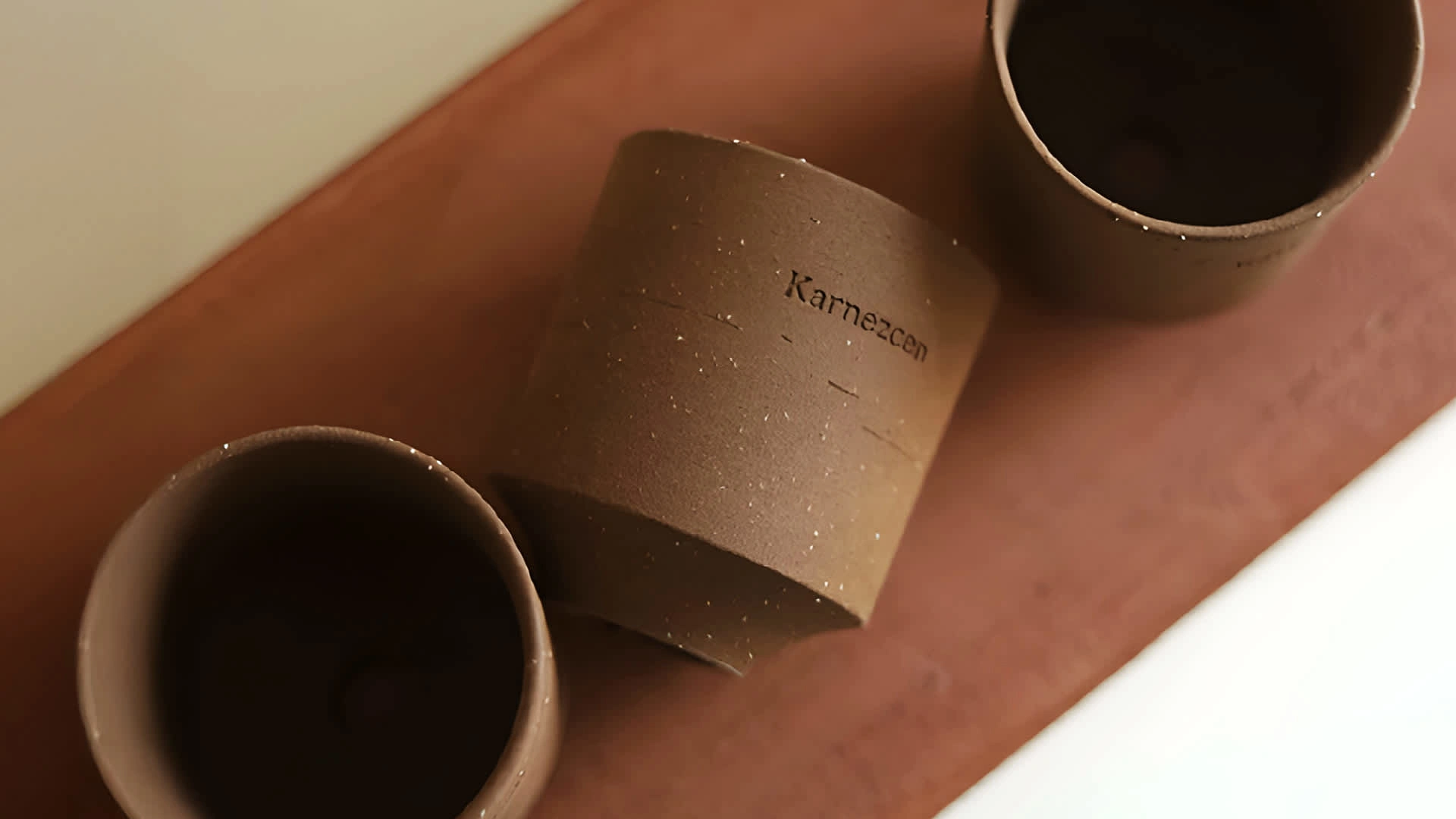
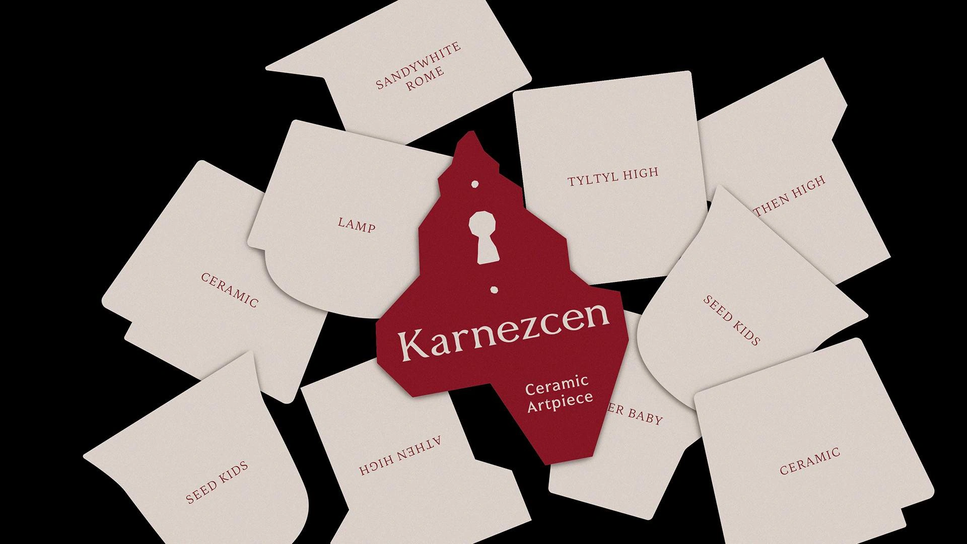
Karnezcen
is a ceramic studio inspired by the hermit crab—an animal that growsby finding a space that fits. This symbolizes the brand’s philosophy of creatingpersonal, evolving spaces through crafted beauty. The logo features a delicatelycarved shell form that intuitively evokes the hermit crab, reflecting Karnezcen’screative freedom beyond physical boundaries. A keyhole and the act of turning akey are used as visual metaphors, symbolizing the journey of discovering newbeauty. The logotype carries a natural ceramic texture, balancing refinementwith warmth. A palette of red, black, and ivory conveys passion, depth, andorganic calm—capturing Karnezcen’s mission to shape beautiful, personallifestyles through craftsmanship.

Work with us
Email : moa.agency.info@gmail.com
Form : GoogleForm
Like this project
Posted Jun 10, 2025
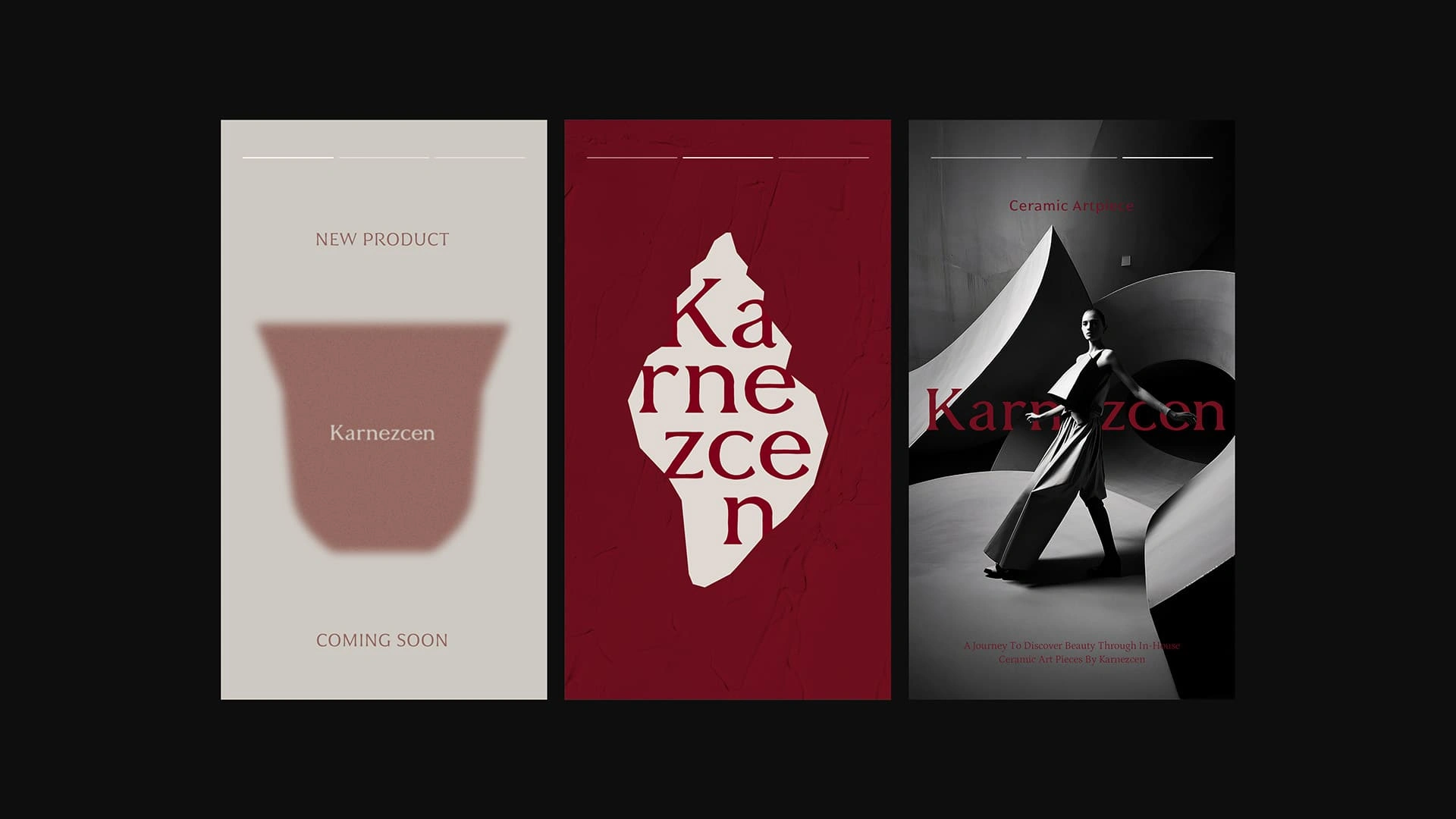
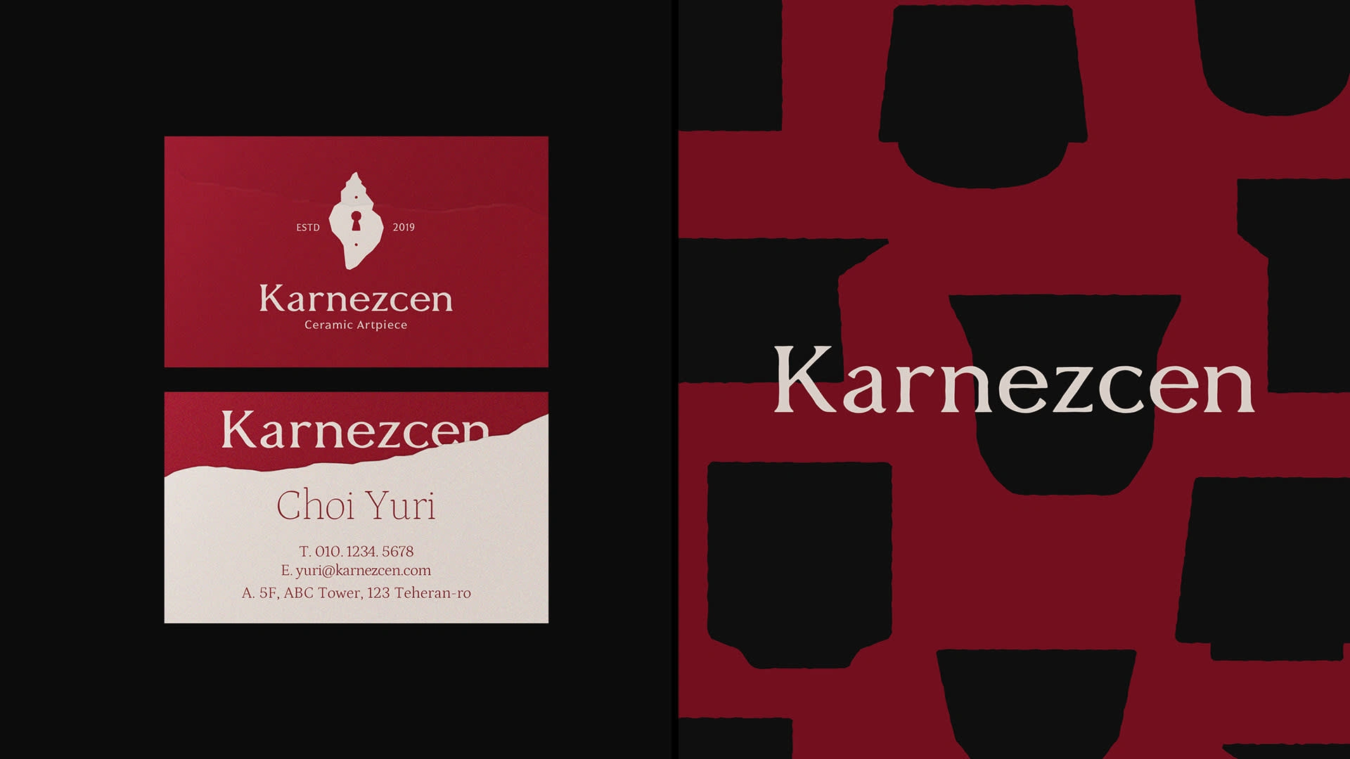
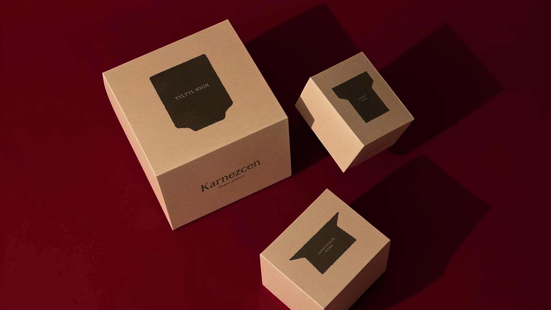
Designed a logo and brand identity for Karnezcen, a ceramic studio.
Likes
1
Views
6
Timeline
Apr 5, 2024 - Aug 8, 2024