Skinny Cut Branding Project
Skinny Cut
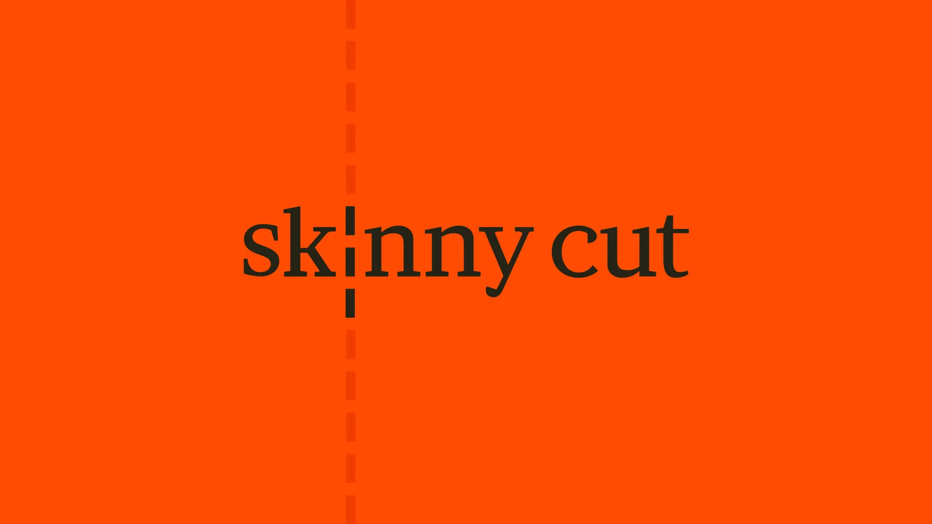
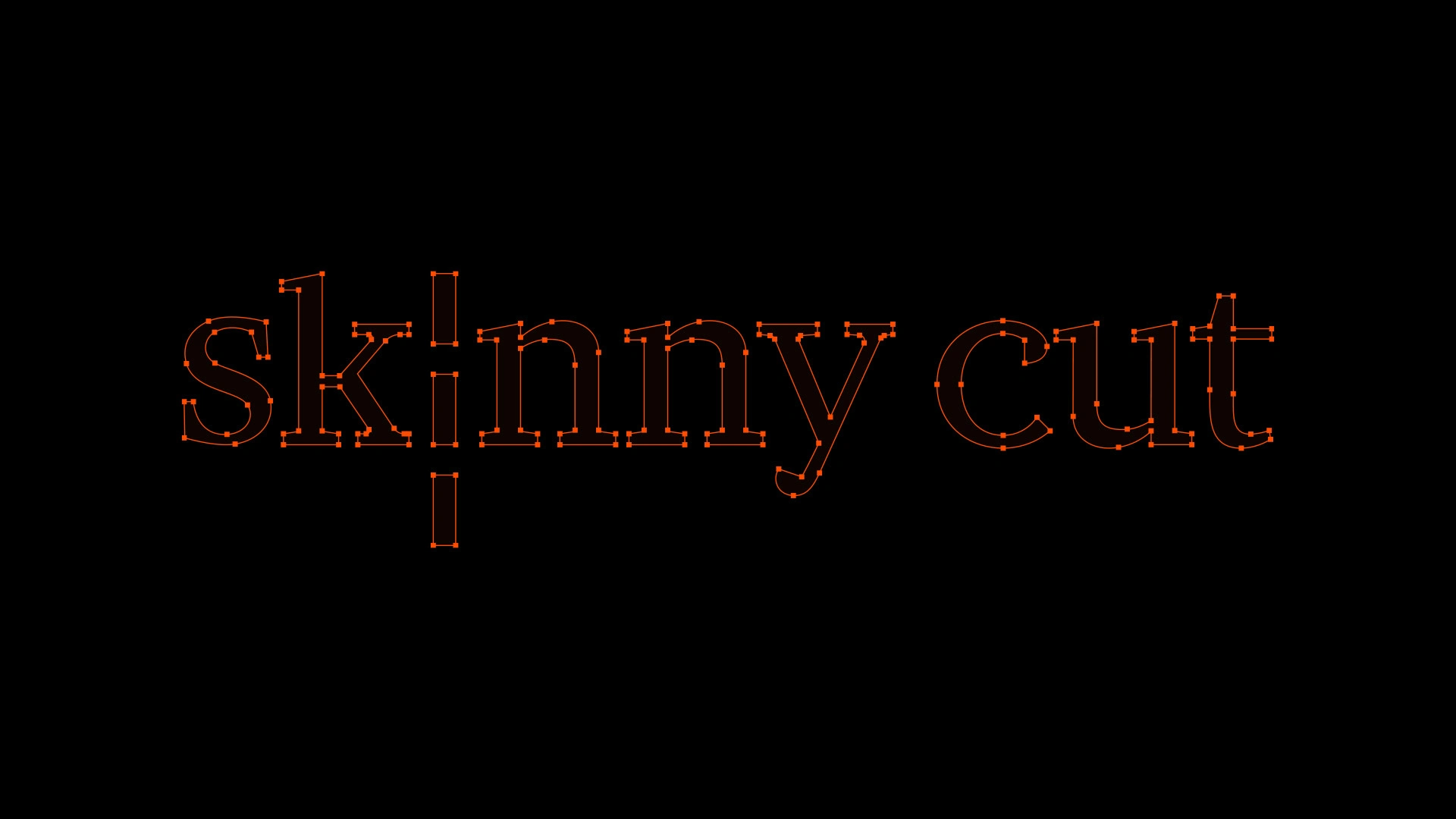
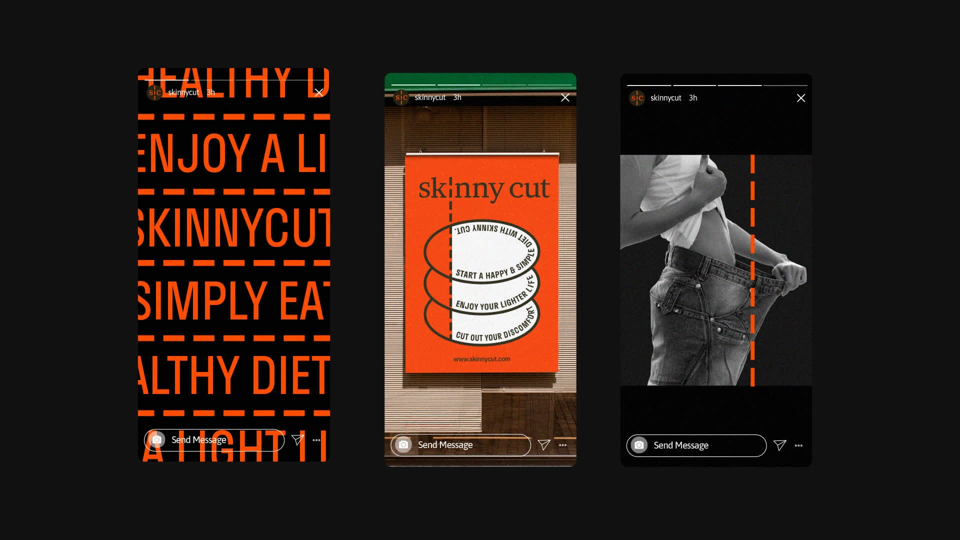
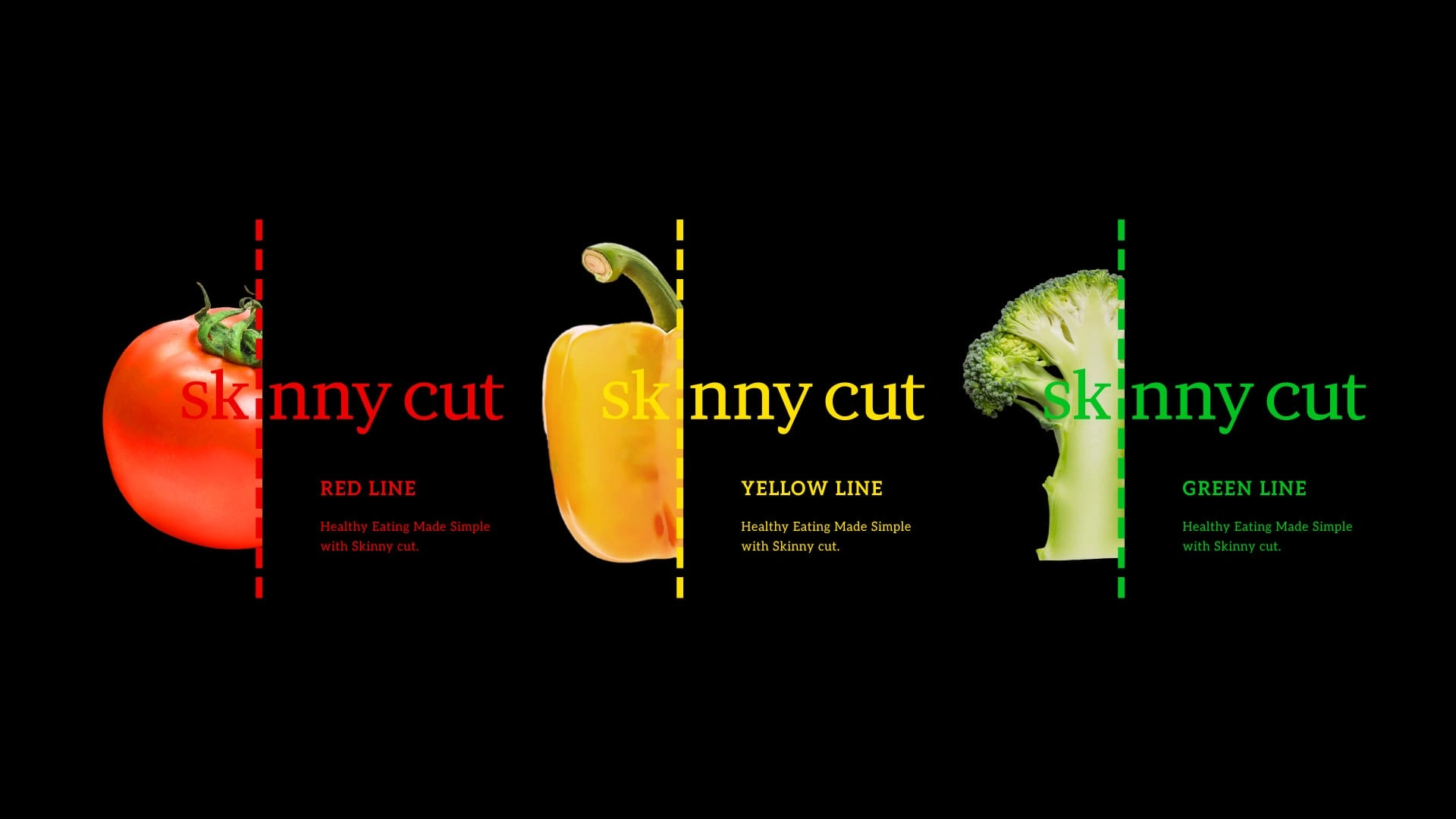
Skinny Cut is an inner beauty brand that promotes light, simple approaches towellness and self-care. At the heart of the brand is the motif of a tear line—symbolizing the effortless removal of unnecessary weight and discomfort. This conceptis visually captured in the logo, where a dotted line cuts through the brand name,representing control, separation, and the beginning of change. Bold colorcontrasts and tear-line graphics emphasize not just weight loss, but the idea ofjoyful transformation. Packaging features clean icons like “Light Eating,”“Healthy Diet,” and “Lose Weight,” along with apple imagery to convey naturalingredients and a healthy, accessible approach to dieting. Skinny Cut aims to gobeyond weight loss—serving as a fresh tear line for a lighter, healthier lifestyle.


Work with us
Email : moa.agency.info@gmail.com
Form : GoogleForm
Like this project
Posted Jun 10, 2025
Developed branding for Skinny Cut, emphasizing wellness and transformation.
