Multi-million dollar growth wins and other writing samples
Daniel Johnson
There's always more story behind growth experiments and other UX improvements. Even the smallest change can involve complicated problem solving, usability testing, multiple versions of content, brainstorming sessions...
But what matters in the end is the business and user impact.
Here are a few highlights that show the range of my work over the years.
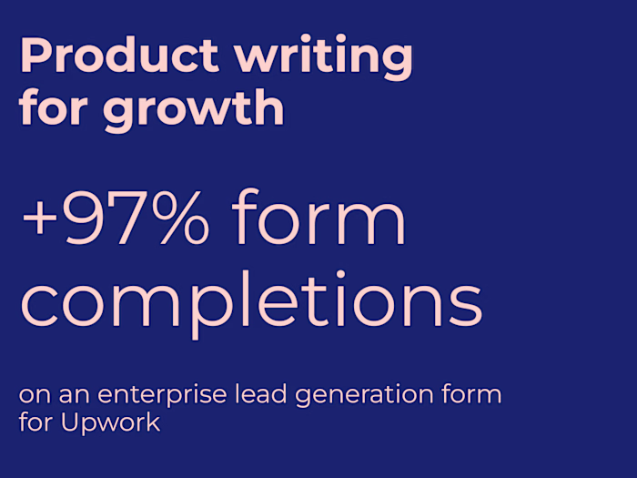
$6.4 million annual recurring revenue from a Pinterest advertising product upsell
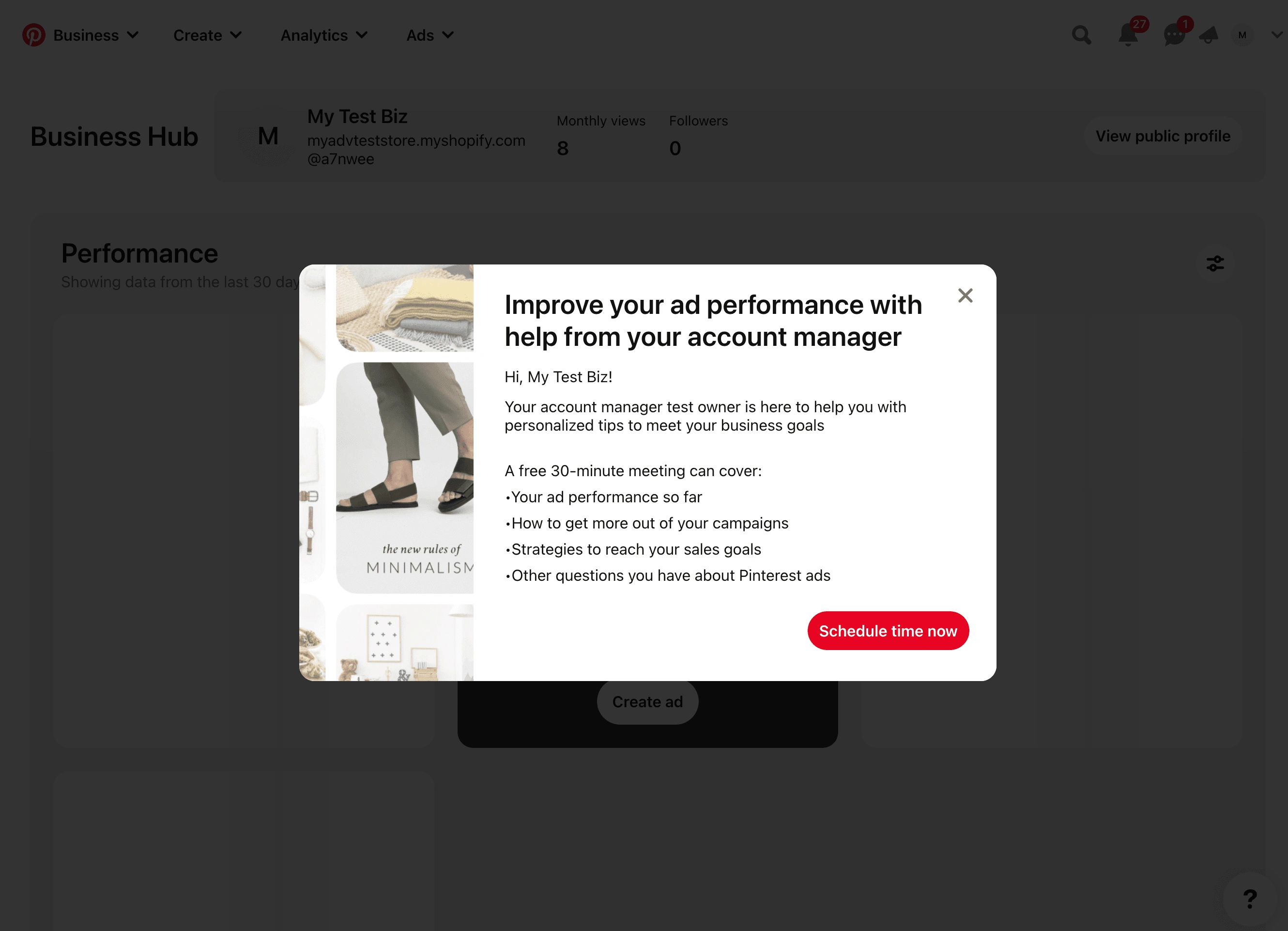
After a small to medium business advertiser has an introductory call with their account manager, the only ways that they can meet again for continued support are if the account manager contacts them again, or the advertiser emails their account manager.
Of the (redacted number) of advertisers created in the last 6 months, only 29% completed an account manager email or call, and 7% scheduled a call.
Hypothesis
Introducing a modal that allows advertisers to schedule time with their account manager will improve 14-day and 28-day retention.
Test content
Key messages:
Test content for the upsell
Test content also included a meeting reminder email and calendar invite which both included relevant information and repeated value propositions to ensure people follow through with the call
Results
The test led to an increase in small to medium business advertisers setting up a call, with an estimated impact of $6.4 million in annual recurring revenue
Updating "Why am I seeing this ad" screen for new legal guidelines and a more transparent Pinterest experience
This was a content-first design to update an informational modal in preparation for changing requirements from the 2023 EU Digital Services Act. We used this as an opportunity to improve transparency, user trust, and clear communication about how the platform uses their data.
I also like working with legal teams to find more accessible language to communicate legal text.
Before and after content updates
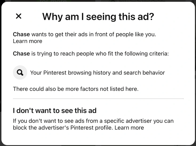
Before the updates
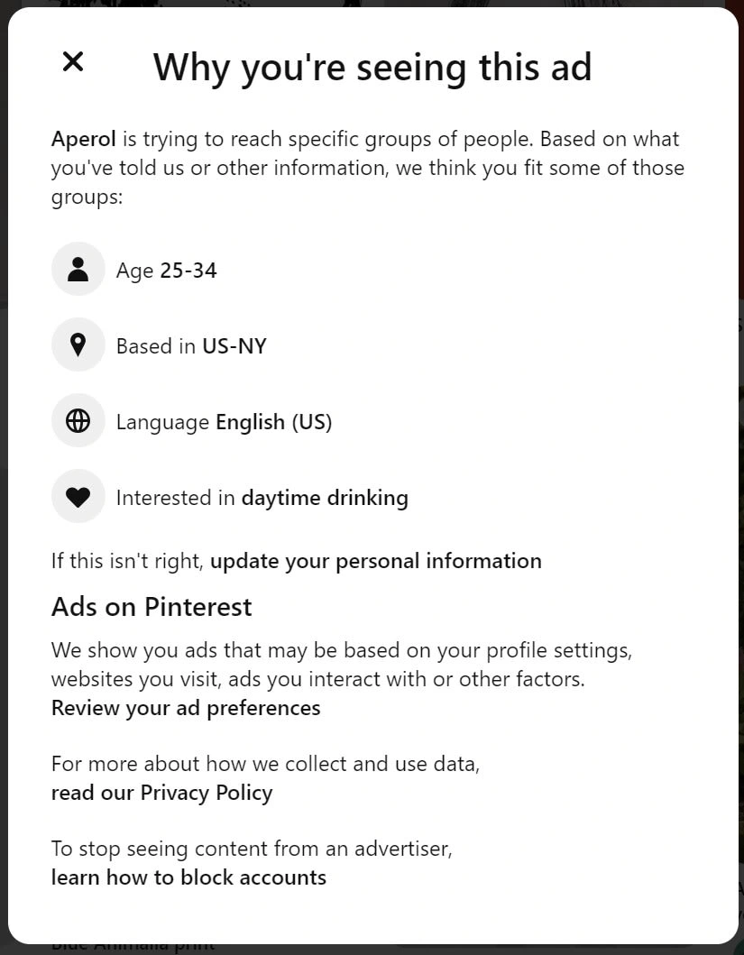
After content updates
Results
Our main criteria was to not negatively impact the amount of ads hidden, reported, or blocked, and we succeeded.
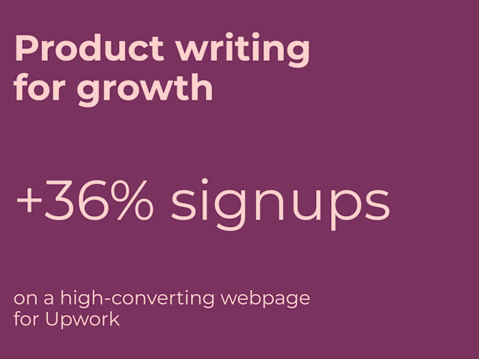
Driving homepage registrations with "Why Upwork" content
As part of a larger homepage UX vision, my team conducted user research to identify questions that prospective customers had about Upwork and had them prioritize which questions most impacted their decision to sign up for the platform.
Hypothesis
By adding prominent content that speaks to quality of freelancers, no upfront costs, and safety and security, we will improve visit to client registration because we know these are all key considerations for prospects when evaluating the risk of trying a new talent solution.
Test content
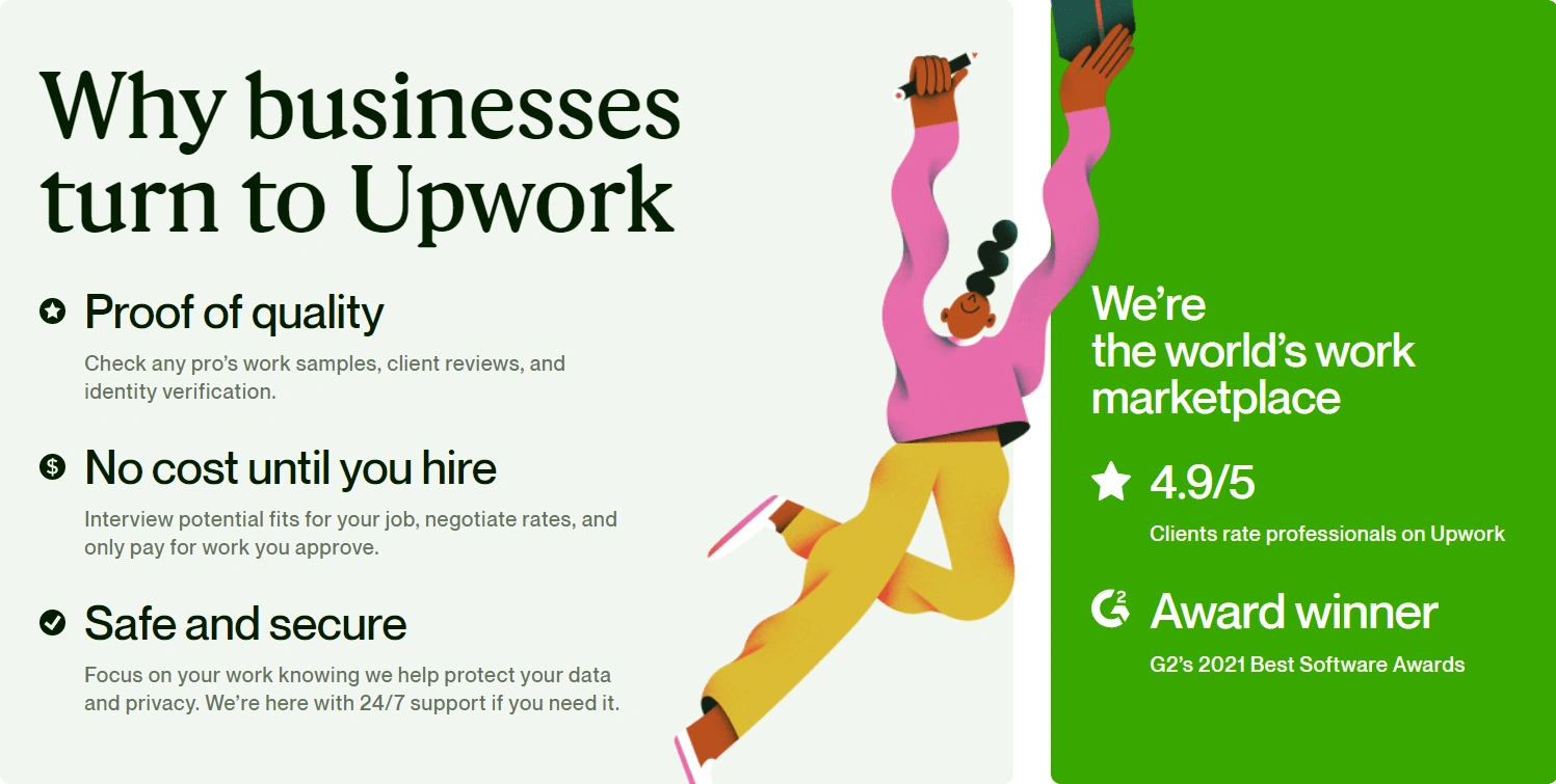
Content added to the homepage
Results
+6% client registrations
Improved engagement with page
Small but positive increase in freelancer registrations and other product offerings
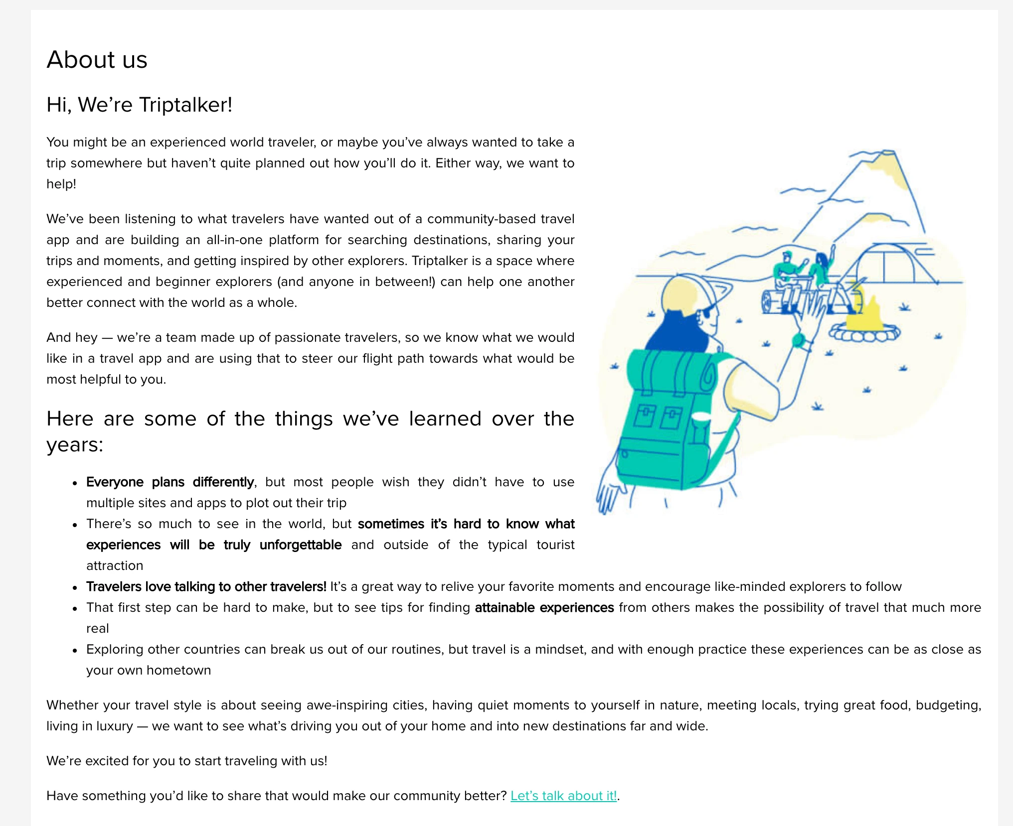
Customer-centric "about" page for a travel app
I put multiple approaches of these through user testing to get a sense of how the concept of our product resonated with prospective users.
It's also a great example of something I love to incorporate into UX design: sequential storytelling. I grew up reading comics, I've written a few self-published comics, and at one point I worked as an editorial assistant for a comics publisher. So much of what I've learned about the art of comics informs how I think about user interfaces. This includes the interplay between words and images, nonlinear interaction with time and space, the communication of ideas through components both as individual pieces and as a larger whole, even just the delight that people get out of visual narratives.
So many companies (of all sizes) use "about us" pages as an opportunity to tell their company's story, or list out bios of their team. I can see the utility in this for investors or press, but with a startup that's building an image from the ground up, I wondered: how could this better reflect the values of a company and how they want to interact with their actual audience?
When building this page, I reflected on what our audience told us about what they wanted out of a travel app rather than what we wanted them to care about.
So often we get caught up in the standard way things have been done that we don't stop to reflect on why we're doing it or whether that approach to content is actually useful. The internet may not be so new and unknown anymore, but it's easy to forget that there's still so much room to think outside the box.
This isn't the kind of page that drives business metrics, which may make it a lower priority in the grand scheme of things, but that also means there's lower risk in trying out more ambitious, creative ideas.
Like this project
Posted Aug 30, 2023
See more rewrites and designs that led to millions in revenue and improved user experiences.
Likes
0
Views
46