Increased contact form completions with new content
Highlights
+97% form completions
+74% qualified leads
+44% first meetings with a sales representative
After identifying an opportunity to improve the messaging on a page that was critical for generating leads for high-value customers, I worked closely with a product manager and product designer on a growth team to center the content on what was most important to a prospective customer.
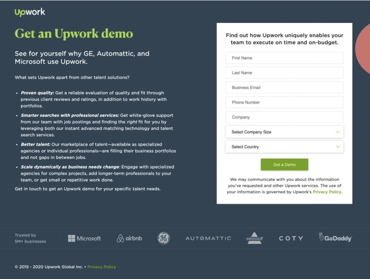
Before
Even though the main intent of the form was to generate leads for an Enterprise offering, the value propositions spoke about the general Upwork experience
Focused more on why Upwork as a company is great rather than the actual value it brings
Wordy, overloaded with information, and trying hard to sell a product before a sales call has even happened
"Get a Demo" CTA could feel like a big commitment
Filling out the form led to a generic completion page regardless of whether someone qualified for the Enterprise service or not

(contact page before redesign)
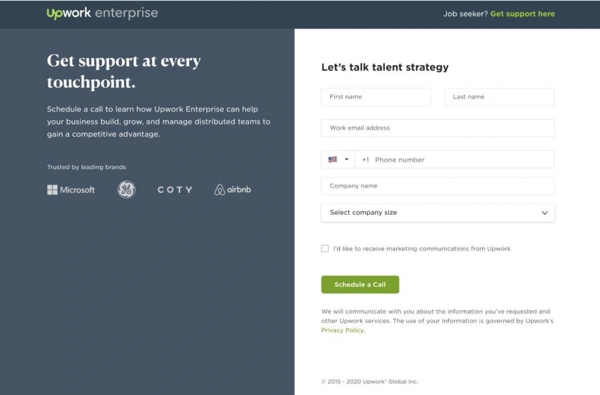
After
Clearly grounds Enterprise customers so they know they're in the right place
Concise and to the point, focused on a few main ideas
Leads with value to clients rather than features
"Schedule a Call" CTA is flexible, and shows awareness of client needs

(contact page after redesign)
Other improvements
Redesigned the confirmation screen for qualified leads to more clearly set expectations
Designed a new confirmation screen for unqualified leads to give them context on why they didn't qualify for the enterprise offering and other options that might better suit their needs
Added a more prominent link for freelancers, who often accidentally ended up on the page and filled out the form
Like this project
Posted Jul 27, 2023
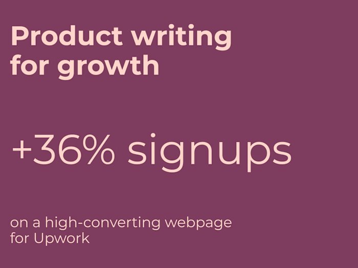
+97% increase in form completions, +74% qualified leads, and +44% first meetings with sales representatives.


