Higher acquisition rates with a consistent signup experience
Highlights
+36% visit to registration
+31% visit to posting a job
Hypothesis for the experiment
If we can more clearly set expectations on a sign up screen with content that matches the message on the previous screen and explains what will happen after signing up, we will increase registrations and first-time job posts.
Control
Generic "Get Started" CTA didn't speak to the headline or the overall focus of the page
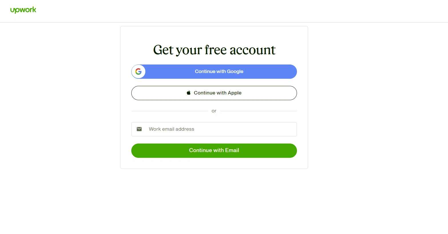
CTA redirected to a 2-step sign up process where users select what account they want (client or freelancer)
Sign-up messaging did not reflect where someone is coming from or confirm that they're heading in the direction they expected

landing page headline and CTA (control)

sign up page (control)
Test
CTA matches the action in the headline
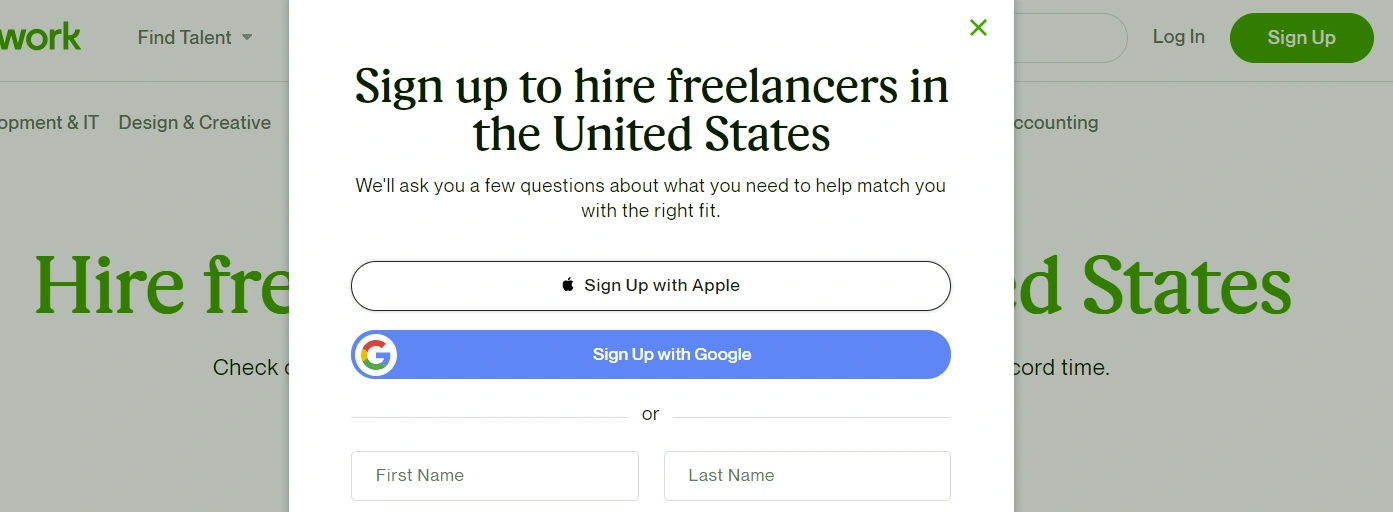
CTA pops up an on-page modal for a 1-step sign up for a client account
Sign-up messaging acknowledges the content of the previous screen and the action someone takes to get there, and sets expectations for what is coming next

landing page headline and CTA (test)

sign up page (test)
Like this project
Posted Jul 27, 2023
+36% visit to registration and +31% visit to posting a job.


