Case Study: AI-Powered Onboarding & Rewards — Brave Achievers"
Kenneth Madukwe
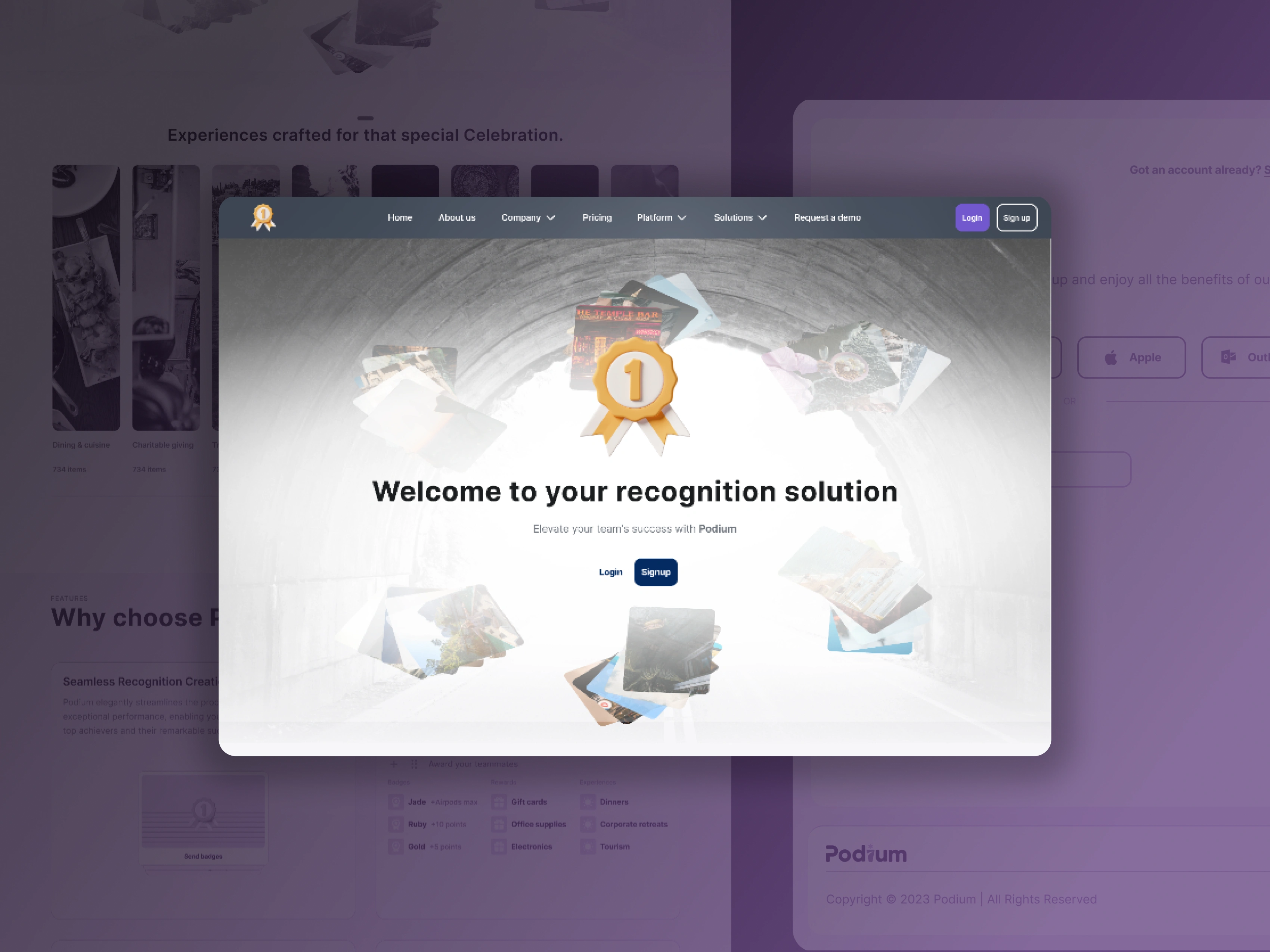
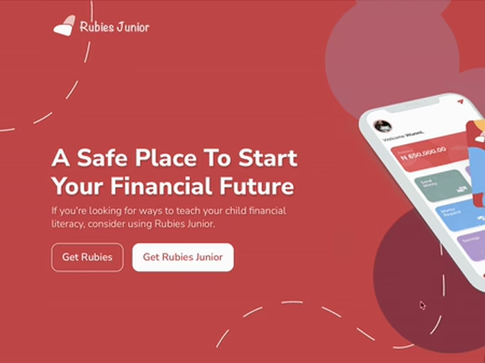
Product hero section
Client
Overview
Brave Achievers is a U.S.-based digital learning and skills-development platform using AI to personalize learning paths. I redesigned the core dashboard, improved task discoverability, and rebuilt the onboarding experience to help learners engage faster and understand the full product value immediately.
My Role
Product Designer : UX, UI, research, interaction design, prototyping, and design system alignment for web & mobile.
Challenge
The main issues holding the platform back:
Dashboard clutter made key actions hard to find
Users didn’t understand how AI-powered recommendations worked
Onboarding did not highlight product value early
Mobile responsiveness was inconsistent
UI components varied across pages, creating friction
To support scale and credibility, the platform needed an interface that felt smarter, cleaner, and easier to navigate.
Approach
1. Research & Insight Synthesis
I ran interviews with learners, instructors, and internal team members.
Key insights:
Users wanted a clear starting point
Rewards were buried under low-priority content
Giving recognition was a burden due to the process.
Many didn’t understand how and why rewards was given
Mobile view lacked structure, confusing first-time users
These insights shaped the design direction:
Reduce noise. Amplify value. Guide users forward.
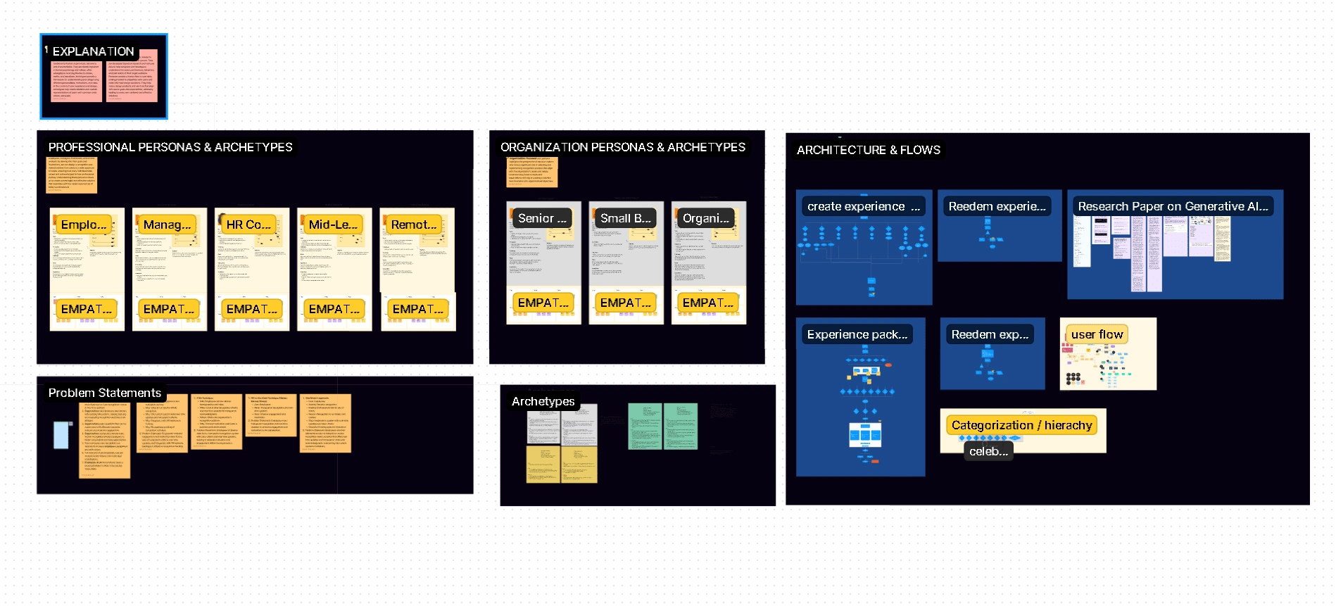
Collaborative Research on Figjam
2. Information Architecture Redesign
I reorganized the platform around three primary user intentions:
Start Rewarding , recognizing and renewing: actionable tasks and AI recommendations
Track Activities and Data: clear metrics and milestones
Explore content: discover new rewards and reward providers with ease
This established a simple, intuitive mental model.
3. UX / Interaction Design
Core improvements:
Clearer prioritization of AI-recommended tasks
Structured progress tracking with understandable metrics
Predictable navigation across web + mobile
Simplified onboarding with better expectation-setting
Micro-interactions reinforcing momentum and completion
Error-tolerant patterns for forms and learning actions
The platform became more actionable and less overwhelming.
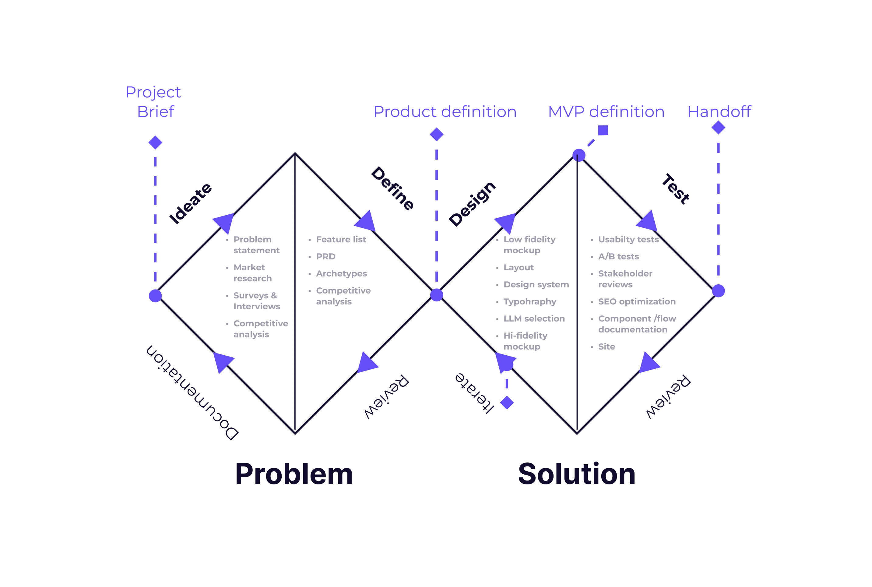
Product Design Process
4. Visual & UI System
I applied a consistent visual language across the app:
Clean typography hierarchy
Consistent cards for tasks, modules, and achievements
Clear spacing rules for readability
Unified iconography across features
High-contrast CTAs for learner focus
This established visual discipline and reduced cognitive load.
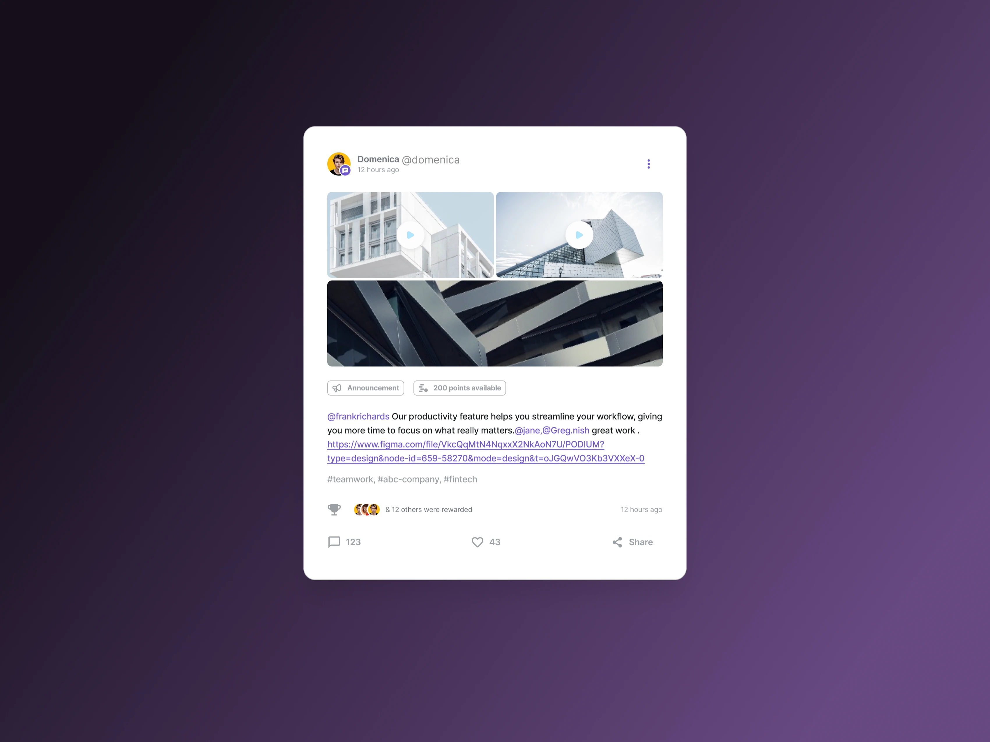
Recognition card component
5. Prototyping & Validation
Interactive prototypes were tested with active learners and new users.
Tets carried out:
A/B tests for layouts, copy, colour schemes and flows
Usability tests to understand ease of use and determine task completion rate while adhering to accesibility guidelines
Surveys and questionnires
We iterated specifically on the dashboard hero section and mobile navigation based on user observations.
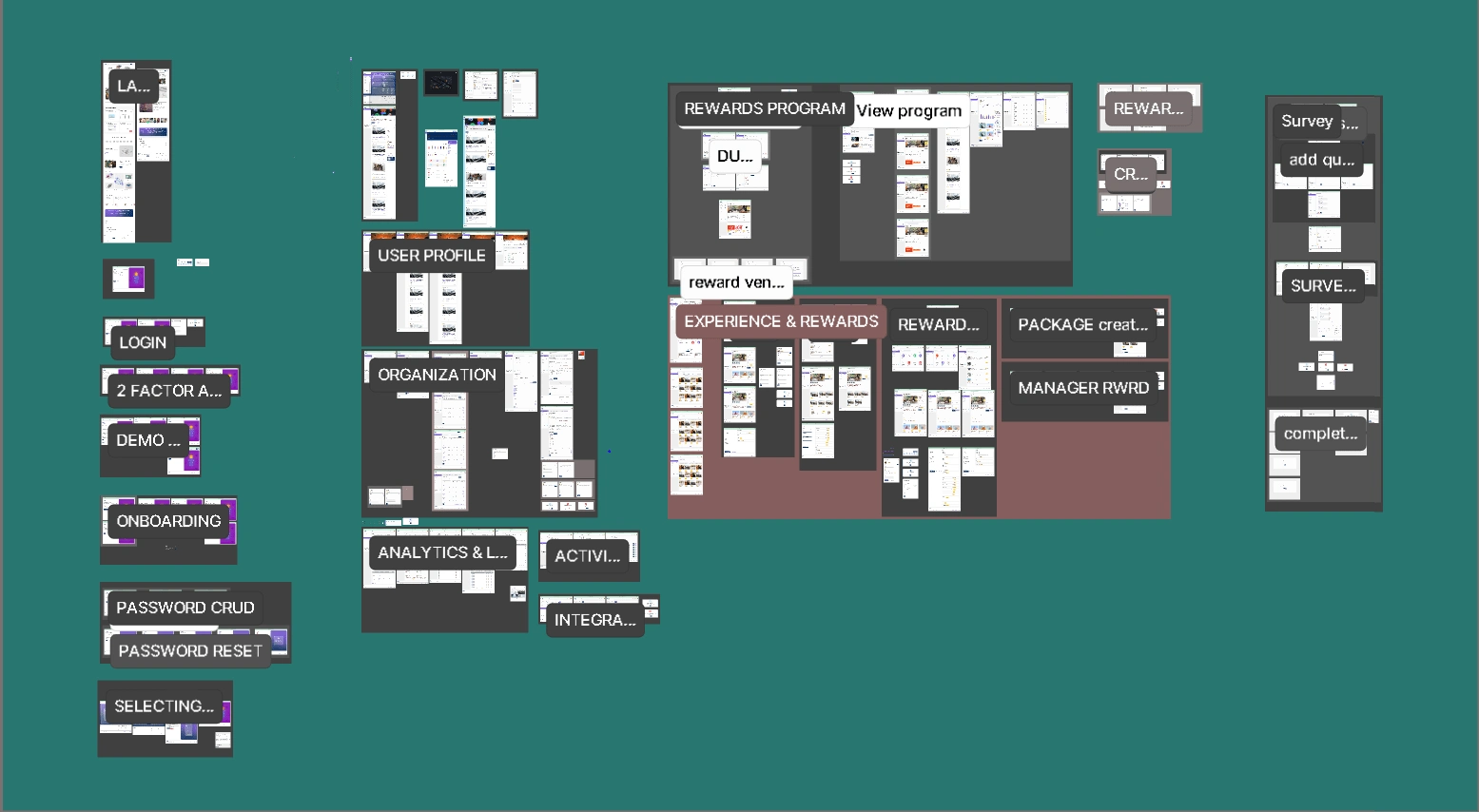
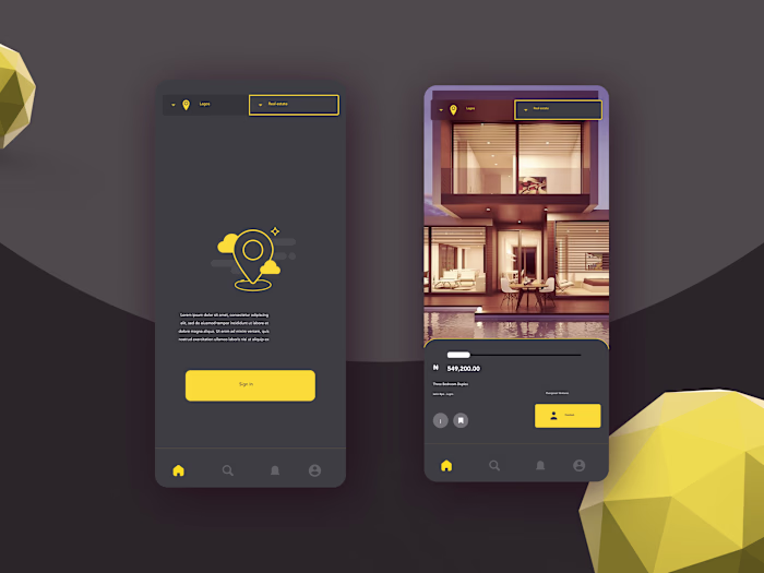
Design Screens
Solution
A streamlined, learner-centered platform:
AI recommendations surfaced inside a clear “Start Learning” module
Cleaner dashboard with a single, intentional entry point
Consistent UI system across devices
Shorter, value-first onboarding flow
Simplified progress tracking
The experience became more intuitive and more aligned with users’ real learning behavior.
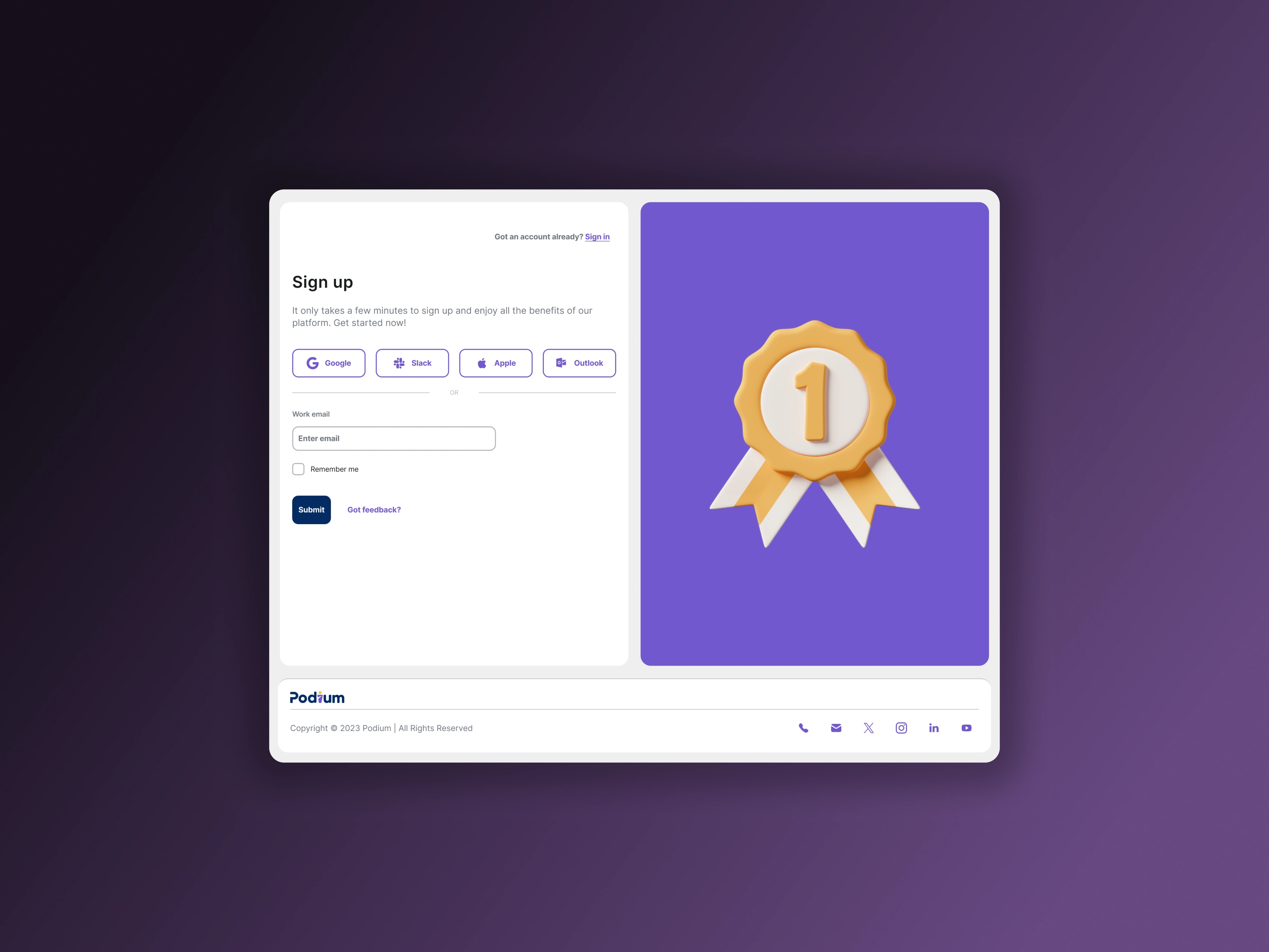
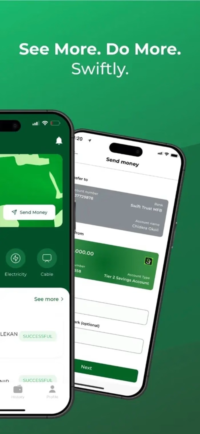
Landing page
Outcomes
Though exact metrics are internal, the redesign produced:
More engagement with recommended tasks
Better clarity around learning goals and progress
Faster onboarding completion
Stronger learner confidence and understanding of platform value
Improved design & dev collaboration through unified components
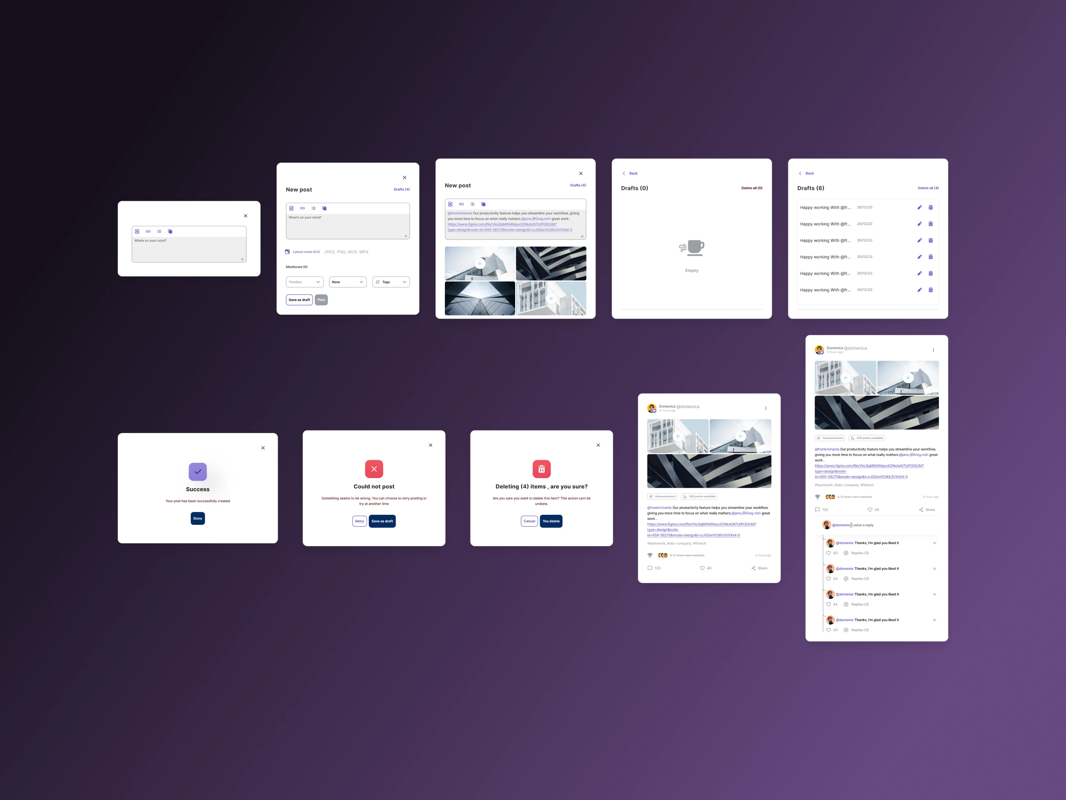
Recognition component states
What I Learned
AI-powered products need explainability and structure. When users understand why the system recommends something and when that recommendation is surfaced clearly engagement rises naturally. Simplicity is the ultimate accelerant in learning platforms.
Like this project
Posted Nov 14, 2024
Designed an AI-powered employee rewards and recognition product.