Workpeg Homepage Redesign
Ayodele Okanlawon
Overview
Workpeg is an AI-powered workflow assistant designed to help teams across product, engineering, operations, finance, and more run faster and stay aligned.
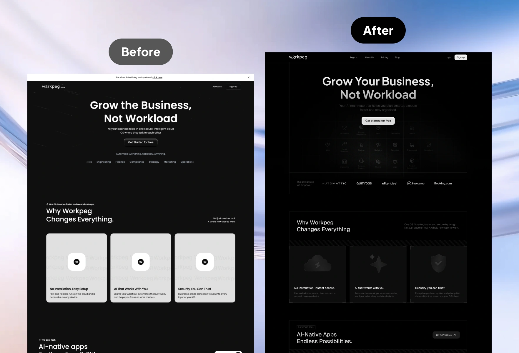
While the product delivered strong value, the original homepage did not clearly communicate its capabilities, lacked visual hierarchy, and did not effectively convert visitors into signups.
I redesigned the homepage to improve clarity, brand perception, conversion, and storytelling.
Problem
Visitors did not immediately understand what Workpeg does.
The original homepage had:
Weak above-the-fold messaging
Mixed visual language
Hard to understand feature sections
No clear path to sign up
No social proof
No product storytelling
This reduced user confidence and overall conversion.
Objectives
Communicate Workpeg’s core value in the first 3 seconds
Increase signups by improving CTA clarity
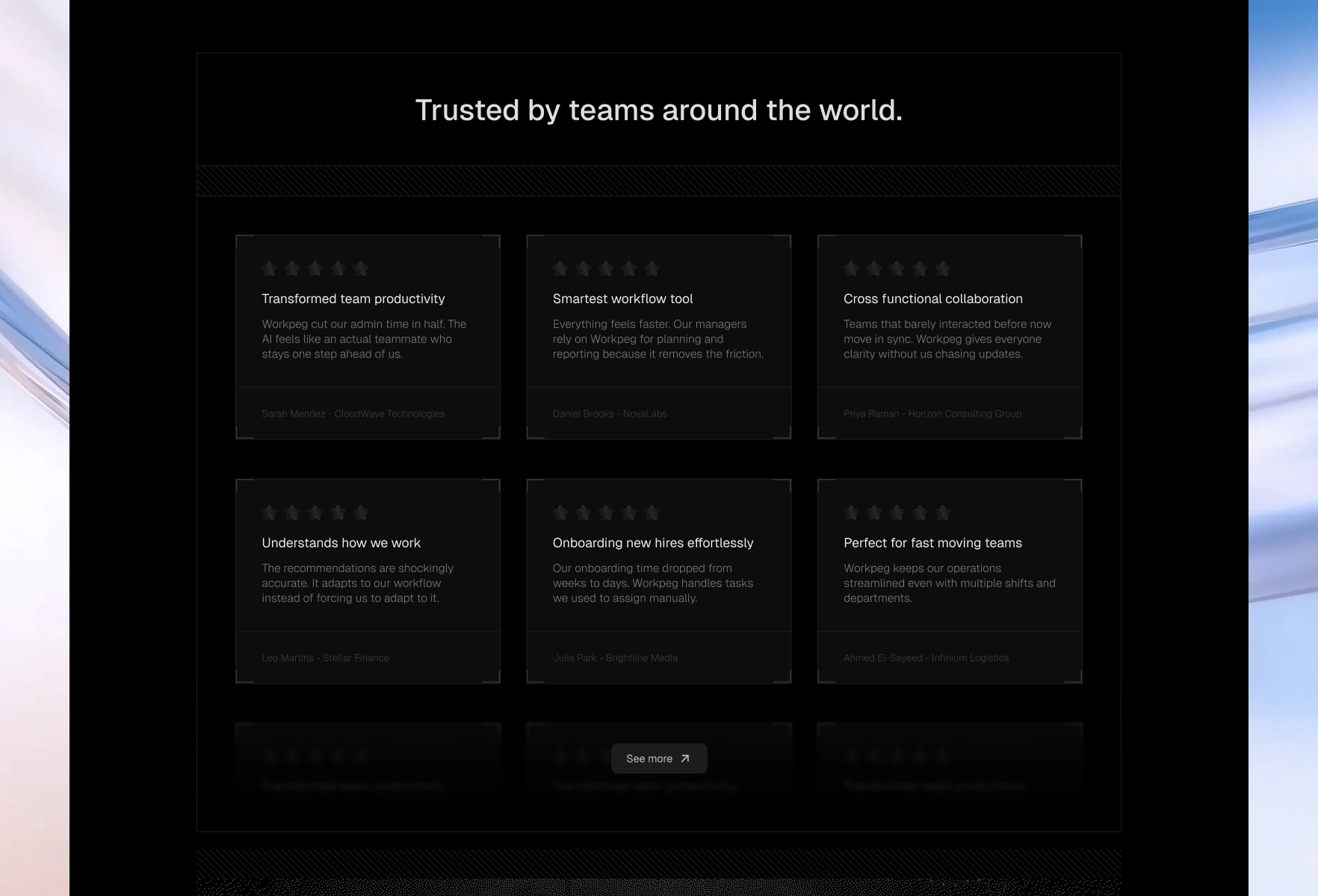
Add credibility through testimonials and trust markers
Present Workpeg as a smart, friendly AI helper
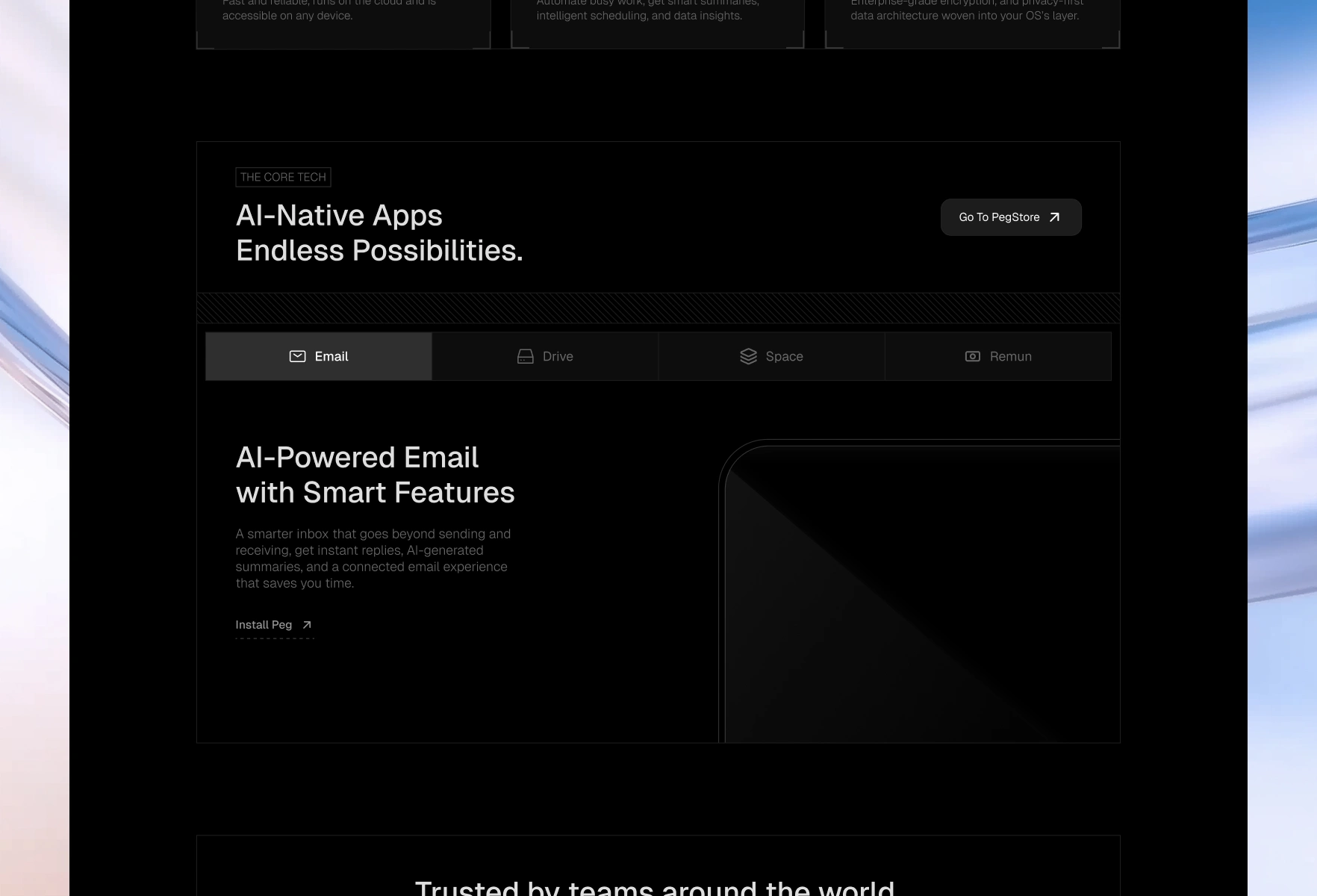
Explain features in a simple, benefits-first structure
Make the visual identity feel premium and modern
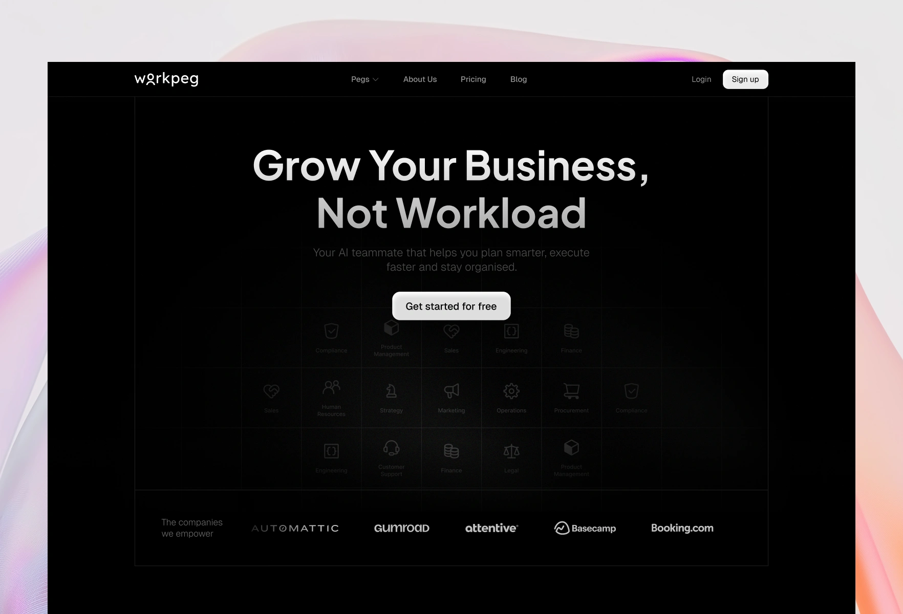
Hero
Research
To understand what users expect from an AI workflow tool, I reviewed:
Competitor homepages (Notion, Asana, Motion, ClickUp)
Conversion best practices for SaaS hero sections
Common messaging patterns in AI SaaS tools
User preferences for clarity, simplicity, and trust cues
The insight was clear. People want:
A fast explanation
Proof it works
A clear path for next steps
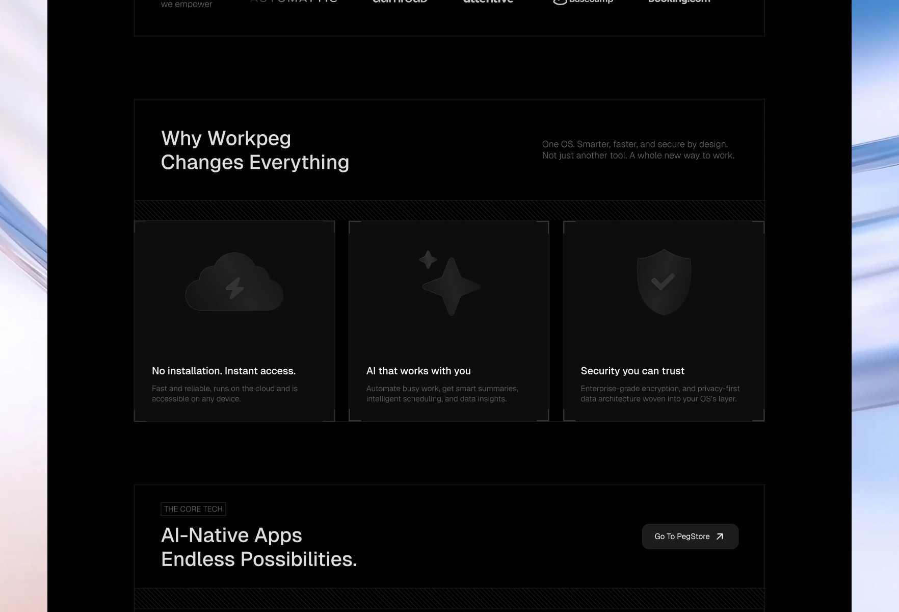
Features
Pegs
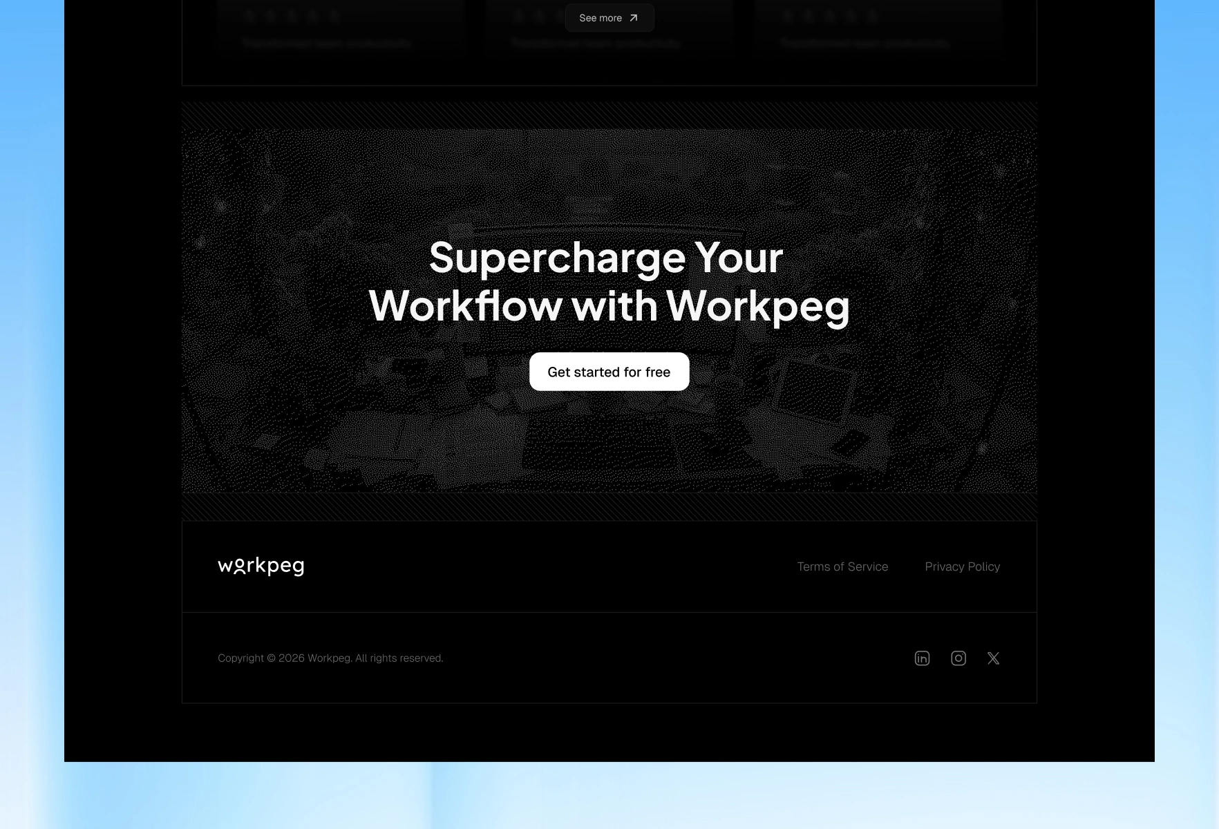
Footer
Final Outcome
The redesigned homepage:
Communicates value instantly
Uses a clean, predictable structure
Shows Workpeg as a premium AI product
Improves trust with clear social proof
Adds personality with a friendly AI character
Pushes visitors toward signup with minimal friction
The new experience feels faster, clearer, and more mature.
Like this project
Posted Dec 12, 2025
Improve clarity, messaging, and conversion for a workflow automation and AI assistant platform.
Likes
0
Views
15