AI-Powered Basketball App Design
Ayodele Okanlawon
Introduction & Discovery
When I first joined this project, the ambition was clear: build an AI-powered basketball app that doesn’t just track your game but transforms it into a global experience. Basketball culture thrives on competition, visibility, and connection. Our goal was to capture that essence by enabling players to:
Track their stats automatically through AI-powered recognition.
Get personalized highlights from their everyday runs.
Climb global leaderboards and measure themselves against peers.
Earn rewards that tie back into the basketball lifestyle.
The product vision wasn’t simply another performance tracker. It was about creating an ecosystem of gamified basketball culture that mirrors what TikTok did for self-expression and what Strava did for running.
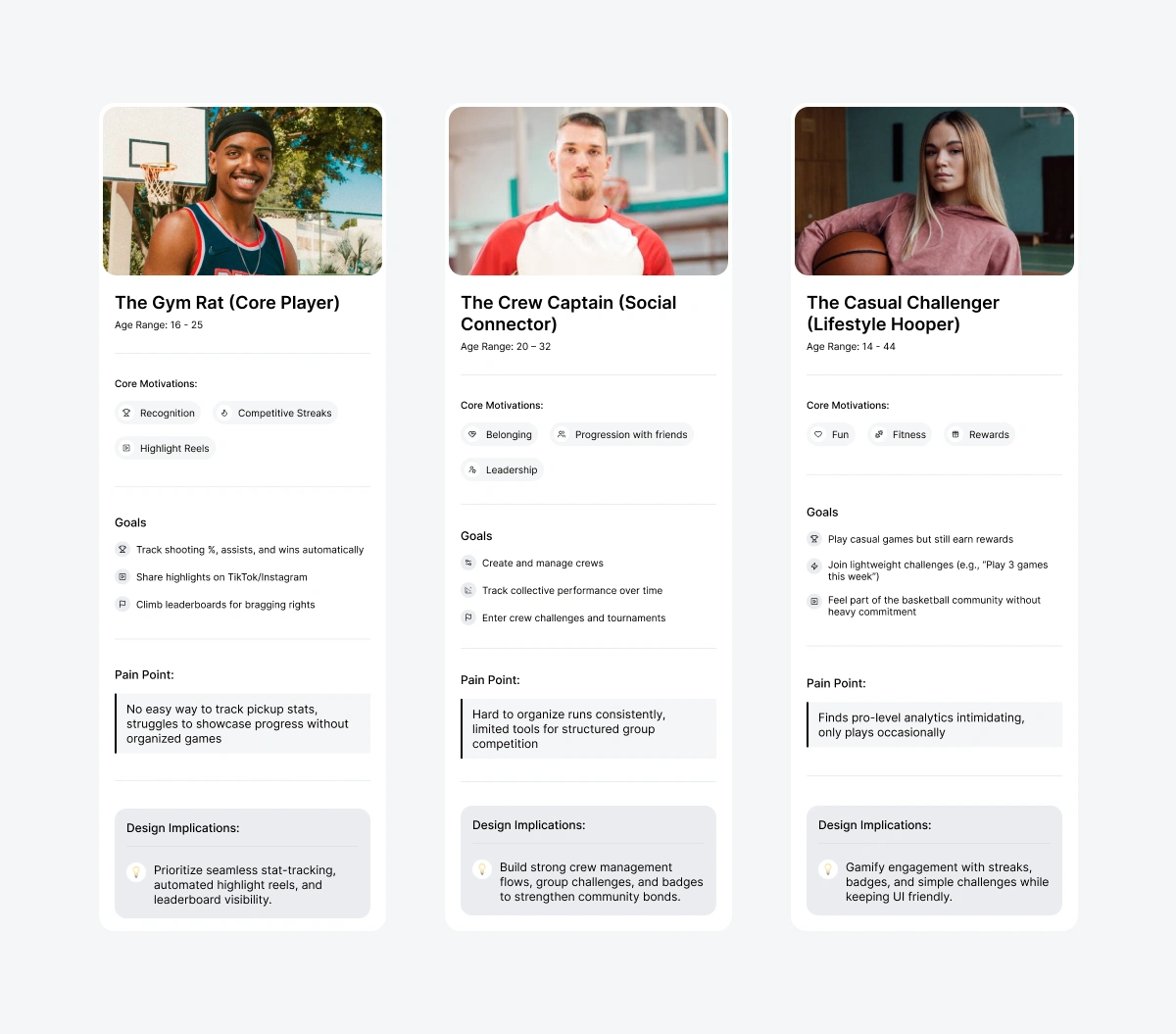
Target Audience
We identified three primary personas through conceptual research and competitor benchmarking:
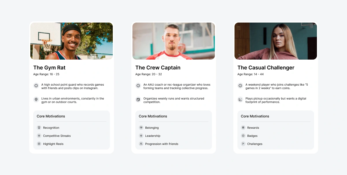
While heavily male-dominated, we designed with an inclusive tone. Basketball is global, and inclusivity strengthens community adoption.
Market Benchmarking
Before shaping flows, I benchmarked direct competitors. A few stood out:
Hooper.gg: The closest direct competitor, structured around gamified stat-tracking and leaderboards. Strong in community-building but visually cluttered and limited in aspirational design.
HomeCourt: Set the standard for mobile-first basketball AI experiences. Their onboarding feels premium, though the UI can overwhelm casual users with dense stats.
SportsVisio: Positioned toward semi-pro and pro players. Their product lacked a lifestyle layer, skewing too technical for casual athletes.
I also drew lessons from indirect competitors:
Strava: Seamless blend of competition and social connection.
Duolingo: Mastery streaks and micro-feedback systems.
TikTok: Ease of video sharing and instant gratification in UX.
Each competitor provided inspiration but also gaps: clutter, intimidating UI, or lack of lifestyle culture. These gaps shaped our north star — a modern, clean, glassmorphic UI with just the right balance of performance and play.
Problem Definition
From synthesis, we articulated three core design problems:
How do we make basketball data approachable and fun, not intimidating?
How do we build a system that celebrates community while rewarding individual achievement?
How do we maintain aesthetic clarity in a data-heavy UI?
Answering these became the foundation for design decisions ahead.
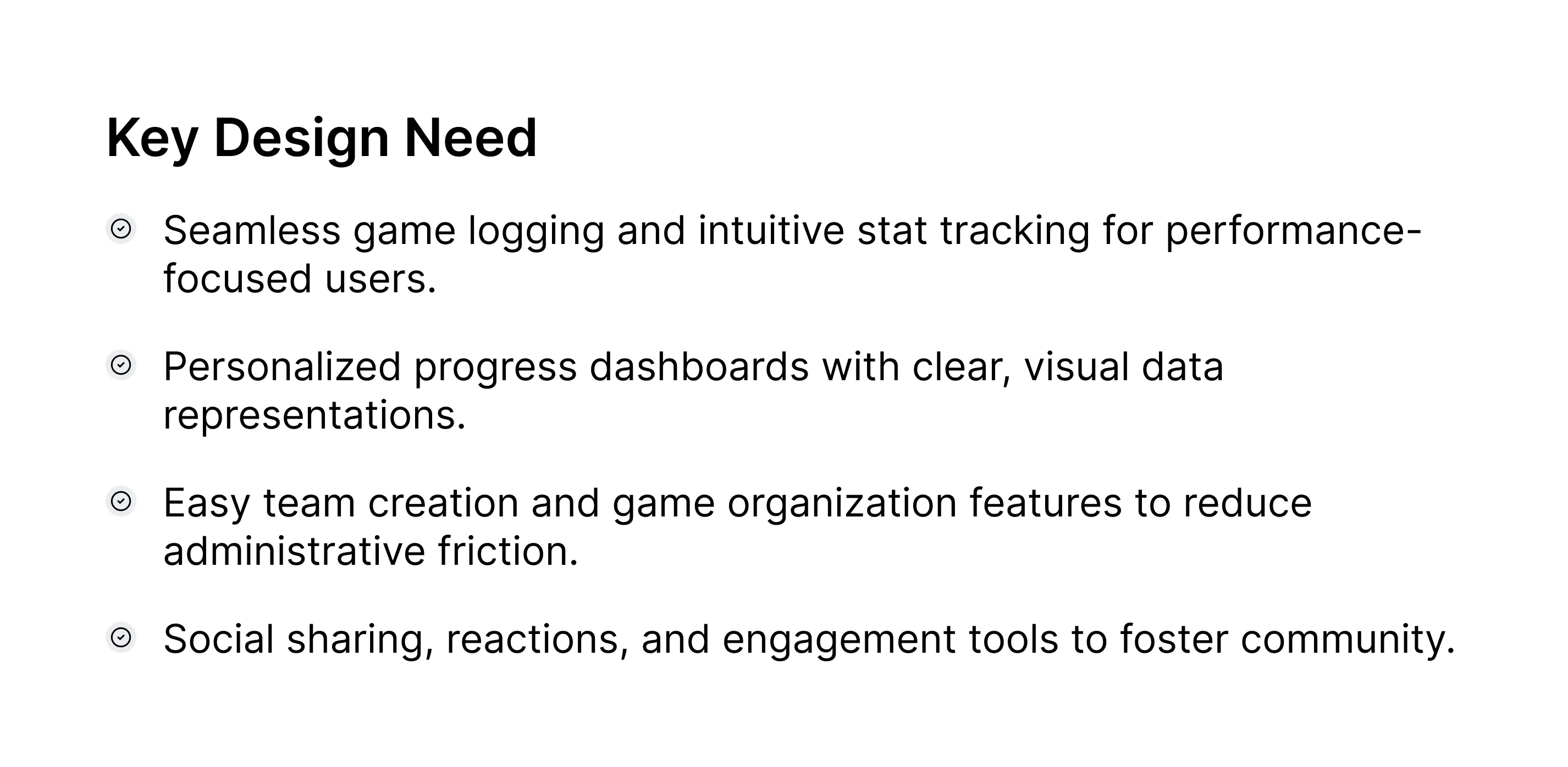
Design Goals
Clarity: Use minimal and modern glassmorphic UI to avoid data overload.
Gamification: Layer streaks, rewards, and challenges without overwhelming.
Social Energy: Emphasize crews, activity feeds, and highlights for shareability.
Future-Readiness: Ensure screens are developer-ready, scalable, and adaptable to AI video processing flows.
Competitor Benchmarking & Design Strategy Competitor Benchmarking
When designing Ball Club, I knew the ecosystem was already filled with apps promising performance tracking and competitive play. My task was not to copy them but to understand their value and spot gaps that would define our unique space.
Direct Competitors
Strengths: Strong community-driven leaderboard, simple player profiles, and gamified achievements.
Weaknesses: Overly cluttered stats pages. Their interface feels built for hardcore players, leaving casual hoopers intimidated.
HomeCourt (by Nex Team)
Strengths: Polished onboarding, refined computer vision for shooting drills, clear video highlights.
Weaknesses: Heavy emphasis on training drills, less on the social, crew-based, gamified experience that today’s players want.
SportsVisio
Strengths: AI-powered video breakdown, auto-clipping highlights, market push toward analytics.
Weaknesses: Feels more like a coaching tool than a fun-first, social product.
Indirect Competitors
Hudl and Pixellot: Great for organized teams, but inaccessible for pickup and casual players.
PickupHub: Helps players organize games, but offers no game recording or gamification layer.
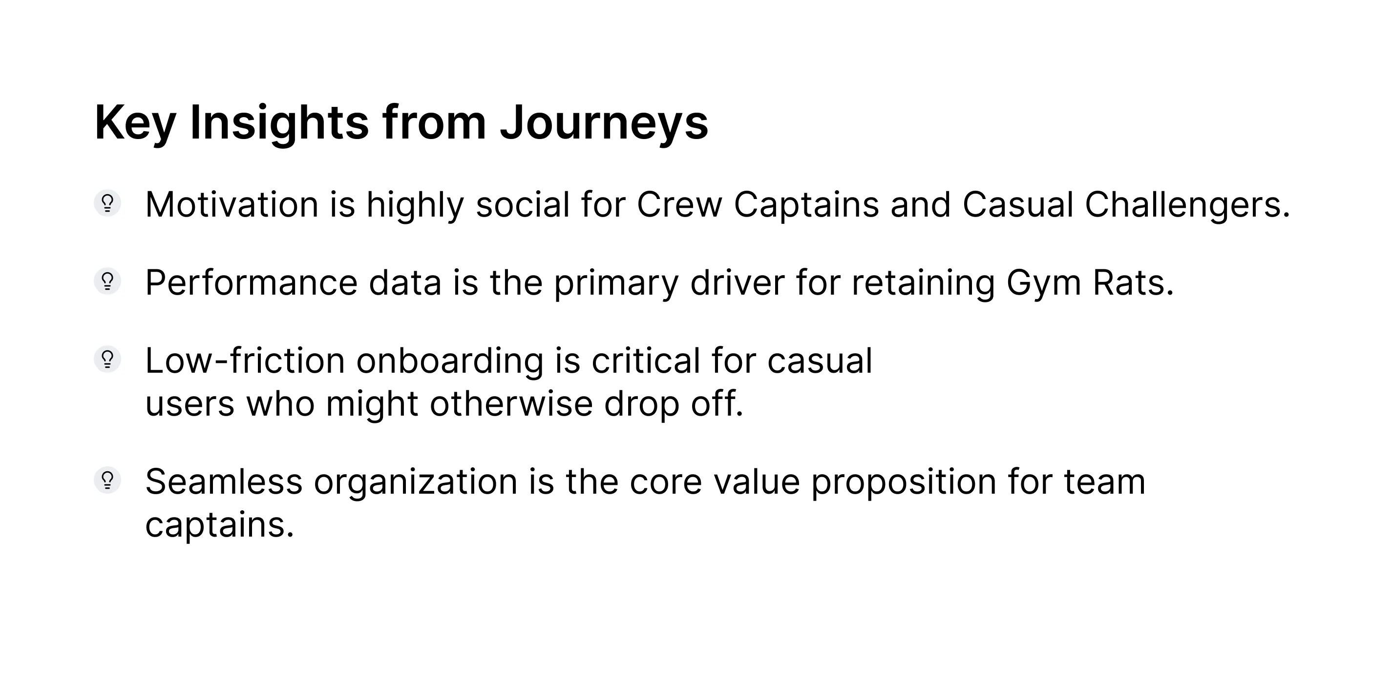
Key Takeaway from Benchmarking
Most competitors either go too deep into analytics (alienating casual users) or too shallow into community (failing to sustain long-term engagement). The white space lies in merging fun-first culture with pro-level AI insights.
That became Ball Club’s north star.
User Personas & Journey Mapping
Through competitor analysis, user profiling, and assumed behavioral insights, I developed three guiding personas. These personas grounded design choices and helped us evaluate features through a human lens.
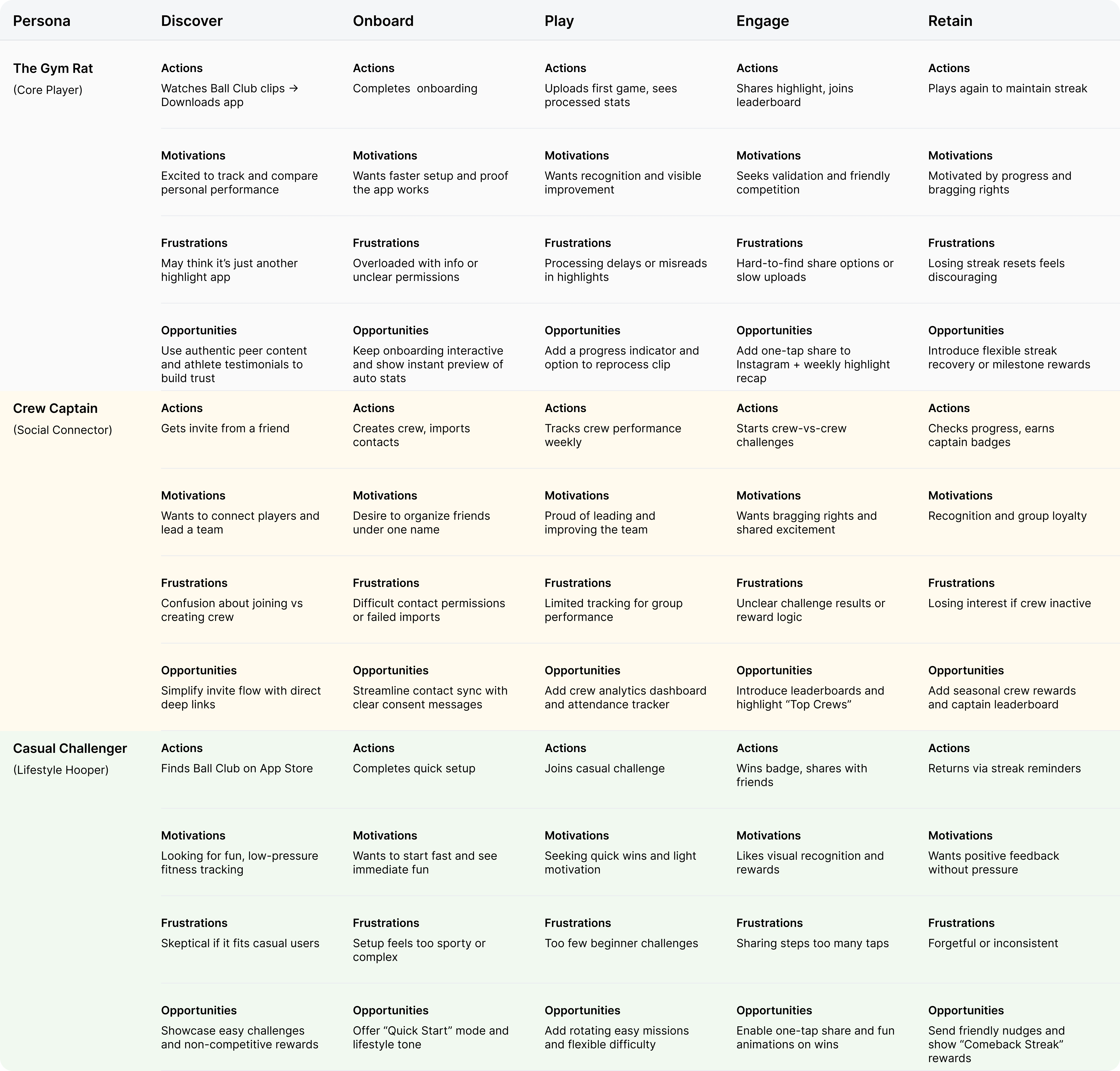
Journey Mapping
We mapped journeys for each persona to visualize motivations, frustrations, and opportunities across the app lifecycle.
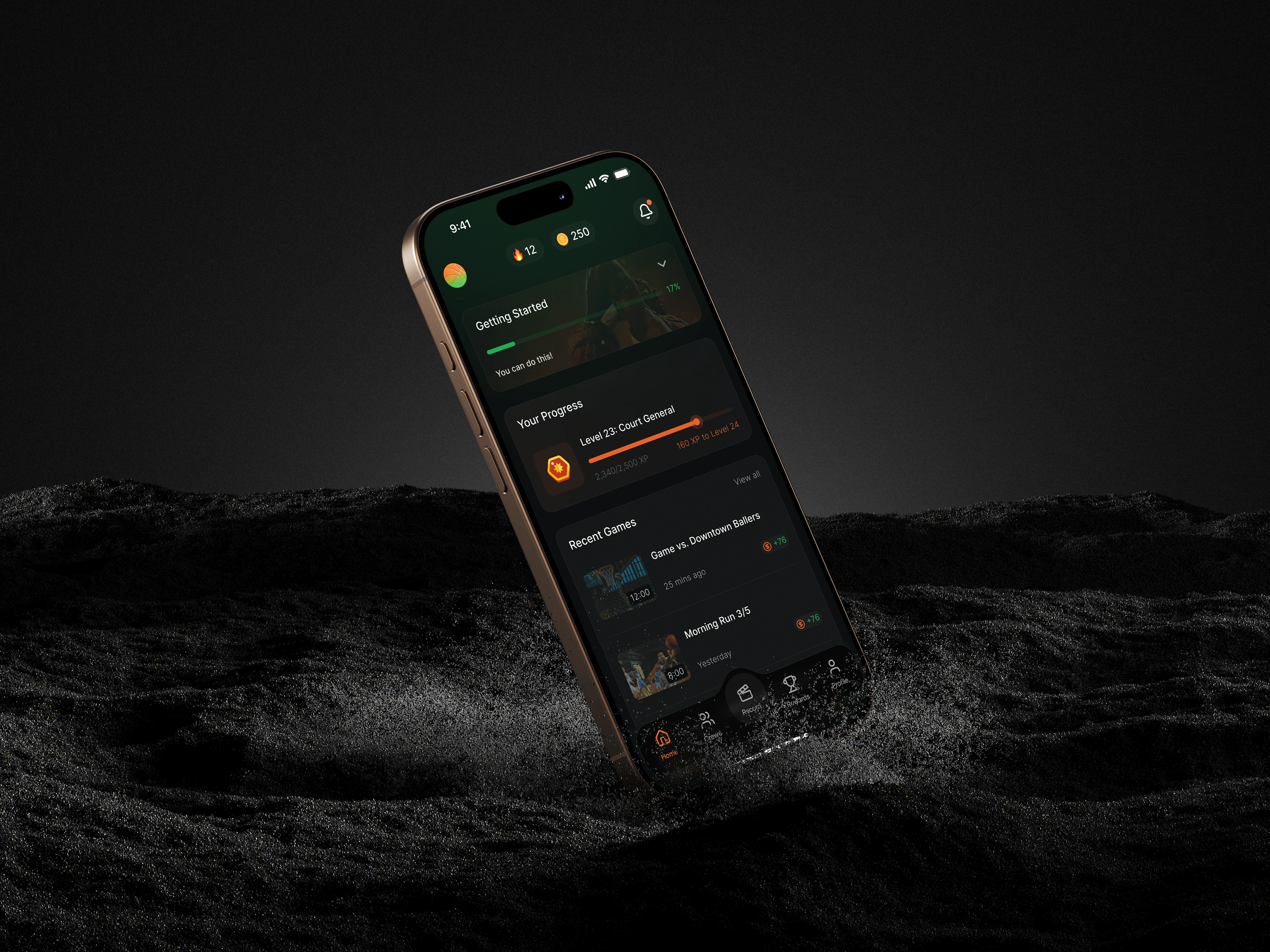
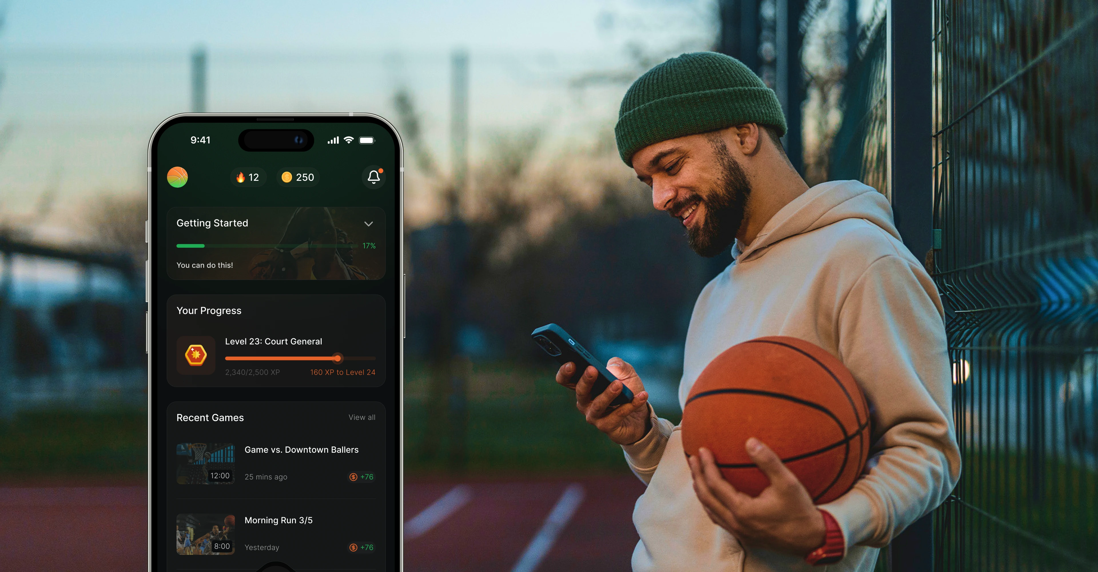
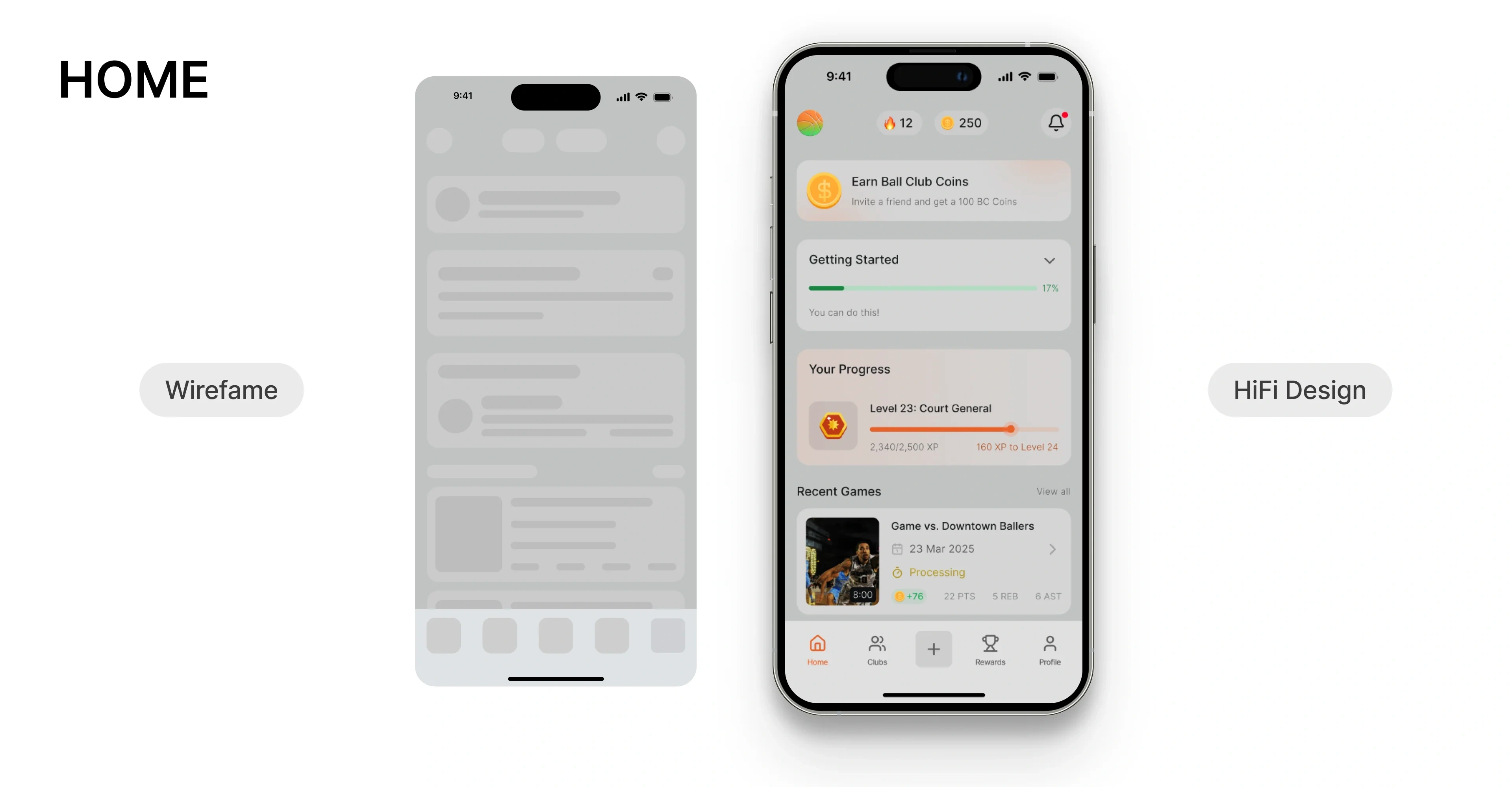
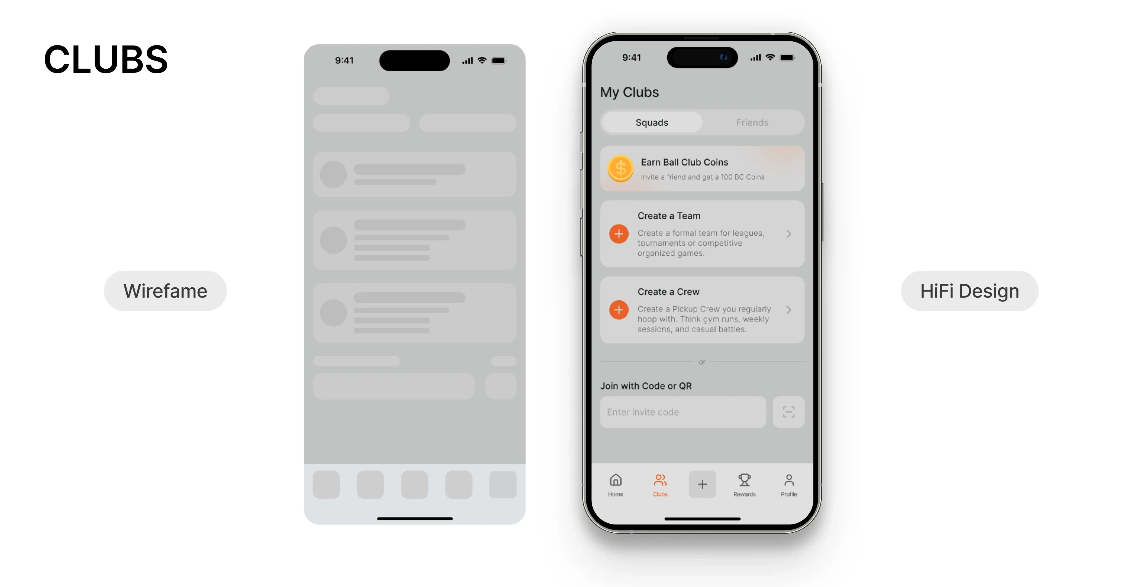
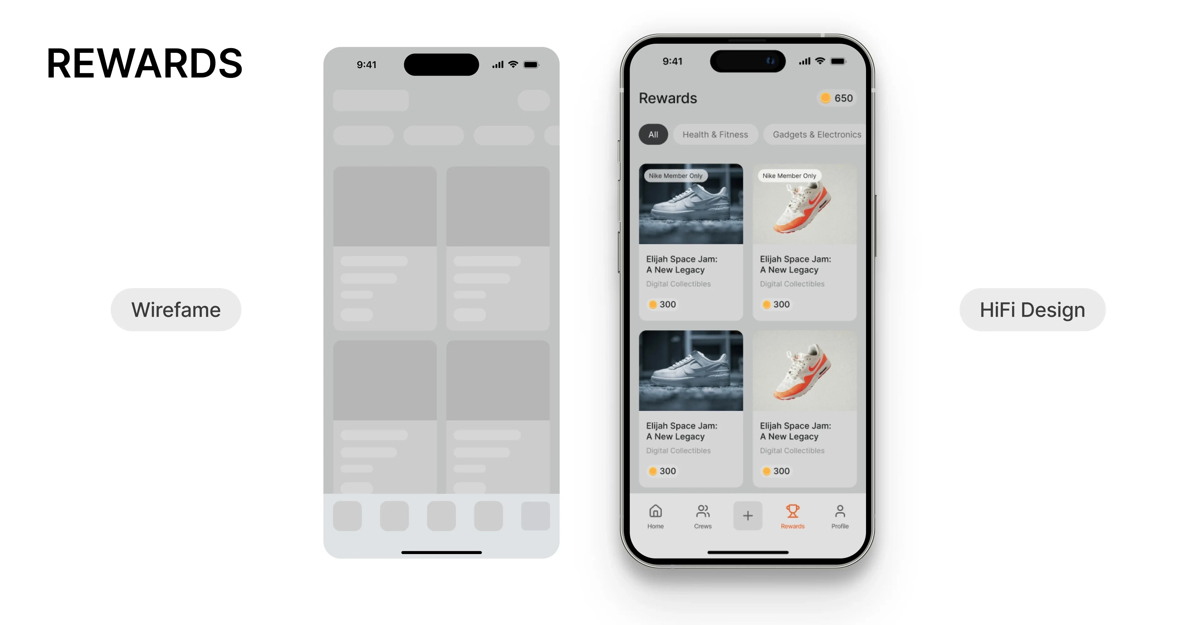
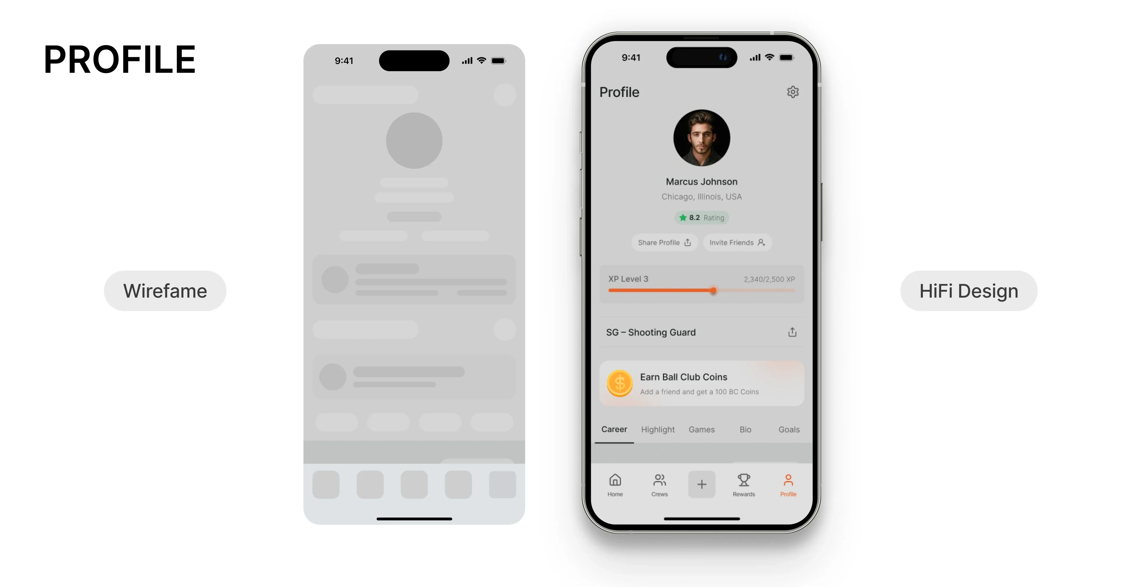
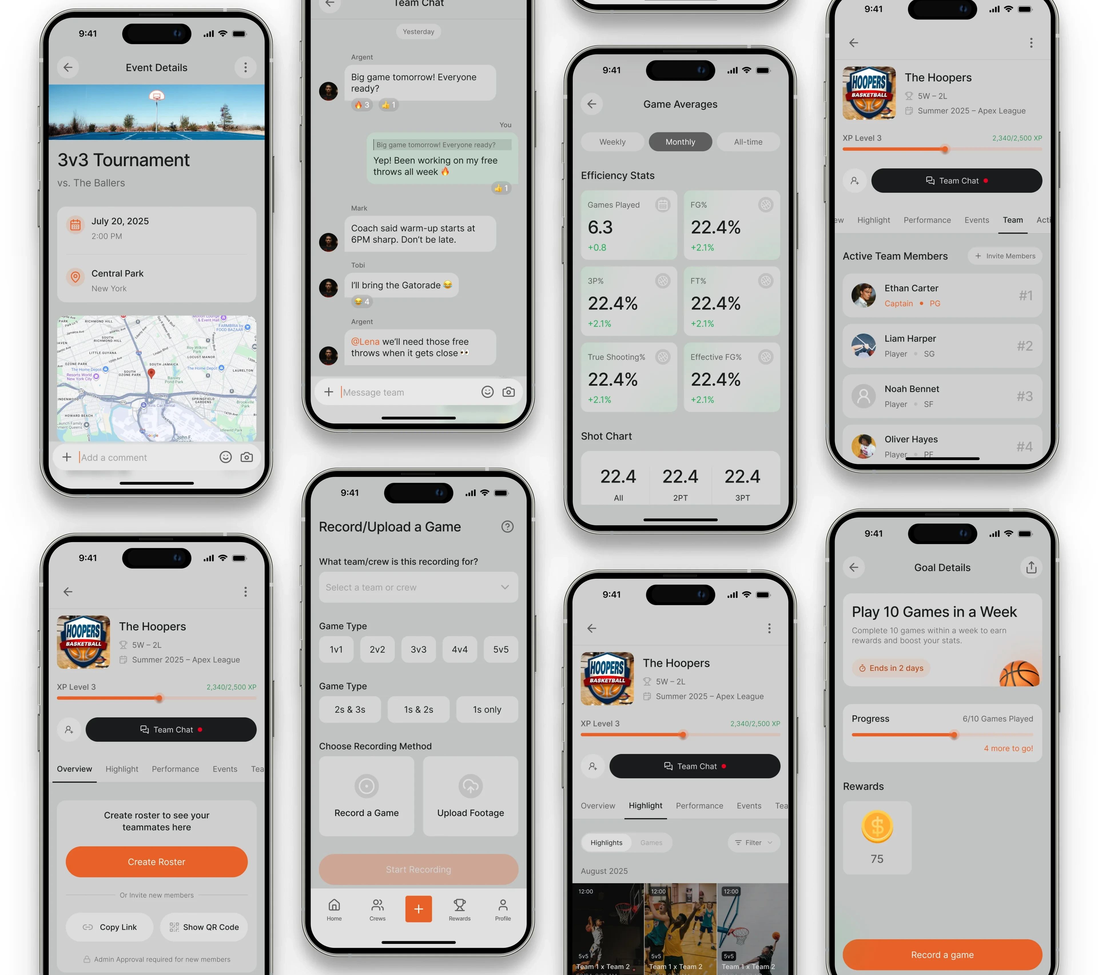
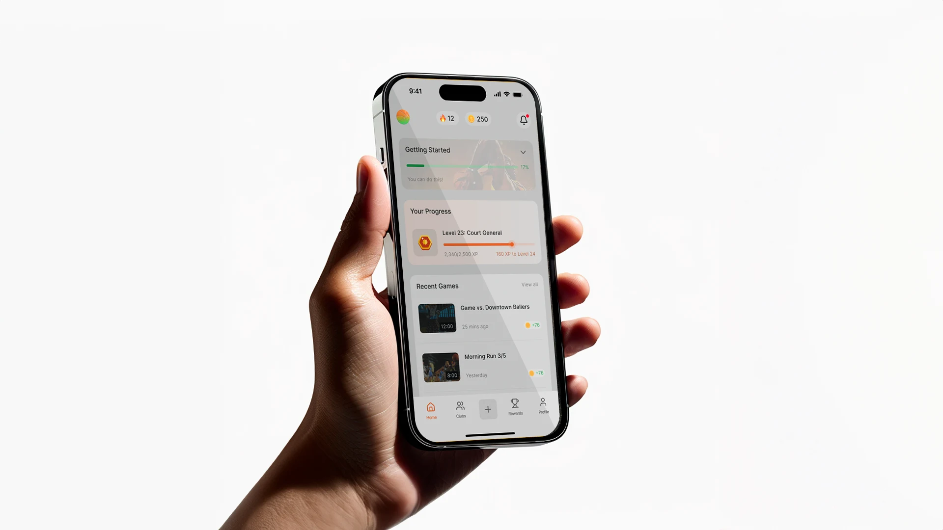
Wireframes & Hi-Fi Designs
This stage was about moving from research and opportunity framing into tangible design structures. I started with low-fidelity sketches, then evolved them into wireframes that shaped the core flows of the Ball Club experience. Afterwards, I transformed the structured wireframes into a visually compelling, branded product experience. By layering typography, color, and microinteractions on top of the flows, the Ball Club app moved from sketches into something users could immediately connect with.
Like this project
Posted Nov 5, 2025
Designed an AI-powered basketball app with gamification and social features.
Likes
2
Views
11