UX Design for ZedVest Digital Investment Platform
Ayodele Okanlawon
Executive Summary
ZedVest is a digital investment platform designed to give everyday people in emerging markets access to secure, dollar-denominated investment opportunities.
My role was to design the end-to-end user experience, from onboarding and funding flows to investment discovery, performance monitoring, and withdrawals. The goal was not only to create an intuitive interface but also to tackle systemic barriers to investment: lack of trust, limited financial literacy, and the friction of cross-border transactions.
This case study documents my process, including research insights, design decisions, challenges, and outcomes. It reflects on how thoughtful design can unlock financial opportunities in contexts where trust, transparency, and usability are paramount.
Introduction
In many African markets, access to reliable, high-yield investments is limited. Traditional options are often denominated in local currencies prone to devaluation. Dollar-denominated investments provide stability but are usually restricted to sophisticated investors or institutions.
ZedVest set out to close this gap by creating a platform that:
Allows users to fund in both Naira and USD.
Provides curated investment opportunities vetted for reliability.
Delivers a transparent and reassuring experience to reduce uncertainty and build confidence.
My Role
I served as the Lead UX/UI Designer, responsible for:
Researching user pain points in the investment journey.
Defining the user flows for onboarding, funding, investing, and withdrawals.
Designing mobile-first high-fidelity screens in Figma.
Collaborating with stakeholders to align the design with regulatory and business requirements.
Scope
This is an ongoing project aimed at solving a real market challenge. While the MVP may not require some of the features and functionalities in this case study, I approached it as though it were an MMP (Minimum Marketable Product) with end-to-end accountability, making it easier to launch the next phase of the product after the MVP has been released.
The scope included:
Discovery & Research
Problem Definition
Design Goals
Ideation & Wireframing
Final Design & Prototyping
Usability Testing (conceptual)
Reflection & Learnings
Research & Insights
Since the target audience spans first-time retail investors and semi-experienced professionals, I structured research around:
User Interviews: Informal conversations with potential investors in Nigeria.
Market Scan: Reviewing existing competitors (Rise, Trove, Bamboo, Chaka).
Behavioral Insights: Exploring how trust and literacy affect investment adoption.
Key Findings
1. Trust is the #1 barrier
Users expressed skepticism about investment apps due to:
Stories of scams and failed schemes.
Lack of visibility into how money is managed.
Hidden fees that erode returns.
Implication: The design needed to over-communicate trust signals—transparency, regulatory info, clear returns.
2. Financial literacy gaps
Many first-time investors struggle with:
Understanding risk profiles (conservative vs aggressive).
Interpreting ROI percentages.
Differentiating between short-term and long-term opportunities.
Implication: Provide bite-sized education inside the app—tooltips, contextual explanations, and comparisons.
3. Cross-currency funding is confusing
Funding in Naira vs USD raised common questions:
“If I fund in Naira, how is it converted?”
“What rates are used, and are there extra fees?”
“How long does it take for my money to reflect?”
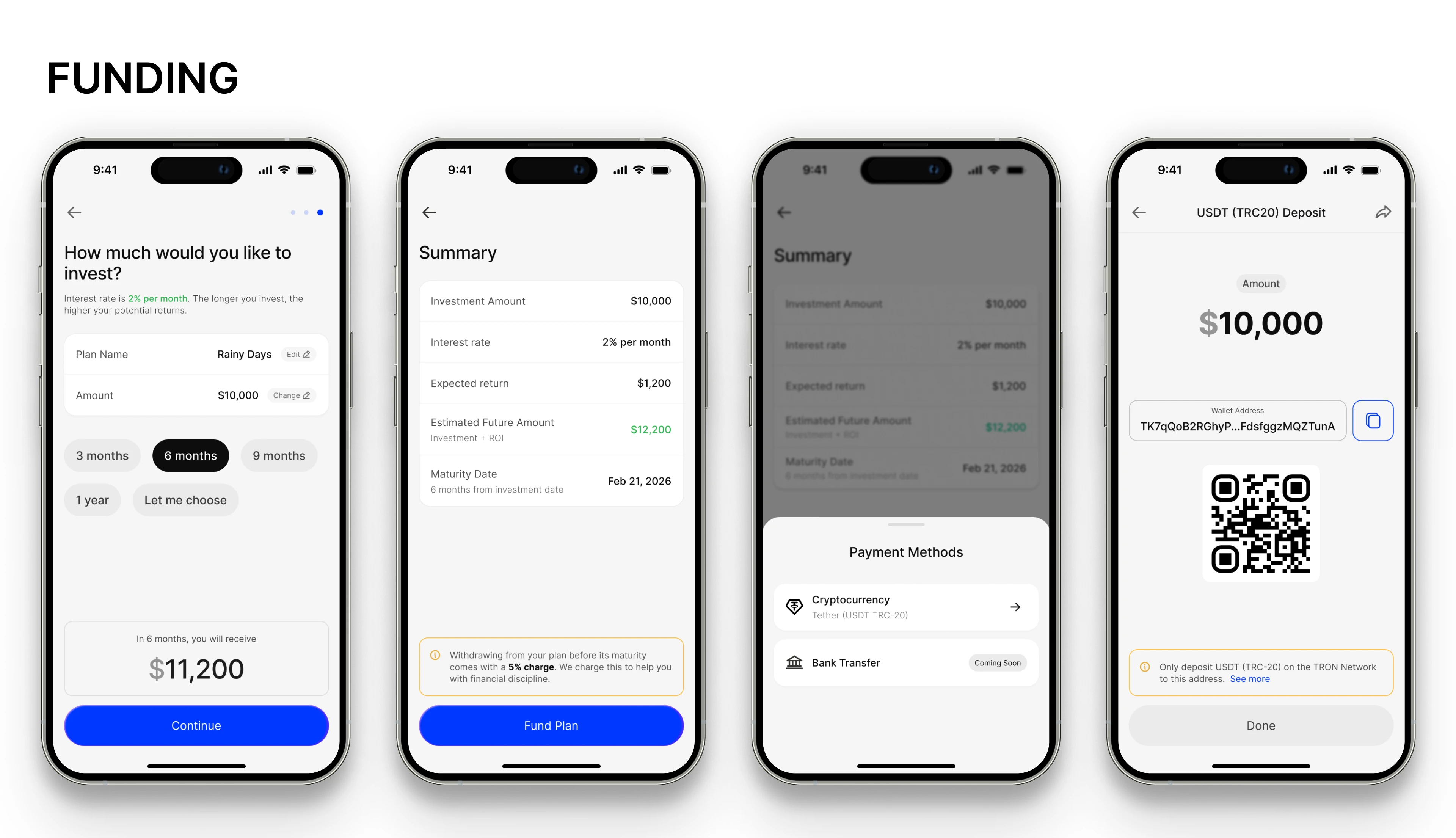
Implication: The funding flow had to be frictionless and transparent, showing exact exchange rates and settlement times.
4. Simplicity matters more than variety
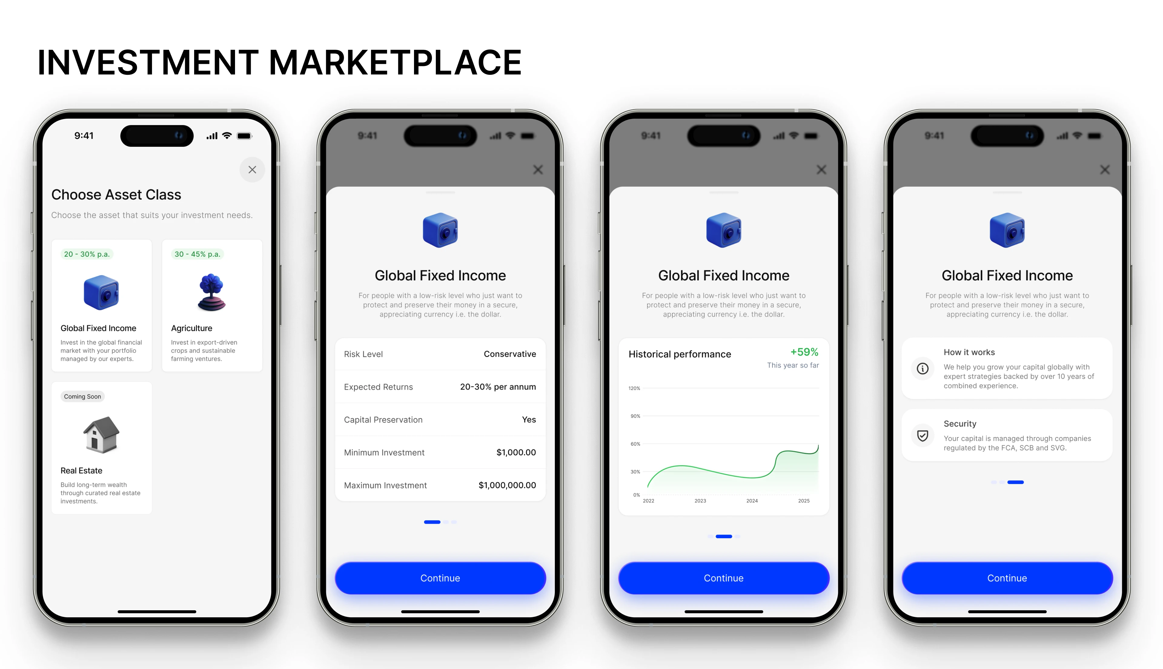
Users preferred a curated set of safe, high-quality opportunities over dozens of complex products. Too many choices created overwhelm and decision paralysis.
Implication: Keep the investment catalog focused and guide users with personalized recommendations.
Problem Definition
The research revealed three major challenges to solve:
How might we build trust in digital investments for first-time users?
How might we simplify cross-currency funding while maintaining transparency?
How might we balance simplicity with enough flexibility for different investor goals?
Design Goals
To address these problems, I established clear design goals:
Trust by Design
Showcase licenses, compliance, and institutional partnerships.
Provide transparent ROI calculators and clear risk labels.
Integrate social proof (reviews, testimonials).
Frictionless Funding
Offer both Naira and USD funding options.
Show conversion rates, fees, and timelines upfront.
Reduce steps to a minimum.
Accessible Investment Education
Embed micro-learning in context.
Use plain language instead of jargon.
Provide scenario-based illustrations of potential returns.
Clean, Mobile-First Experience
Prioritize simplicity for first-time users.
Maintain professional polish for more advanced investors.
Optimize for small screens and intermittent internet connections.
Ideation & Concept Development
After defining the problem and aligning on design goals, I moved into structured ideation. I combined design thinking methods with a lean product design mindset to generate concepts quickly and validate feasibility.
Techniques applied:
Crazy 8s sketching → produced multiple divergent ideas around onboarding, funding, and investment selection flows.
Affinity mapping → grouped raw ideas into themes (e.g., trust-building, simplicity, clarity of returns, dual-currency support).
Design studio workshops (solo version) → ran mini-sprints where I sketched, critiqued, and iterated on my own ideas as if in a group, simulating collaborative feedback loops.
Key Conceptual Themes
Trust through transparency → dashboards that don’t overwhelm, with clear labeling of USD vs. NGN balances.
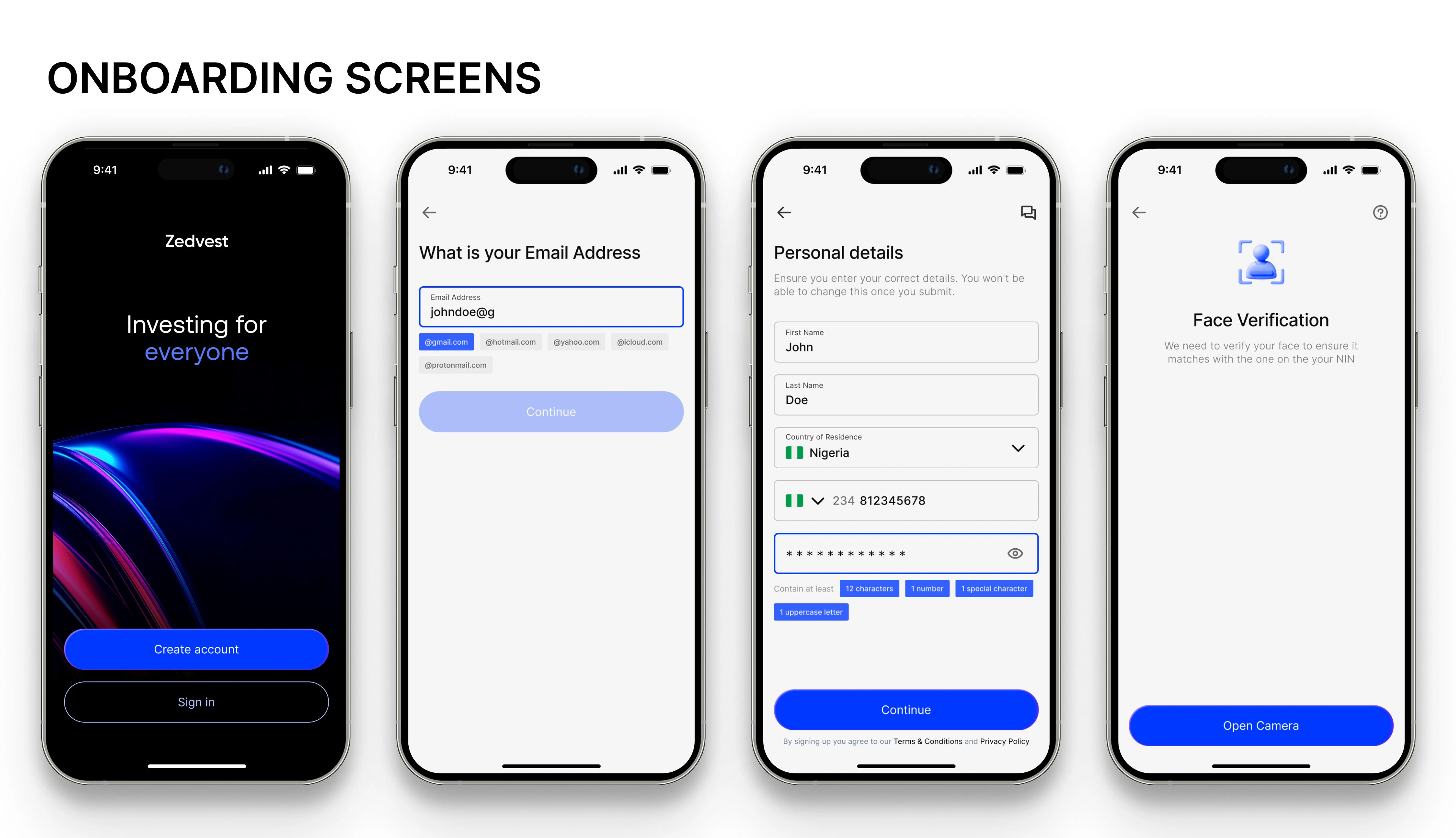
Simplicity-first onboarding → sign-up flow that asks for the bare minimum upfront while deferring KYC complexity.
Seamless dual-funding → allows users to switch between Naira and Dollar seamlessly, reinforcing flexibility.
Educational nudges → integrate contextual tooltips and microcopy, helping novice investors feel more confident.
Mobile-first interactions → prioritize thumb reach, simplified navigation, and one-tap confirmations.
Design Execution
Once wireframes were validated, I moved into high-fidelity UI design.
Design principles applied:
Clarity: Financial concepts can feel intimidating; I used simple language, minimal jargon, and consistent iconography.
Trustworthiness: Blue tones, clean typography, and well-structured white space reinforced a sense of security.
Guided Action: Clear CTAs with active states (e.g., “Fund Wallet”, “View Portfolio”) supported user confidence.
Cultural Relevance: Payment and currency flows accounted for both Nigerian and international users, localizing without fragmenting the design.
Accessibility Considerations
Ensured contrast ratios meet WCAG AA standards.
Designed components with touch targets ≥ 44px for mobile usability.
Provided color + icon states for status indicators (e.g., success, pending, failed transactions).
Final Design
The final screens reflected ZedVest’s core goals:
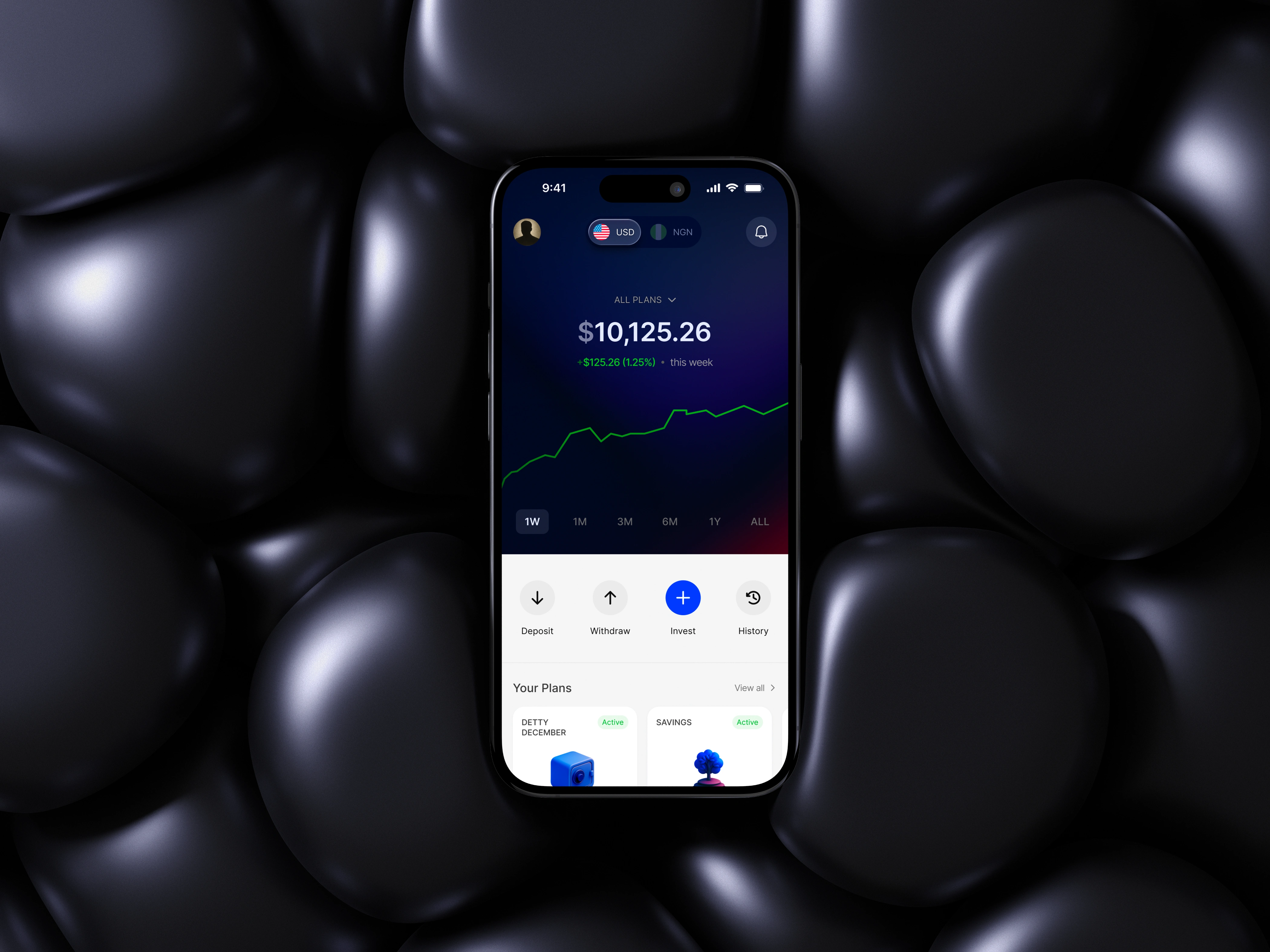
Onboarding flow: Fast, transparent, and confidence-building. Clear CTAs and minimal steps.
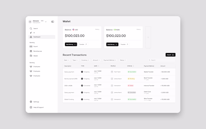
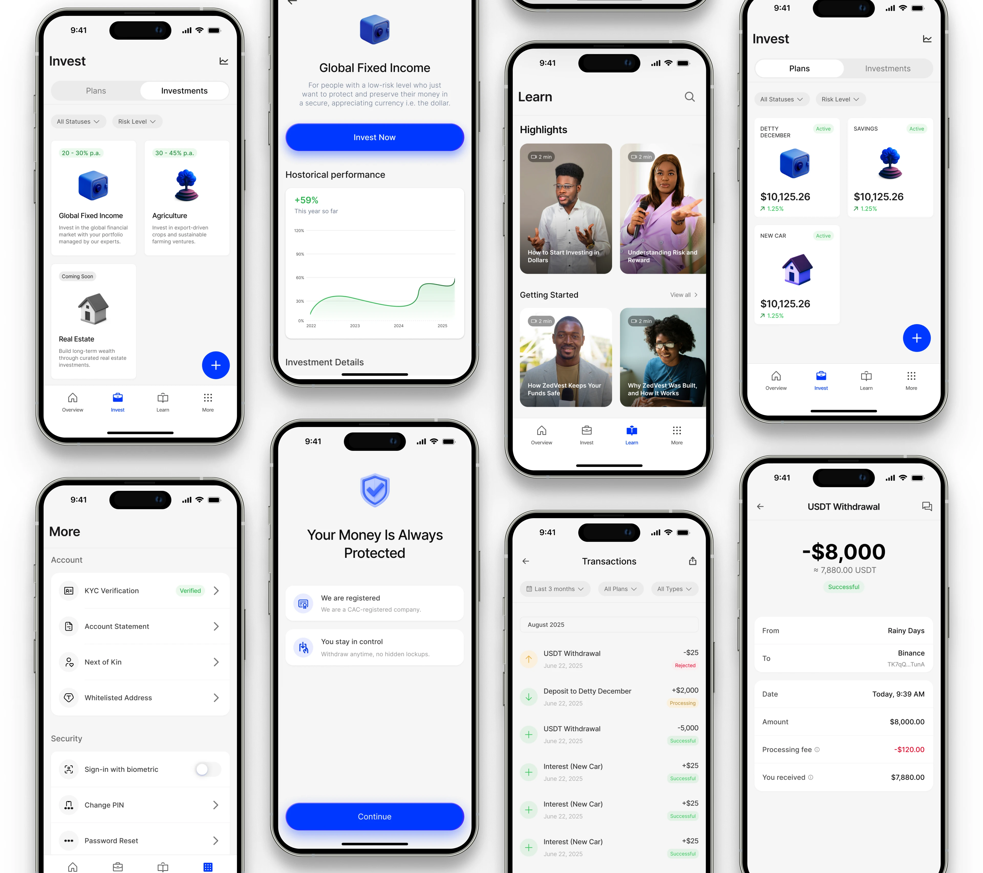
Funding: Dual Naira and USD wallet integration with intuitive currency switching.
Investment marketplace: Curated opportunities presented like cards, emphasizing simplicity over complexity.
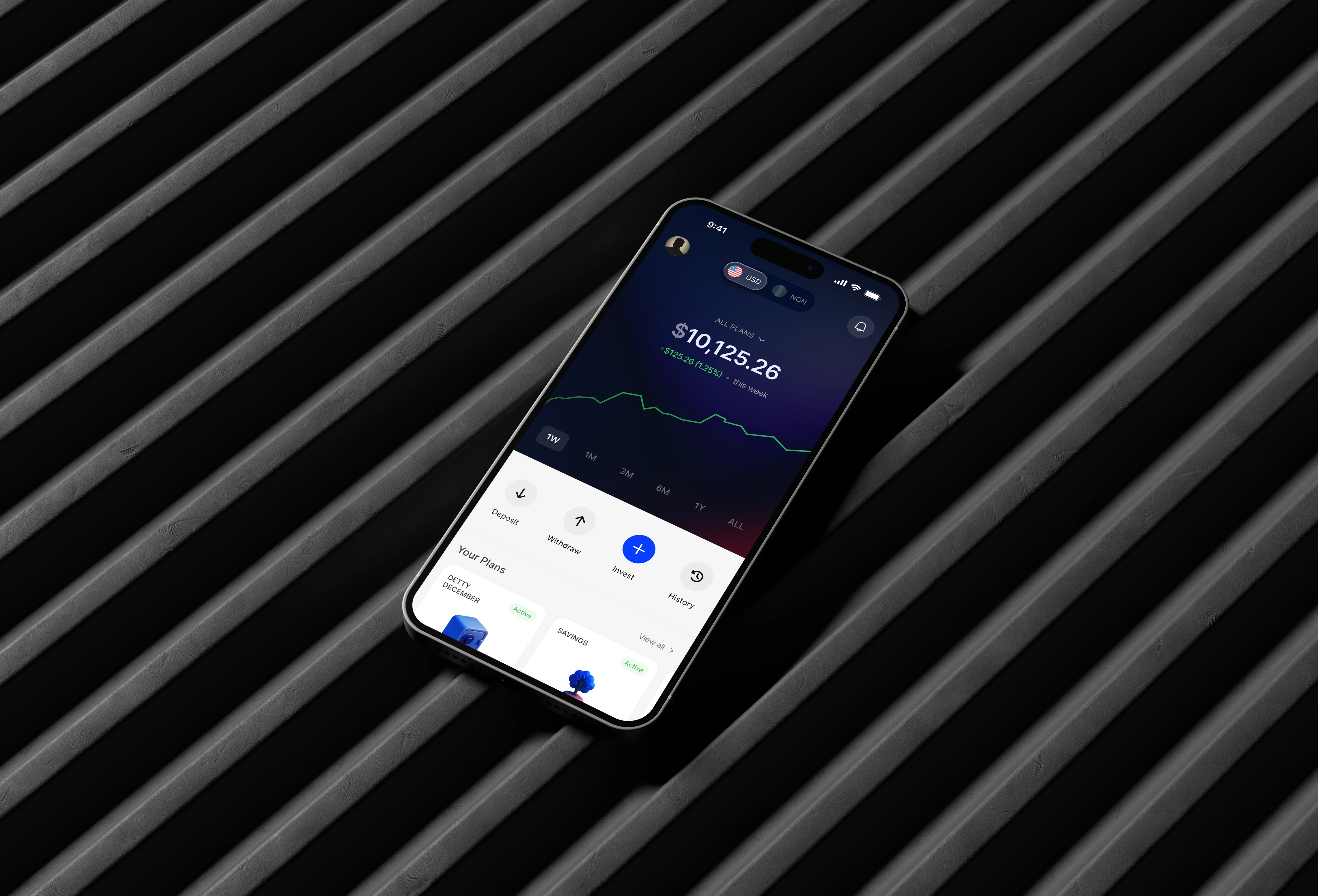
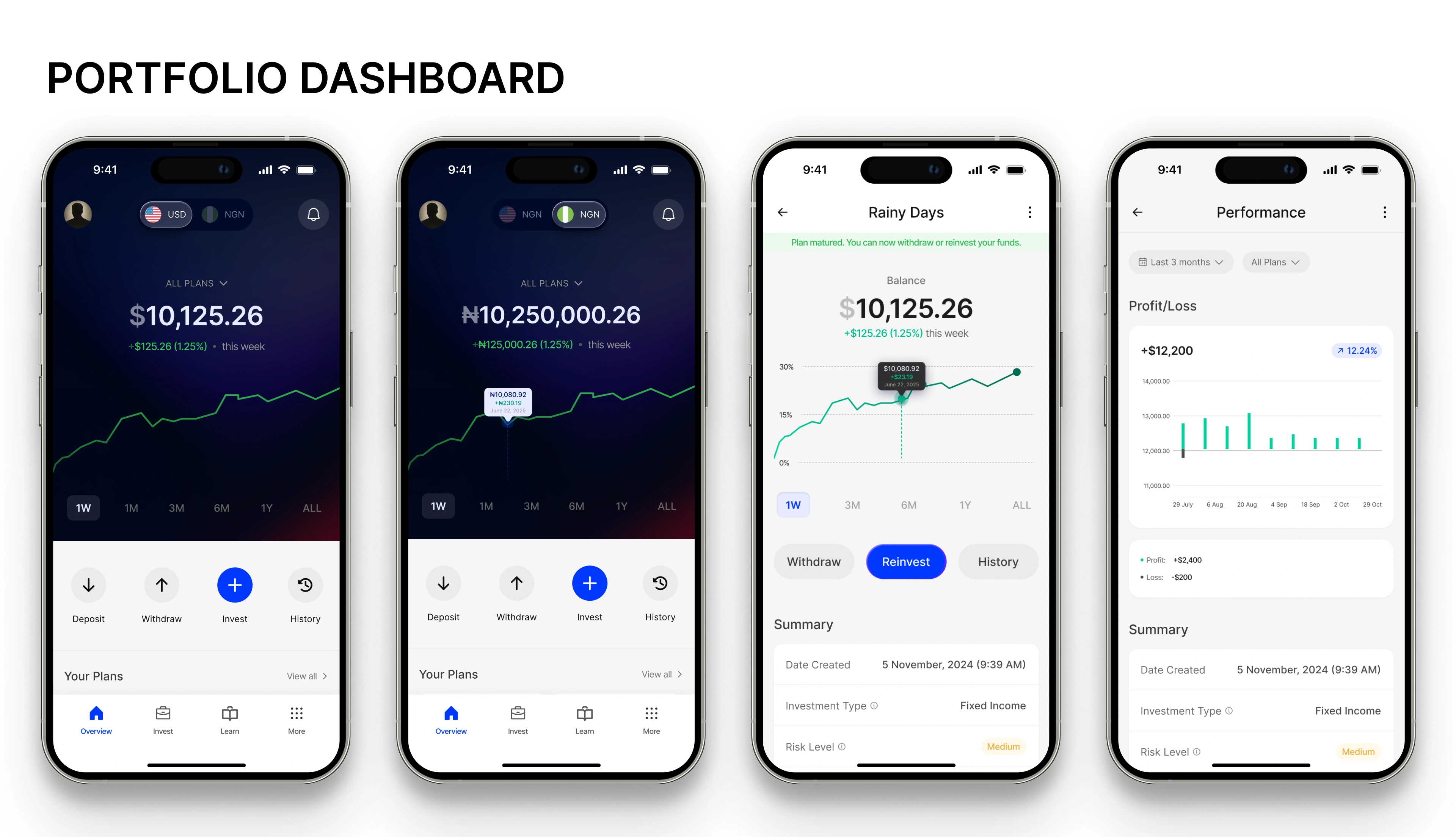
Portfolio dashboard: Clean, real-time insights with growth indicators and historical performance charts.
Withdrawal flow: Straightforward, reducing anxiety around liquidity.
Interactive Prototype
Created in Figma, linking all flows from sign-up to withdrawal.
Smooth animations to replicate real app behavior.
Clickable hotspots allowed stakeholders to experience core user journeys.
Outcomes
Delivered a polished MMP design for ZedVest covering onboarding, funding, investment, portfolio management, and withdrawals.
Created an interactive Figma prototype used to align with stakeholders and secure development approval.
Established a scalable design system ensuring consistency across future product updates.
Impact
Stakeholder alignment: The prototype allowed non-design stakeholders to clearly visualize flows, reducing back-and-forth.
Investor confidence: The design highlighted trust-building UI patterns (clear timelines, security cues, dual-currency support).
User readiness: Testing feedback confirmed that both beginner and experienced investors could navigate the MMP with minimal friction.
Reflections
Designing for a market like Nigeria required balancing simplicity with trust signals. Users were not only concerned about usability but also credibility and security.
The currency duality (Naira + USD) introduced complexity, but testing proved that a simple toggle solved most friction points.
Future iterations should explore:
Personalized investment recommendations to guide beginners.
Gamification / progress indicators to drive continued engagement.
Education layers (tooltips, explainers) to reduce intimidation for first-time investors.
Like this project
Posted Nov 4, 2025
My role was to design the end-to-end user experience, from onboarding and funding flows to investment discovery, performance monitoring, and withdrawals.
Likes
1
Views
21