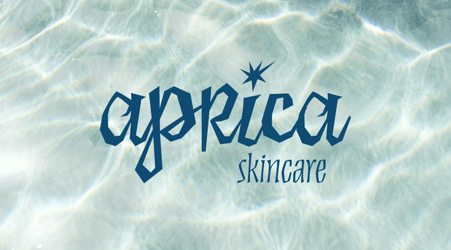
Brand Identity and Packaging Design for Aprica Skincare
Simona Todorova
Aprica Skincare needed a way to stand out on shelves in an oversaturated industry. Their primary target is women aged 16-35, who are environmentally-conscious, look to express their individuality, enjoy the outdoors, and are looking for products that are multi-purpose but effective so that they can minimize how much they carny with them on their adventures without sacrificing self-care.
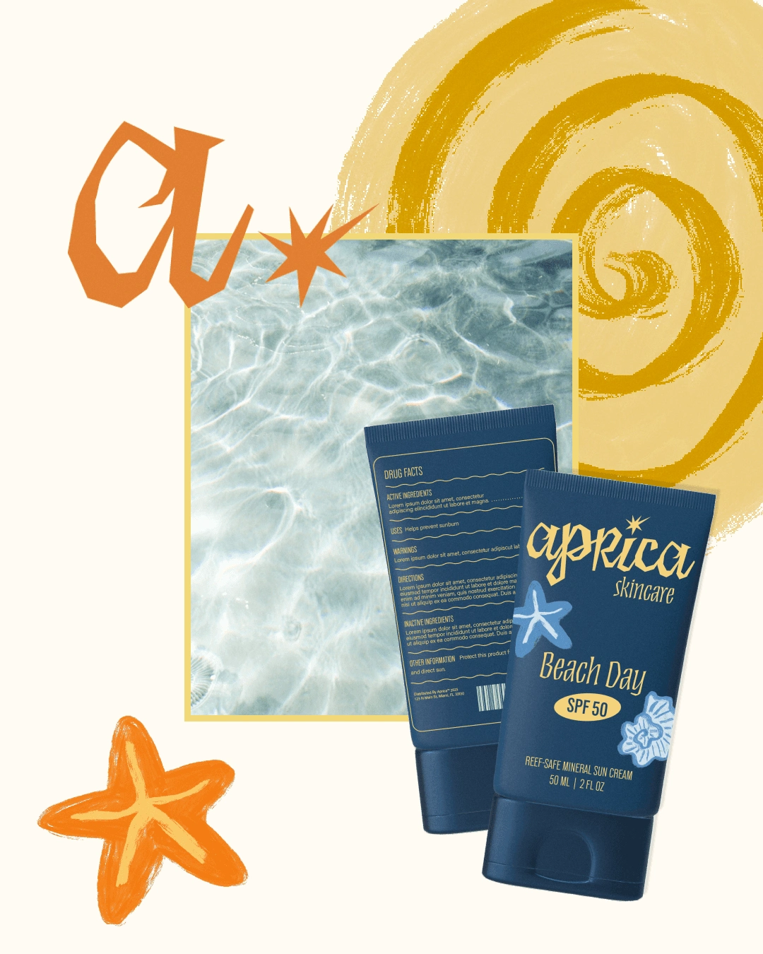
We decided to focus on colors rooted in nature, the sun, and the sea, and provided hand-drawn brand elements to create a whimsical and organic feel. Each color represents a different function for quick associations that are intuitive. The use of tactile elements of soft matte packaging and high-gloss key elements provides a multi-sensory experience that invokes luxury and quality while still maintaining whimsy and fun!

Like this project
Posted May 23, 2025
Developed a unique brand identity and packaging for Aprica Skincare using nature-inspired colors and tactile elements.
Likes
0
Views
4