Attalon — Digital Experience & UI System

Janet Wong

Attalon — Digital Experience & UI System
Role: Product Designer (UX/UI)
Focus: UI clarity, information architecture, technical communication
Overview
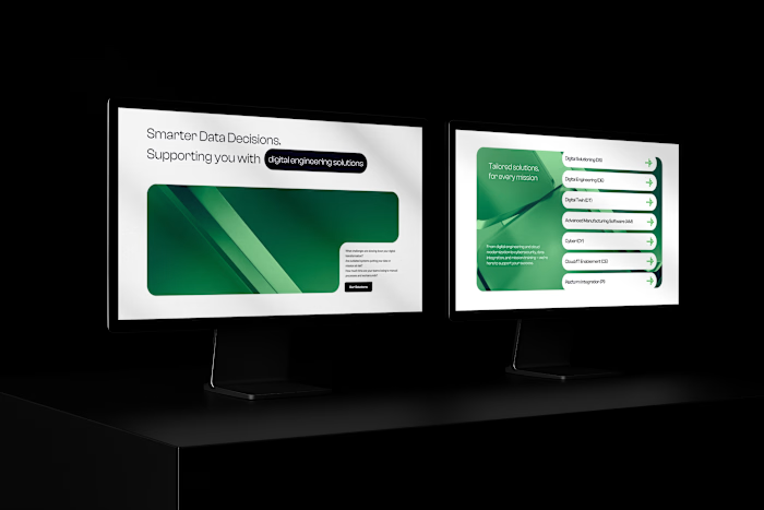
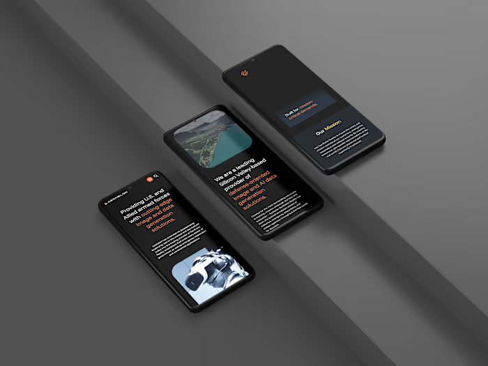
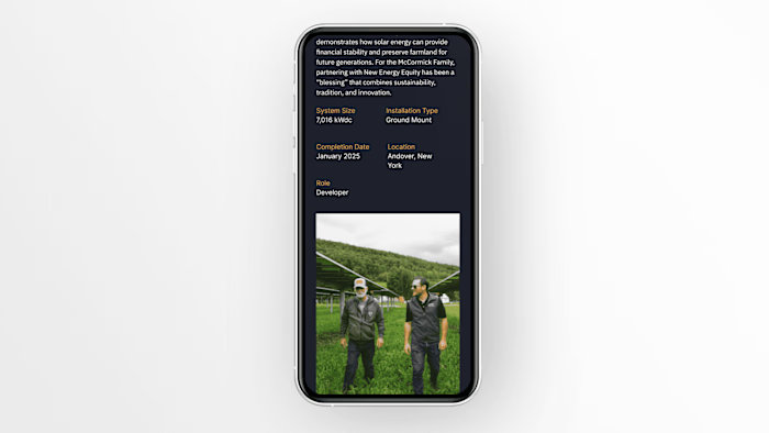
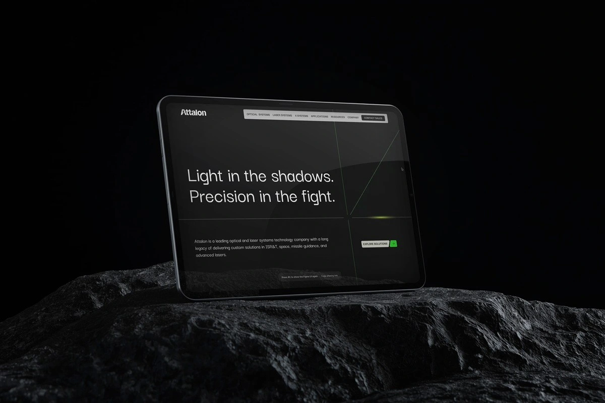
Designed a digital experience for a defense technology company, focused on translating complex technical information into a clear, structured, and user-friendly interface.
Key Improvements
Simplified complex technical content into clear, digestible UI
Designed structured layouts to improve information hierarchy
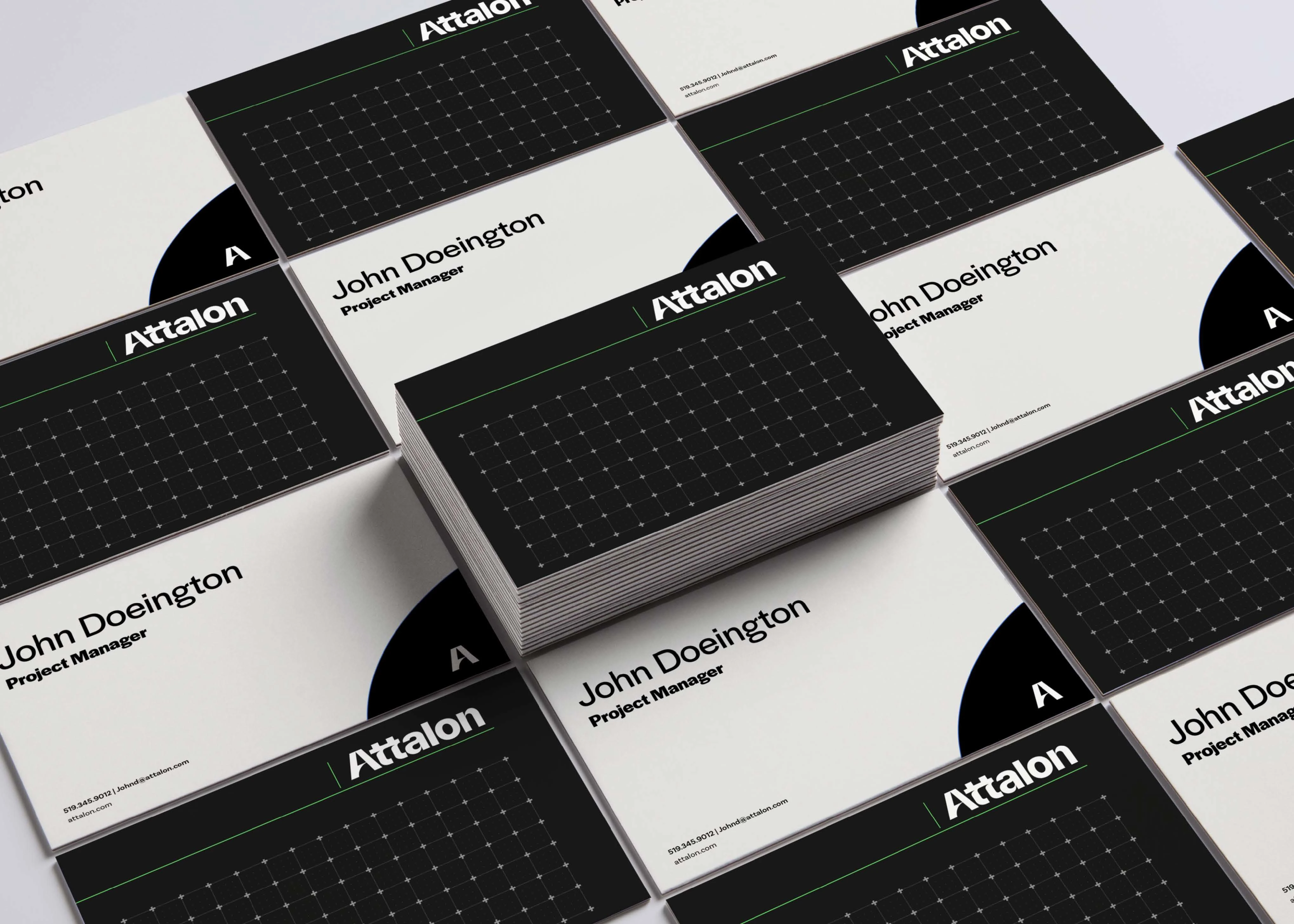
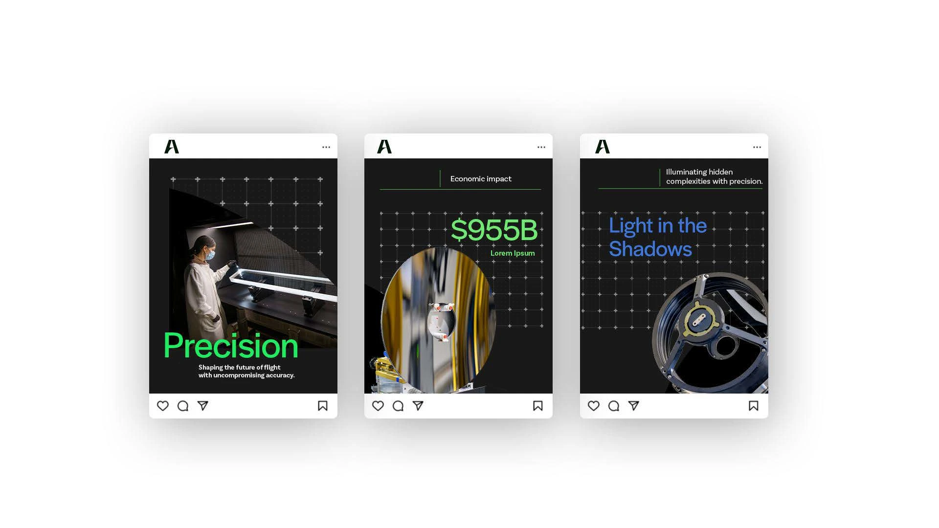
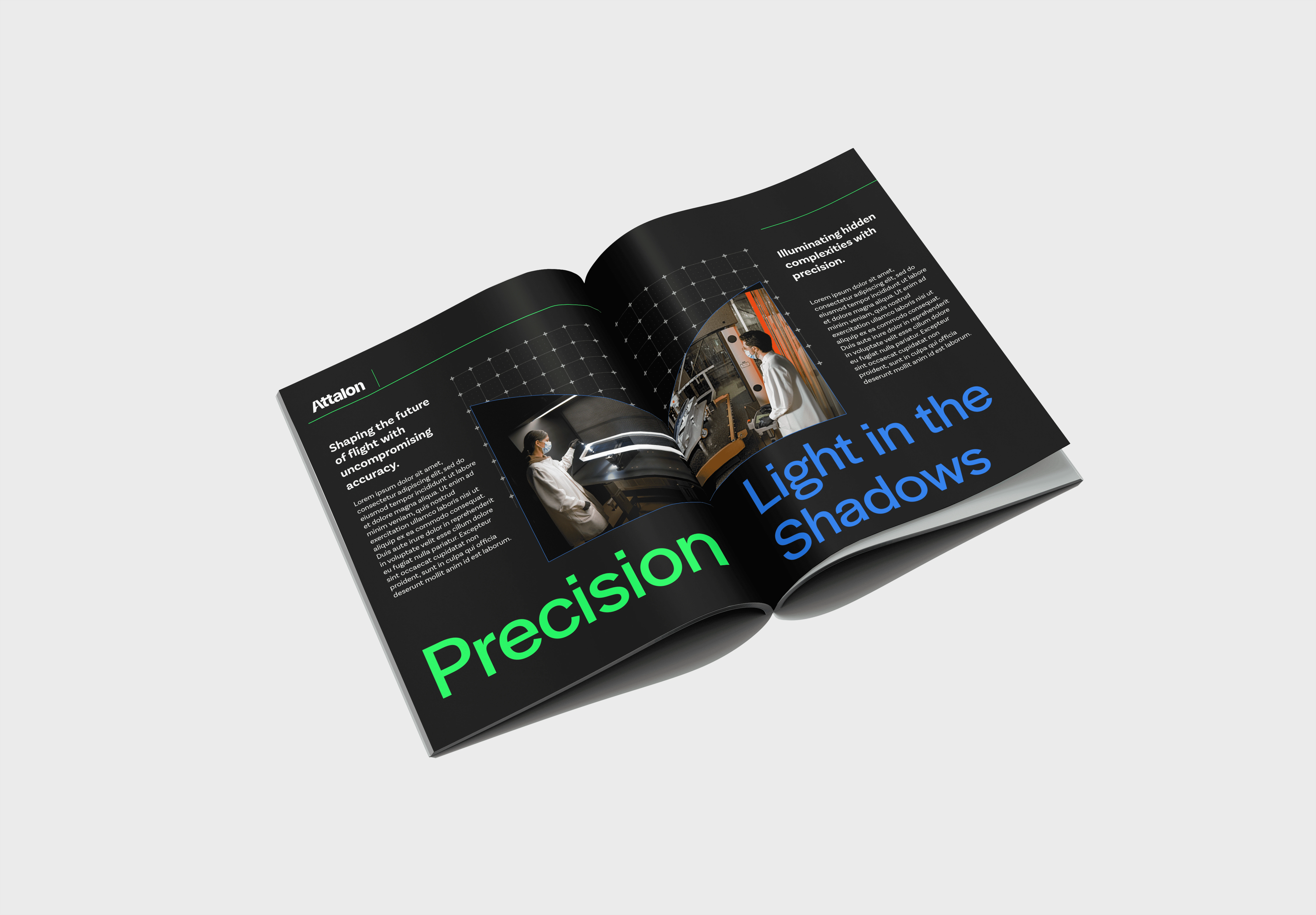
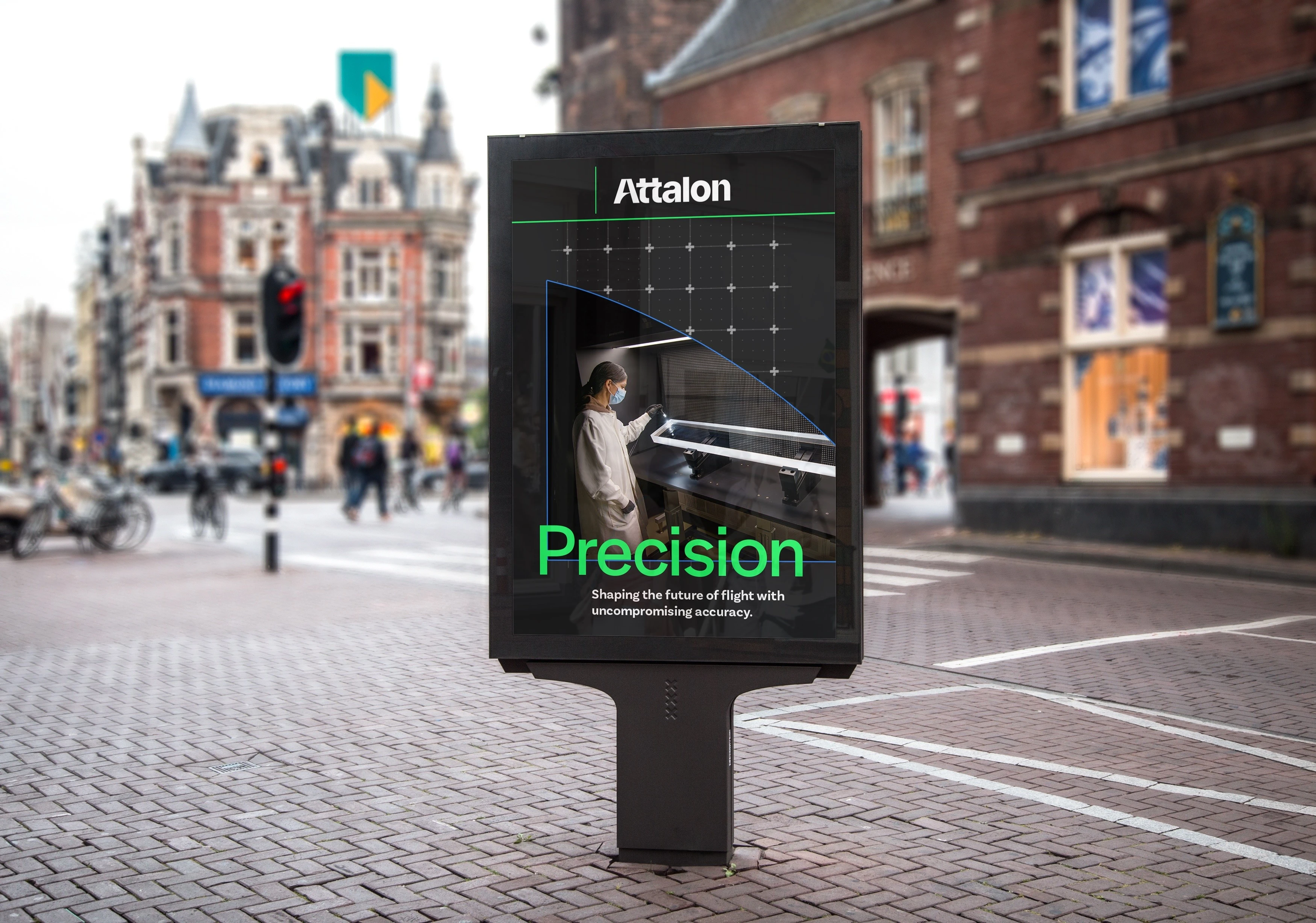
Created consistent visual patterns across pages
Improved clarity and usability for technical and non-technical audiences
The Problem
The product involved highly technical concepts that were:
difficult to understand quickly
inconsistently presented across pages
not optimized for clarity or usability
Approach
1. Translate complexity into clarity
Broke down technical content into structured sections that are easier to scan and understand.
2. Improve hierarchy and readability
Used typography, spacing, and layout to guide users through dense information.
3. Standardize UI patterns
Created consistent layouts and components to unify the experience.
4. Design for multiple audiences
Balanced clarity for both technical experts and general users.
System Thinking
Developed repeatable layout structures and UI patterns that could scale across multiple pages and future content.
Year
2025
Tools
Figma
Category
Branding and Identity
01
02
03
04
Like this project
Posted May 22, 2026
Designed a user-friendly digital experience for a defense technology company, enhancing UI clarity.
Likes
0
Views
0