Shihab Star
Alma Aurelia
About Shihab Star ⭐️
Shihab Star is a Muslim bulletin for youth in Bandung, Indonesia. Founded in 2006 the company has grown reputation where it has the bulletin that is awaited every month by young people, even the wider community in Bandung. After 9 years, Shihab Star finally ended publication in 2015.
In 2021, I was contacted to redesign the company logo to keep up with current trends and differentiate the brand within the market.
Why did Shihab Star need its logo redesigned? ✍🏻
When Shihab Star was first founded in 2006 by Asep Rohimat, there was a lack of Muslim bulletin in Bandung. This meant there was no direct competition to worry about. But then, the company ended publication in 2015.
After 15 years, the situation has changed with a range of similar Muslim bulletin, which means that Shihab Star has needed to be more strategic with its brand identity for its Comeback in 2021.
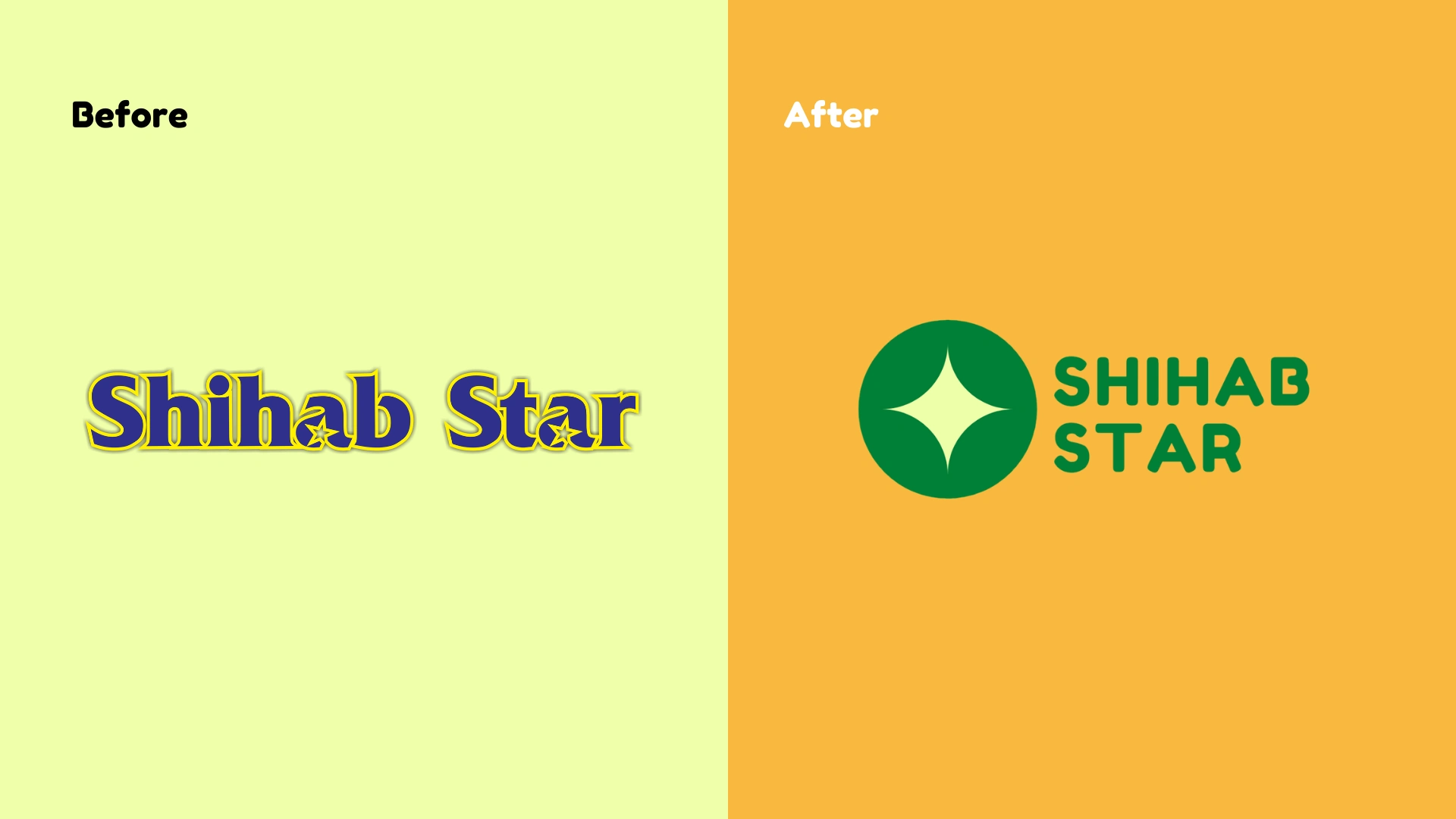
Before-After Logo
Previous Logo 💫
The previous logo design was colored in navy blue and light yellow. This color is reasonable to use because this logo was designed in 2006. There was a star symbol on each letter A to symbolize the 'star' itself. Shihab Star wanted the logo to be redesigned so that it would represent the branding as a trendy and fresh bulletin, that would appeal to the Muslim youth.
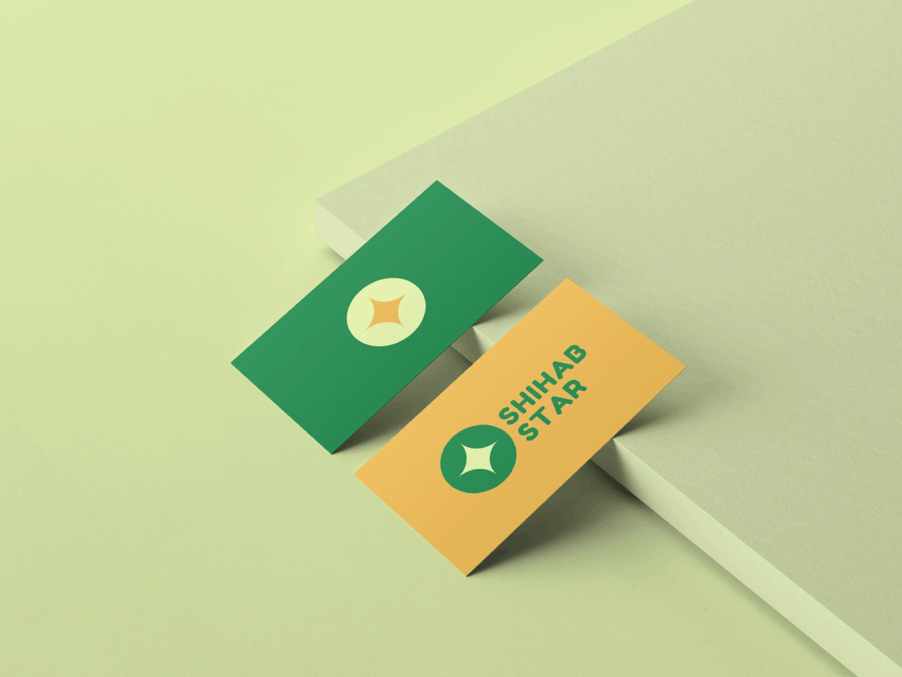
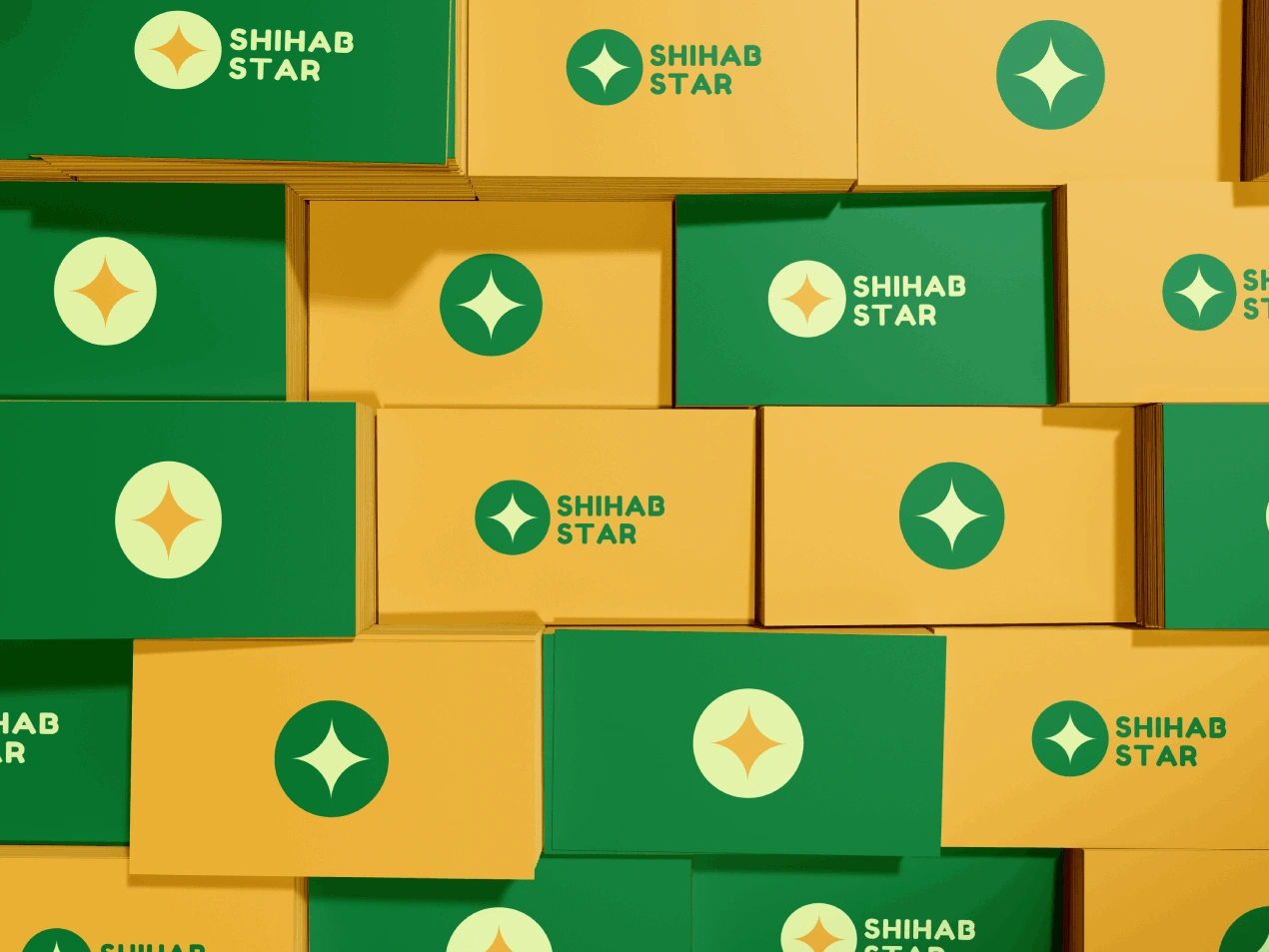
New Shihab Star Logo
New Logo Philosophy 🌟
Green means renewal, balancing, and harmonization. Yellow is associated with hope, bright yellow can give a feeling of happiness and joy. With this, it is hoped that the new Shihab Star can bring harmony and give joy to its readers. Shihab means light, the hope is that this media can become light through the media.
New Shihab Star Logo
Solution 🏁
The initial focus was to design a new star symbol. Various star symbols were explored during the idea generation phase, however, the final design is we keep the star symbol simple and clean, so we added a circle shape behind the star symbol resulted in a youthful icon.
A big, round, bold font was chosen to support the new symbol, which a dramatic change from the previous logo. This gives a greater sense of professionalism and simplicity. Altogether the final logo is a modern and youthful design that perfectly matches Shihab Star's comeback.
Like this project
Posted Apr 14, 2021
Shihab Star is a Muslim bulletin for youth in Indonesia. After 9 years, they ended its publication. In 2021, they needed a redesigned logo for their comeback.
Likes
0
Views
203
Clients
Shihab Star