Mom's Cookbook Website
Mom's Cookbook is an ongoing project created as a personalized wedding gift, designed to preserve and share cherished family recipes. As the client takes time to test and finalize the recipes, the project is progressing at a comfortable pace. The primary goal was to design an intuitive, editable website that captures the warmth of family cooking traditions. I aimed to ensure the site was responsive across all devices, allowing family members to access and add recipes conveniently, whether they’re in the kitchen or on the go.
Research, Wireframes, and Working in WIX
When I was first asked to design a cookbook website, I began by exploring various recipe sites to gather inspiration. Many existing platforms were either blog-based or cluttered, making it difficult to navigate beyond a specific recipe search. I wanted to avoid this complexity and instead create a user-friendly, intuitive experience for the family.
With my research complete, I transitioned into wireframing. Since the website would be built using WIX, I took time to explore their templates to better understand the platform’s capabilities and limitations. Although I had worked with WIX before, I had never used it for a client project, so I needed to ensure that the design and branding aligned with both the client’s needs and WIX's functionality. During the wireframing process, I worked closely with the client to make sure that all key features, such as easy navigation and recipe editing, were seamlessly integrated. The process involved several rounds of sketching and revisions until we found a design that best captured the client’s vision.
Taking the wireframes into WIX was the next step. I chose a template that matched our design goals, allowing me to focus on usability while taking advantage of WIX’s built-in features, like pre-programmed animations and flexible layouts. This approach not only streamlined development but also helped the client visualize the final site early in the process.
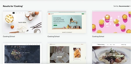
Wix Cooking Templates
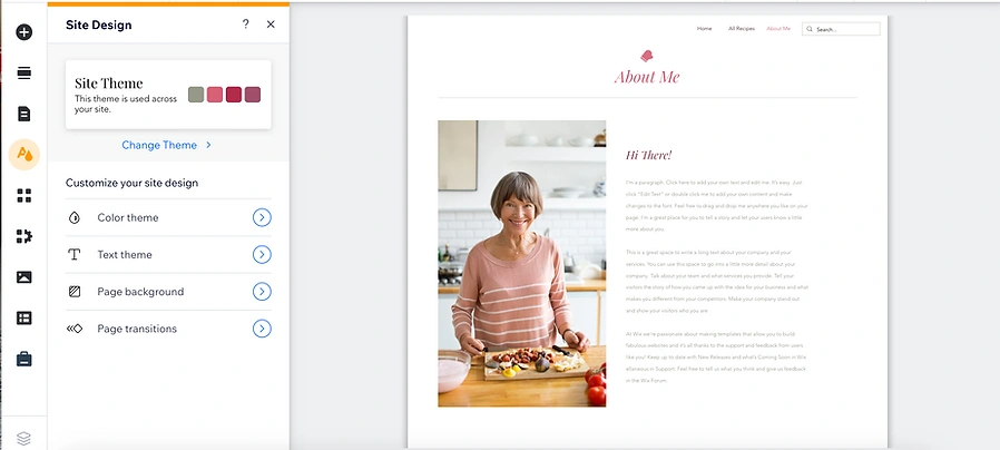
## Editing Wix Template to fit my wireframes
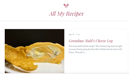
Recipe Blog Post
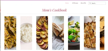
Home Screen of Mom's Cookbook
Deciding How to Add Recipes and Finishing Touches
With the wireframes in place and the WIX template selected, I turned my attention to structuring the recipe input system. There were two primary options: creating individual sub-pages for each recipe or using WIX’s blog feature. While the sub-page method made it simple to add recipes, it would limit filtering options and might result in inconsistent design across the site. Conversely, the blog feature provided built-in tagging and filtering capabilities, which would significantly improve usability, but it introduced a steeper learning curve for the client.
After carefully considering both approaches, I chose to implement the blog feature. Though it required additional training, the long-term benefits of organization and filtering made it the ideal solution. I worked closely with the client to ensure they were comfortable navigating and updating the system, offering tutorials and ongoing support to ease the transition.
With the recipe structure finalized, I shifted focus to the UI design and final touches. During this phase, I incorporated images and polished the visual design to create a seamless and inviting user experience. We had already discussed the color scheme, fonts, and iconography, so bringing those elements into the design was straightforward. However, while testing the site’s mobile version, I identified some navigation issues that needed adjustments. By refining these aspects, I ensured that the site would function just as effectively on mobile devices as it did on desktop.
Conclusion
This project gave me invaluable insights into balancing user needs, client input, and technical constraints. Throughout the design process, I had the opportunity to delve deeper into the importance of research, ensuring that the site avoided the complexity and clutter found in many existing recipe-based websites. By focusing on a clean, intuitive user experience, I aimed to make the website as approachable as possible for a multi-generational family.
I also learned a great deal about adapting my design to fit the limitations and strengths of WIX. Collaborating closely with the client throughout the wireframing and prototyping phases taught me how essential it is to remain flexible in response to feedback and evolving requirements. This project highlighted the importance of long-term usability and planning for ease of editing, which became central to the decisions I made regarding how recipes would be added to the site.
Overall, this project deepened my understanding of how thoughtful research and an iterative design process can shape a successful and meaningful digital experience. While the project is ongoing, I’m proud of the progress made so far and am confident it will provide a lasting, functional gift for the family.
To view the website, visit: Mom's Cookbook
Like this project
Posted Sep 26, 2024
Mom's Cookbook is a personalized recipe website created to preserve and share family recipes. Designed to be user-friendly, responsive, and easily editable.
Likes
0
Views
7
