An App for Hogle Zoo
Mariah Foerster
One day while planning a trip to the Hogle Zoo, I noticed that while they had a website, they didn't have a dedicated app. That sparked an idea to create a prototype for them. My goal was to design a user-friendly app that would enhance visitor experience by providing essential information, navigation tools, and interactive features. I wanted the app to be intuitive enough for users to easily navigate while exploring the zoo but also immersive, encouraging deeper engagement with exhibits and events.
Research and Exploration
Before starting the design process, I began by exploring the existing Hogle Zoo website and reviewing apps from other zoos and aquariums. While larger zoos had apps, mainly focused on navigation, I noticed that there weren’t many zoo or aquarium apps in general. This led me to expand my research to include amusement park apps, as they offer similar visitor experiences where people need real-time information while moving around a large space. Key features that stood out in these apps included interactive maps, live cams, event schedules, and detailed information about attractions.
In addition to this, I visited Hogle Zoo to observe how visitors navigated the zoo, what signage they relied on, and which areas seemed to be confusing. These in-person observations were critical in shaping the core features of the app and its overall structure.
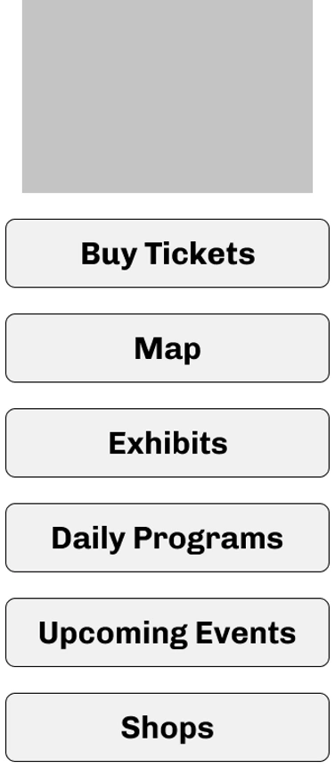
Home Page Gray Comps
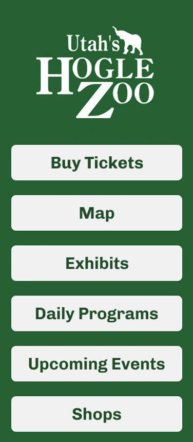
Home Page Final Color Comps
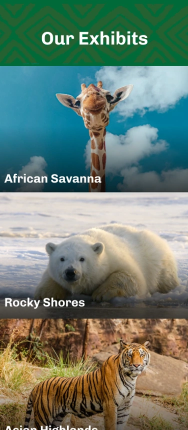
Exhibits Final Color Comps
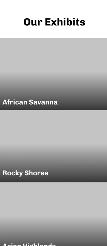
Exhibits Gray Comps
Sketching, Wireframing, and Visual Design
After gathering insights from my research, I began sketching ideas for the app’s layout. My primary goal was to ensure the app was simple and intuitive, making it easy for any visitor to use while navigating the zoo. The initial sketches focused on a flow that would start with purchasing tickets and then guide users through essential features like the interactive map, animal information, and event schedules. Once the sketches were refined, I transitioned to wireframing to solidify the structure and ensure consistent, user-friendly navigation throughout the app.
As the wireframes took shape, I moved on to adding visual elements. It's important to note that the images used in the prototype were free stock images, not specific to Hogle Zoo. For the design, I aimed to capture the vibrant, natural atmosphere of the Hogle Zoo while staying true to their branding. I carefully examined their website, incorporating earthy tones and playful icons to align with their existing visual identity. During this phase, I conducted user tests to gather feedback on both design and usability. Based on this feedback, I made adjustments to button sizes, color contrast, and the overall layout, ensuring the app was both engaging and functional.
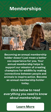
Memeberships Page
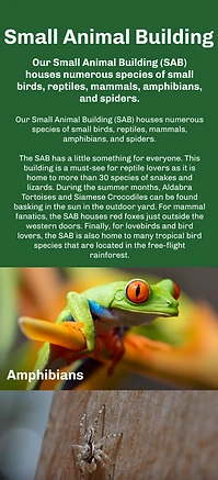
Small Animal Building Page
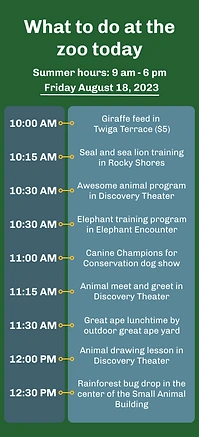
What To Do Today Page
Prototyping, User Testing, and Presentation
With the wireframes and visual elements in place, I moved on to building the prototype, aiming to get as close as possible to a real app experience. The goal was to create a fully functional, clickable prototype that allowed users to interact with its key features and get a true sense of the app's flow. Throughout the prototyping phase, I tried new prototyping options in Figma and continuously tested the app with a small group of users to gather feedback on functionality, ease of navigation, and overall usability. Each round of testing offered valuable insights, helping me refine the layout, interaction design, and overall user flow.
After integrating this feedback, I developed the final version of the prototype, ensuring it was polished, intuitive, and aligned with the zoo's brand. When I was ready to present the app to Hogle Zoo, I spent time finding the right contact and eventually sent an email with a detailed project description and the prototype link. In the description, I highlighted the app's core features and demonstrated how it would enhance the overall visitor experience. Although the feedback was positive, the zoo decided to revisit the project at a later date.
You can view the final prototype here: Hogle Zoo Prototype
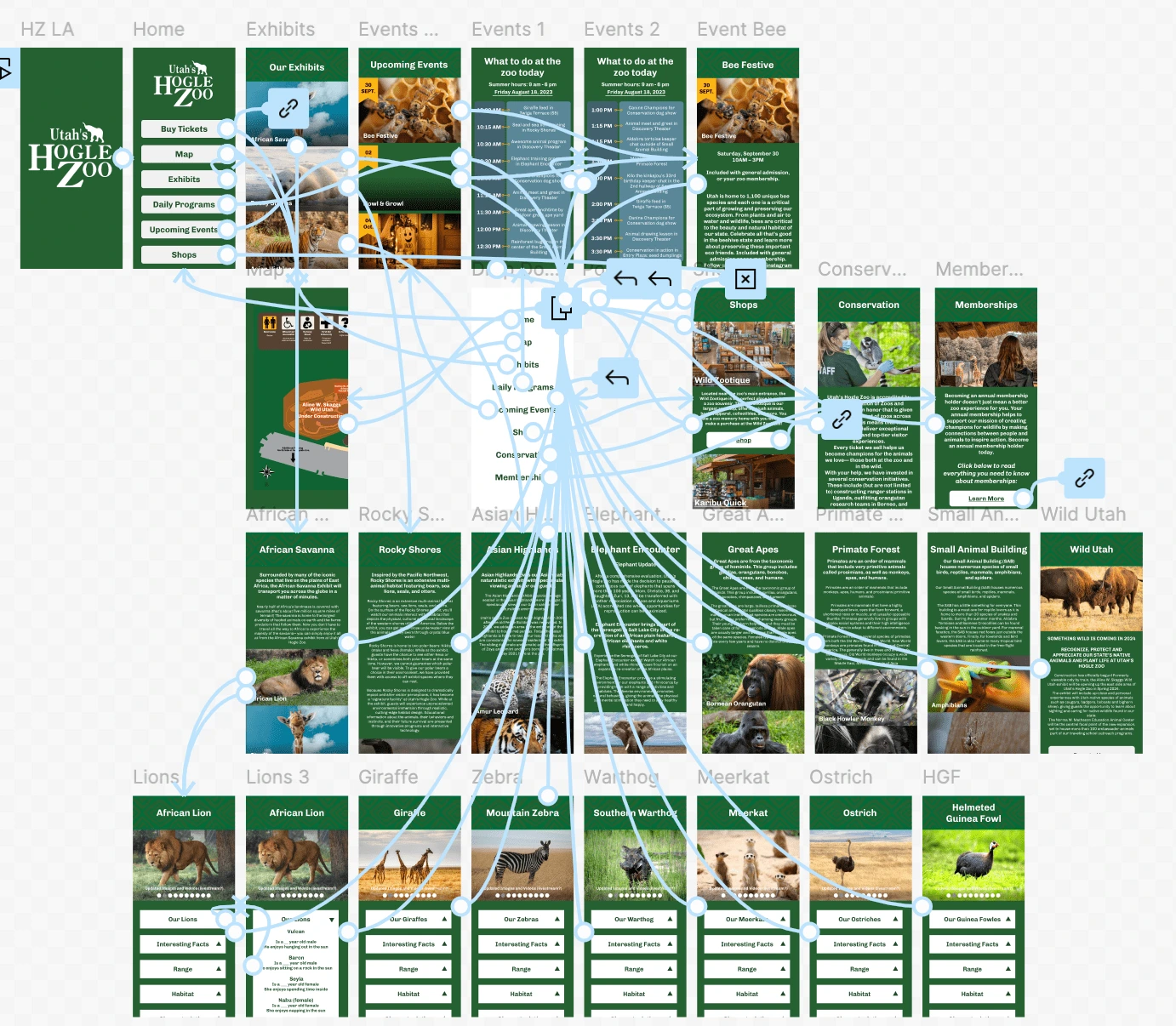
Prototype Spaghetti
Conclusion
This project was a valuable learning experience in understanding the connection between digital tools and physical environments. Through focused user research and testing, I gained a deeper appreciation for designing with the end user in mind, rather than relying on assumptions. The research and feedback I gathered directly shaped the app's design, reinforcing the importance of understanding how people interact with both digital interfaces and real-world spaces.
Additionally, this project emphasized the need for flexibility throughout the design process. From wireframes to the final prototype, I had to adapt based on user feedback, continually refining both the functionality and visual elements. This iterative process taught me the importance of maintaining an open mindset and the ability to pivot as needed to improve the final product.
Even though the Hogle Zoo team is not moving forward with the app at this time, I’m confident that the work I've done will have a lasting impact, even if only on my design process. The project provided valuable insights into designing digital experiences that enhance real-world interactions, and it reminded me of the importance of patience and persistence when seeking opportunities to create meaningful design solutions. It has strengthened my understanding of how digital tools can transform visitor engagement, and I look forward to applying these lessons in future projects.
Like this project
Posted Sep 26, 2024
The Hogle Zoo App project was designed to enhance the zoo experience with features like an interactive map, animal profiles, and event schedules.
Likes
0
Views
10