Creation of Distinct Brand Identities for Five Clients
Mary Anne Josette
Five brands. Four voices. One approach.
Each of these brand identities was built from the ground up — different industries, different clients, different worlds. What they share is the belief that a strong visual identity is not decoration. It is a strategy made visible.
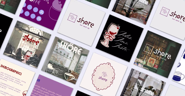
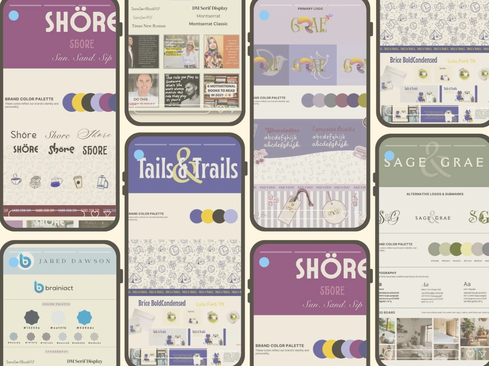
Shöre Cafe
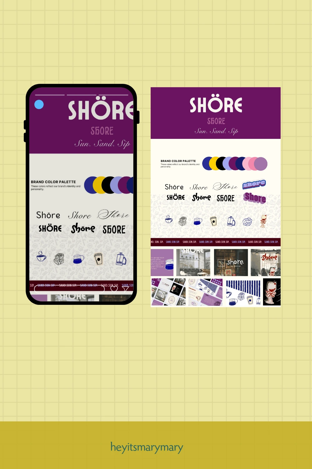
Shöre needed a brand that could hold two moods in one name — morning coffee and evening wine. The palette landed on deep purple and cream, grounded and coastal at once. Six logo directions were explored before the stamp motif became the anchor: something that felt like a place worth remembering.

"A brand that knows its mood at every hour of the day is a brand people return to."
Tails & Trails
Navy, olive, cream, and a pop of yellow. A cat with a suitcase. A bear in sunglasses. The characters were designed before the rules — and they changed everything. Tails & Trails became a brand that pet owners don't just trust. They wear it on their luggage tags.
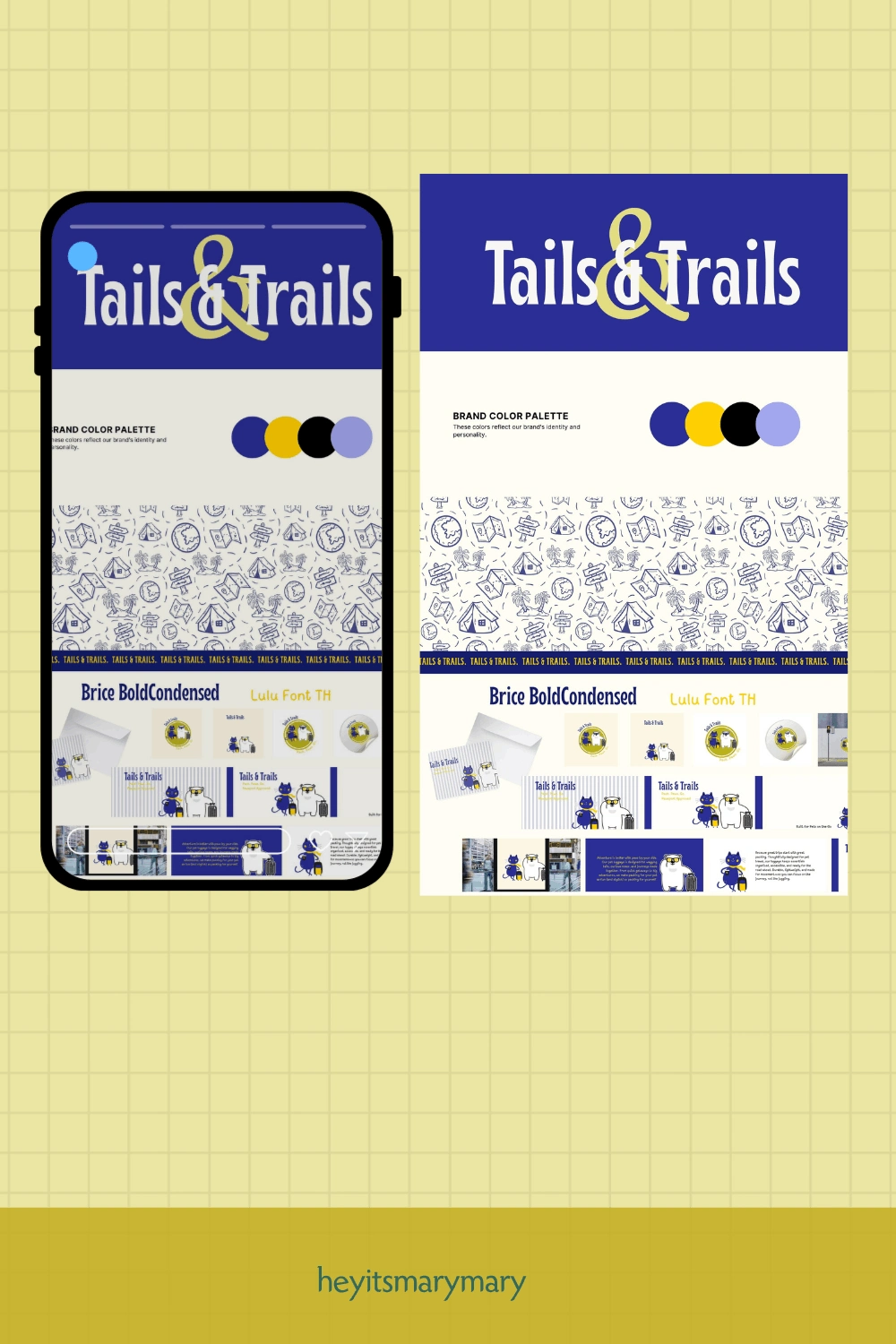
"The best brand identity doesn't look designed. It looks inevitable."
Grae
Grae arrived with a palette of lavender, slate, plum, navy, and olive — moody, layered, and quietly confident. The logo carries an illustrated bird mid-flight, and the typography pairs handwritten warmth with structured serif. The stripe pattern and hang tags turned the identity into something tactile — a brand you want to hold in your hands.
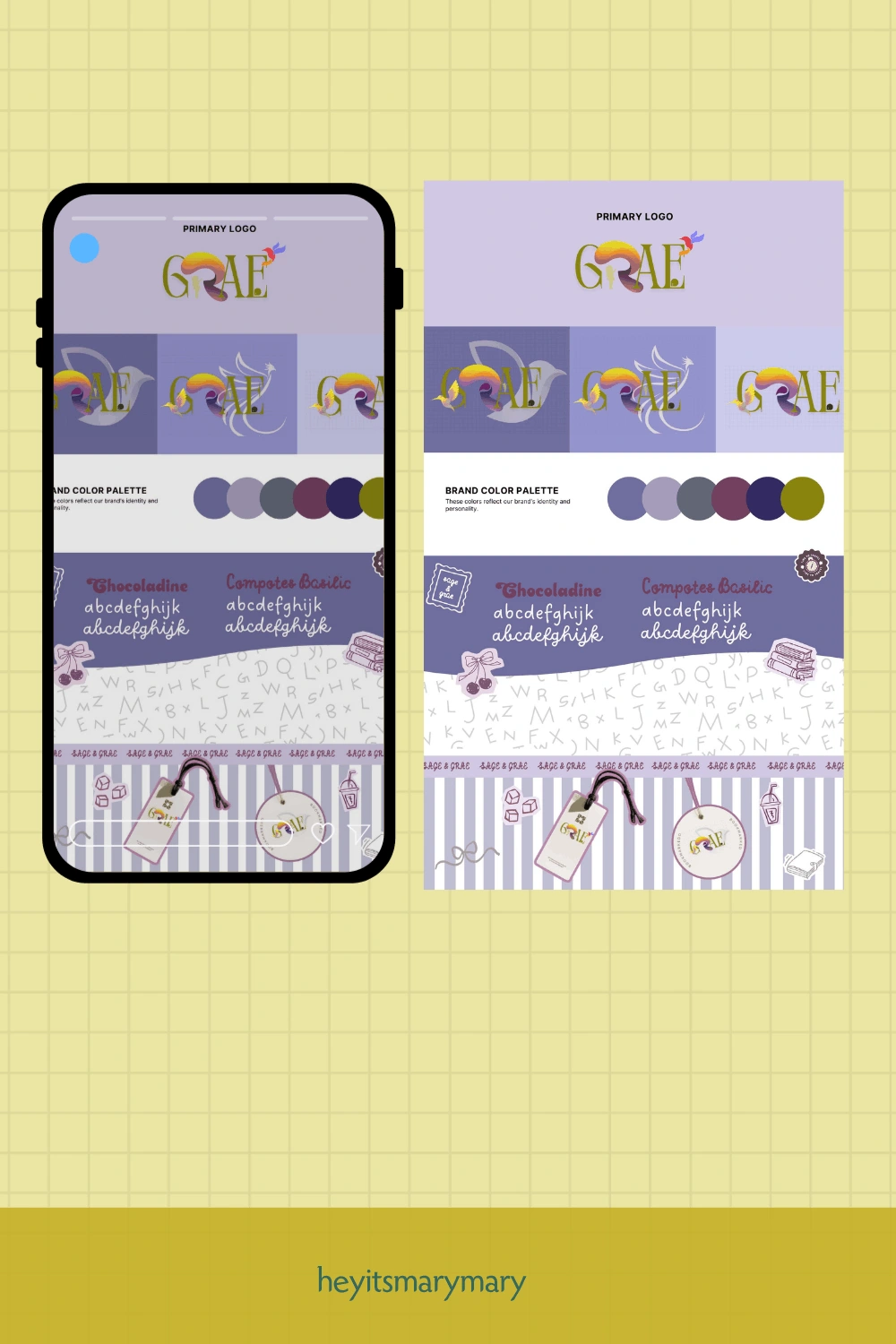
"Some brands whisper. Grae was designed to be the kind of whisper you lean in to hear."
Sage & Grae
Sage & Grae is a brand for people who care how a room feels. The palette — sage green, olive, butter yellow, warm grey, and slate blue — was chosen to feel like a Sunday morning with good light. Three logo variations were developed: a full wordmark, a monogram mark, and an ampersand submark that works alone. Typography is clean and grounded, the mood board earthy and inviting.
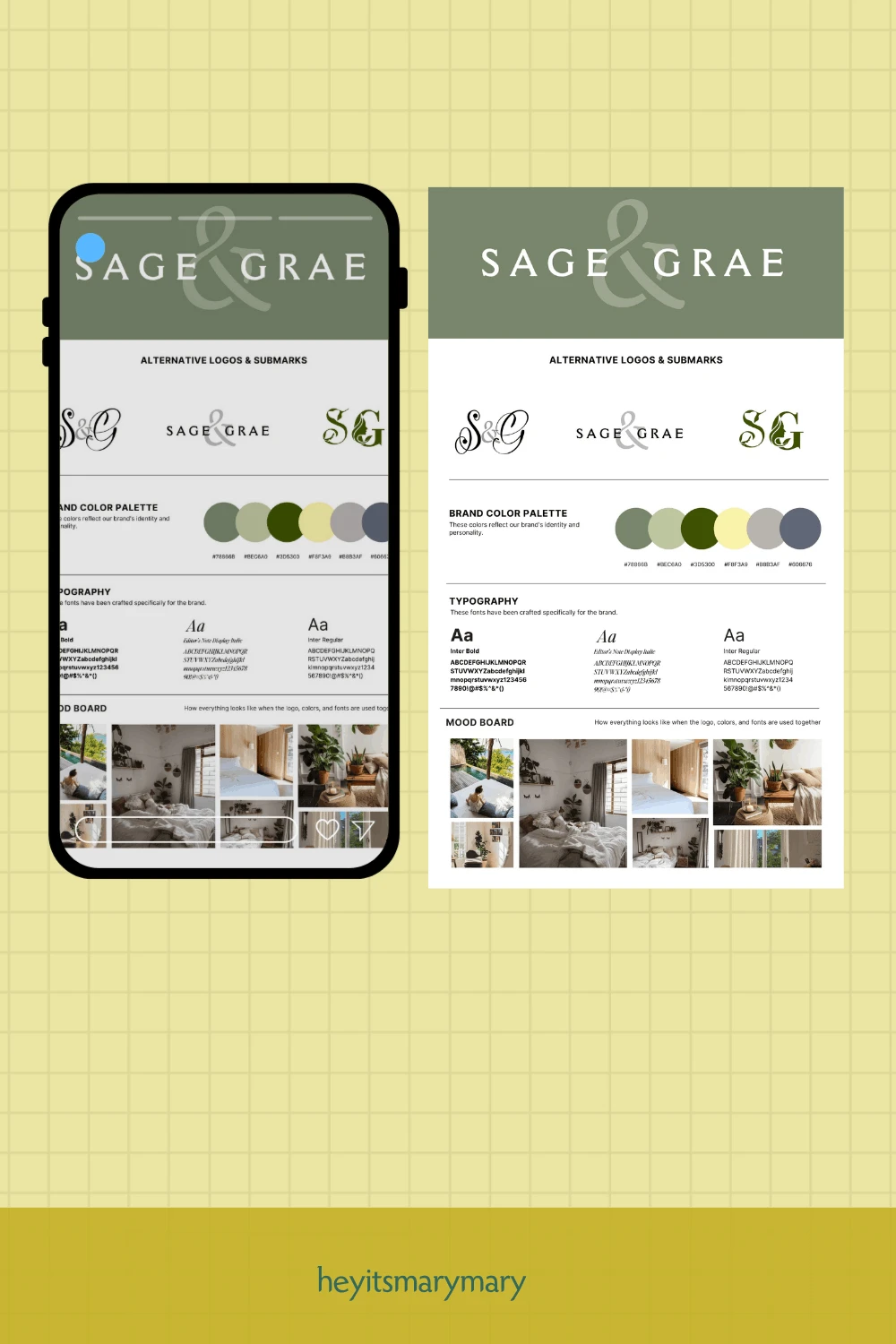
"A home brand has to feel like home from the first glance. That's the whole brief."
Jared Dawson / Brainiact
Jared Dawson is a thought leader, and his brand had to look the part. The Brainiact identity uses a deep navy, sky blue, and ice — a palette that reads as intelligent and direct. Social media templates were built for scale: quote cards, motivational posts, book recommendations, and call-to-action graphics, all locked to the same visual system so the feed stays consistent as the content grows.
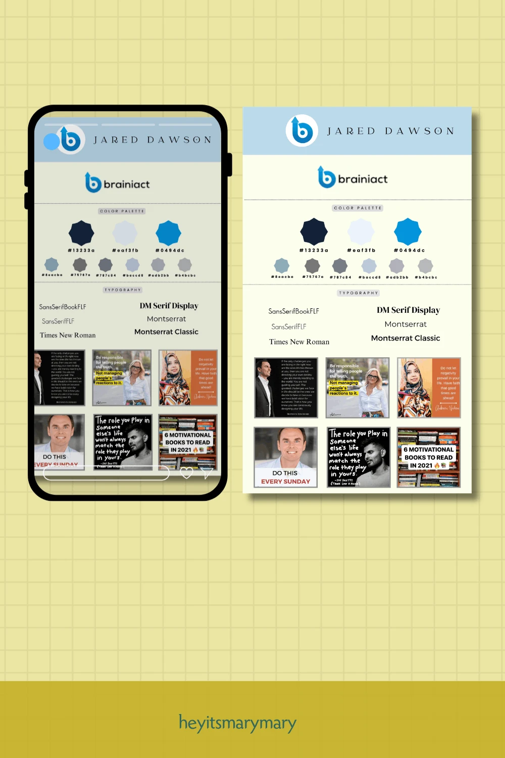
"A personal brand is a promise. The design has to keep it — every single post."
If you want your brand to speak more, send me a message 📩
Like this project
Posted Jun 29, 2026
Created unique brand identities for five clients across various industries.