WeReload Brand Identity & Mobile App Design
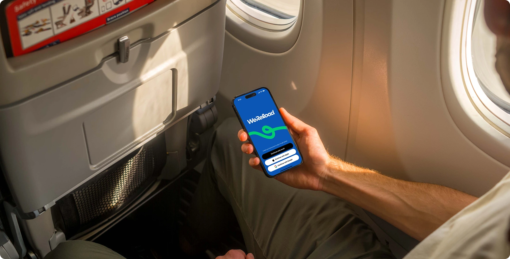
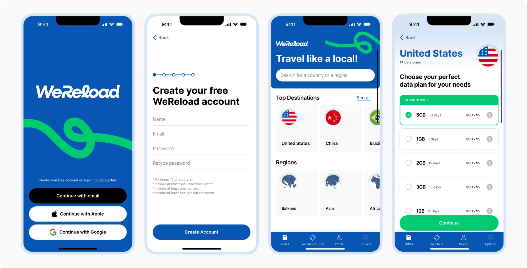
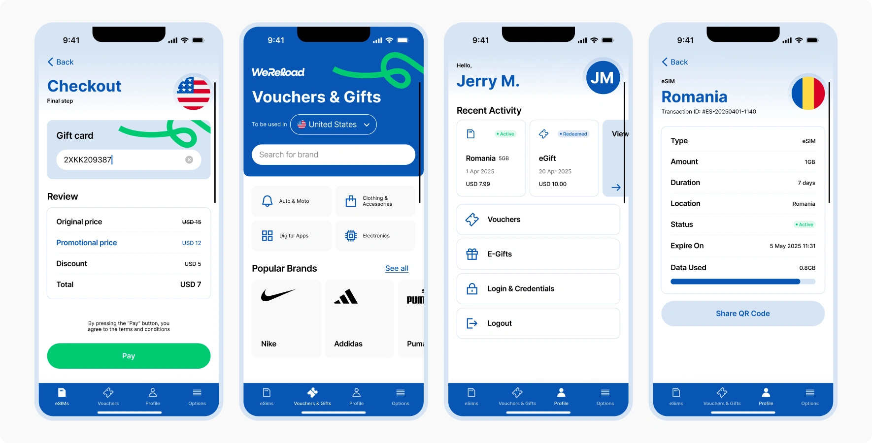
WeReload is a forward-thinking digital connectivity provider specializing in eSIM technology. Designed for international travelers, it offers affordable, hassle-free mobile data plans across 200+ countries, enabling seamless global connectivity without costly roaming fees. The user-friendly app simplifies purchasing, activating, and managing data plans, ensuring effortless connectivity on the go.
Logo Concept
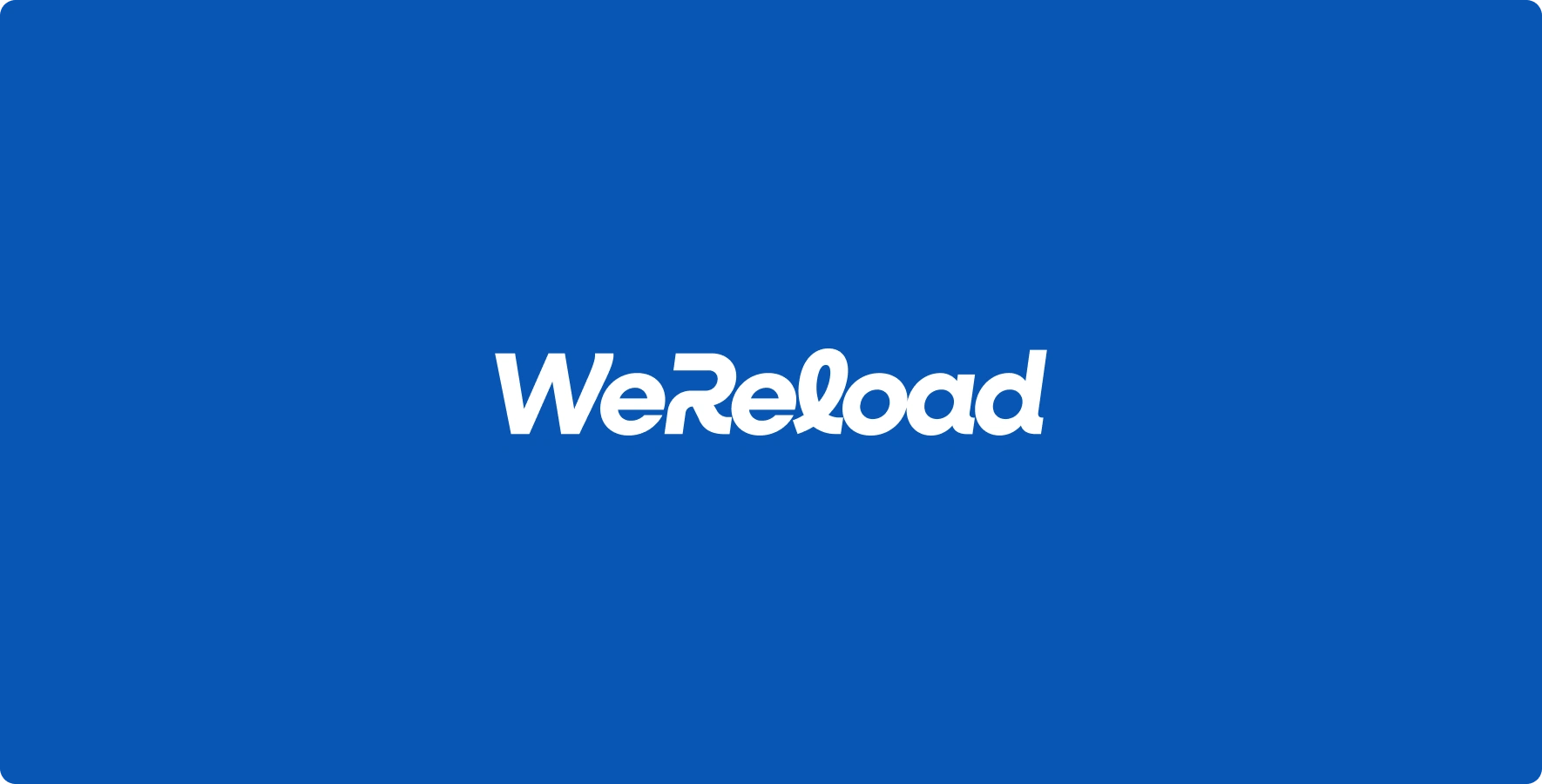
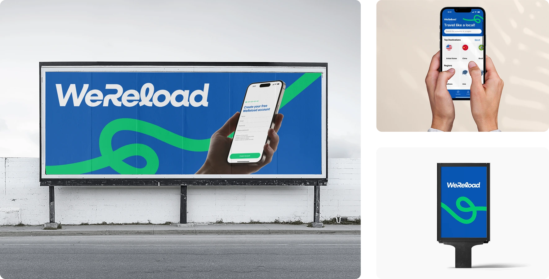
The WeReload logo is a typographic design integrated with a flowing line graphic, symbolizing continuous, uninterrupted connectivity. This element reflects the smooth transitions between networks enabled by eSIM technology, highlighting the brand’s commitment to reliable, seamless digital experiences worldwide.
Approach
Our design approach focused on clarity, simplicity, and user-centricity. The modern typographic logo and flowing line graphic were created for instant recognition across digital platforms.
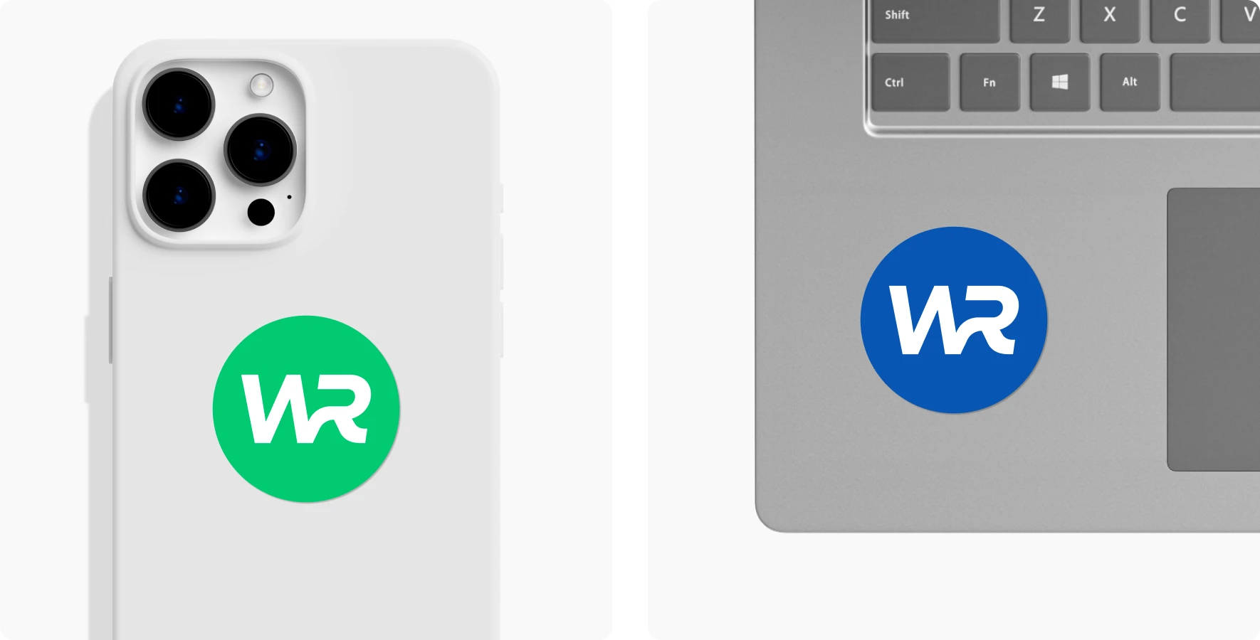
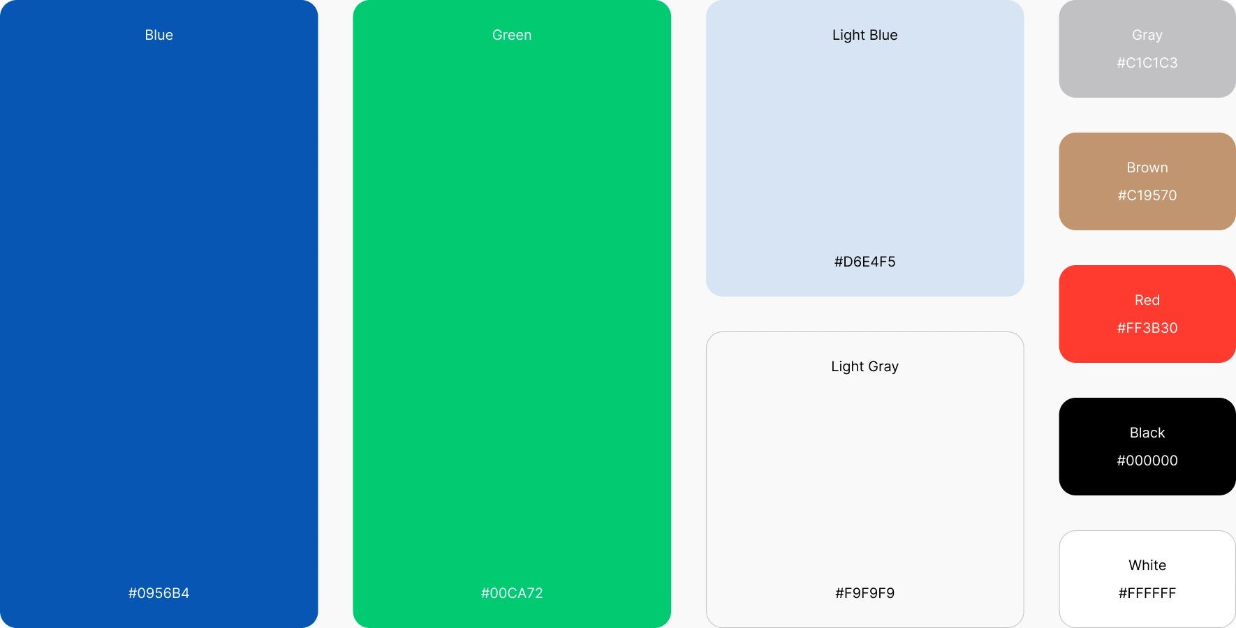
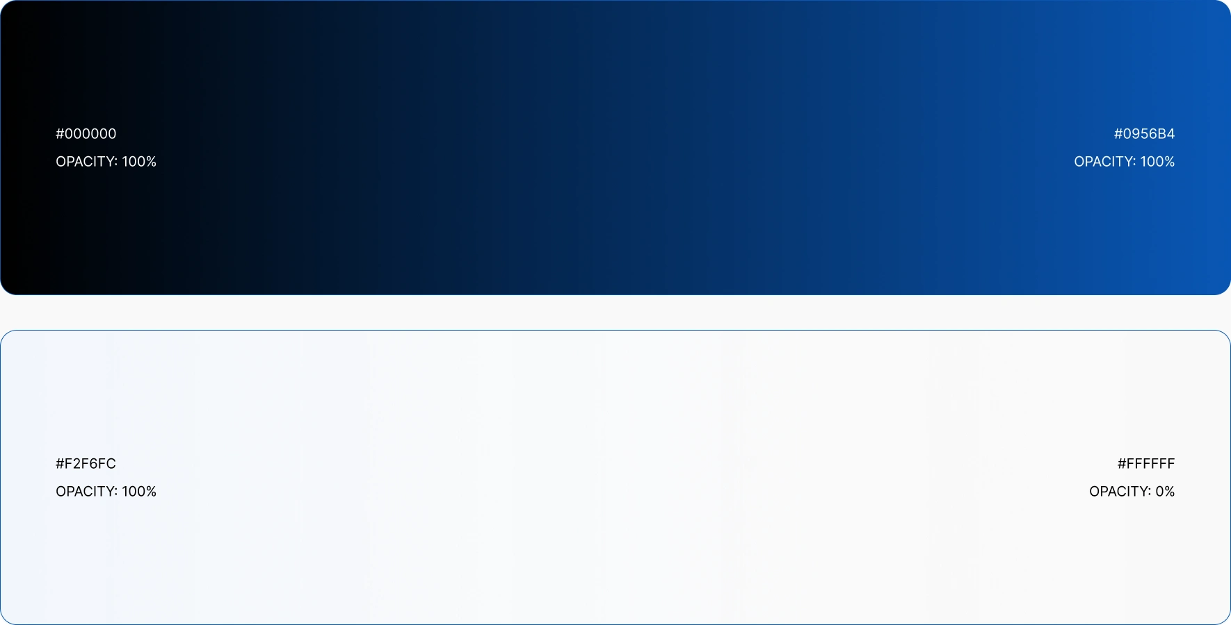
A color palette of blues and greens—complemented by light blue, gray, and selective tertiary accents—was used to convey trust, freshness, and visual interest. Bold yet soft gradients bring depth to interactive elements while maintaining a clean, modern aesthetic.
Typography (Inter) ensures legibility across all screens, while minimalist icons guide users intuitively without distraction. Together, the visual elements establish a cohesive, approachable, and user-friendly brand identity that embodies WeReload’s promise of seamless connectivity.






Like this project
Posted Sep 26, 2025
Designed WeReload’s brand identity with a flowing logo, fresh colors, and intuitive visuals, reflecting seamless, global eSIM connectivity for travelers.

