Luxury brands don’t need louder

Ismail khalid


Luxury brands don’t need louder design.
They need stronger presence.
That was the thinking behind Réverie.
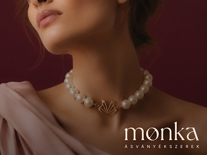
A jewelry identity built to feel refined, elegant and instantly premium.
The system combines:
💎 A distinctive geometric brand mark
🍷 Deep burgundy for richness and confidence
🤍 Warm cream tones for softness and balance
🖋 Refined serif typography
📸 Editorial jewelry imagery
📱 Social, print and campaign applications
The goal was simple:
Make the brand feel valuable before the customer even sees the price.
Because in luxury, perception starts long before purchase.
A logo alone cannot create that.
The whole system has to work together.
Packaging.
Social content.
Brochures.
Campaigns.
Outdoor advertising.
Product presentation.
One visual language.
One clear feeling.
Réverie was designed to feel like something worth keeping.
Now I’m curious:
What makes this identity feel most premium?
A. The burgundy palette
B. The logo mark
C. The typography
D. The overall art direction
Drop your answer below.
If you’re building a jewelry, fashion, beauty or luxury lifestyle brand and your visuals still feel ordinary, send me a message.
#BrandIdentity #LuxuryBranding #JewelryBranding #LogoDesign #VisualIdentity #CreativeDirection #BrandDesign #ArtDirection
Like this project
Posted Oct 7, 2026
Luxury brands don’t need louder design. They need stronger presence. That was the thinking behind Réverie. A jewelry identity built to feel refined, elegant ...