
If your drink tastes different but looks like everything else on the shelf, you already lost.
That was the problem behind PUNCH!
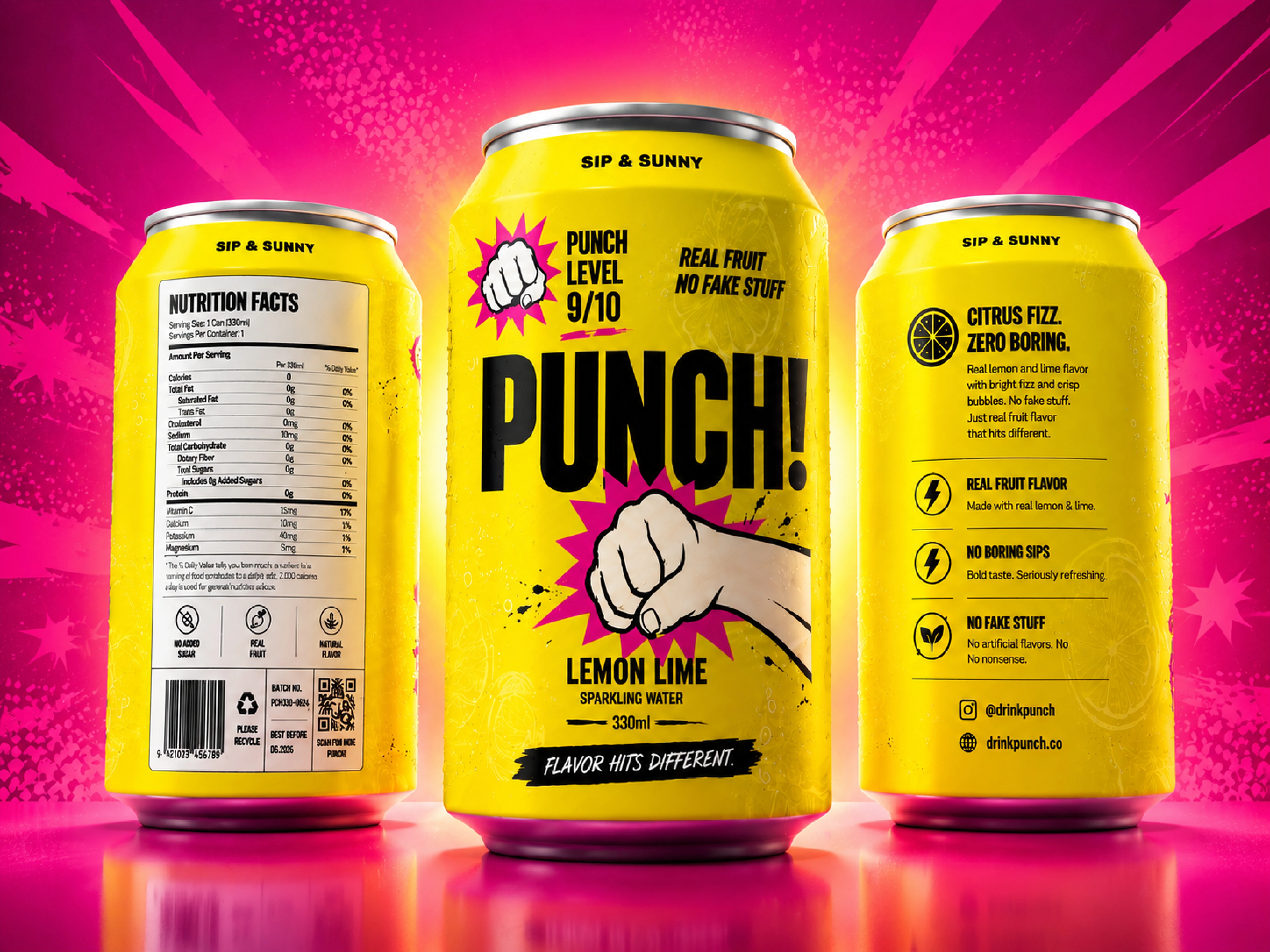
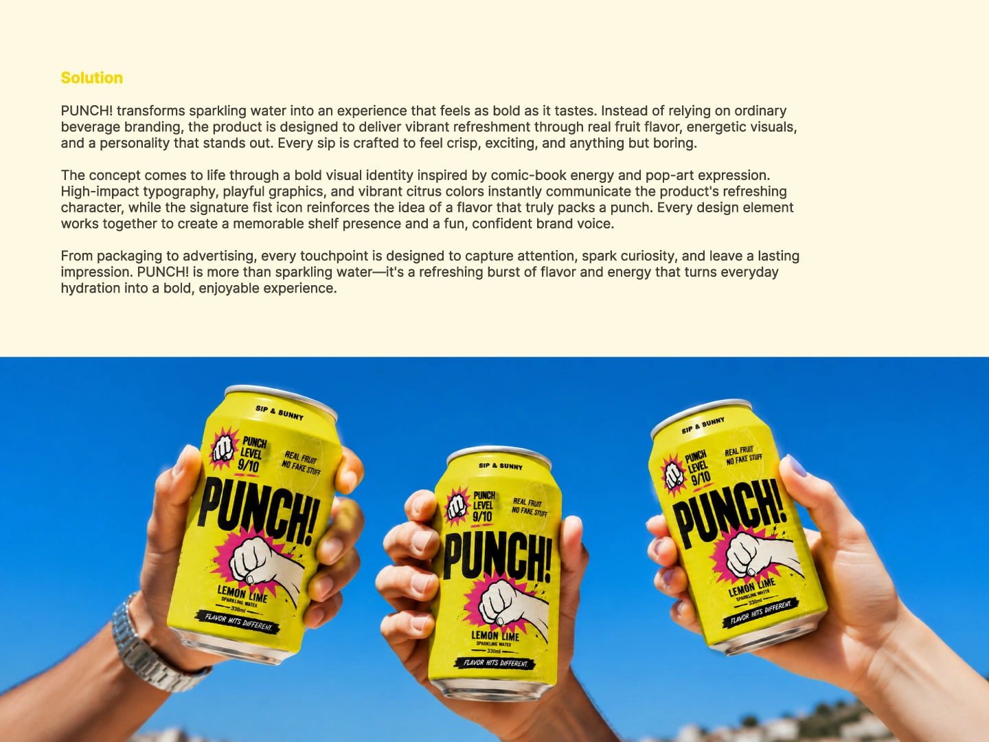
A sparkling water brand built to feel loud, energetic and impossible to ignore.
The idea was simple:
Make the packaging hit as hard as the flavour.
So the identity leans into:
🥊 A bold fist symbol
💥 Comic-book impact graphics
🟡 High-energy citrus yellow
💗 Electric pink accents
⚫ Heavy typography with attitude
The result feels less like another “healthy sparkling water” brand and more like something with an actual personality.
Then the system was pushed across:
Packaging
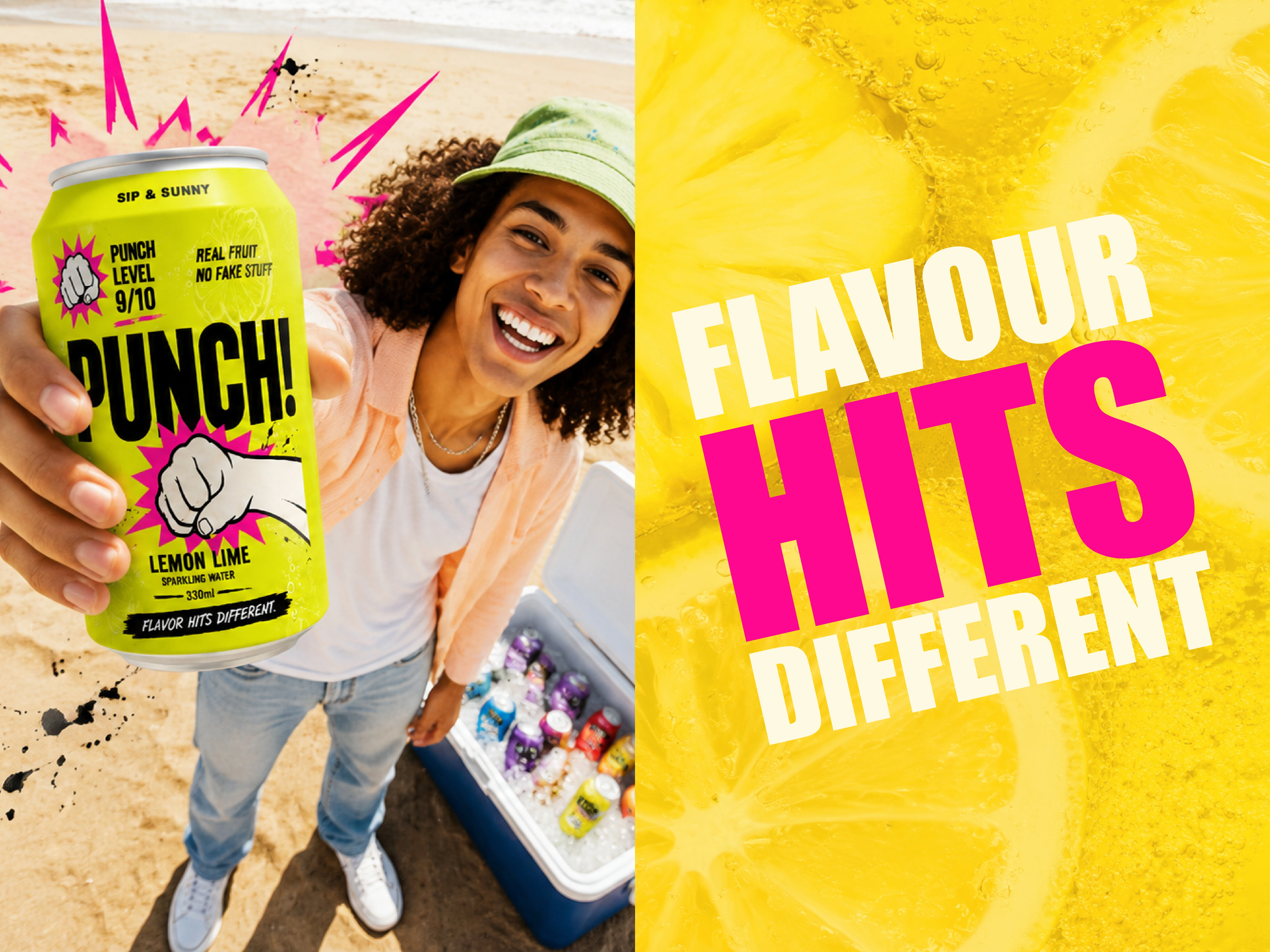
Advertising
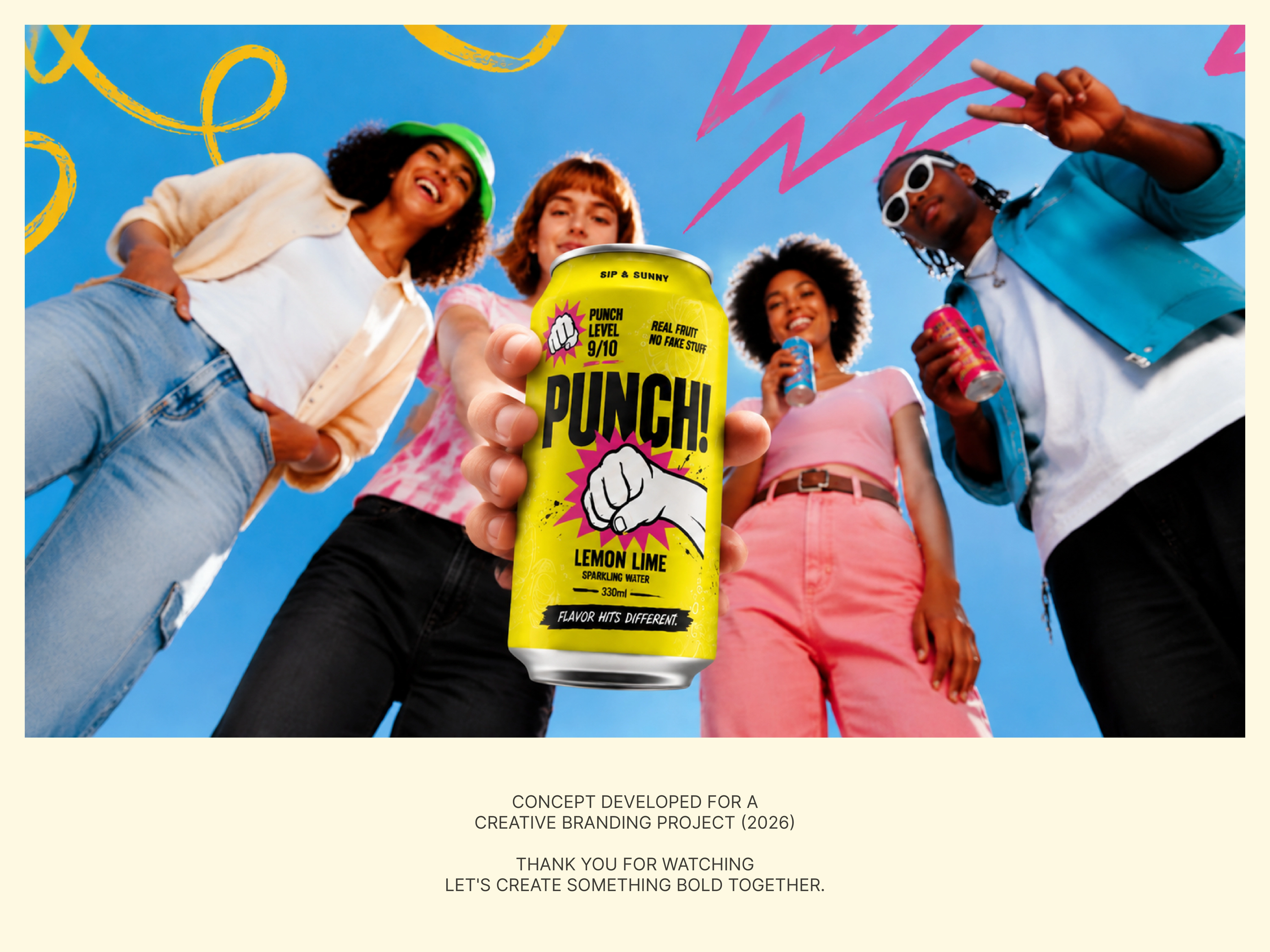
Lifestyle campaigns
Social content
Product photography
Brand messaging
The goal was not to make it clean and safe.
The goal was to make someone stop, look, pick it up and remember it.
Because on a crowded shelf, forgettable is expensive.
PUNCH!
Flavor hits different.
Now I want to know:
Would you grab this can if you saw it in-store?
A. Immediately
B. Strong, but needs refinement
C. Too loud for me
Drop A, B or C below.
If you’re launching a beverage, food or CPG brand and need packaging that actually competes for attention, send me a message.
#PackagingDesign #BeverageBranding #BrandIdentity #CPGBranding #FoodBranding #VisualIdentity #CreativeDirection #BrandDesign
0 likes · 2 views · Oct 6, 2026
If your drink tastes different but looks like everything else on the shelf, you already lost. That was the problem behind PUNCH! A sparkling water brand buil...


