Common Networks
Solving the last mile internet problem
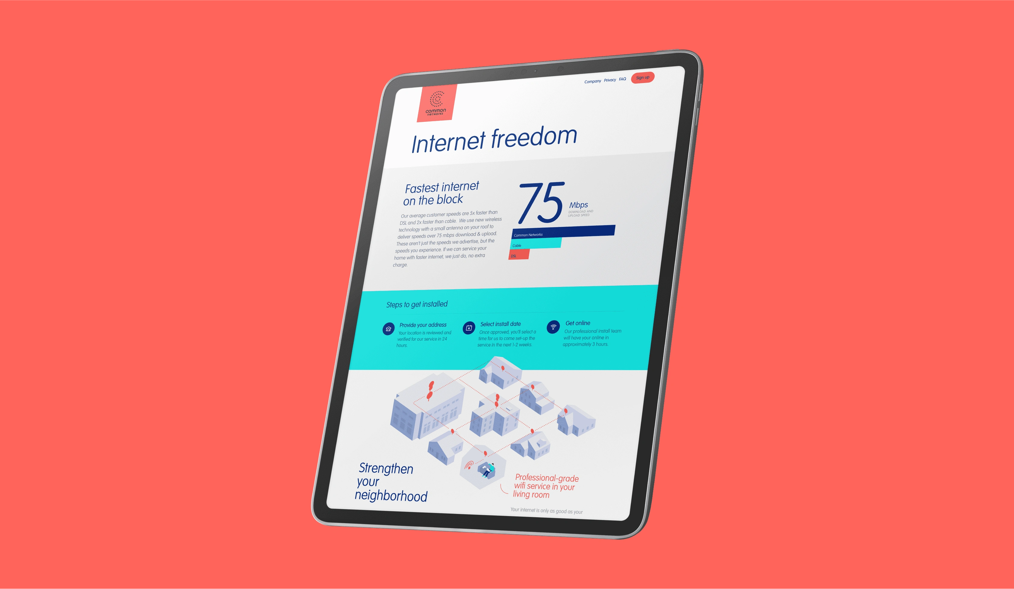
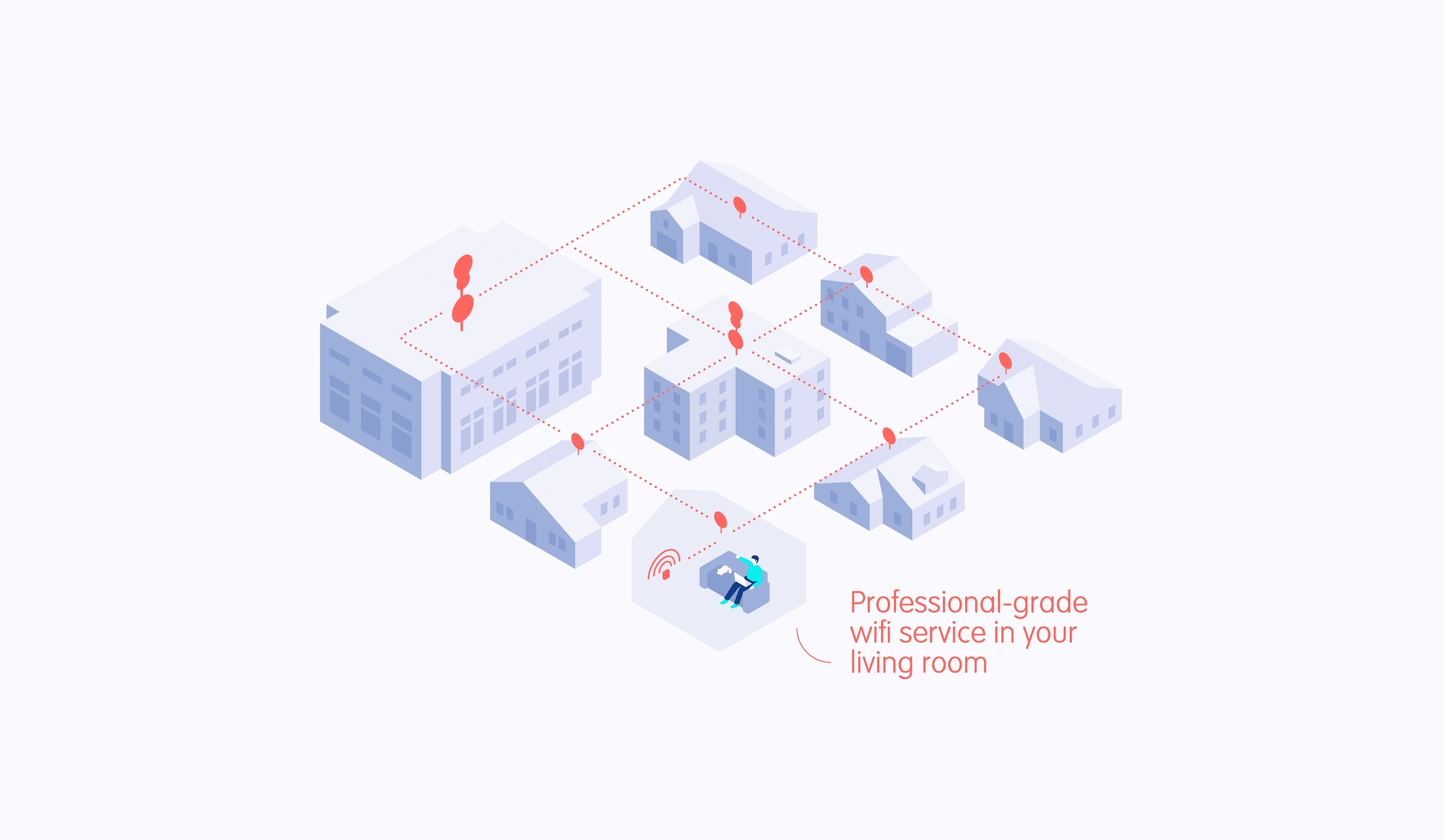
Common Networks was established to bring affordable internet to suburban communities across the US. Using a unique antenna technology as a cost-effective alternative to traditional fiber optics, it managed to disrupt telecom monopolies and provide high-speed internet at a fraction of the price.
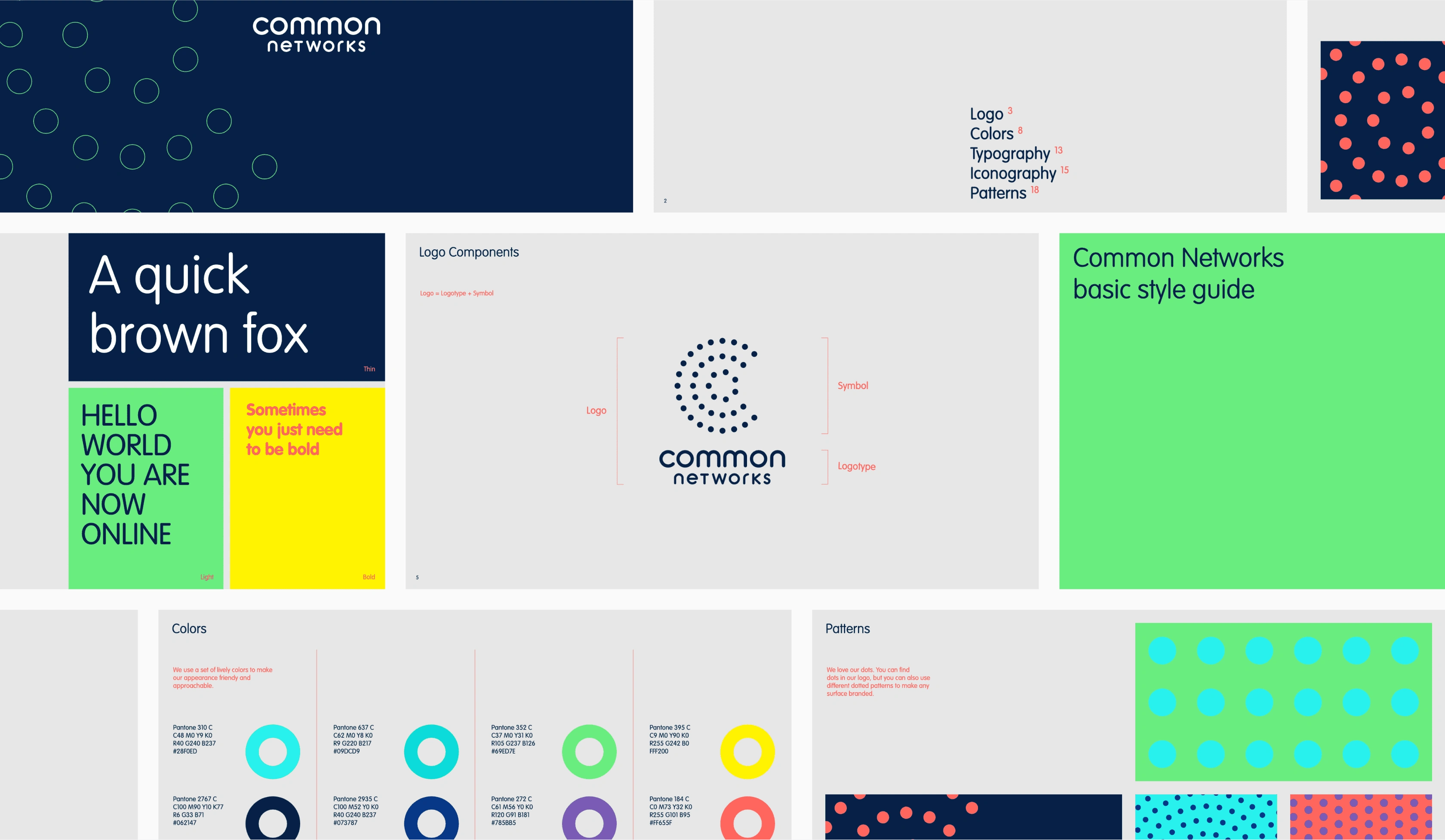
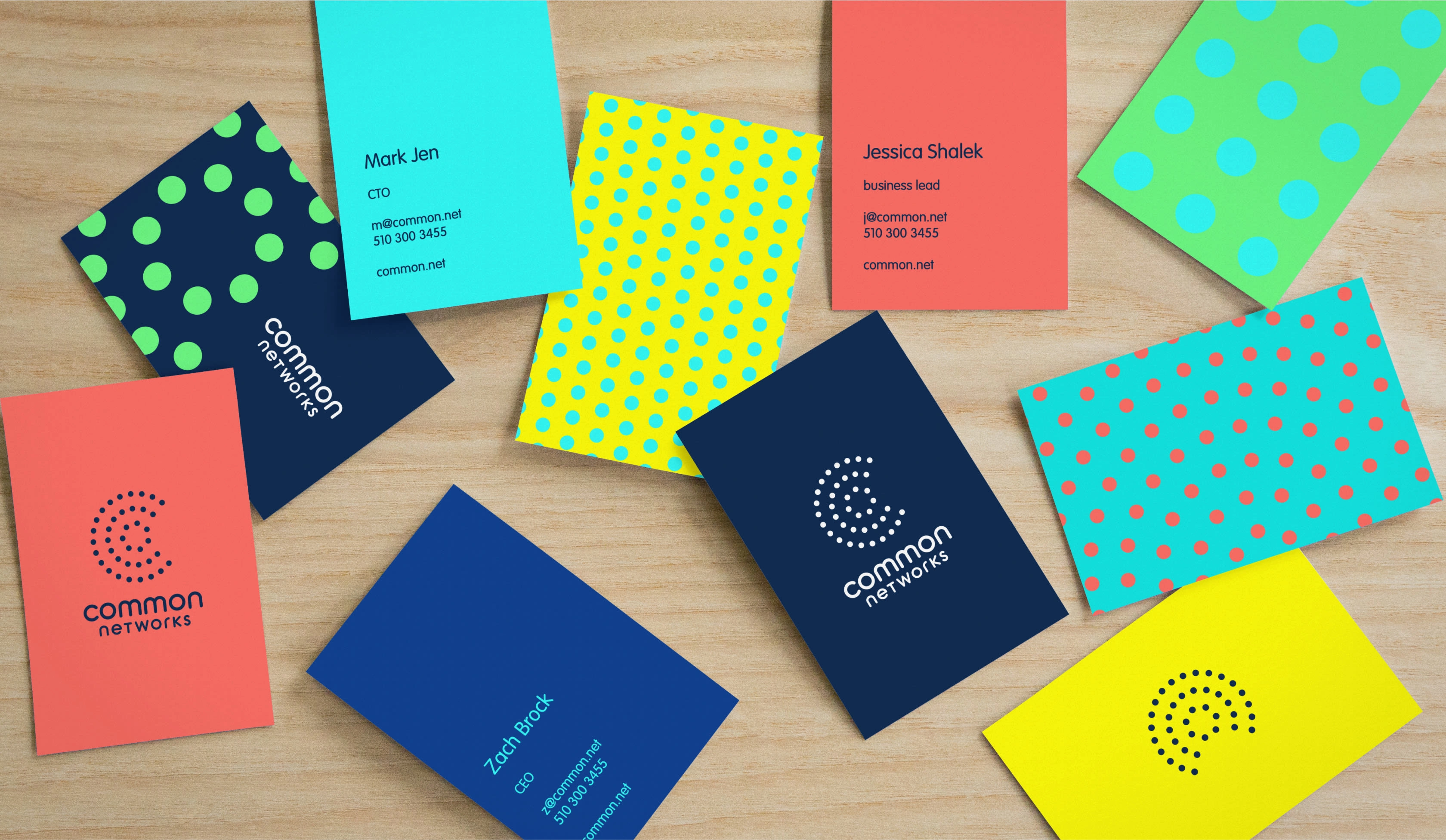
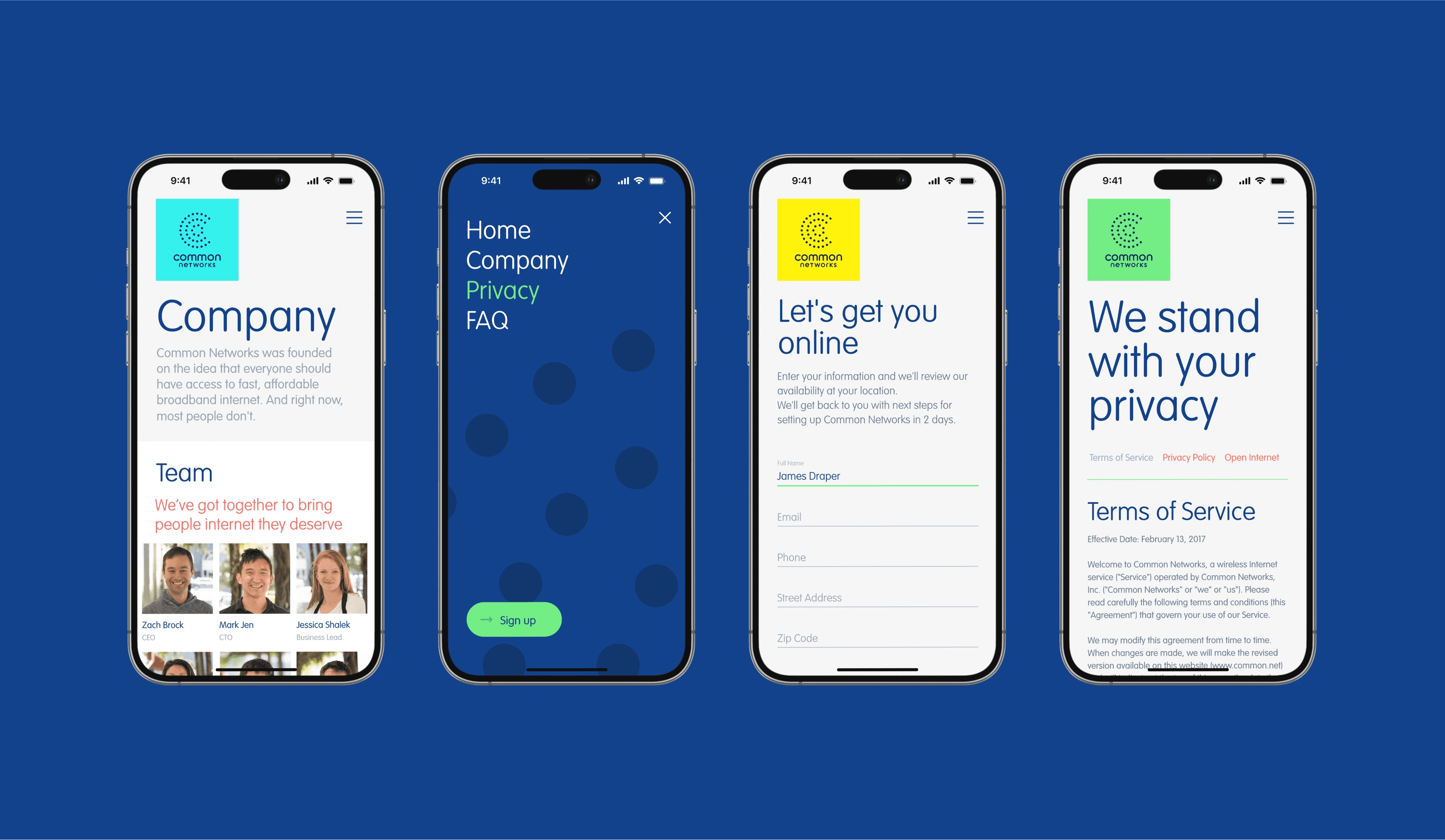
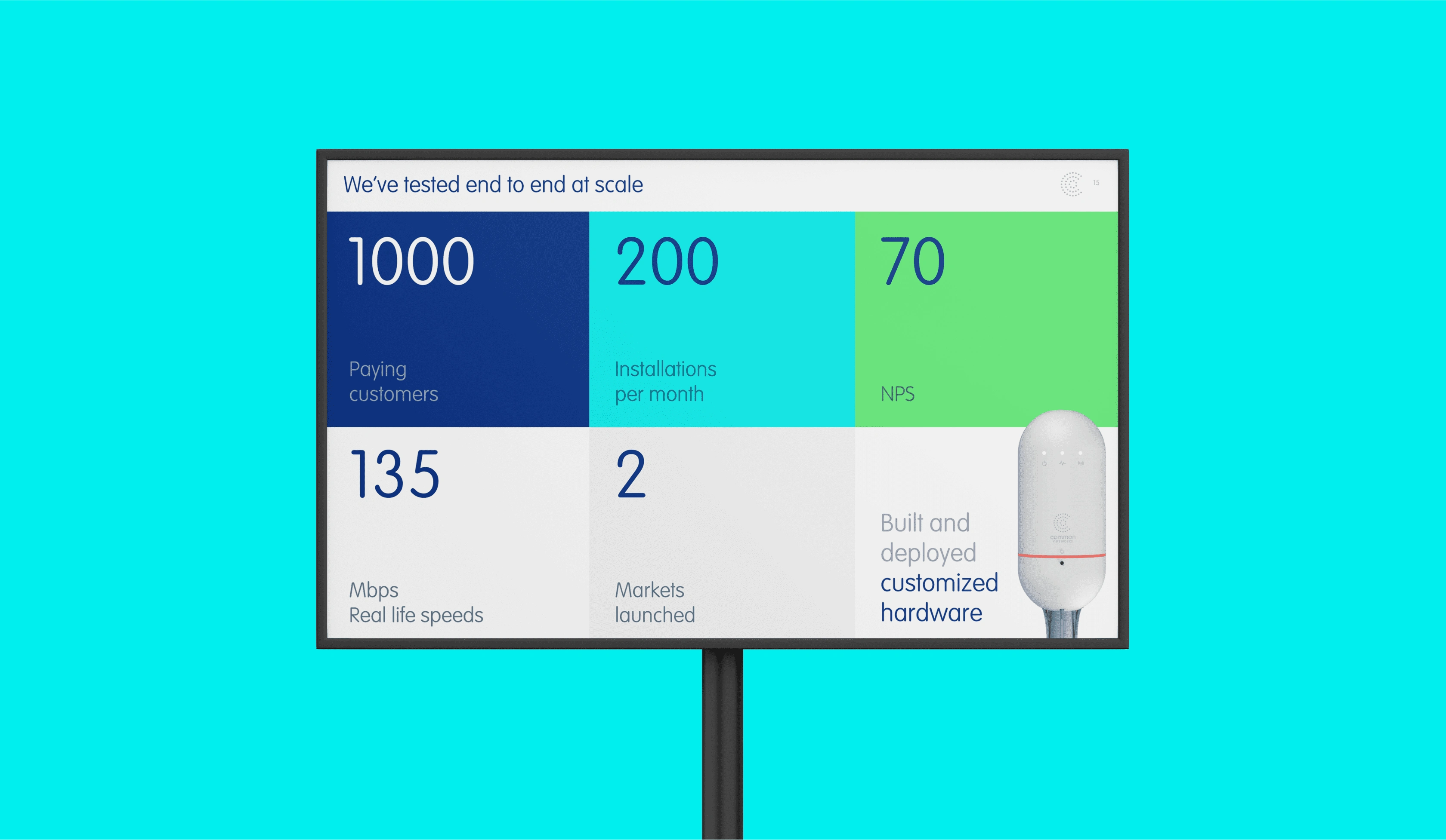
Collaborating closely with the Common team, I worked on building their website, designing investment presentations, and developing their distinctive brand identity. Incorporating the concept of interconnected networks, I designed a clever C-shaped symbol made of multiple nods, that is both instantly recognizable and unique. The colorful friendly dots challenged the dry corporate branding of the competition and became the talk of the town when the brand was first launched in Alameda, CA.



Like this project
Posted Oct 6, 2023
Solving the last mile internet problem

