KptnCook Website Redesign - UX Case Study
Tilek Dzhumanazarov
KptnCook Website Redesign - UX Case Study
We modernized an outdated website into a high-trust platform—using clear plan comparisons, authentic UGC video, and interactive features to eliminate user confusion and drive subscriptions.
Intro & Challenge
Resolving Plan Ambiguity and Building Digital Trust
The client’s legacy platform was severely outdated, failing to clearly communicate the distinct value propositions between their subscription plans. Users struggled to understand what they were paying for, resulting in lost conversions. Furthermore, the website lacked the modern, dynamic flair needed to properly showcase its rich recipe ecosystem and advanced AI features.
Our mission was to completely overhaul the digital experience: modernize the visual aesthetic, clearly differentiate the plan tiers, prominently feature their signature recipes, and embed human-centric elements to massively elevate brand trust.
Research & Insights
Leveraging Industry Standards and User Generated Content
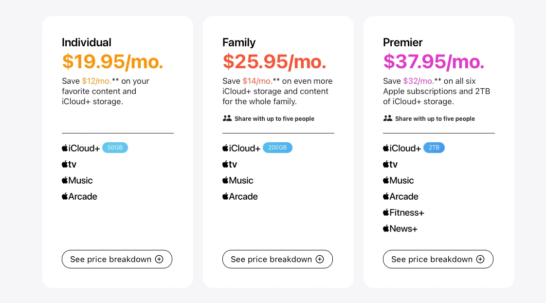
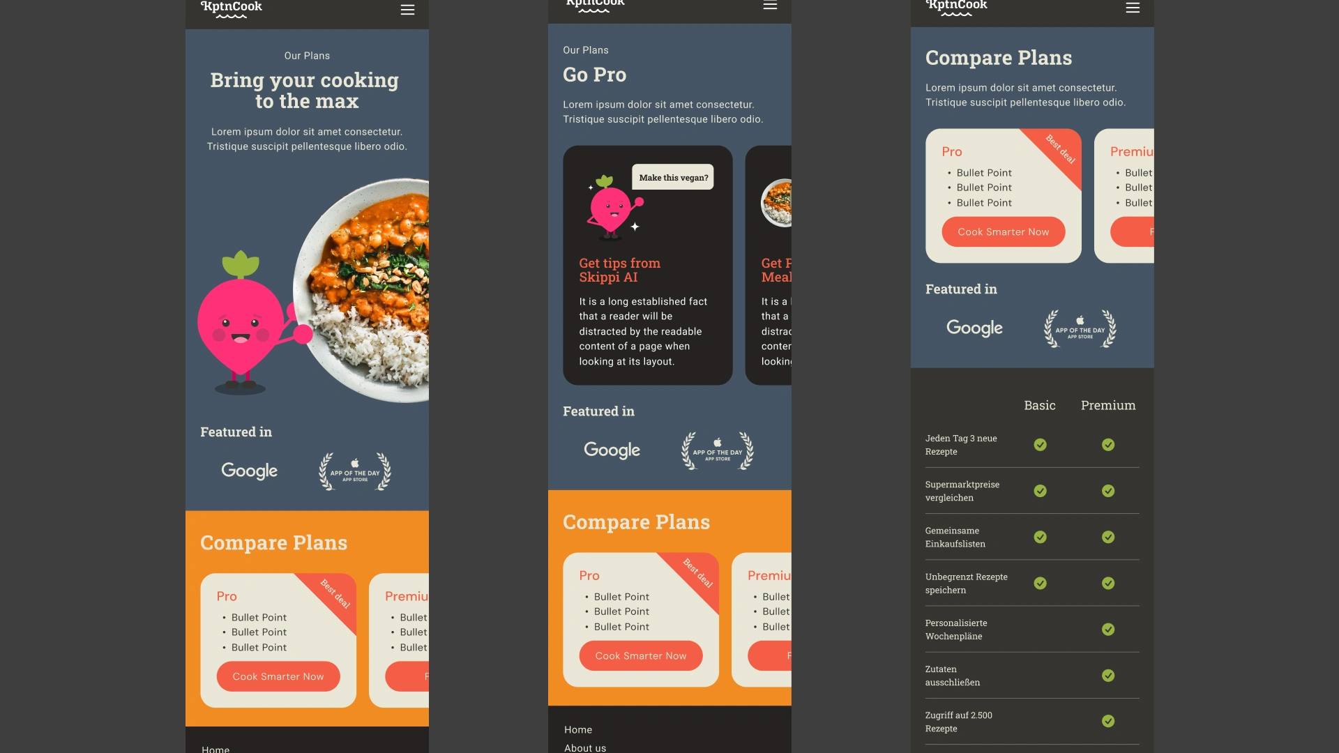
To solve the plan differentiation issue, we analyzed industry-leading comparison frameworks, specifically studying how brands like Apple utilize structured cards and detailed feature matrices to cleanly map out product variations. This research guided our approach to showing exactly what each tier offers—and what it doesn't—at a glance.
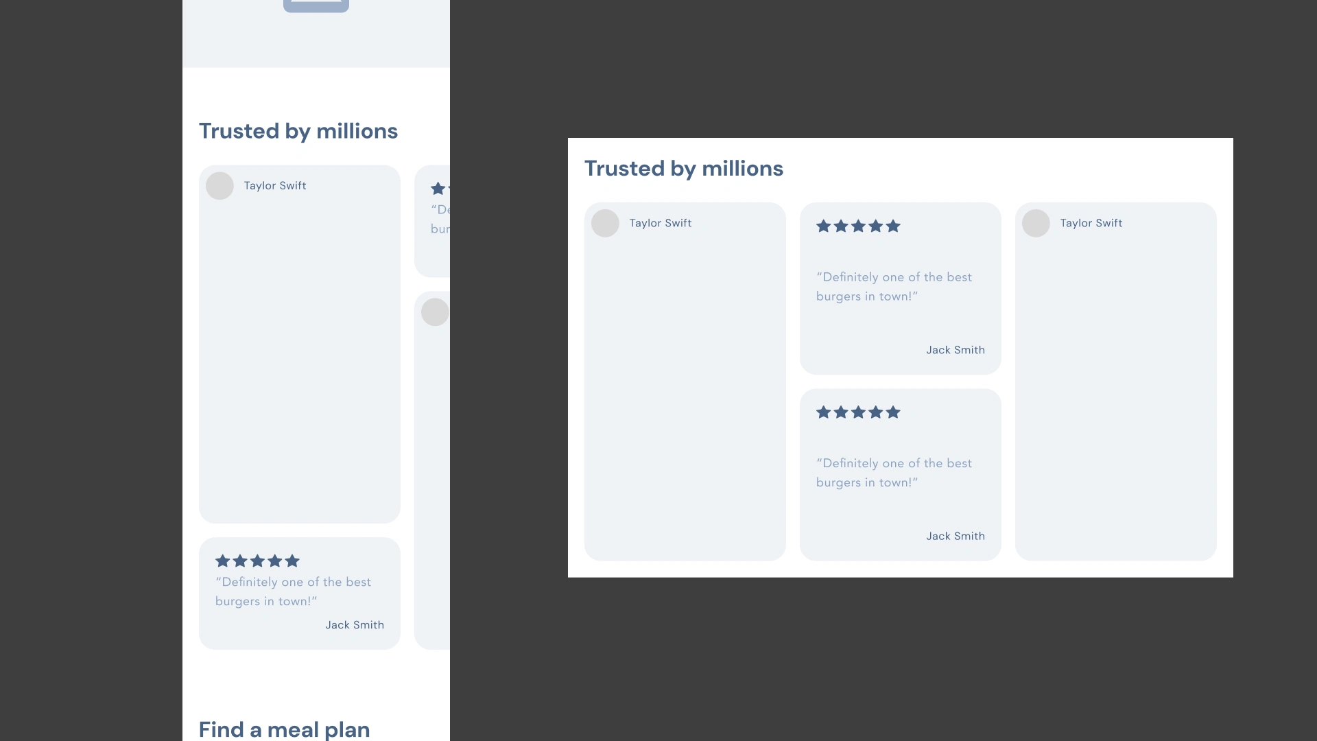
Additionally, psychological UX research confirms that seeing real humans significantly increases overall brand trust. To capitalize on this, we decided to integrate authentic User Generated Content (UGC) videos directly into the primary user flows, replacing sterile corporate imagery with real, relatable human experiences.
Wireframes
Mapping Features, Content, and Plan Structures
During the low-fidelity wireframing phase, we mapped out two critical environments:
Main Page
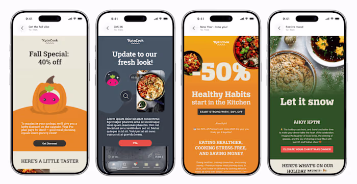
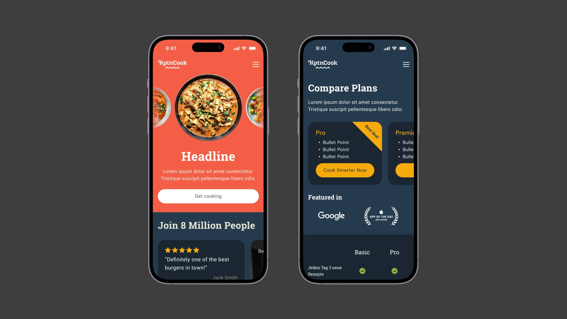
We experimented with structural layouts that seamlessly embedded UGC video blocks and previewed the subscription plans right on the homepage to capture early intent.
Plans Page
We explored various card layouts and structural hierarchies to determine the most intuitive way to introduce and contrast the core features of each tier.
Design Drafts
Exploring Personalization, AI Features, and Visual Hierarchy
Moving into high-fidelity drafts, we breathed life into the wireframes by injecting imagery, color, and key brand assets across two main areas:
Main Page
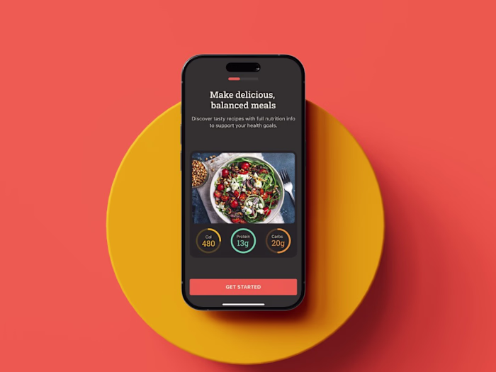
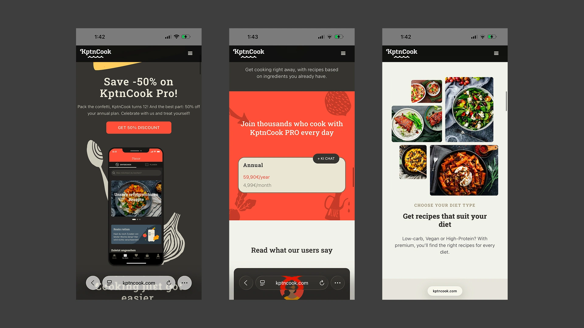
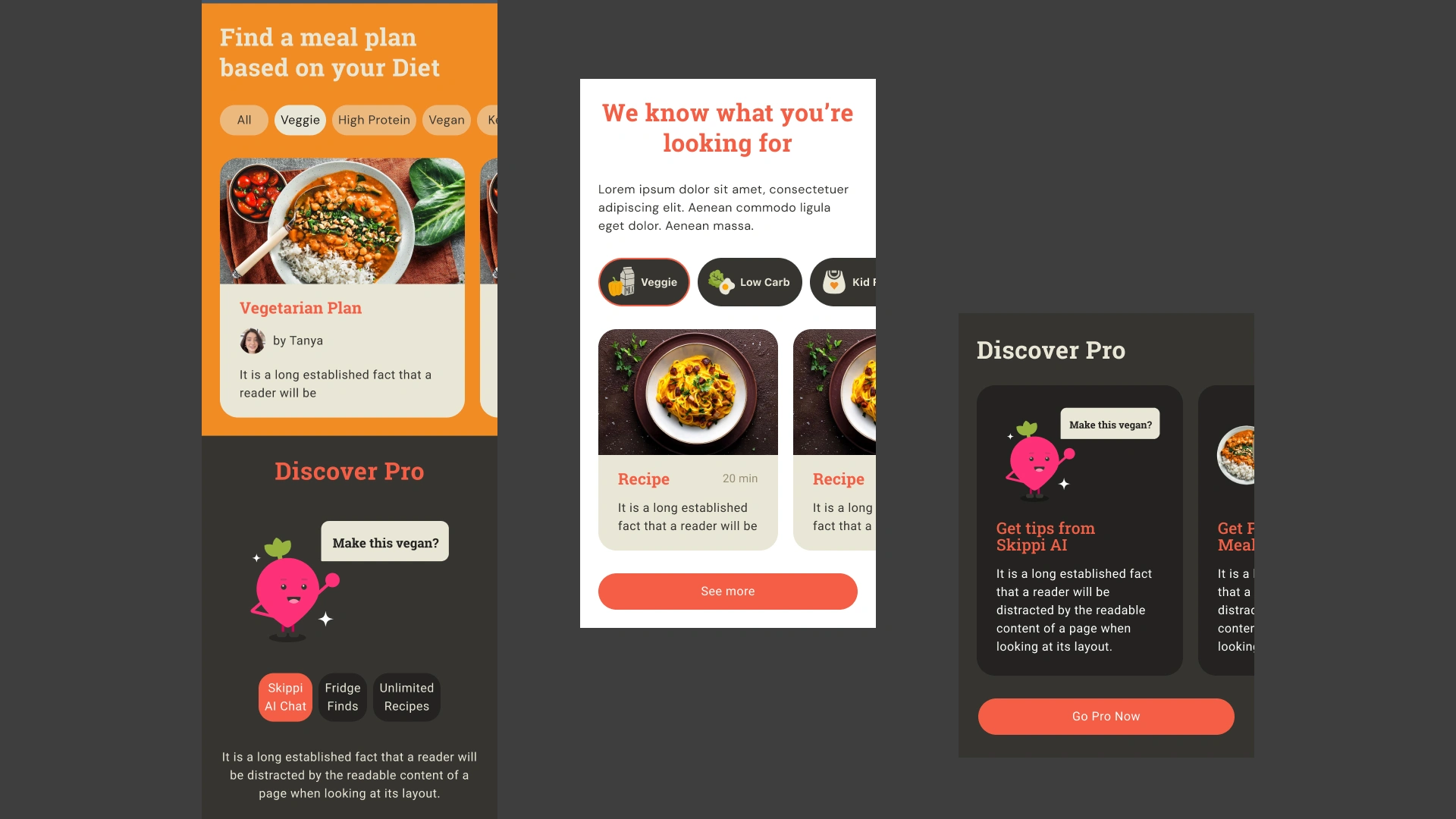
We designed various UI components to showcase the platform’s new AI capabilities, emphasizing personalized meal planning and recipe discovery.
Plans Page
We introduced "Skippi"—the charismatic character and face of the new AI features—to add personality to the plans page. We also rapidly iterated on the layout hierarchy, testing different variations to see whether the plans, detailed features, or a high-impact hero image should anchor the top of the page.
Final Design
Clean Modernity, Guided Comparisons, and Social Proof
The final design introduces a fresh, contemporary color palette that perfectly complements the brand’s legacy core colors, creating a vibrant yet familiar aesthetic.
Main Page
Trust is established instantly by placing raw UGC videos and verified user reviews upfront. The layout effortlessly guides users through the brand's recipes, new AI innovations, and a preview of the plans.
Plans Page
To eliminate user confusion, we deployed a dual-layered approach. Users can now swipe through a sleek, highly visual carousel of the individual plans, or scroll down to view a comprehensive, Apple-inspired comparison matrix table. The result is a highly transparent, modern, and trustworthy funnel built to convert.
Like this project
Posted Jun 30, 2026
Redesign of KptnCook's website to enhance digital trust and improve subscription plan clarity.
Likes
0
Views
0
Timeline
Oct 13, 2025 - Nov 10, 2025
Clients
KptnCook