KptnCook CRM Email Campaigns
Tilek Dzhumanazarov
CRM Emails for KptnCook
Overview
Bringing CRM campaigns to life through motion and design
KptnCook runs regular CRM campaigns to keep users engaged, informed, and excited about the app. My role was to translate campaign copy into compelling visuals — emails and in-app messages — delivered almost every week. While the CRM manager owned the messaging strategy and copy, I was responsible for making that text feel alive, on-brand, and worth opening.
My Job
Visualising weekly campaigns across Email and In-App
My job was to create dynamic visuals for CRM channels — including Email and In-App messages — for the KptnCook app, almost weekly. While the CRM manager was responsible for the text of each campaign, my role was to translate that copy into visuals that matched the campaign's intent, fit the brand, and caught the user's attention in a crowded inbox or notification tray.
Creative Process
From campaign brief to design-critique-ready iterations
After receiving a campaign copy, I had a weekly sync with the CRM manager to ask questions and align on the campaign's tone, context, and key message. From there, I searched for inspiration — looking at visual references, app aesthetics, and seasonal or thematic cues that fit the topic. I sketched rough concepts first, then developed multiple design directions with distinct styles for Design Critique meetings. After collecting feedback from the team, I refined and finalised the chosen direction.
A process built around iteration, not perfection
No direction was locked in early. Having multiple style variations ready for critique meant decisions were made collaboratively, with clear rationale — and the strongest visual always had room to emerge from the process rather than being assumed upfront.
Localisation
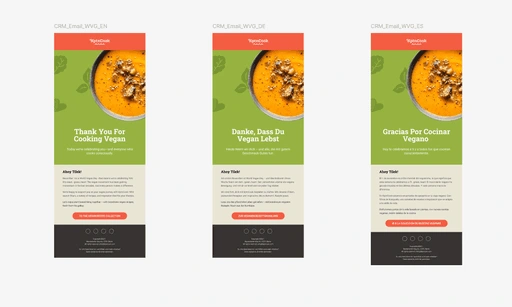
Designing for five languages without five different designs
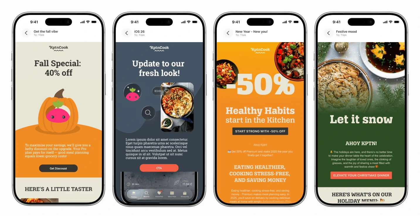
While campaigns were written in English and German, the emails were also delivered in Spanish, French, and Portuguese. Translated copies for those languages were rarely available at the design stage. To keep one universal design working across all five languages, I avoided placing text directly on images wherever possible — using text fields instead, so copy could be swapped without touching the visual. Exceptions were made when headlines weren't translated, or when featuring text across multiple languages was itself a creative decision in larger campaigns.
Dark Mode Optimisation
Designing for inboxes we can't control
Dark mode in emails cannot be controlled — every email client handles it differently, and some override styles entirely. Rather than ignoring it, I built dark mode resilience into every design from the start.
A few rules applied to every email
All images were exported as transparent PNGs placed on contrasting backgrounds, so they remained visible even when a client stripped or inverted colours.
Brand elements — including logos — were always given background colours rather than left floating on transparent.
Before finalising any design, I previewed it in both a coded dark mode and an inversion-only fallback, to catch problems before they reached the inbox.
Designs
Over 50 emails crafted for engagement and brand consistency
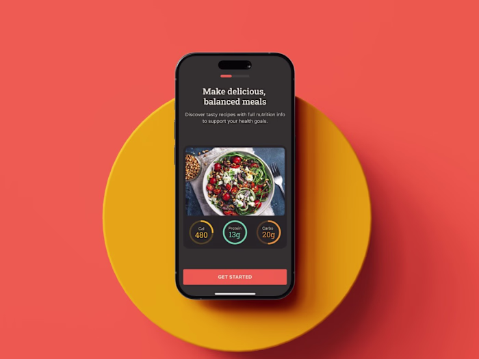
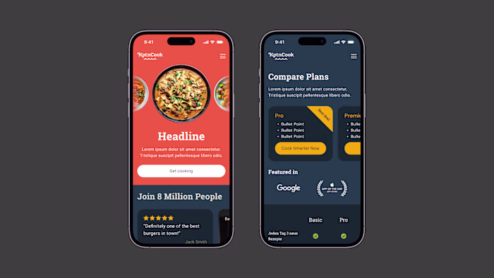
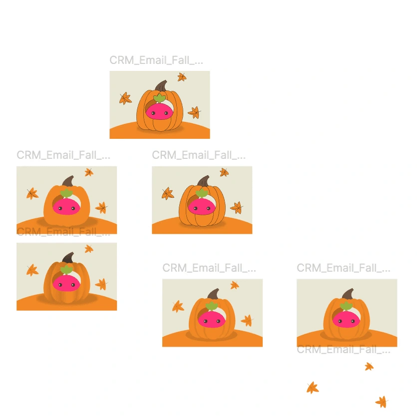
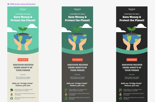
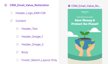
I produced more than 50 email designs for CRM over the course of my time at KptnCook. Each design served a different campaign goal — from feature announcements and seasonal moments to re-engagement nudges and product education. The visuals either highlighted a key brand visual or illustrated a specific app feature, always keeping the design grounded in KptnCook's identity while making the campaign message feel fresh and relevant.

Built with Auto Layout for flexibility and speed
Every email template was built using Figma's Auto Layout, making it easy to swap content, resize sections, and adapt designs across different campaign formats without rebuilding from scratch. This kept the file organised, handoff-ready, and consistent across the 50+ designs produced.
Animations
Motion as the final layer to drive engagement
To increase open rates and engagement, I animated every header image. Animation was always the last step in the production flow — applied only after all assets were reviewed and approved. This prevented rework and kept the file pipeline clean. The final deliverable was always compressed to 2 MB or smaller to meet technical requirements for email clients and in-app delivery, ensuring fast load times without sacrificing visual quality.
Export
A clean handoff every time
Once all assets were finalised and animations approved, I exported every image as a PNG and organised them into a structured folder. The folder — alongside a link to the Figma file — was handed over to the person responsible for email building, giving them everything they needed without back-and-forth.
Exploring direct export tools
There are plugins and tools that promise to export Figma designs directly into an email builder, skipping the manual handoff entirely. I explored options like Email Love to test whether they could fit into the workflow — while promising in concept, they worked best for simpler layouts and required workarounds for more complex or animated designs.
Building emails in code
With an intermediate understanding of HTML and CSS, I occasionally built emails directly myself — writing the structure and styling by hand rather than relying on a drag-and-drop builder. This was useful for campaigns where precise control over layout and rendering mattered, and gave me a clearer understanding of why certain design decisions hold up in production and others don't.
Like this project
Posted Jun 7, 2026
Designed dynamic visuals for KptnCook's CRM campaigns across Email and In-App.
Likes
0
Views
0
Timeline
Aug 1, 2024 - Oct 31, 2025
Clients
KptnCook