LOOP - Design System for Recycling
Tilek Dzhumanazarov
Loop
User-centred design project that rethinks how recycling information is communicated.
Through research, journey mapping, and system design, it transforms disposal into a guided, intuitive experience.
Problem
Recycling Is Not Failing. Communication Is.
Despite environmental awareness, recycling rates remain inconsistent and inefficient across countries. In Germany, recycling rates are relatively high (around 65–70%), yet contamination rates remain significant. In countries like the U.S., municipal recycling rates are closer to 30–35%. Even in high-performing systems, confusion about bin colours, symbols, and material separation leads to incorrect disposal.
Research Shows
People are unsure which bin to use.
Visual systems differ between countries.
Multi-material packaging creates uncertainty.
Icons and colour systems are inconsistent.
Research
Comparative Visual System Analysis
To understand how visual communication influences recycling behaviour, I analysed systems in:
Germany
France
South Korea
United States
Using semiotic theory, I examined:
Colour coding systems
Iconography
Layout structure
Information hierarchy
Cultural adaptation
User Journey Map
The Recycling Experience Today
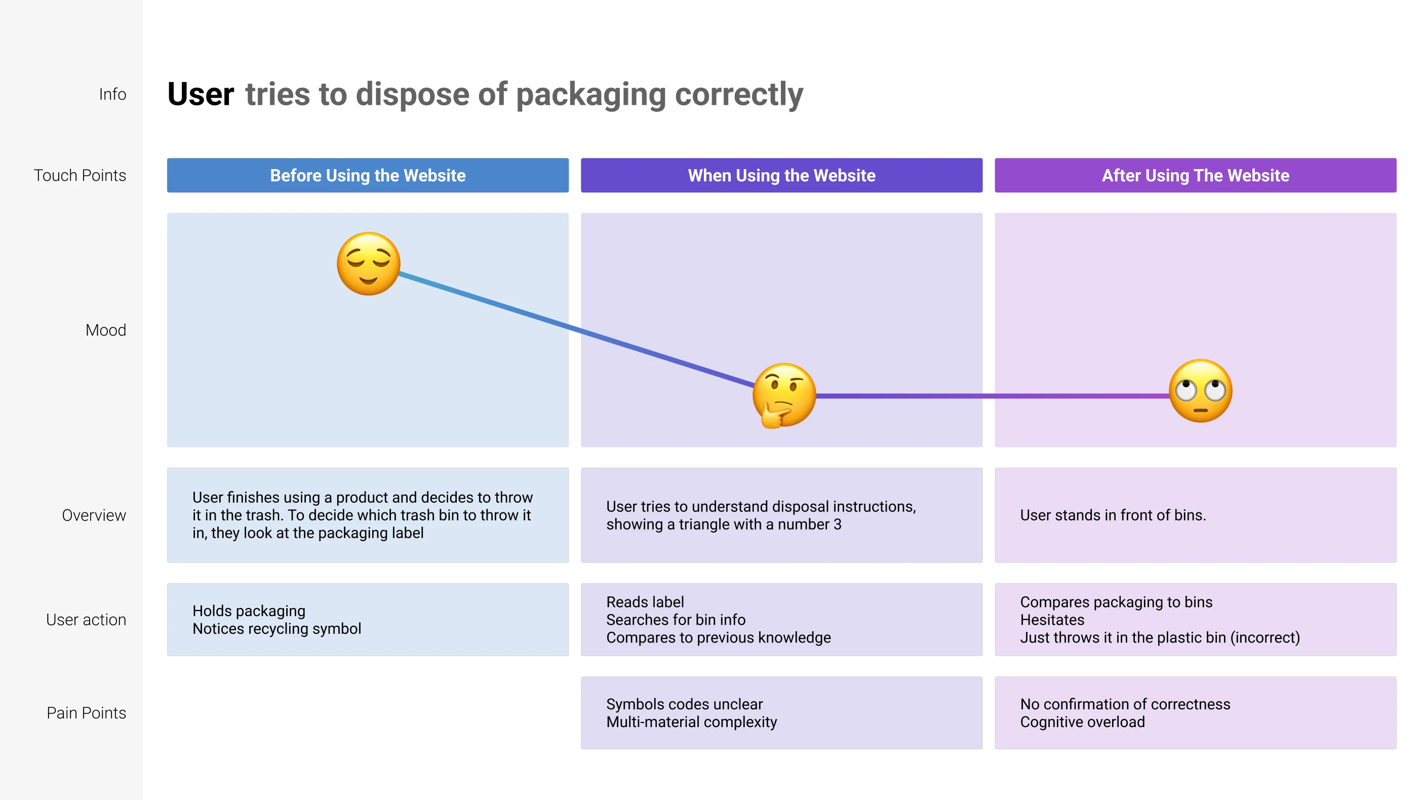
Core Insight
Recycling systems fail at the moment of decision.
This moment needs:
Immediate clarity
Visual dominance
Cross-cultural recognition
Actionable instruction
Design Principles
From behavioural insight to visual logic
LOOP is grounded in thses UX principles:
Clarity over complexity
Material-based colour consistency
Immediate bin recognition
Global–local adaptability
Each principle addresses a specific friction point identified in the research and journey mapping.
Design System
Translating principles into scalable structure
The LOOP design system translates behavioural insights into a structured, recognisable, and adaptable visual language. Each component, from logo to label architecture, is designed to reduce cognitive load and guide decision-making at the moment of disposal.
Logo
The LOOP identity represents continuity, return, and circular material flow. The wordmark integrates rounded geometry to reflect cyclical movement while maintaining strong legibility across print and digital applications.
Its simplicity ensures scalability, functioning on small packaging labels as well as digital interfaces.
The “O” as a Structural Frame
The letter functions as more than a typographic element — it becomes a modular frame within the system.
Its circular form is abstracted and reused as:
A container for icons
A framing device within labels
A visual anchor for QR integration
A recurring structural motif across digital and physical applications
By transforming the “O” into a functional design element, the identity extends beyond branding and becomes part of the information architecture itself.
This creates visual consistency while reinforcing the core idea of circularity at every interaction point.
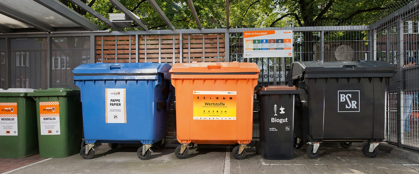
Colour System
Each material category is assigned a fixed colour to enable rapid visual identification:
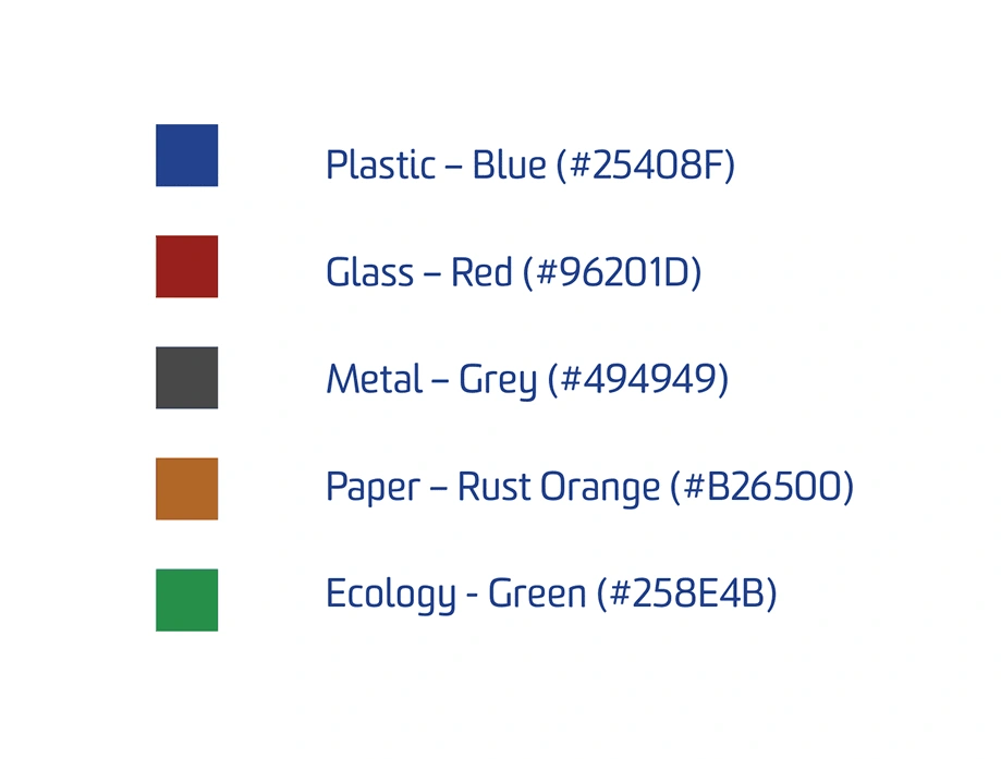
The system is material-driven rather than country-driven, ensuring cross-border consistency while allowing local adaptation. Colour becomes the primary recognition cue at the bin.
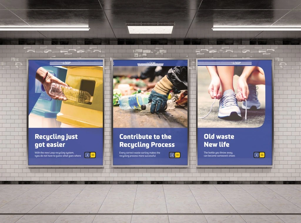
System Application
The poster applies the LOOP colour system, iconography, and circular framing element at a larger scale. Material-based colours structure the layout, while simplified messaging reinforces clarity and recognition beyond packaging.
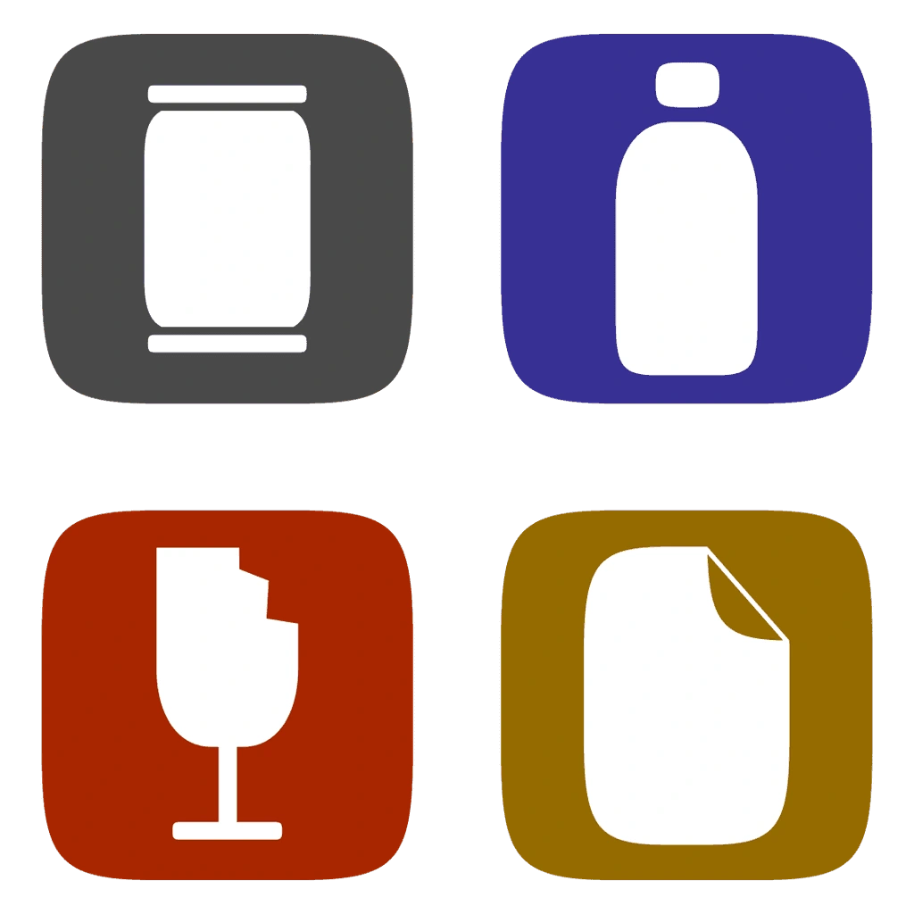
Iconography
Custom-designed icons represent each material in simplified, high-contrast forms.
The icons prioritise:
Legibility at small sizes
Minimal visual noise
Immediate material recognition
Their geometry aligns with the logo and label system, creating visual coherence across applications.
Label Architecture
The label is structured into two clear zones:
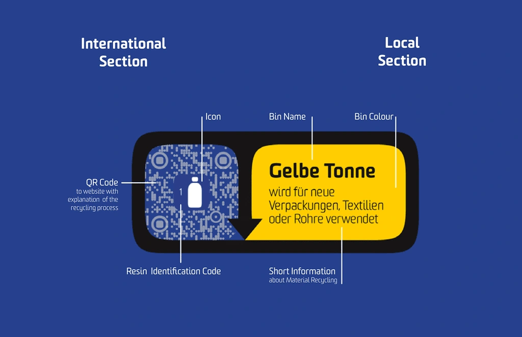
This dual-layer architecture resolves the conflict between global manufacturing standards and local waste systems, reducing ambiguity at the point of decision.
Label Sizing
The system includes scalable label formats optimised for:
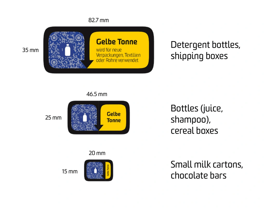
Each size maintains consistent hierarchy and readability, ensuring the system functions across diverse physical contexts without losing clarity.
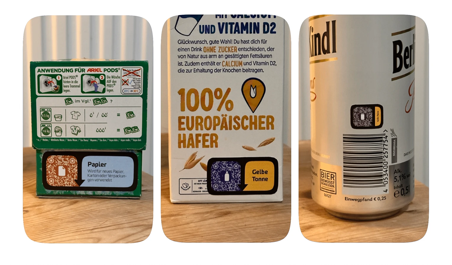
Application
Designing for real-world constraints
The system is designed to function across different packaging sizes and materials. Flexible scaling ensures readability on small formats (e.g., cartons) and large surfaces (e.g., detergent bottles).
Multi-material packaging is addressed through structured separation guidance, helping users identify which component belongs in which bin.
The result is not just a label — but a behaviour-guiding interface embedded directly into packaging.
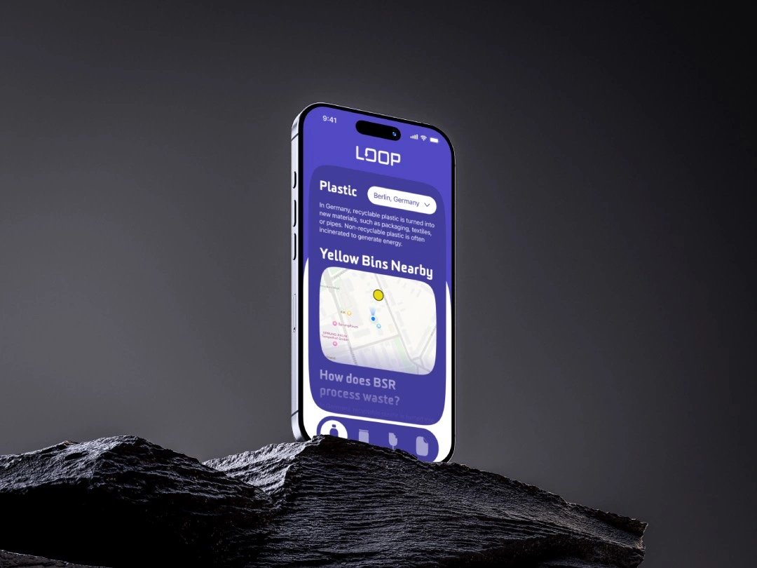
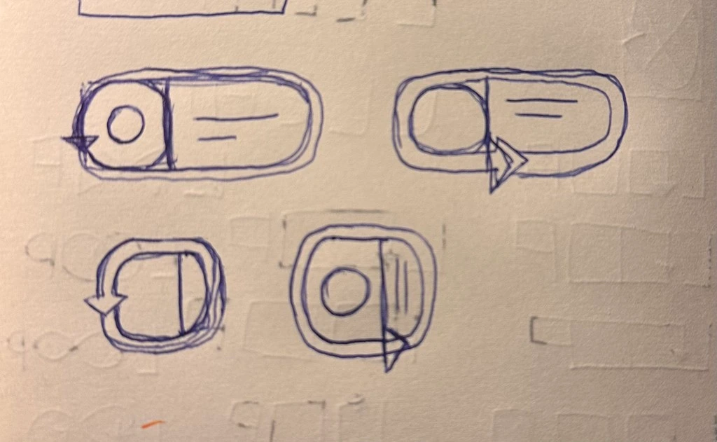
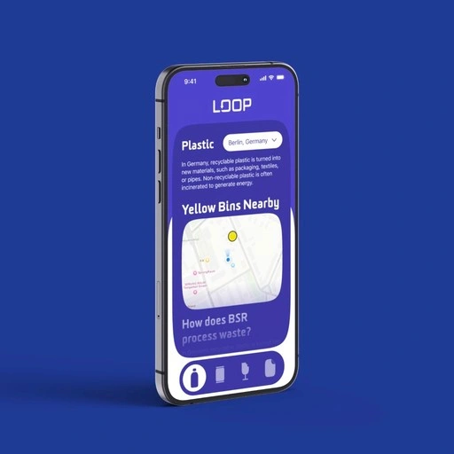
Digital Layer
Extending clarity beyond the physical label
A mobile-first prototype supports the system through QR integration.
Digital Layer
Extending clarity beyond the physical label
A mobile-first prototype supports the system through QR integration.
Like this project
Posted Jun 7, 2026
Developed LOOP design system to enhance recycling decision clarity using visual communication.
Likes
0
Views
0
Timeline
May 1, 2025 - Jul 27, 2025