Discover Art Events Nearby - Event Booking Mobile App 🧑🎨
Overview 👀
Client: Condifential
Project Duration: 2 Month
Role: UI/UX Designer
Tools: Figma, Adobe Illustrator, Adobe Photoshop, Lottie
UX/UI Discovery for Crafting a Booking Platform for Niche Art & Cultural Events
My Role
I conducted thorough market research and competitor analysis, identifying lucrative business opportunities and crafted user-centric concepts. Developed comprehensive brand guidelines and wireframes to validate proposed solutions and designed high-fidelity prototypes with a focus on primary user journey.
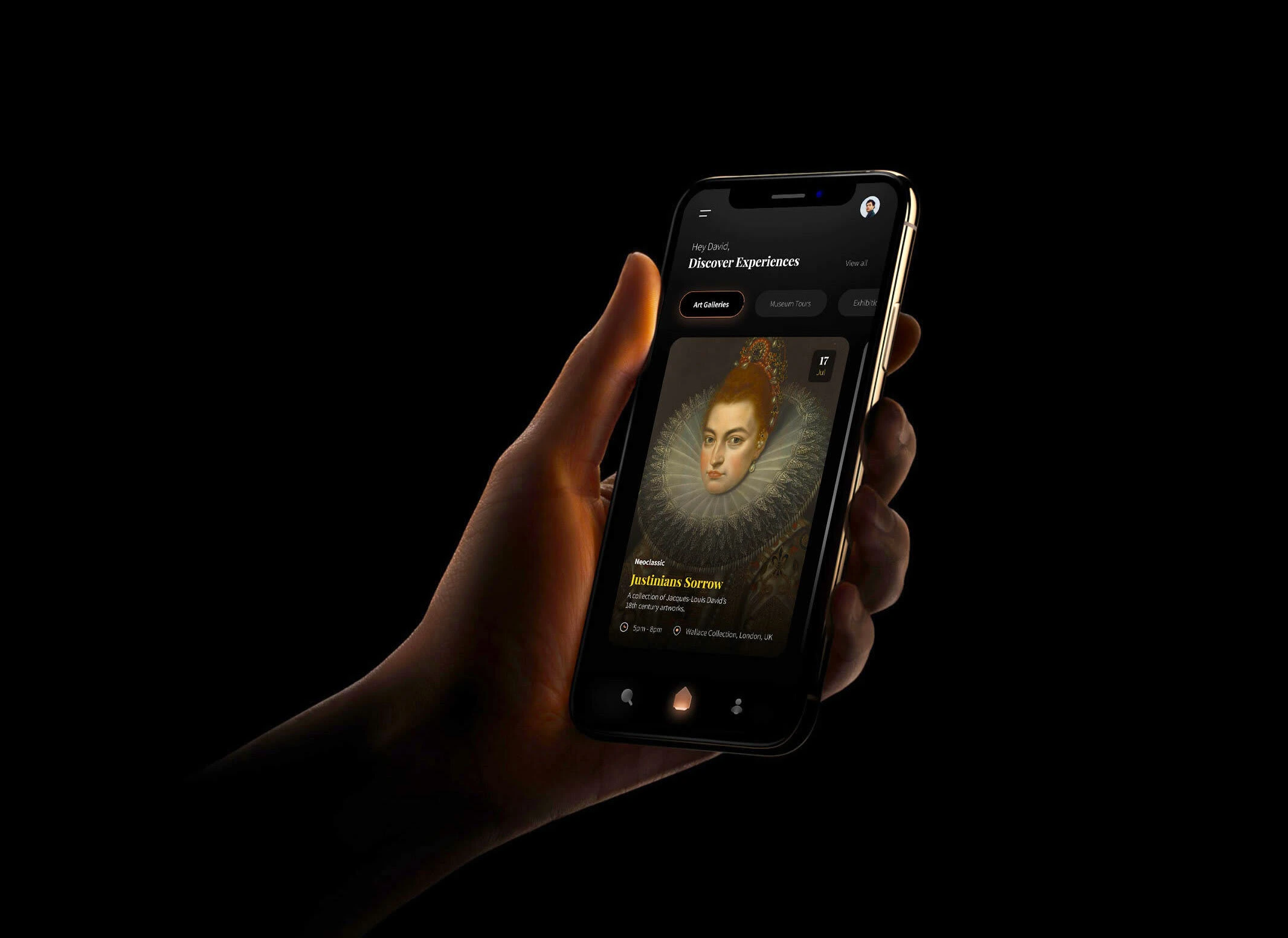
About Vivid
Vivid is a bespoke booking platform for art, culture, and history enthusiasts. Users can discover and purchase tickets for art galleries, exhibitions, museum tours, and more.
Research & Insights
I began by asking key questions and conducting interviews to understand our primary user's goals. It became clear that users wanted a simplified way to discover local events and buy tickets for art and history-related experiences based on their preferences.
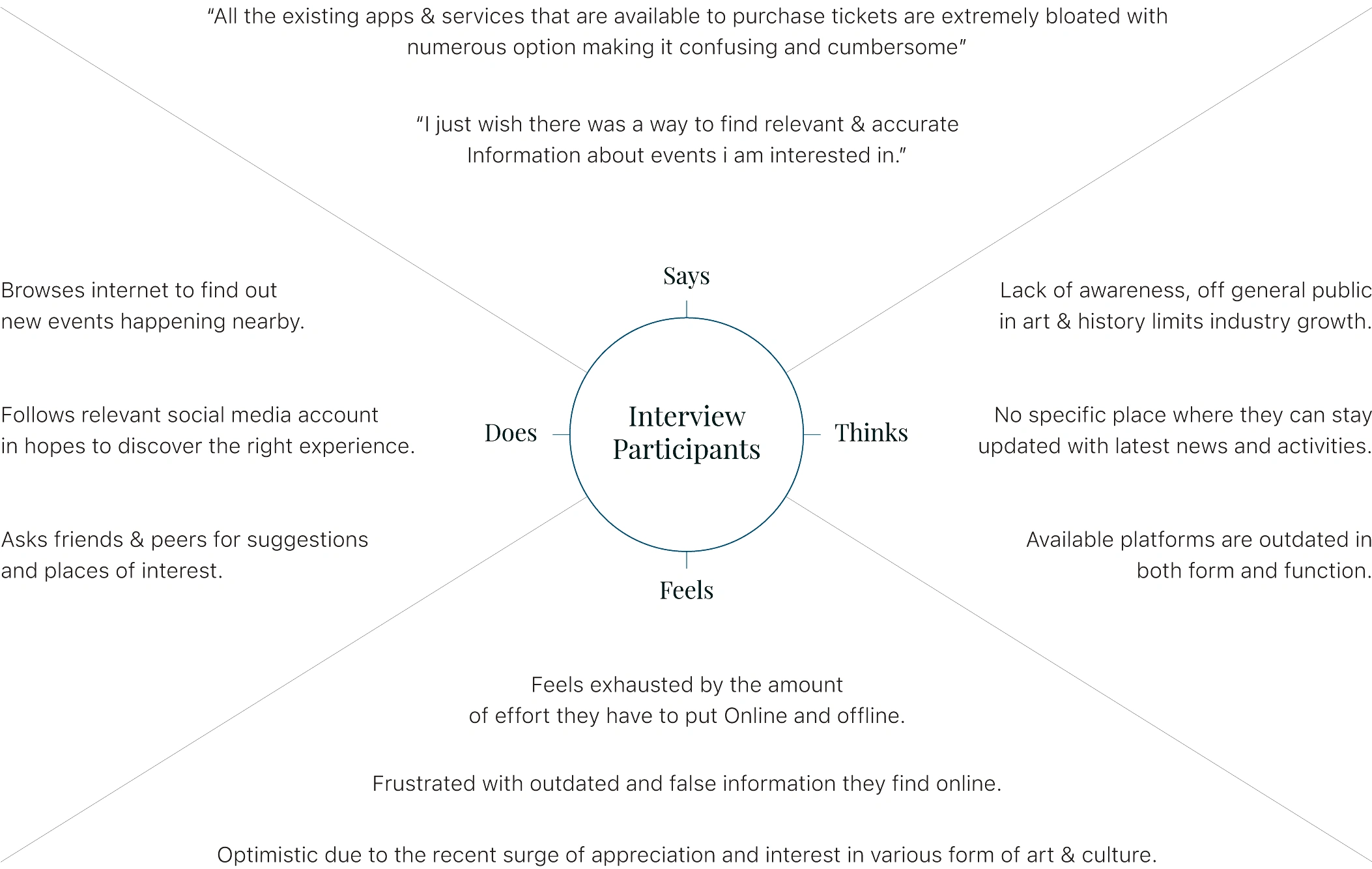
Empathy Map
User personas
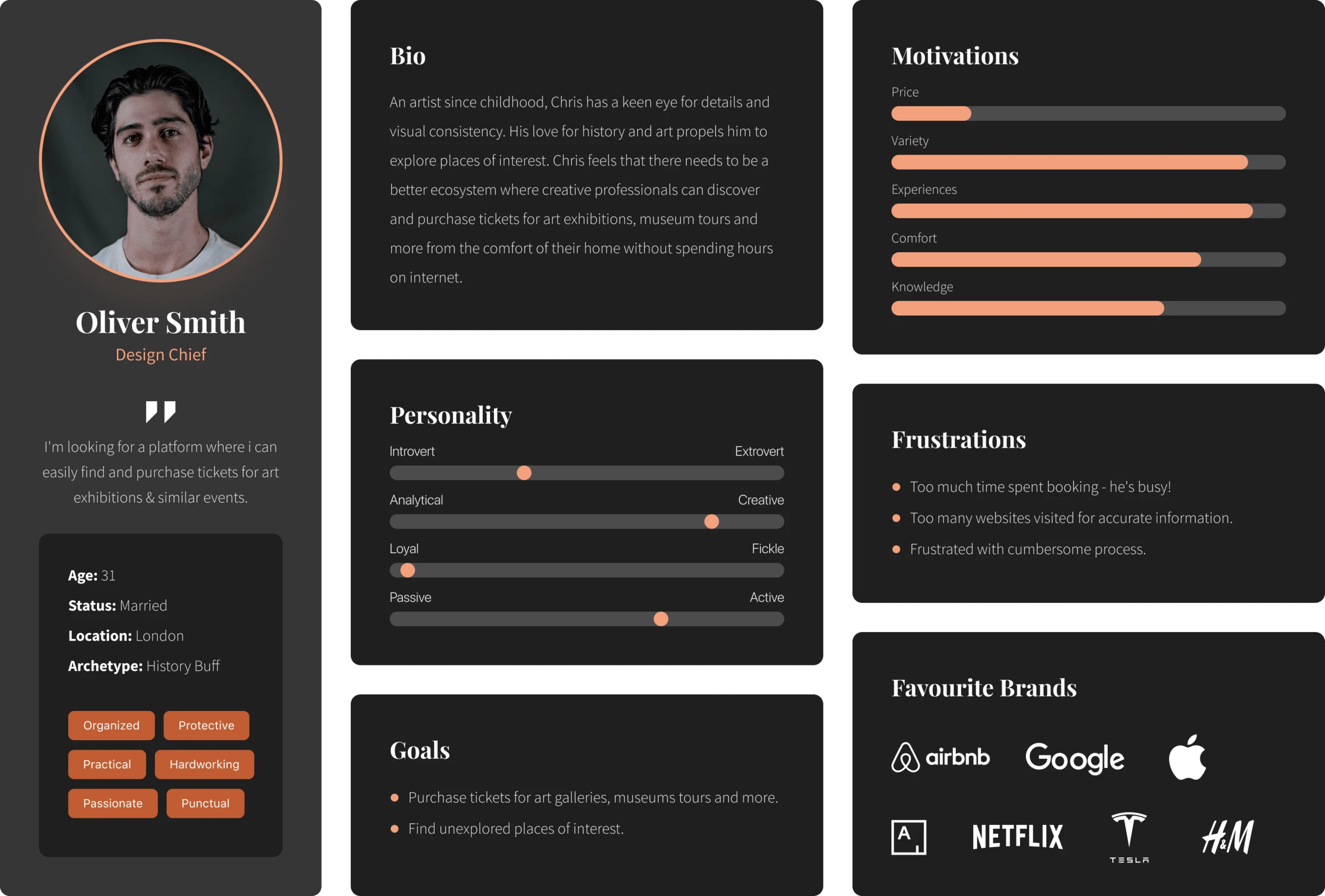
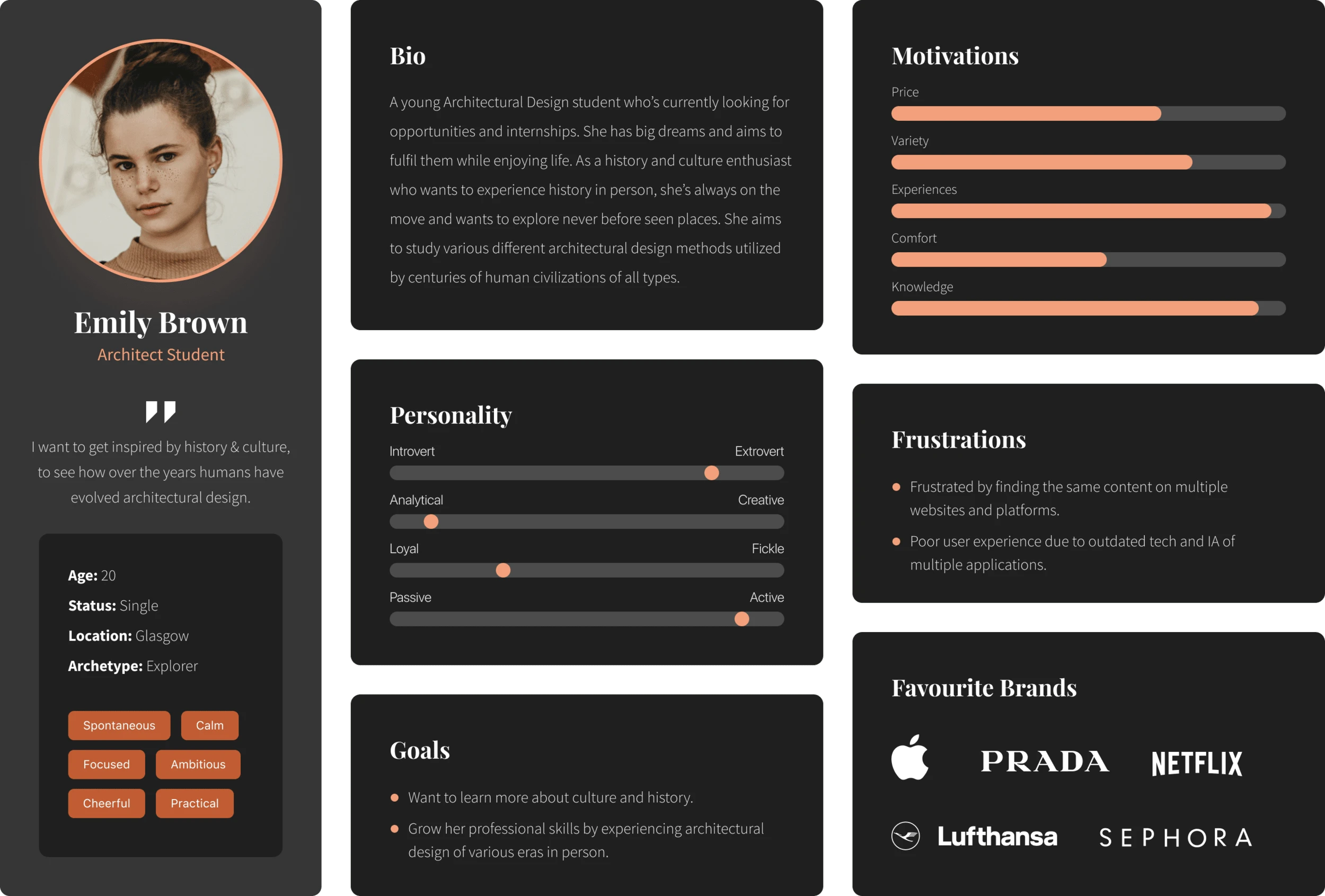
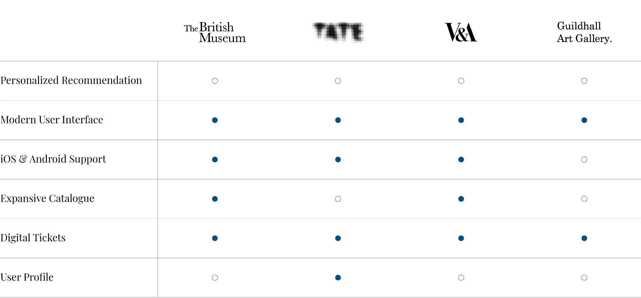
Competitive Analysis
To build Vivid's foundation, I researched existing online booking platforms and identified user needs they weren't meeting. Vital features were selected based on user surveys to give Vivid a competitive edge. Addressing a key pain point, Vivid aims to consolidate art, museum, and exhibition listings into one platform for easy event discovery and ticket purchase.
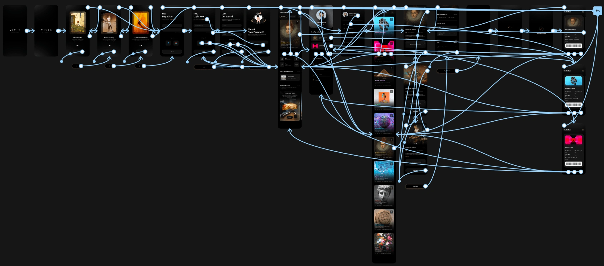
User flow & Information Architecture
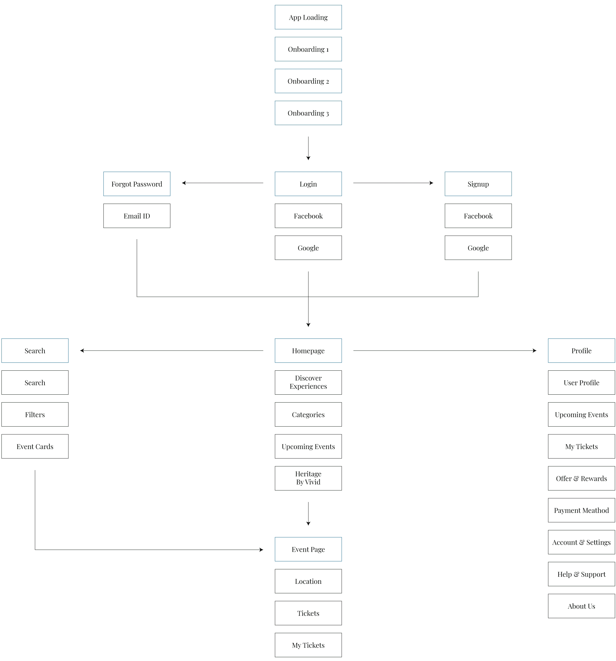
I created a comprehensive user flow to map out the entire journey of purchasing a ticket, providing insight into user interactions with the product. This process allowed me to visualize user navigation and develop a coherent Information Architecture for the platform.

Lo-fi Wireframes
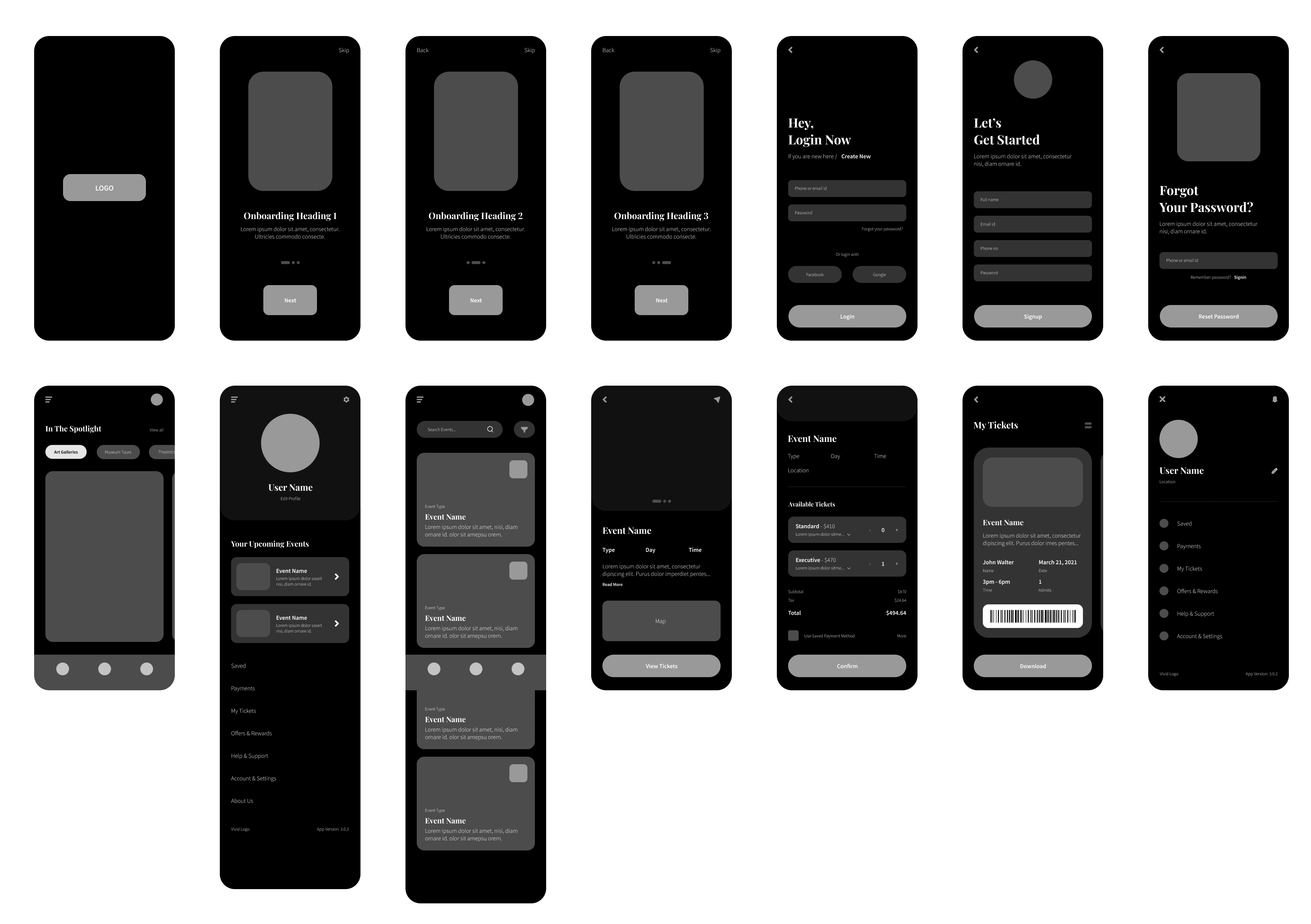
Before advancing to high-fidelity wireframes and prototypes, I initiated the design process by sketching preliminary wireframes on paper. This allowed for a thorough examination of the user flow and identification of areas for enhancement. Subsequently, digital wireframes were developed based on the insights gathered from the initial sketches, ensuring a solid foundation for the app's structure and layout.
Low-fi wireframes
Style Guide
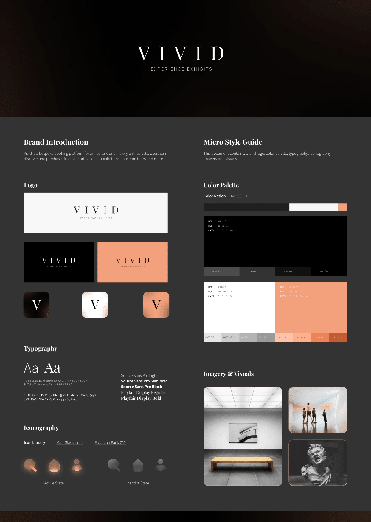
The branding goal was to establish a recognisable identity evoking a sense of rich history. The chosen pastel copper, paired with black and white, was ideal for Vivid's branding, enhancing its earthy tone and premium quality. A combination of Serif and Sans typefaces further contributed to the desired aesthetic.
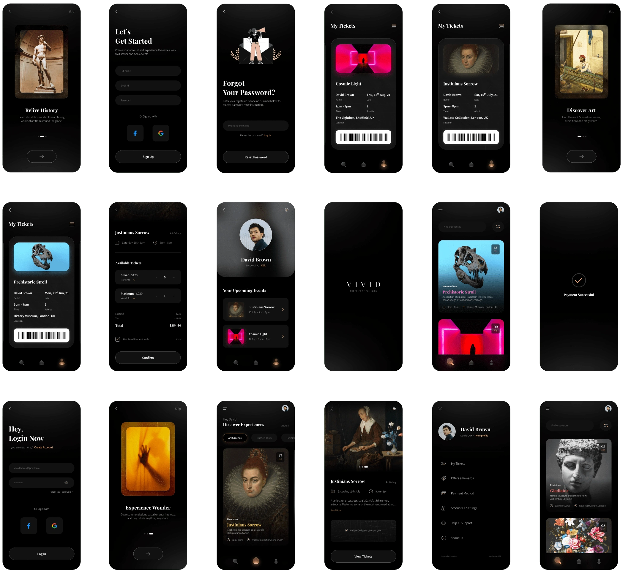
Hi-fi Wireframes and interactions
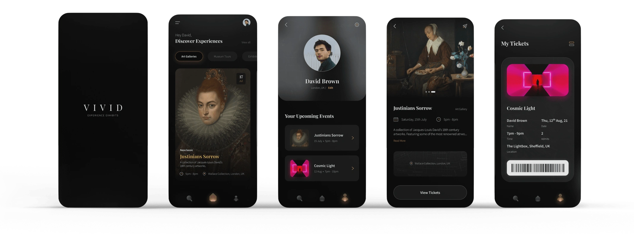
Ultimately, nearly 20 screens were meticulously crafted and prototyped to ensure a seamless user journey, spanning from initial login to ticket purchase.
Like this project
Posted Feb 16, 2024
A bespoke booking platform for art, culture, & history enthusiasts. Users can discover and purchase tickets for art galleries, exhibitions, museum tours & more.
Likes
0
Views
4
Clients
Confidential

