Casa de Estrela Brand Revitalization
Casa de Estrela is a new red wine brand based in Portugal with a bold mission: attract a younger generation of wine drinkers—particularly those in their late 20s to late 30s—who often see wine as something “for older people.” After conducting market research, the brand identified a clear opportunity: create a modern wine that feels premium but more approachable, colorful, and culturally rooted in Portugal.
The Challenge
Although younger audiences don’t reject wine, many associate it with traditional, serious branding. Casa de Estrela wanted to shift that perception—without alienating older consumers or losing the timeless essence of wine.
They needed:
• A unique label design that stood out on shelves
• A visual identity that felt bold yet rooted in tradition
• Social media content to engage their digital-first audience
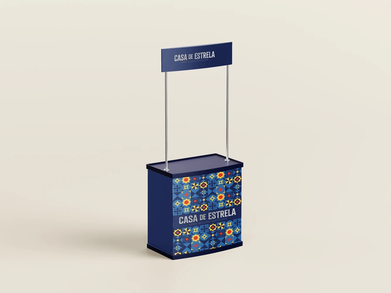
• In-store touchpoints to help consumers discover the brand
My Creative Approach
1. Branding Strategy & Concept
I began by analyzing the market data provided by the client, looking at wine shelf trends, and studying Portuguese visual culture. The direction became clear:
Blend the timeless elegance of wine with the vibrancy of modern Portuguese culture—something eye-catching yet respectful of wine’s classic appeal.
2. Label Design
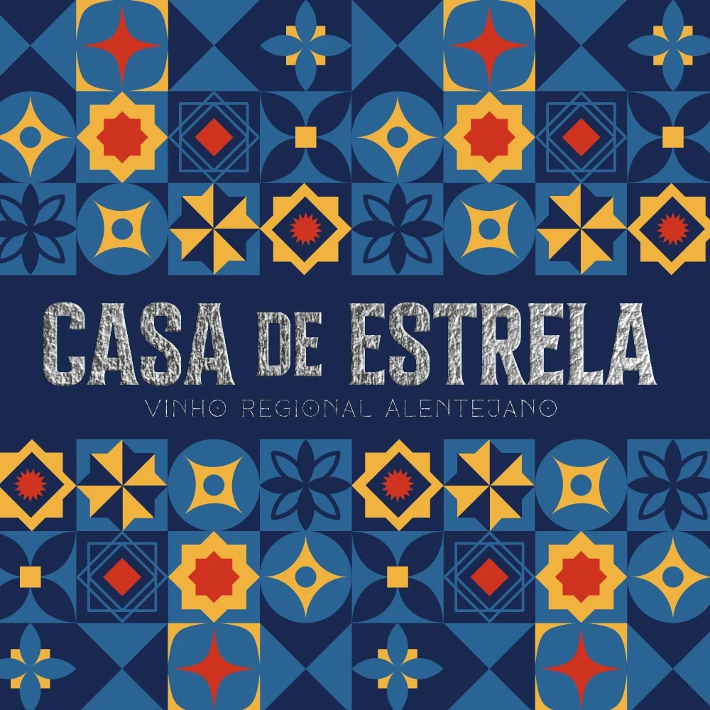
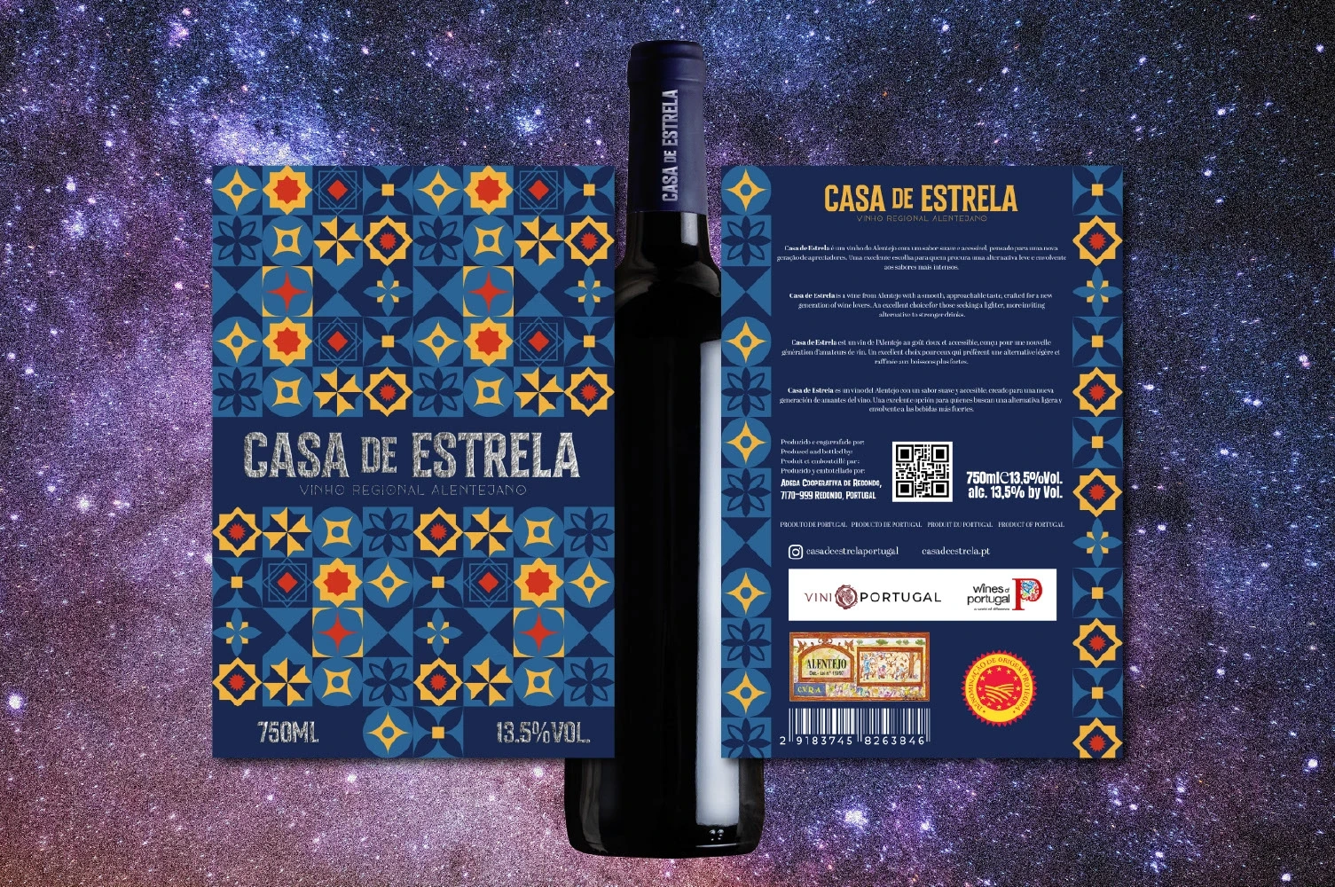
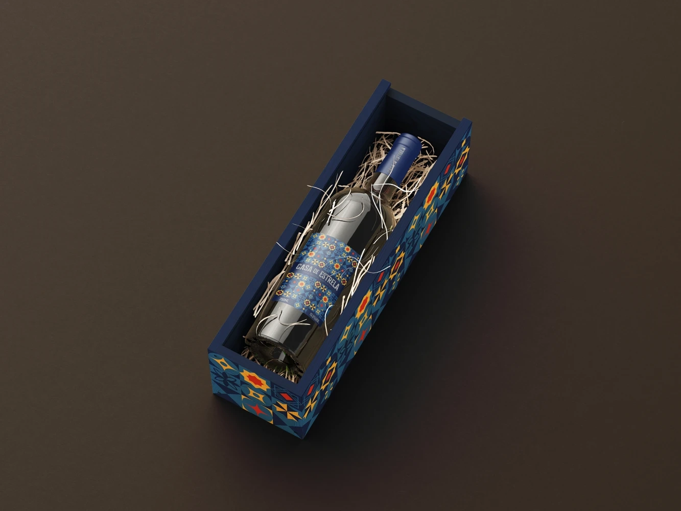
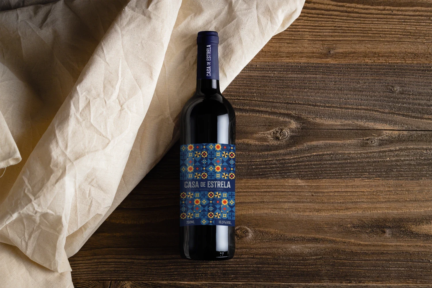
• I designed a label that evokes the look of a modern Portuguese tile, using four bold colors: blue, yellow, red, and light blue.
• The typography is strong and modern—confident without being flashy.
• To retain a premium feel, I used silver foil for the lettering, creating a tactile, elegant finish.
3. Packaging Design
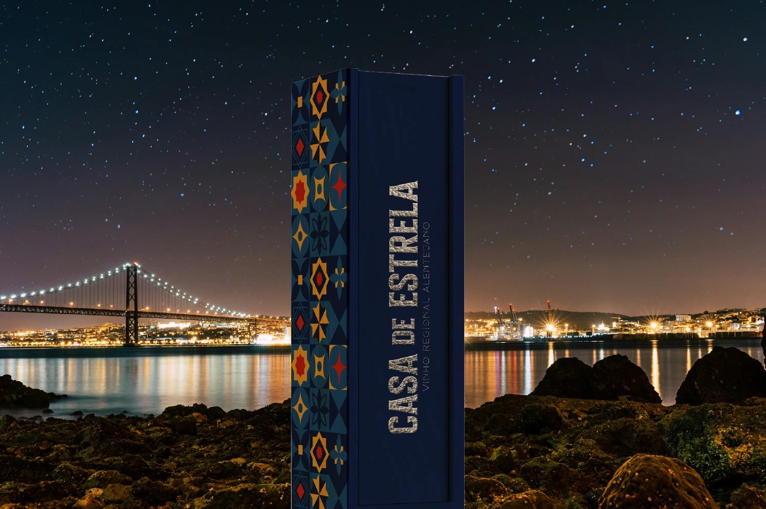
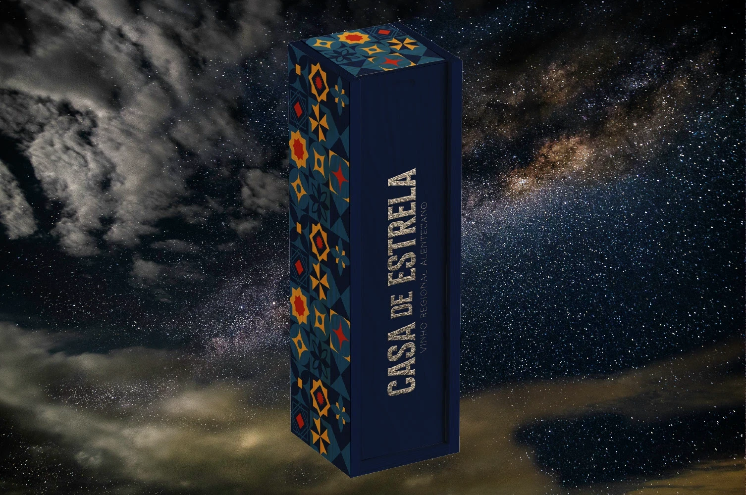
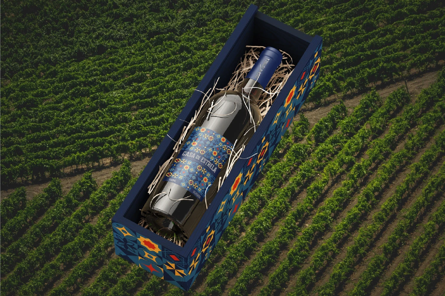
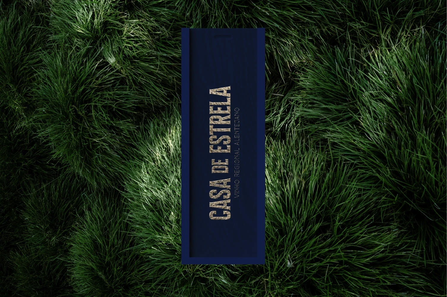
• Casa de Estrela’s gift edition comes in a wooden box featuring the same bold tile design, making it perfect for special occasions or gifting.
• The box helped position the wine as affordable but thoughtful and elevated.
4. Social Media Strategy
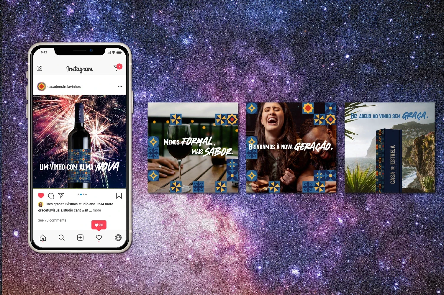
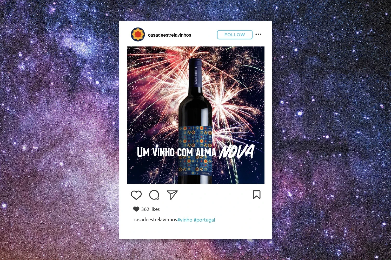
• I created Instagram posts, Reels, and TikTok content targeting younger users who love aesthetic, relatable content.
• The tone was cheeky and confident, encouraging a new generation to enjoy wine without needing to “know everything about it.”
• Catchy phrases like “Um vinho com alma nova” and “Brindamos à nova geração.” helped make the product feel more accessible.
5. Retail Activation
• Designed point-of-sale displays and small stands placed in supermarket wine sections to grab attention and introduce the brand to casual shoppers.
The Results
• Sales Boost: In its first stage, Casa Estrela saw an increase in sales within its target age group (late 20s to late 30s), with strong interest from both locals and tourists.
• Brand Engagement: The wine quickly gained attention on social media, with positive feedback on both the taste and visual identity.
• Gift-Ready Appeal: Shoppers praised the packaging—many noted it was an ideal gift because of its bold, beautiful presentation.
Takeaway
Casa de Estrela shows how good design can do more than look pretty—it can change perceptions, reach new markets, and drive real results. This project is a great example of how I approach brand design strategically—solving business problems through thoughtful, standout visuals and storytelling.
Like this project
Posted Aug 1, 2025
Developed a modern brand identity for Casa de Estrela to attract younger wine drinkers.
Likes
0
Views
4
Timeline
Jul 1, 2025 - Jul 31, 2025

