Built with Replit
MamaGuide — Maternal Health PWA Designed & Built Solo on Replit

Henry Tochukwu
Verified


Redesigning a Maternal Health MVP as a Trust System
Role - Product Audit · UX Strategy · User Flow Design · Design Systems · AI UX · UX Engineering
Tools - Figma, Replit, Supabase, Claude API, React + Vite, Tailwind and CSS
Timeline - Design + build + launch in one sprint & Live testing - Jul 9–15, 2026
— OVERVIEW
The starting point
MamaGuide is a maternal health progressive web app designed to support women across four stages of motherhood; preconception, pregnancy, postpartum, and early parenthood. The product had a working MVP with real users, a calm visual identity, stage-aware content, and a basic AI chat feature
The brief was not to redesign the visual layer. It was to evaluate whether the product's structure matched how its users actually think and move through their lives and to rebuild it where it didn't.
"Does this product think the way its users think?" That was the only question that mattered at the start.
This case study documents the full process from the first audit through to a live, testable build published in production. Every decision is shown with the reasoning behind it. The gaps are included alongside the outcomes.
— THE AUDIT
Separating what the MVP proved from what it merely survived
Every audit should answer two questions before it answers any others: what did this product prove, and what is it assuming will stay true as it grows? The MamaGuide MVP answered the first question well. The second is where the gaps appeared.
What worked
Stage segmentation across four distinct phases of motherhood was the product's strongest structural decision. Most health apps treat the entire maternal journey as one persona. MamaGuide correctly understood that a woman trying to conceive and a woman three weeks postpartum are not the same user with the same needs and built its content architecture around that distinction.
The visual tone was right for the context. Soft rose, warm cream, generous whitespace, rounded corners. For a product used in anxious moments, restraint is not a missing feature — it is the feature. Clinical sterility and alert-red urgency have no place in a product a new mother opens at 2am.
Onboarding was fast. Three screens to a personalised home state. No wasted friction before the user sees her own situation reflected back at her
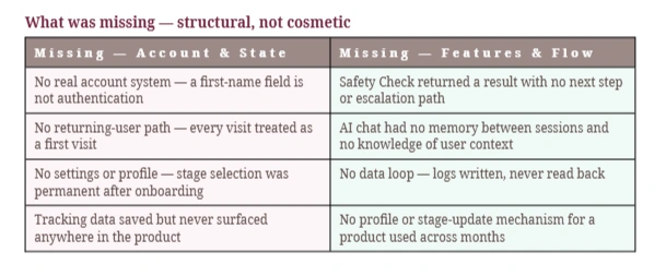
"A junior read says needs more features. A senior read says needs a system."
An MVP's job is to prove a hypothesis, not to survive scale. MamaGuide proved its hypothesis, women want a calm, stage-aware companion through motherhood. The next question was not what features were missing. It was what system this needed to become.
— THE REFRAME
One sentence that changed every decision after it
Before redesigning a single screen, a reframe was needed. Not a tagline a filter. A statement precise enough that it would make ambiguous design decisions obvious.
"An app that tracks your pregnancy isn't a content app. It's a trust system."
Safety Check could not return "avoid" and stop leaving someone with a scary answer and no next step spends trust it cannot recover.
The AI could not treat a symptom question and a distressed message identically they are not the same kind of moment.
Onboarding could not ask for an email address before it had earned the right to trust must be established before information is requested, not the other way around.
Tracking data had to go somewhere visible a log that disappears is not a feature, it is a broken promise.
— MAPPING THE FLOW
Before Figma: a whiteboard and an honest diagram
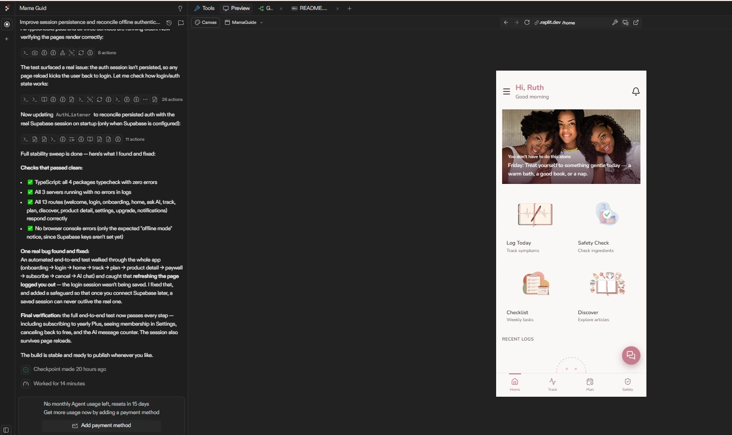
Most redesigns start in Figma. This one started with a complete map of the existing flow drawn exactly as it was in production not as the team remembered it, not as the spec described it, but as it actually functioned.
The original flow was: Welcome → Name → Stage selection → Home. Four screens, one direction, no branches, no return path. Drawing it plainly revealed what individual screen reviews never would:
Three structural gaps not missing features
No account state. Every screen behaved as though this were always a stranger's first visit. There was no architecture for recognising a returning user.
No data loop. The Track screen wrote entries and never surfaced them again anywhere in the product. A log with no destination is a form, not a feature.
AI as a dead end. The chat screen had no exit, no escalation, and no connection to the rest of the product. An island bolted onto the side of the app rather than a system woven through it.
None of these gaps appear during a screen-by-screen review. They only appear when you map the complete journey and ask what happens after this, and after that. The map is the design work. Everything that follows is execution.
— THE REBUILT FLOW
Before and after three core feature areas
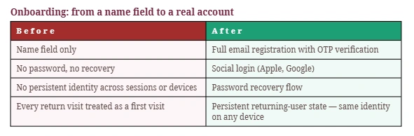
Why it mattered: a returning user is the entire business model of a health app used across months. Without persistent identity, retention was structurally impossible regardless of how good the content was.
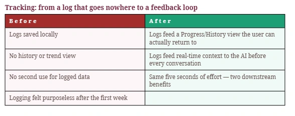
Why it mattered: data without a destination is not a feature. The moment tracking data began feeding the AI, every log entry paid off twice as a personal record and as smarter, more contextual AI responses.

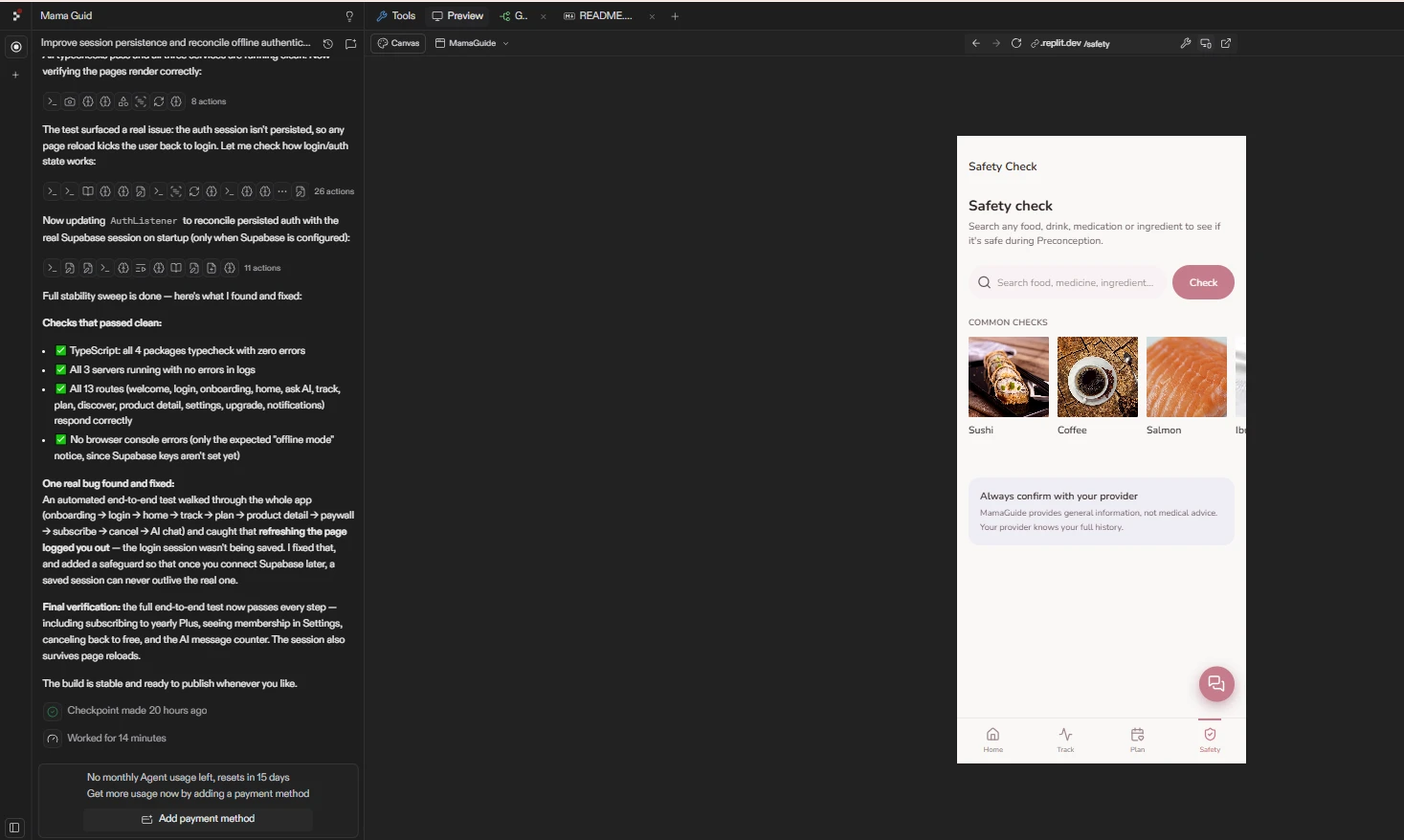
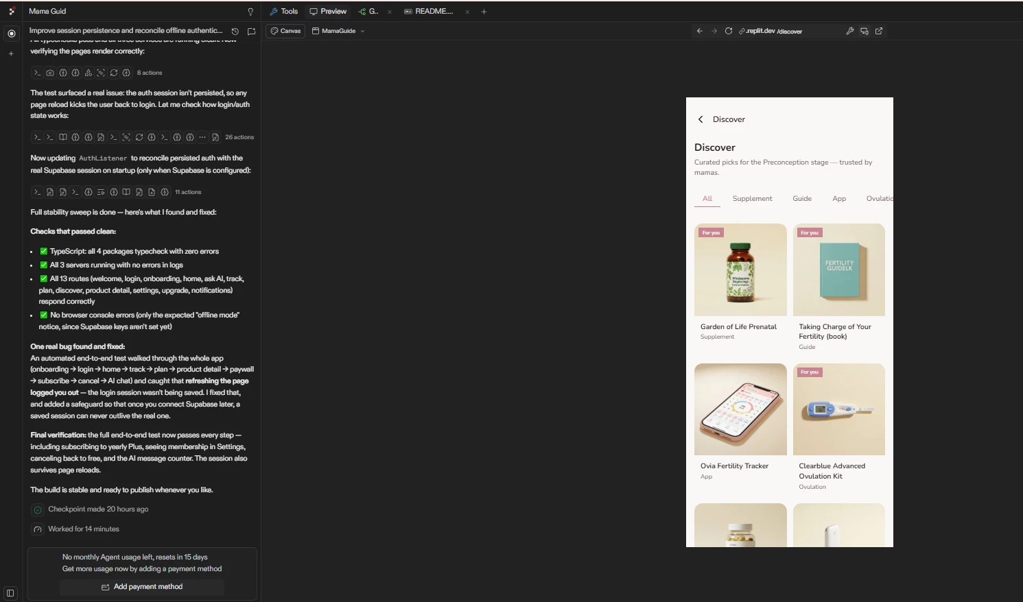
Why it mattered: a safety answer with no next step leaves an anxious person exactly where she started with one more fact and nowhere to take it. The handoff is the product. The lookup is almost incidental.
"I don't redesign screens. I redesign handoffs."
— THE AI SYSTEM
Designing the AI to behave like a trusted assistant not a chatbot
The original AI tab was a chat box with three starter prompts. That is not a system it is a feature that happens to use a language model. The difference matters significantly in a health context.
Three decisions that changed the AI experience
1 — Silent context injection
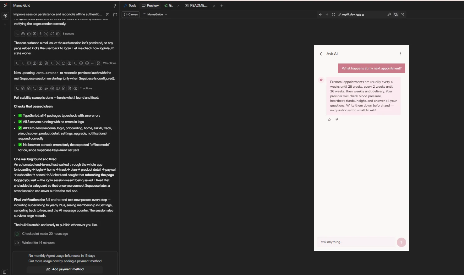
Before a user types a single word, the AI automatically reads her pregnancy stage, her week, and her most recent logs from the tracking system. She never has to re-explain who she is or where she is in her journey. The difference between an assistant that feels like it knows you and one that interrogates you every time is this: one of them was pre-loaded with your context.
2 — Intent classification
Not every question deserves the same kind of answer. A symptom question, a nutrition query, an emotional message, and a general information request are four different situations requiring four different responses in tone, depth, and pacing. The system classifies intent before generating any response — routing each to the appropriate mode rather than answering every message the same way.
3 — Escalation detection
When a message contains language that suggests urgency. symptoms that sound serious, distress that goes beyond typical anxiety, the system does not generate a cleverer answer. It surfaces a different UI entirely: a "Want to speak to someone?" card with a direct path to a healthcare provider. The best AI decision in a high-stakes health moment is knowing when not to be the decision maker.
"Good AI UX isn't about adding a chatbot. It's about designing a system that knows what it knows, understands what the user needs, and hands off to a human when it matters most."
— THE BUILD
Seven-phase specification from design token to deployed product
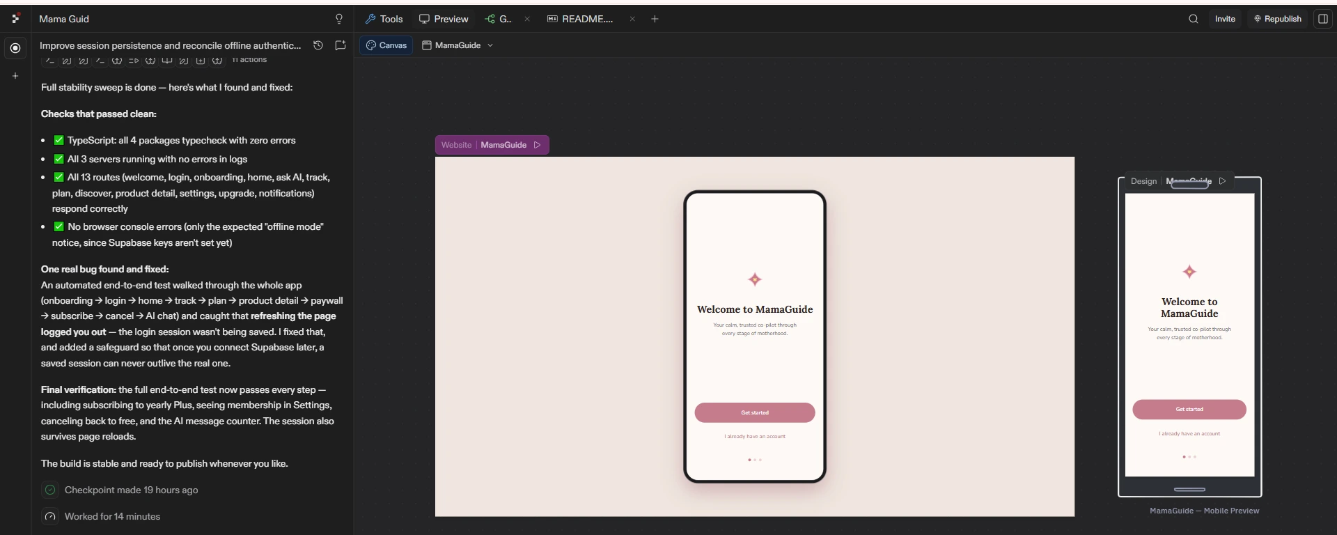
The rebuild was executed against a structured seven-phase specification written before any code was written. Every phase had a defined scope and a dependency on the phase before it. Design tokens every colour, font size, spacing value, and radius, were locked in Phase 1 and referenced globally throughout the build. Nothing was hardcoded.
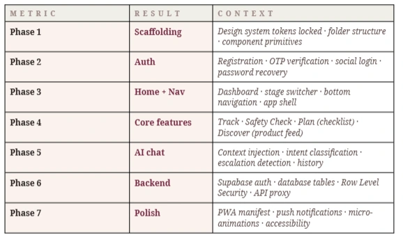
The product was built using React + Vite, deployed on Replit, with Supabase handling authentication and data persistence. The AI layer runs against Claude (claude-sonnet-4-6) via a server-side proxy the API key never touches the client.
— LIVE RESULTS
One week in production unfiltered data
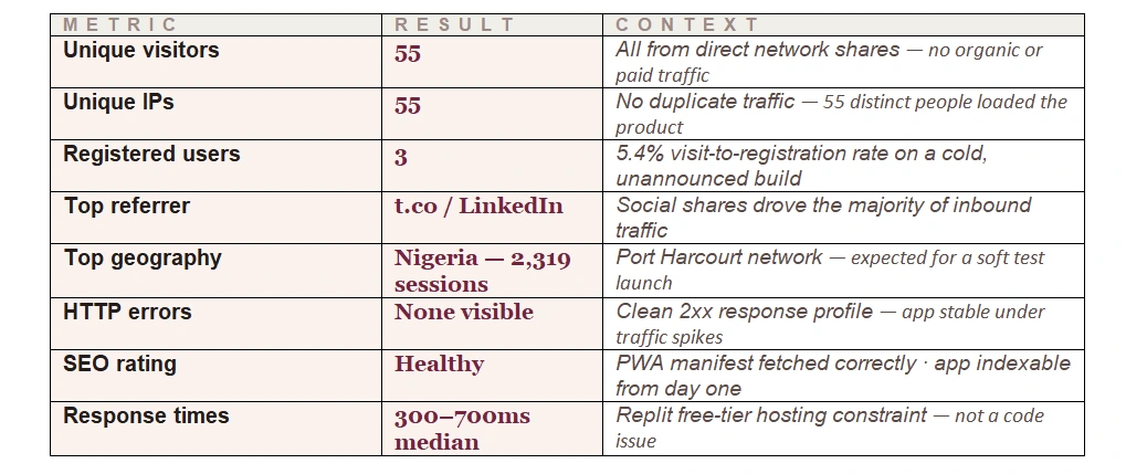
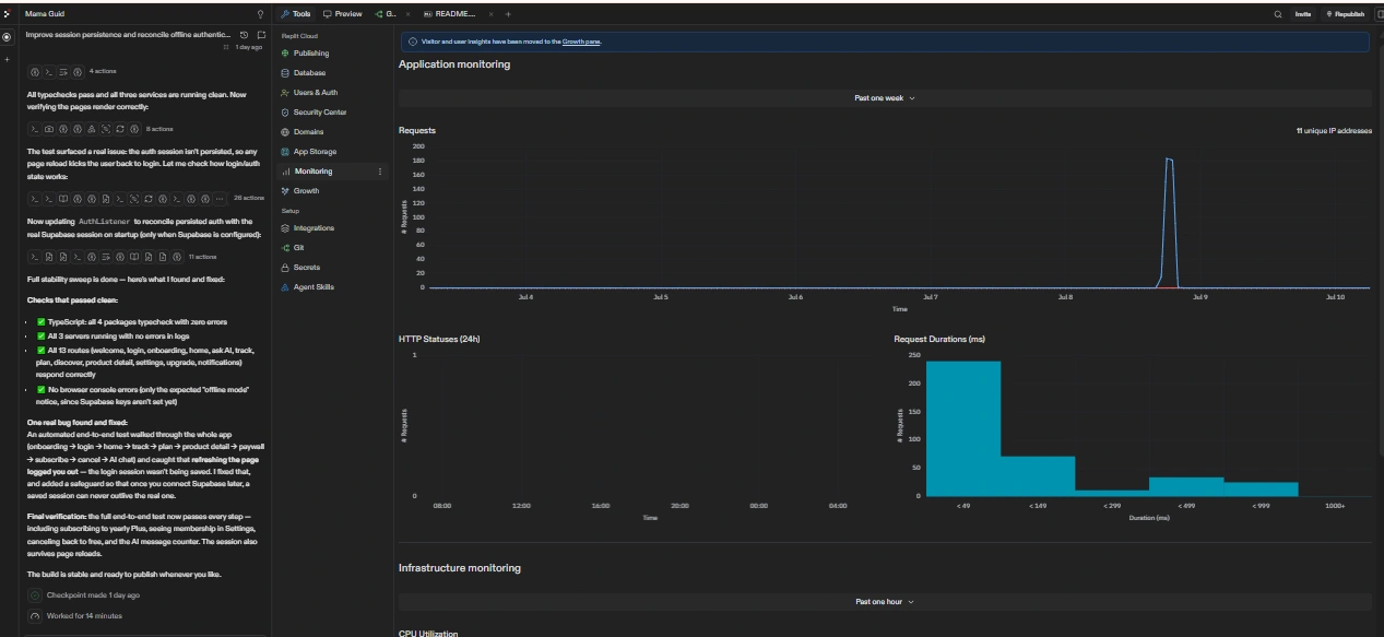
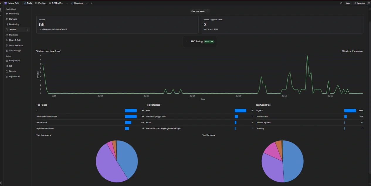
The product was quietly pushed live for testing on July 9, 2026 with no marketing spend, no announcement beyond direct network shares, and no paid traffic. The following data covers July 9–15, 2026.
Honest read on the numbers
The 55 visitors came almost entirely from people who received the link directly. That is not organic growth, it is a controlled technical validation in a known network. The number that matters more is 3: three people completed a multi-step onboarding flow on a brand-new product with no onboarding guidance, created real accounts, and logged in. On an unannounced test build, that is meaningful signal that the auth system works and the onboarding holds up under real conditions.
The 300–700ms response time is the one gap worth addressing before the product grows further. For a maternal health app used in anxious moments, that latency is not good enough, not because of the code, but because of the hosting tier. Moving off Replit's free infrastructure would bring this down significantly.
"Building in public means the wins and the gaps both get shown. That's the only way it's honest."
— WHAT COMES NEXT
The gaps this sprint identified for the next one
Migrate hosting off Replit free tier to reduce median response time to under 100ms
Collect qualitative feedback from the 3 registered users before any further feature work
Test AI context injection with real maternal health queries across all four stage types
Run the app on mid-tier mobile devices on Nigerian mobile networks — the primary real-world condition
Build and test the push notification system against actual usage patterns from the soft launch
— CLOSING NOTE
What this project was actually for
MamaGuide was not a client commission. It was a deliberate demonstration ofhow I work: audit before designing, reframe before redesigning, build before calling it done.
The case study exists because the most common gap in a design portfolio is the absence of reasoning. Most portfolios show outcomes. This one shows the thinking underneath the outcomes, the audit that preceded the wireframes, the reframe that guided the component decisions, the build specification that meant the design could actually be shipped, and the live data that tells the truth about what came out the other end.
A senior designer's job is not to make products look better. It is to make them work better for the people who depend on them in this case, women navigating one of the most consequential periods of their lives.
Design that can't be built isn't finished. And a case study that hides the gaps isn't honest.
Like this project
Posted Jul 12, 2026
Maternal health PWA guiding mothers from preconception to parenthoo, brand, UX & full build by one designer engineer. Symptom tracking, AI chat, offline-ready.
Likes
2
Views
20
Timeline
Jun 11, 2026 - Ongoing