CoinGecko Accessibility Color Contrast Audit
Oluwatobi Adetunji
Overview
Type: Unsolicited Audit
Product: CoinGecko (coingecko.com)
Focus: Accessibility color contrast compliance and design system gap
Outcome: A proposal to extend existing contrast rules to the primary brand color
How it started
I was using CoinGecko last night then something felt visually off about these green buttons so I ran a contrast check.


White text on #4BCC00 (Gecko Green) returned a contrast ratio of 2.0:1
WCAG AA requires a minimum of 4.5:1 for normal text. WCAG AAA requires 7:1. The buttons were failing both thresholds by a significant margin.
I kept looking. The same color was appearing in the opposite direction. Gecko Green as text on white backgrounds, failing in the same way. Same color, both directions, multiple surfaces.
That sent me to the brand guidelines and product itself to understand the full picture
Drilling deeper
Inspecting the live product revealed that CoinGecko's Moon Design System does have a stepped scale for Gecko Green. It just isn't documented publicly. Two steps are in active use:
#E8FCC9. A light tint used on chips and UI components
#35AF00. A darker shade used on chips, buttons to create depth
I tested both for text contrast
The full picture
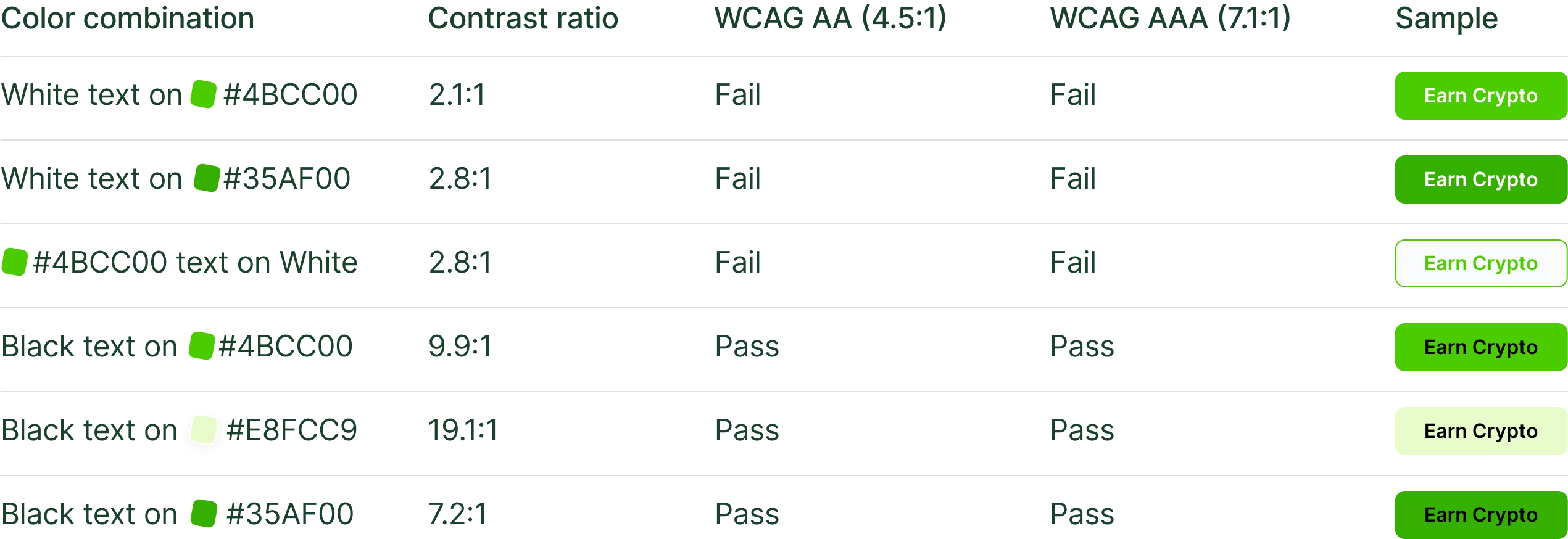
The scale itself isn't the problem. All three steps work well with dark text. The issue is that white was paired with the primary gecko green for the primary and secondary buttons.
White doesn't have enough contrast against any of them.
Why this happened
The stepped scale was built for visual depth and layering.
#35AF00 sits behind the primary green on buttons to create depth. #E8FCC9 creates a softer chip background. Both decisions are visually sound.
The gap is that white text was paired with green as a background and as a text without a contrast check. The colors were never the problem, the text color choice on top of them was. And without a documented rule in Moon defining which text color belongs on each step, white gets used by default because it feels right against a saturated green.
It doesn't pass. Black does, comfortably, on every step in the scale
Moon design system context
CoinGecko's Moon Design System already applies strong contrast thinking to semantic colors. Success Green, Warning Yellow, Danger Red and Info Blue all have tints and shades generated specifically to create contrast in badges and alerts.
The documentation is explicit: those stepped values exist because component statuses require contrast to communicate meaning clearly.
That same thinking wasn't extended to Gecko Green. The primary brand color has no documented text pairing rules. Every designer who reaches for it has to guess what text color to use on top of it and the default guess is wrong.
The proposal
The fix doesn't require changing any color in the scale. It requires documenting one rule clearly in Moon:
Dark text on all Gecko Green backgrounds. White text on none of them.
Specifically:
#4BCC00: Black text only (10.52:1, passes AA and AAA)
#35AF00: Black text only (passes AA and AAA)
#E8FCC9: Dark text, already used correctly on chips
Document that rule the same way badge contrast is documented. Then sweep existing implementations to update the white text instances. Highest-traffic pages first, the rest absorbed into normal sprint cycles.
What this taught me
The most interesting accessibility failures aren't careless ones. They're the ones where a system did something thoughtful, built a stepped scale, documented semantic colors carefully, controlled tints centrally and a gap appeared in a place the same logic wasn't extended to.
The Gecko Green scale is well constructed. It just never had its text pairing rules written down. Finding that required looking past the surface of a single button and understanding how the system was built, what it already did well, and where one specific rule was missing.
Like this project
Posted Apr 25, 2026
A contrast audit of CoinGecko's Gecko Green — tracing a failing button back to a missing rule in the Moon Design System.