Logo Concepts for Arclab.
Alec Minimalec
About Arclab™
Arclab is a Sydney-based residential design practice led by Andrew Croft, combining architectural creativity with structural engineering expertise. The studio specialises in high-end home renovations—particularly on complex or sloped sites—and delivers a balance of design vision and practical execution through detailed plans and photorealistic 3D renders.
Rebrand Goals
Modernize an outdated identity (original logo is over 15 years old).
Reflect Arclab’s growth into a high-quality, design-led practice.
Attract better-fit clients with budgets between $500K–$3.5M.
Position Arclab between architects and building designers—offering smart, collaborative, and grounded design.
Create a calm, confident, and refined visual identity that works across all touchpoints—Instagram, signage, drawings, and merchandise.
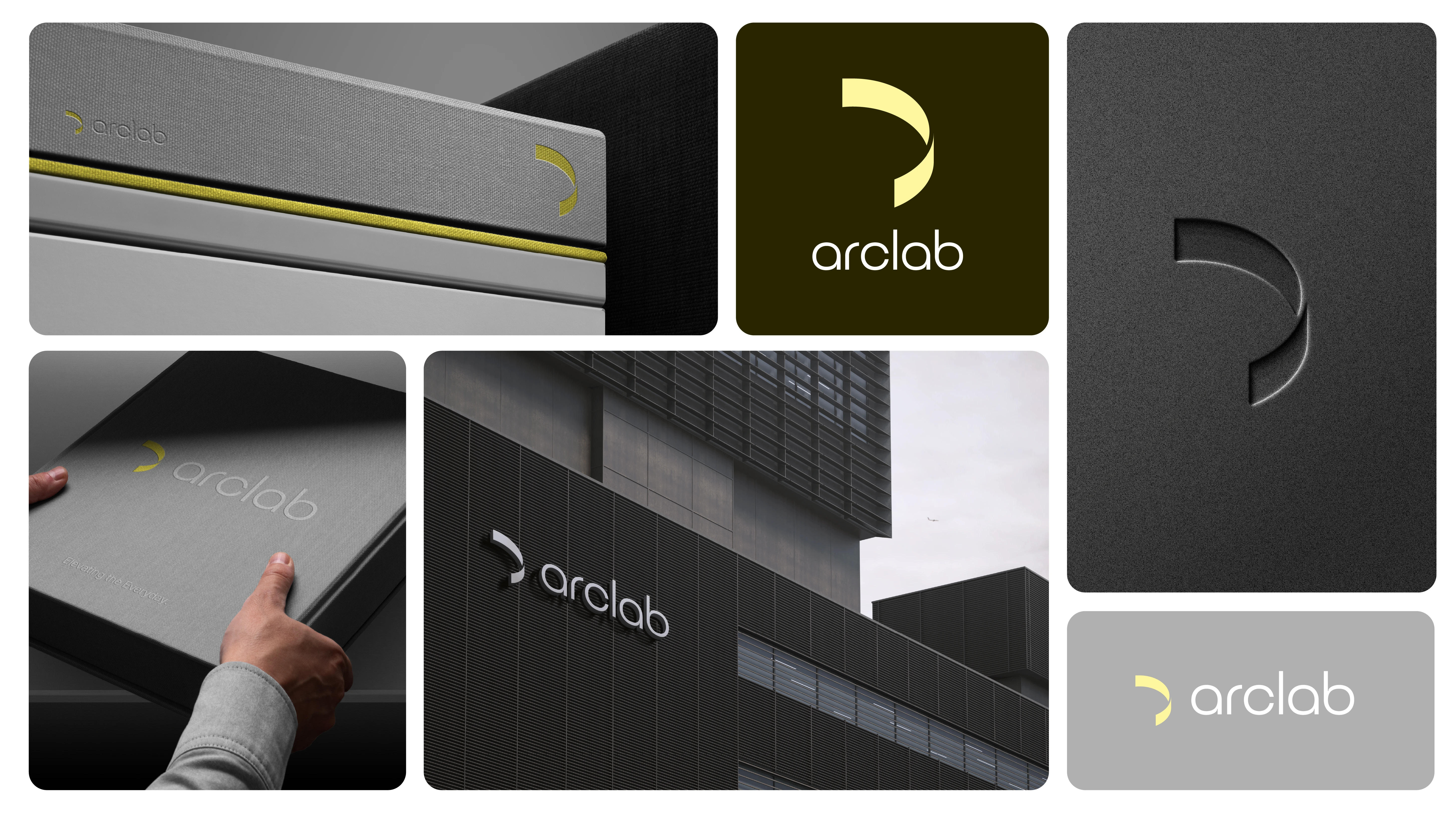
Concept #1
Design Rationale
The symbol represents a fusion of structure and clarity. The rising, radiating form suggests elevation, insight, and transformation—key to Arclab’s approach to renovation. The curved base anchors the mark, referencing sloping sites and the grounded, practical nature of their work. It's abstract yet architectural, evoking precision without rigidity.
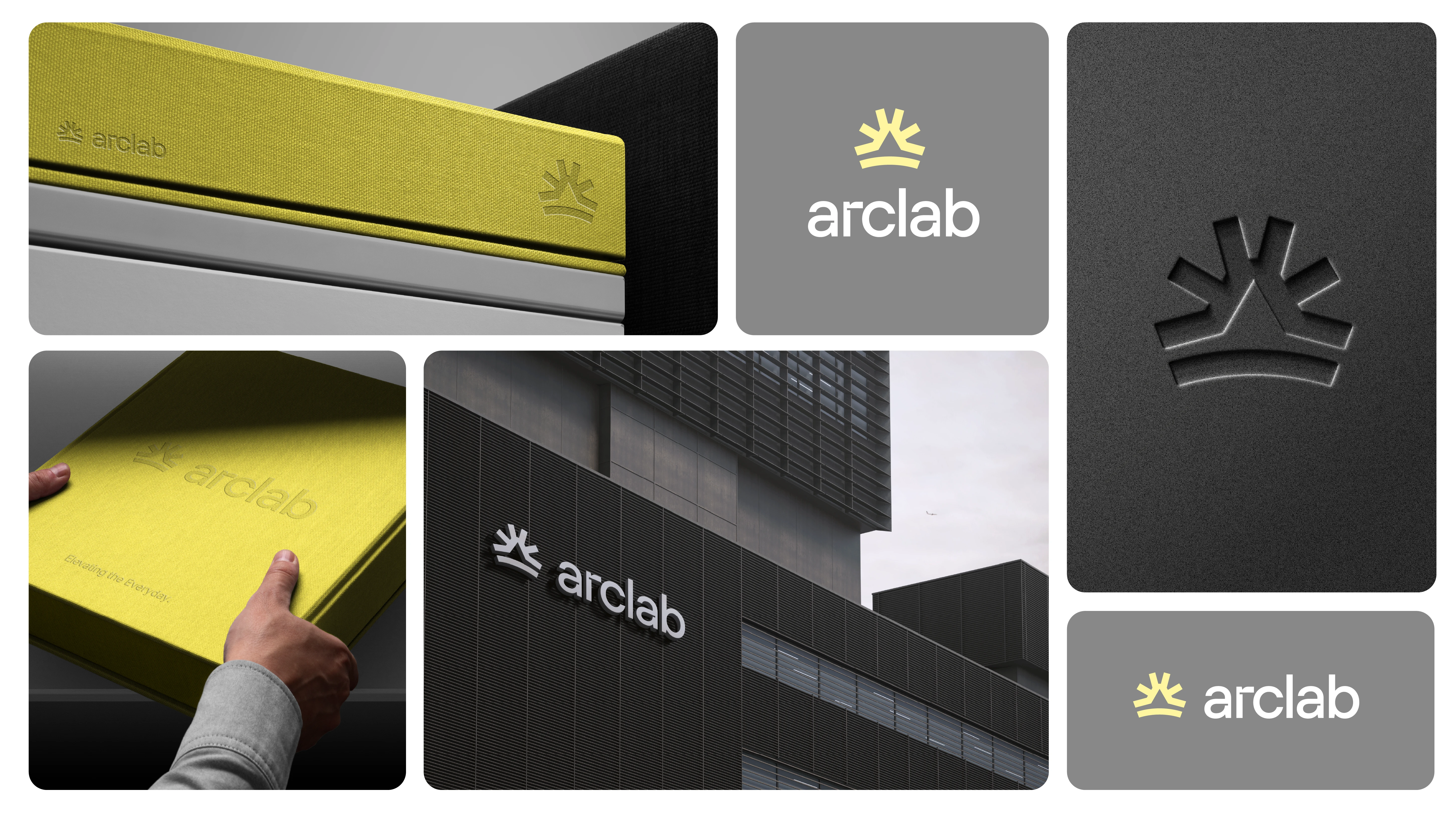
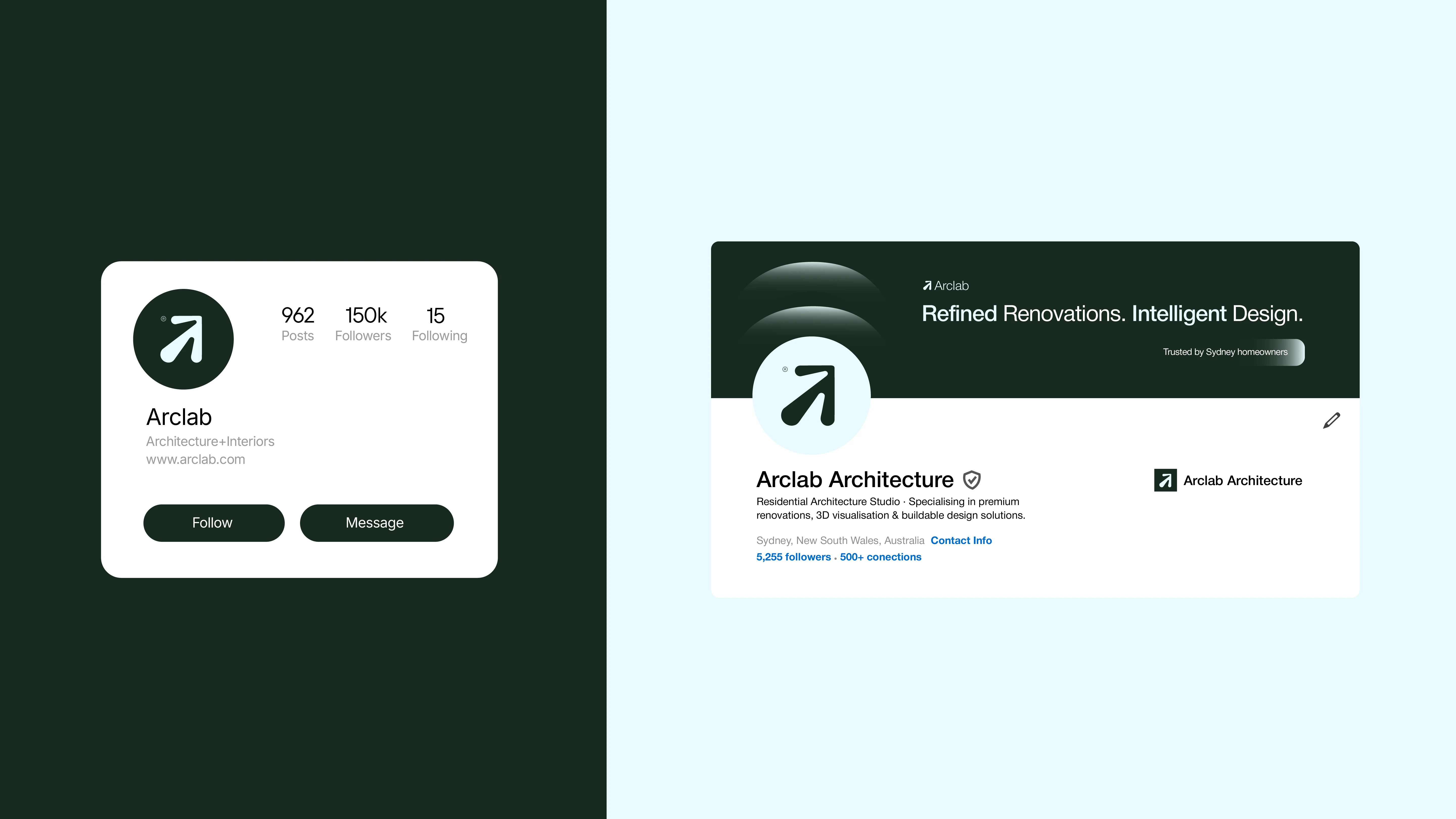
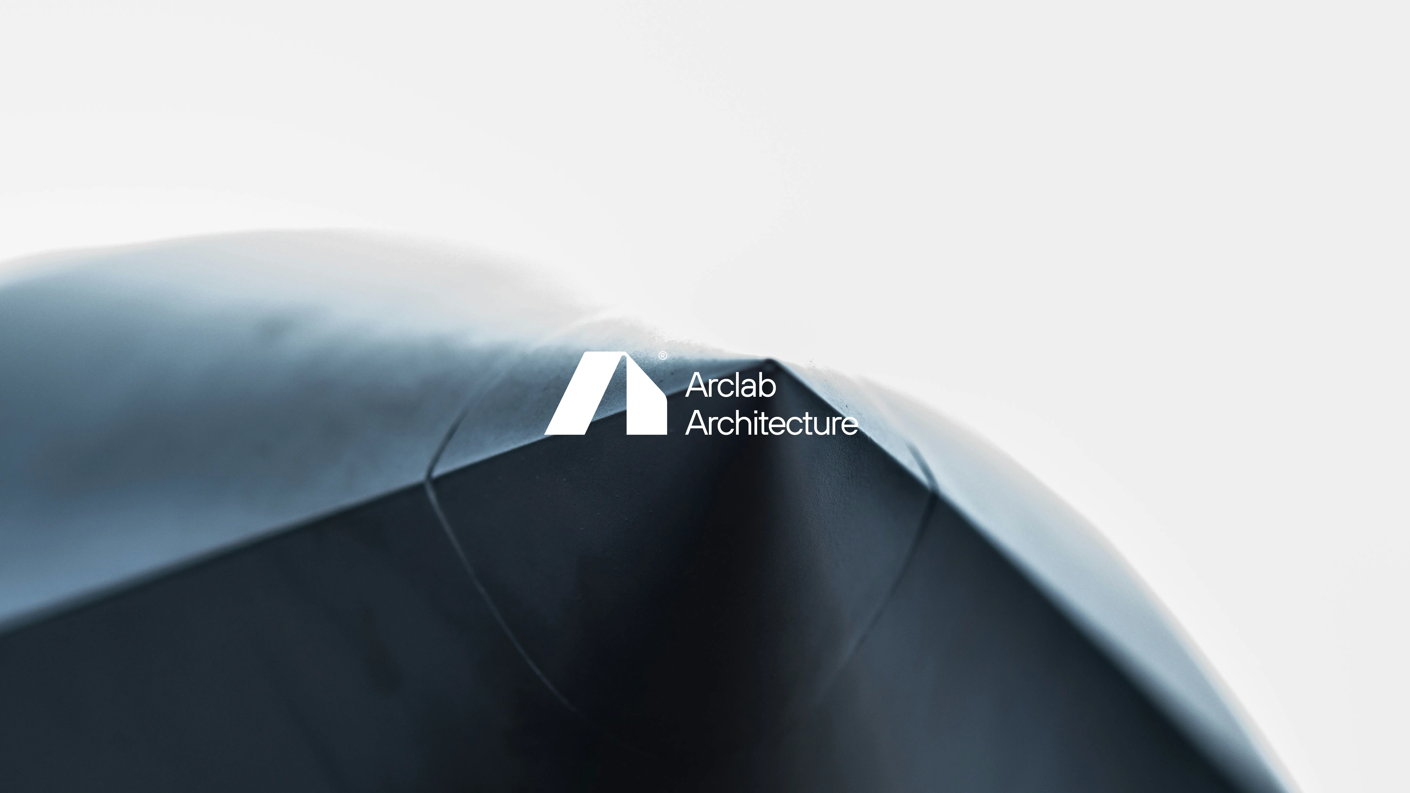
Моckups
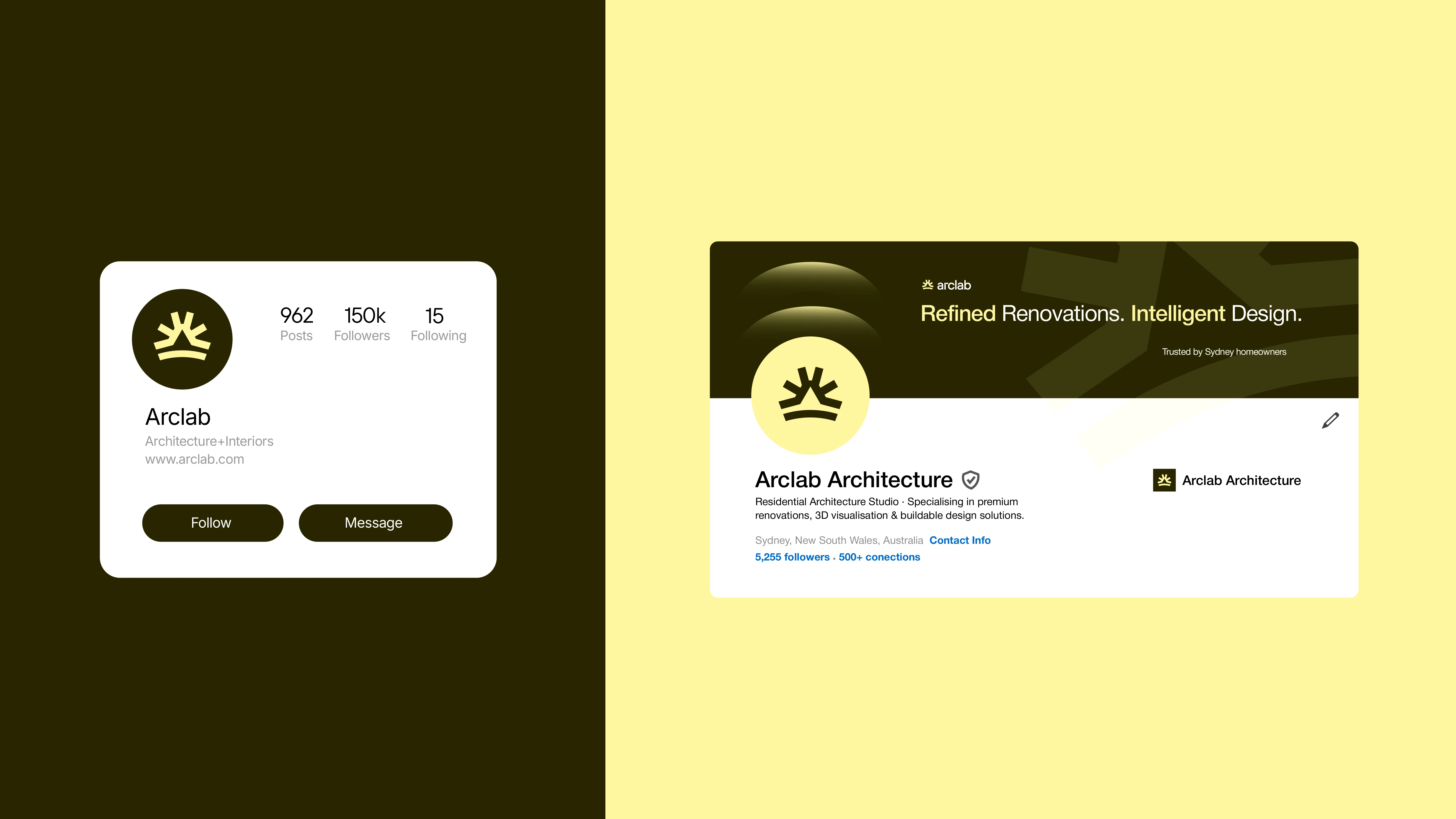
Socials
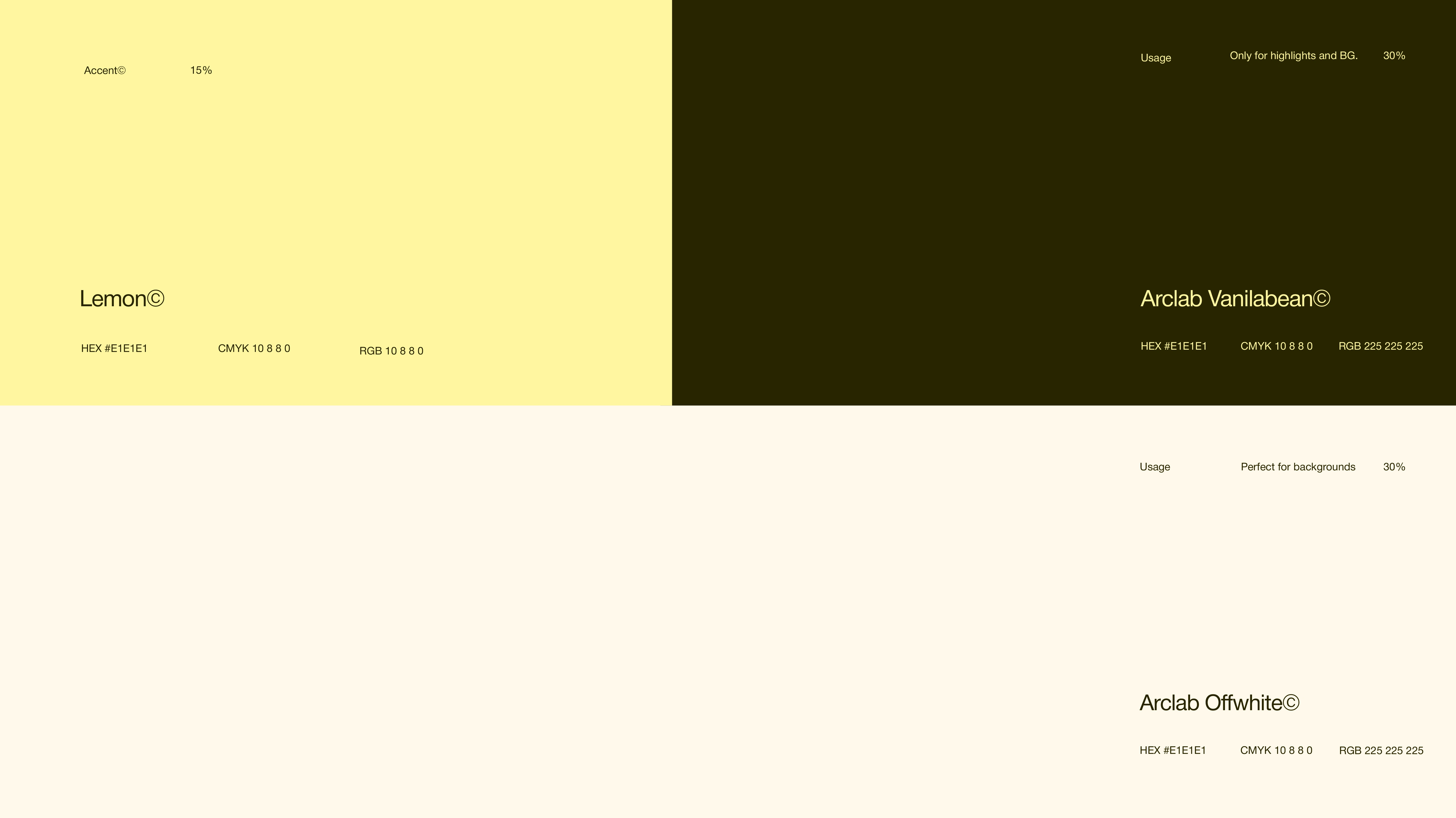
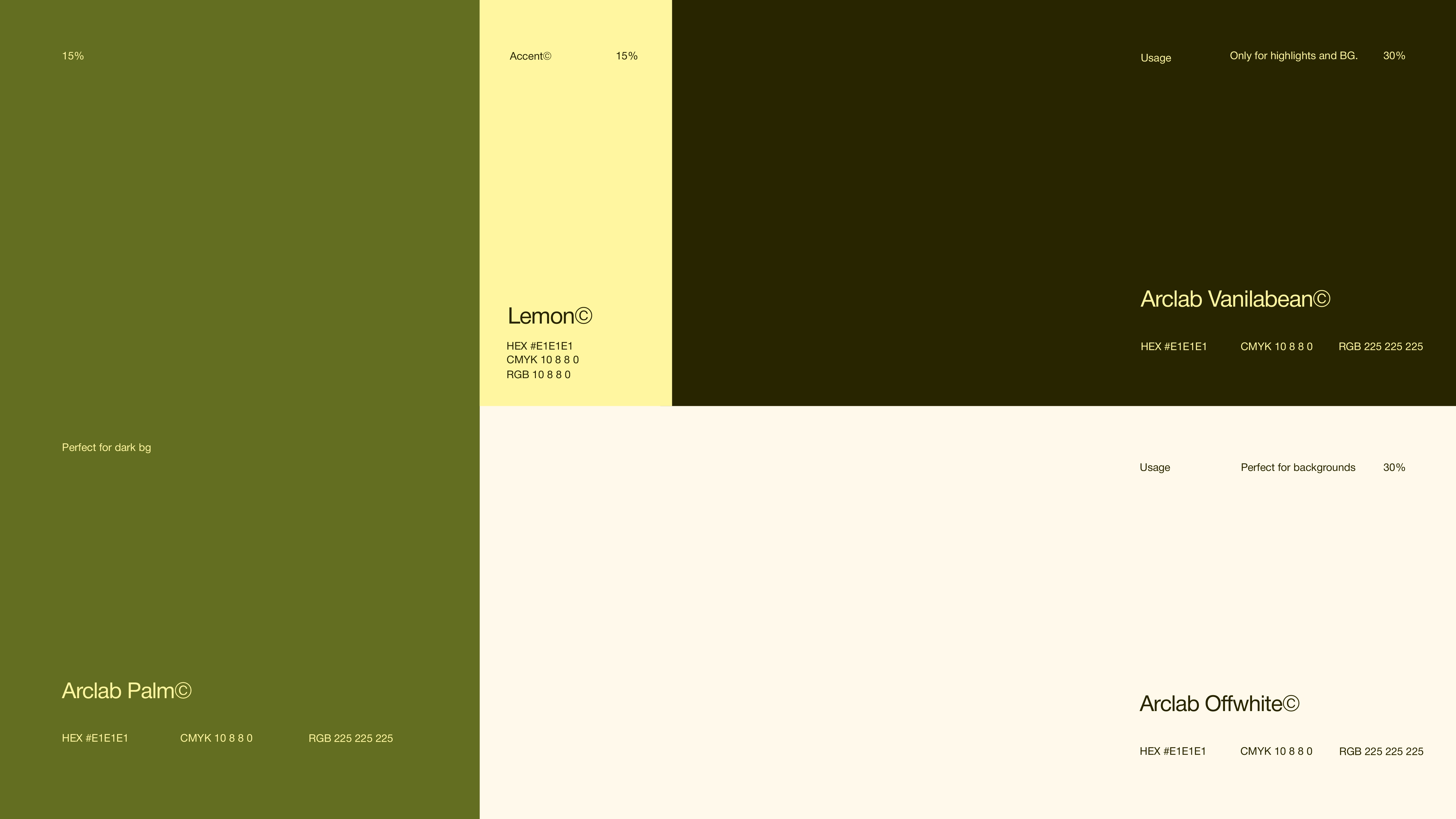
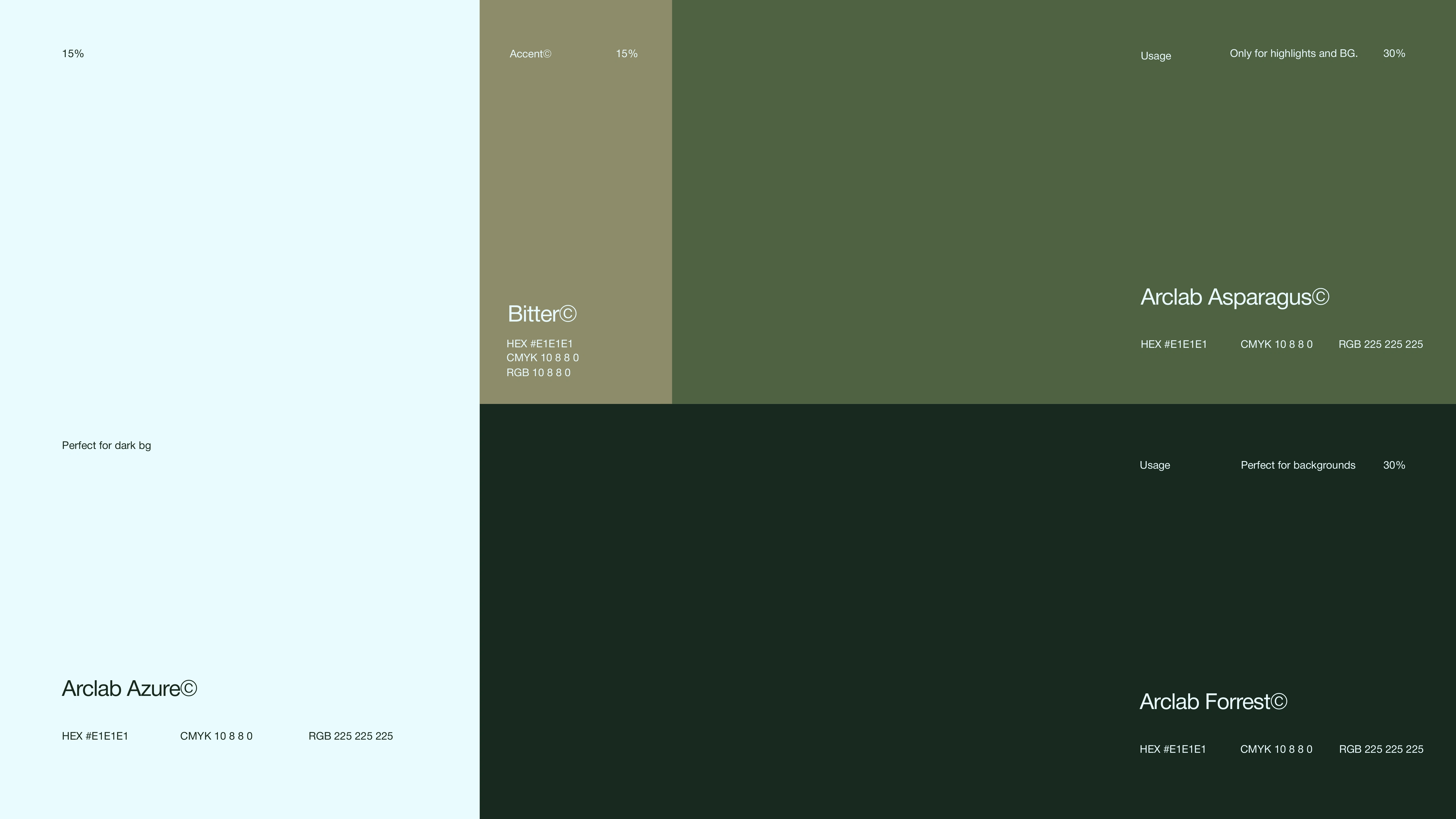
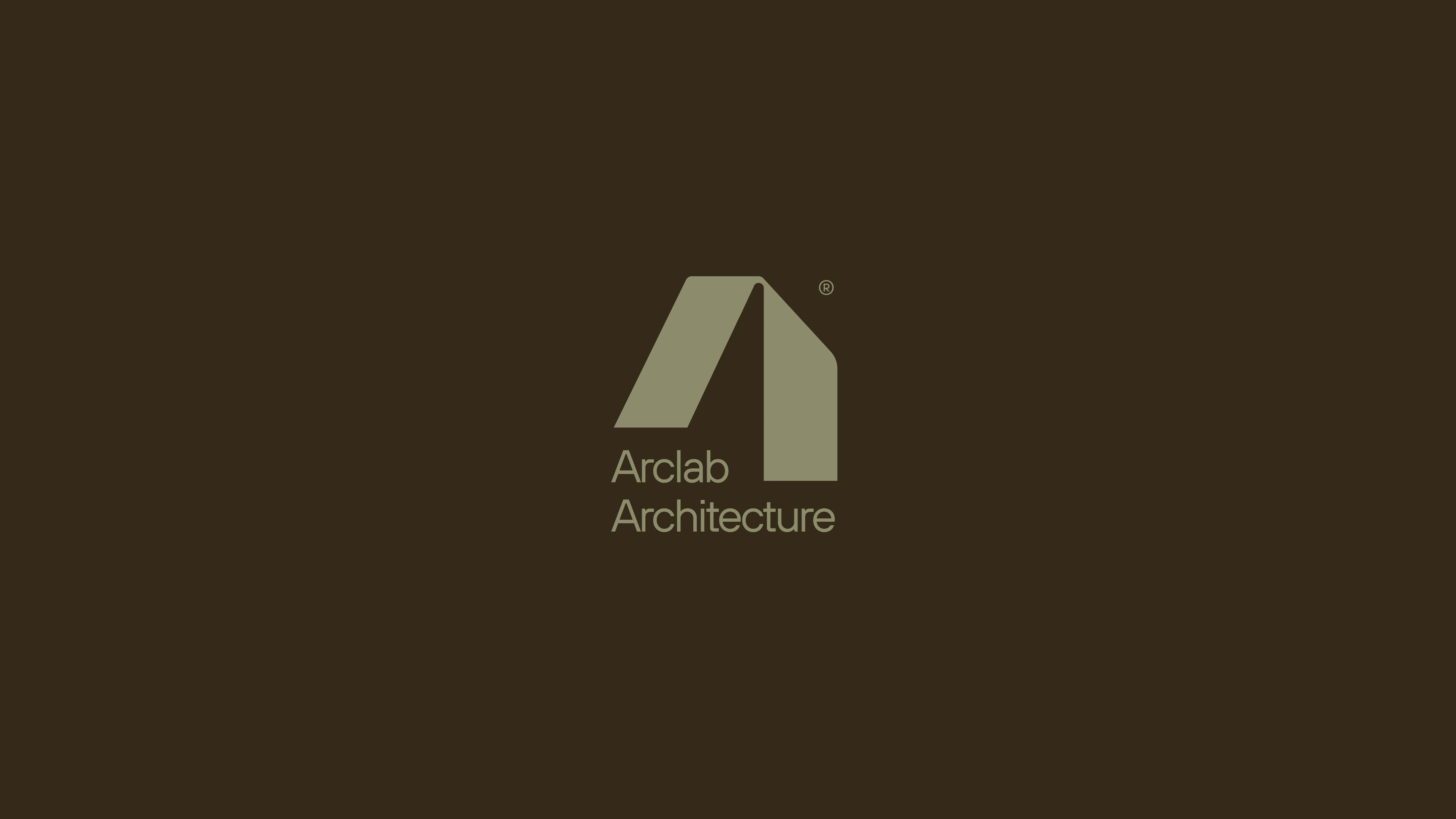
Color Palette
Concept #2
Design Rationale
This concept builds on the word “arc” with a clever typographic gesture—an architectural arch above the “a.” It subtly nods to structure, shelter, and precision without relying on a full symbol. The final period grounds the mark, adding a sense of clarity and quiet confidence. Simple, modern, and smart—just like Arclab.
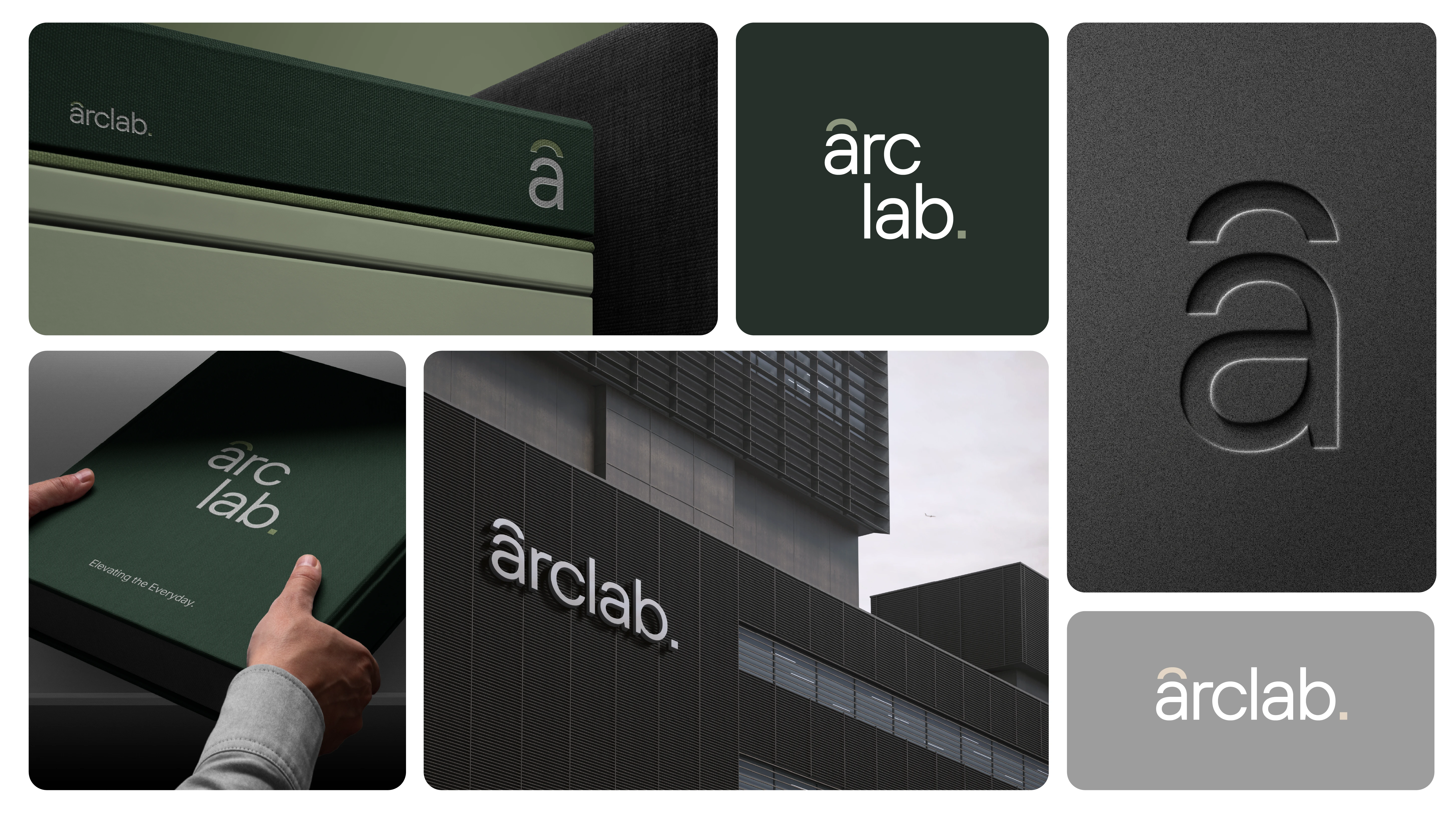
Mockups
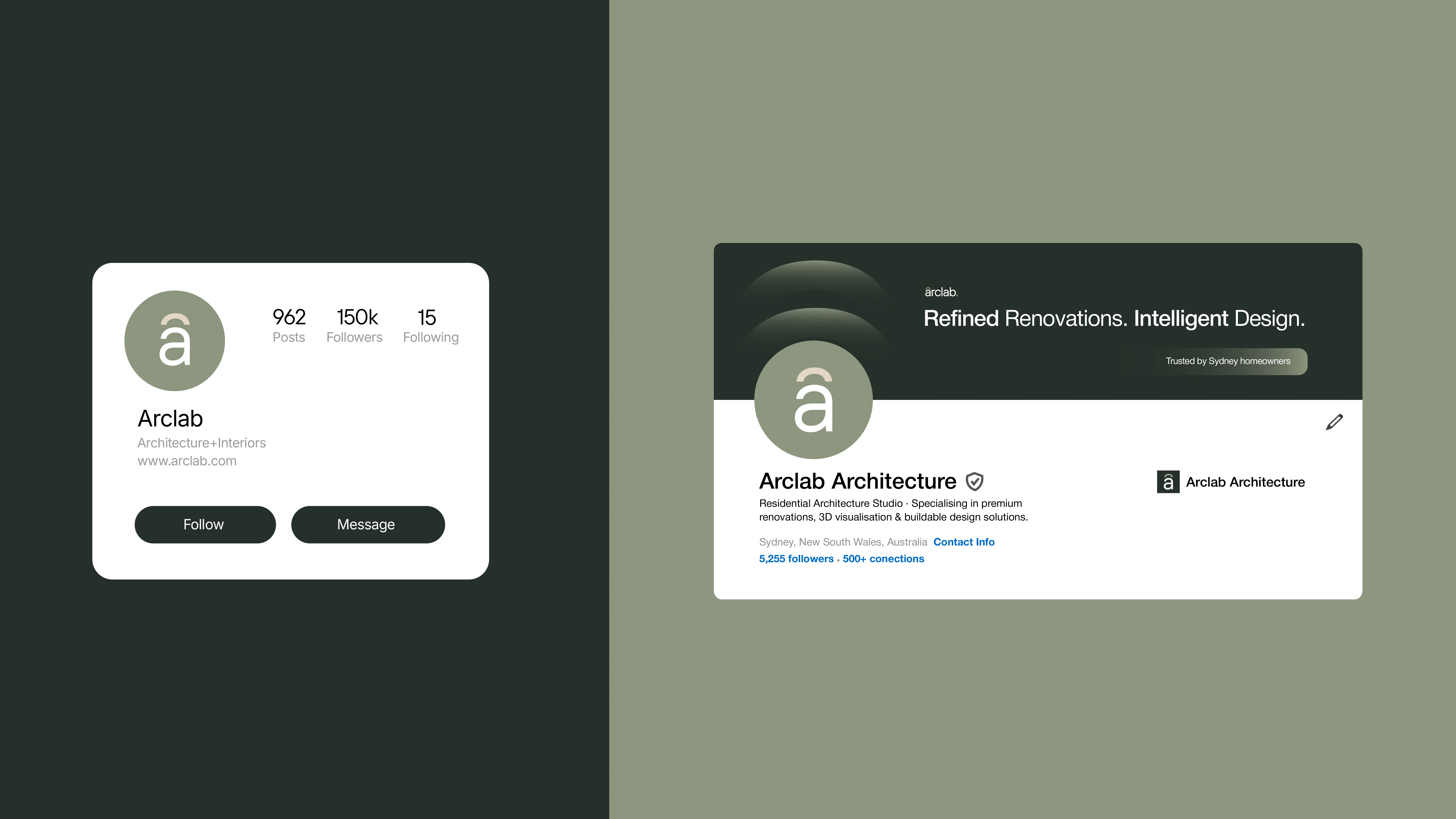
Socials
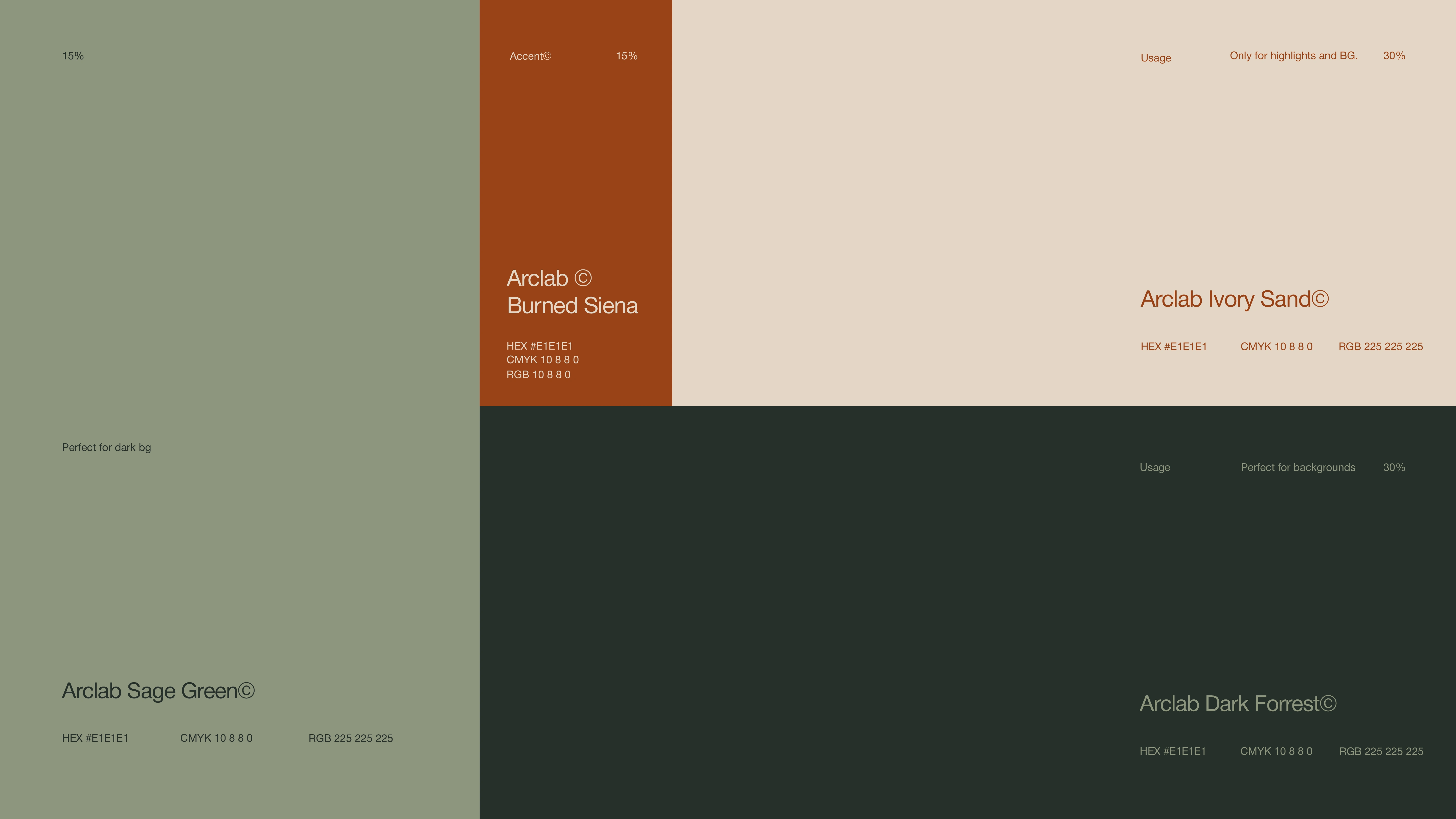
Color Palette
Concept #3
Design Rationale
This symbol plays on the idea of an arc in motion—a curved form sliced with precision to suggest transformation, construction, and direction. It feels dynamic yet stable, mirroring Arclab’s balance of creative design and structural logic. The clean split adds a sense of architectural intention while keeping the form minimal and modern.
Mockups

Socials
Color Palette
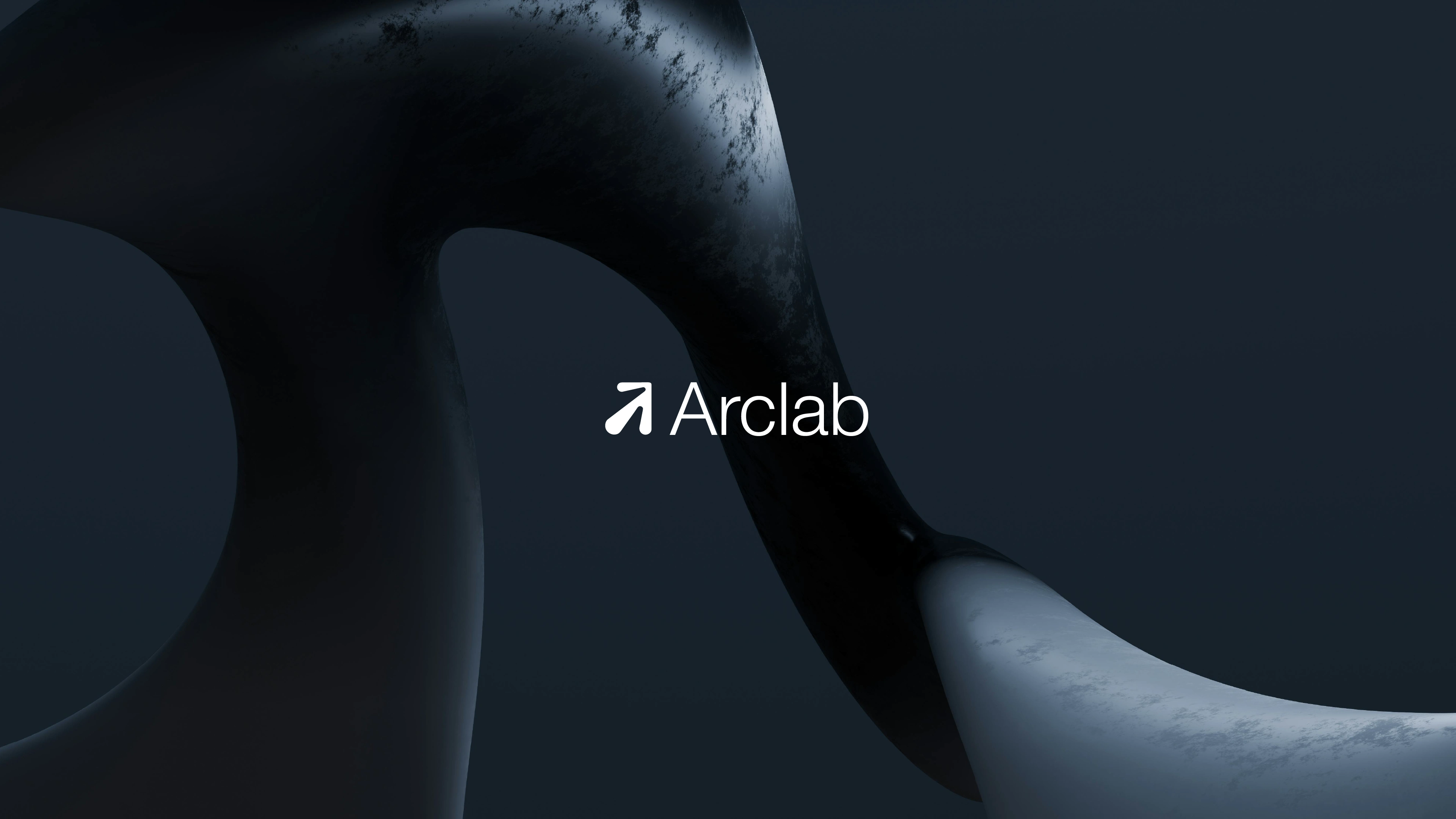
Concept #4
Design Rationale
The symbol doubles as an abstract “A” and an upward arrow—representing Arclab’s name, growth, and forward-thinking design. It’s bold yet soft, reflecting both ambition and approachability.
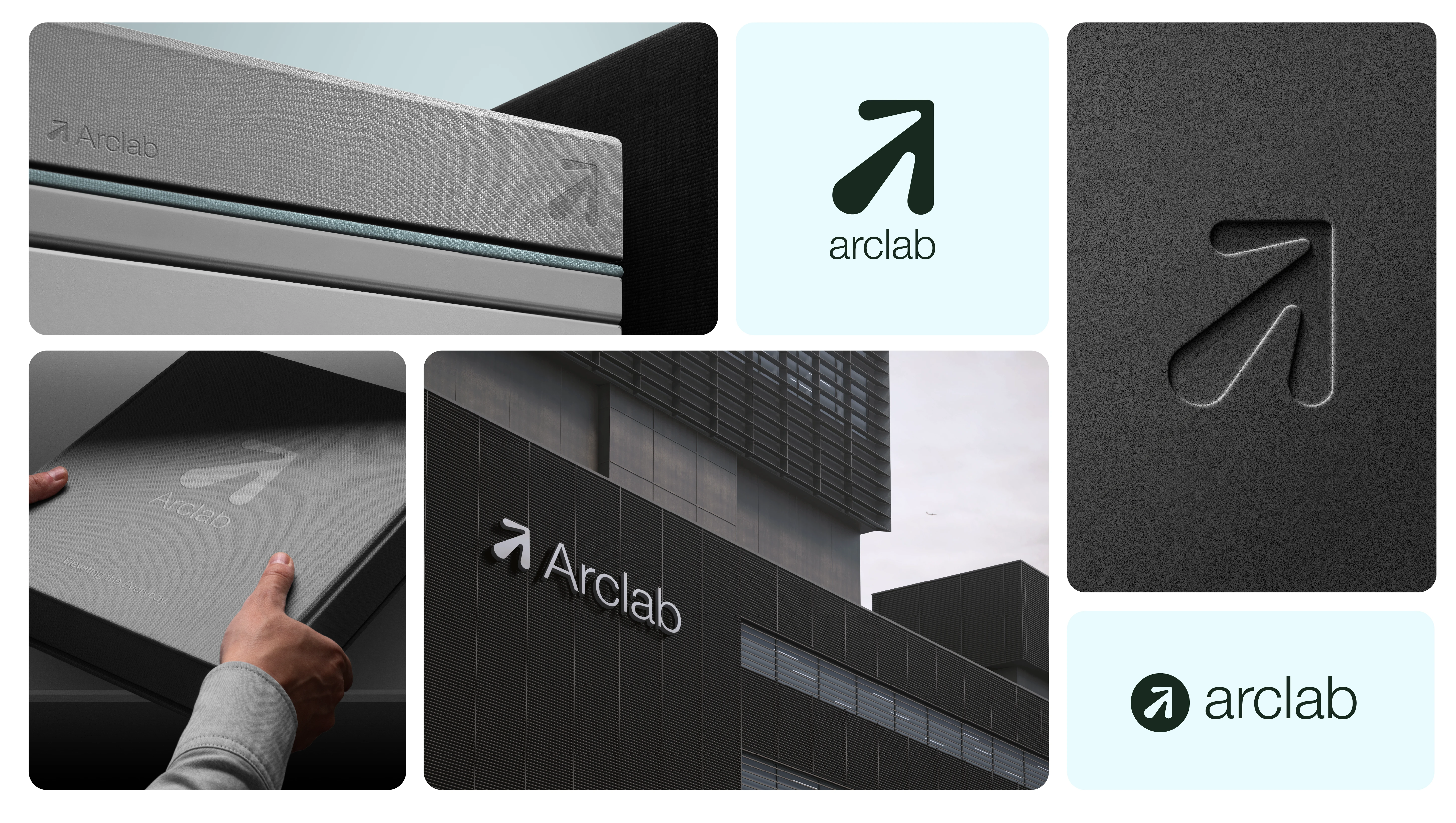
Mockups
Socials
Color Palette
Concept #5
Design Rationale
This symbol forms a stylised “A” with a central cutout, echoing both a pitched roof and a passageway. It feels architectural, grounded, and deliberate—capturing Arclab’s focus on structure, space, and thoughtful renovation. Simple, strong, and unmistakably spatial.
Horizontal Logo
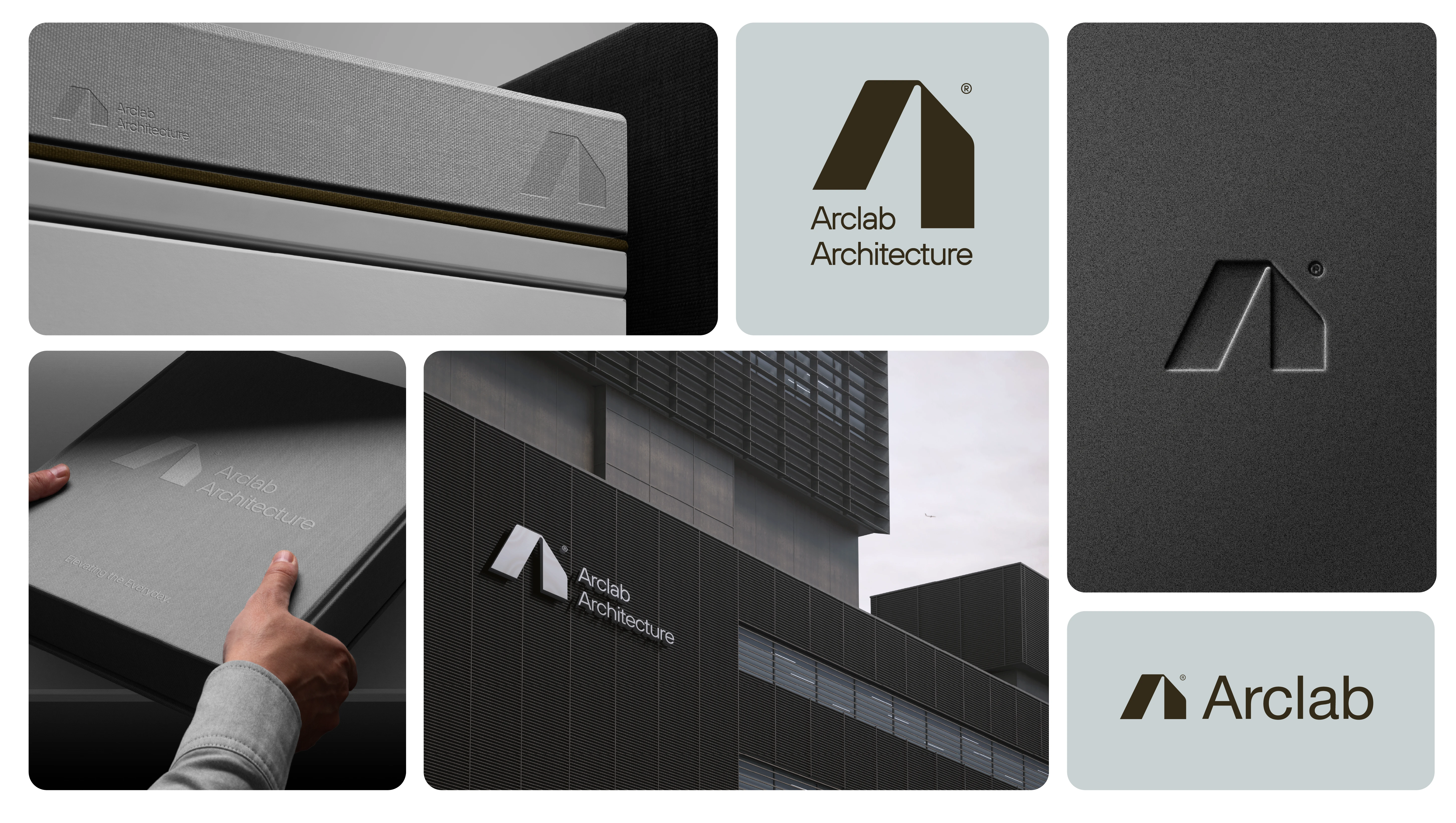
Mockups
Vertical Logo
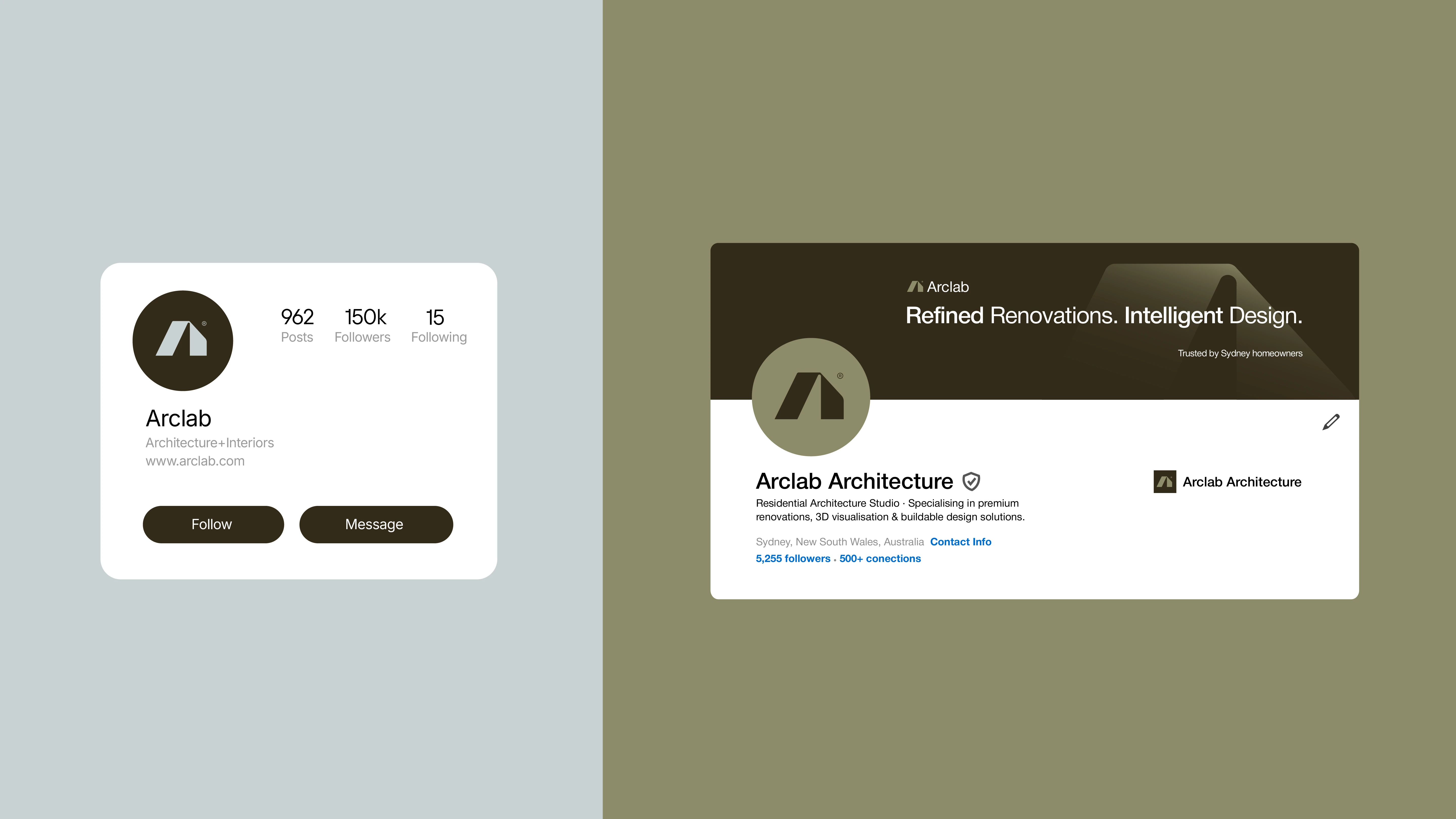
Socials
Let me know which one do you choose?
Thank you for your time.
Alec Minimalec©
Like this project
Posted Jun 13, 2025
Designing Arclab’s logo concepts: clean geometry, structural rhythm, and timeless forms inspired by architecture itself.
Likes
47
Views
504
Timeline
Jun 6, 2025 - Jun 13, 2025