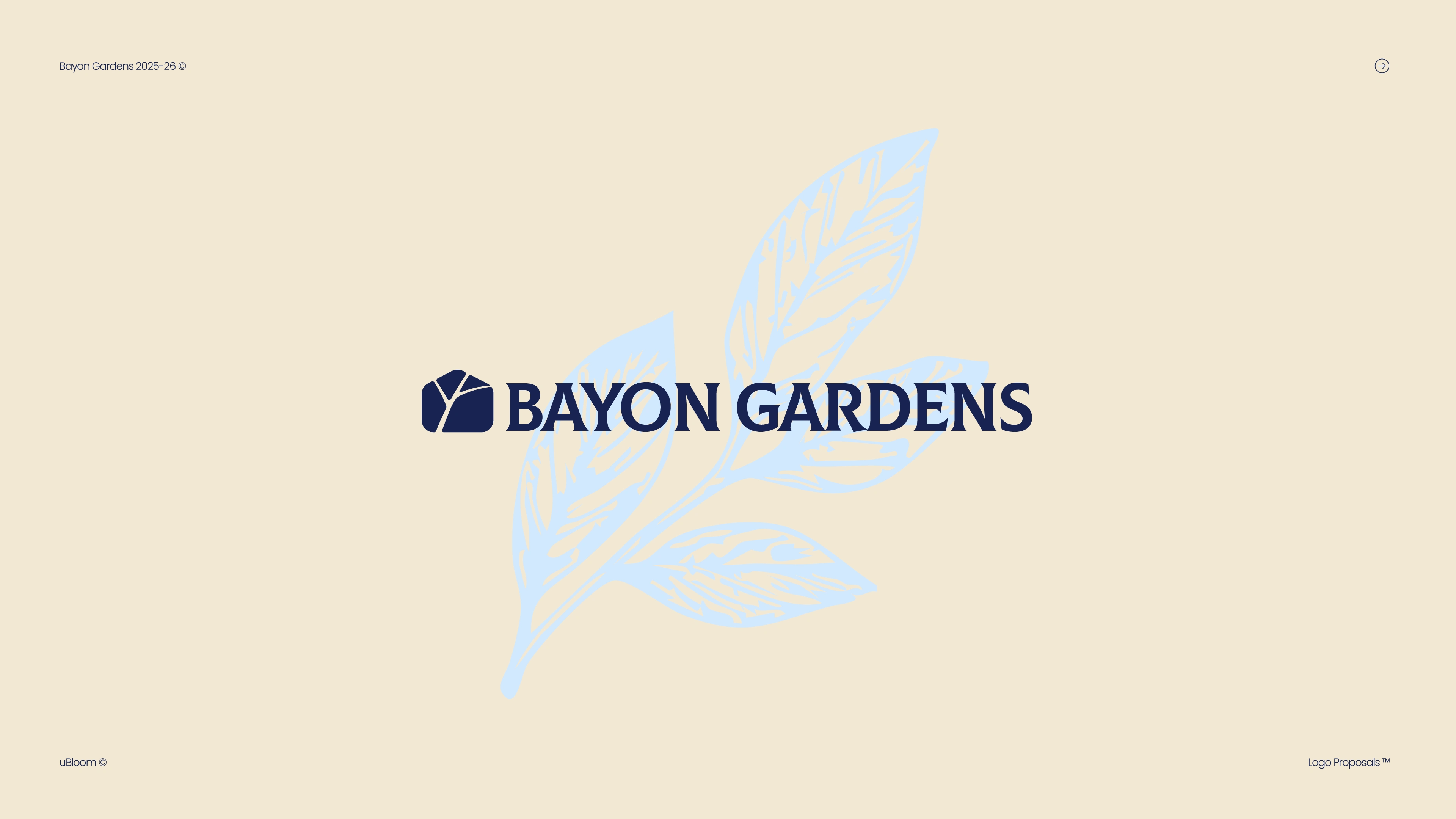
Brand Identity | Bayon Gardens
Alec Minimalec
Verified
Brand Identity
Overview
Bayon Gardens is a high-end landscape design studio working at the intersection of architecture and nature.
Their projects are structured, refined, and deeply intentional. But their previous identity didn’t reflect that level of precision. It felt generic — more “garden center” than architectural studio.
The goal was to build a brand that feels calm, confident, and structurally sound.
The Idea
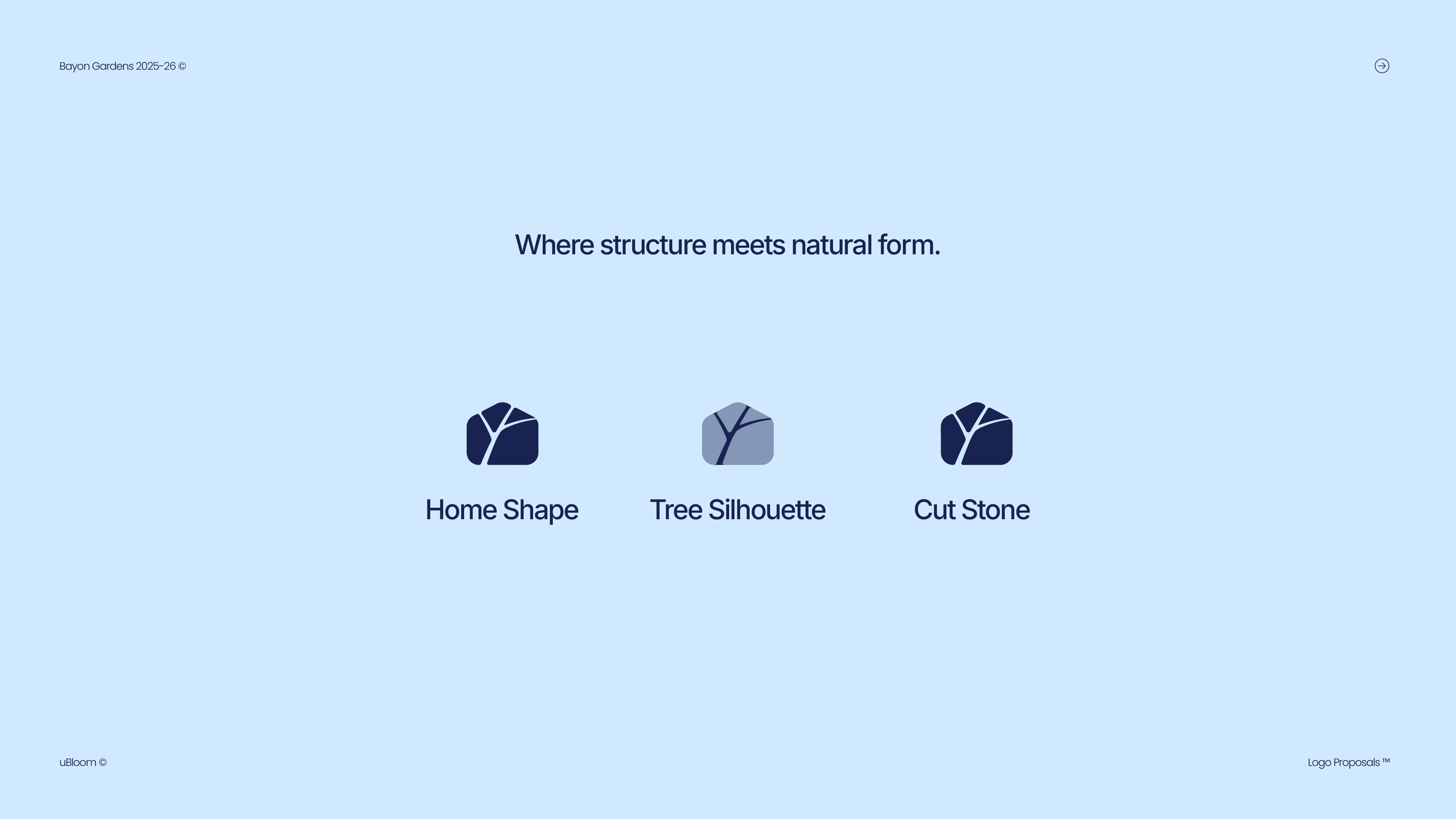
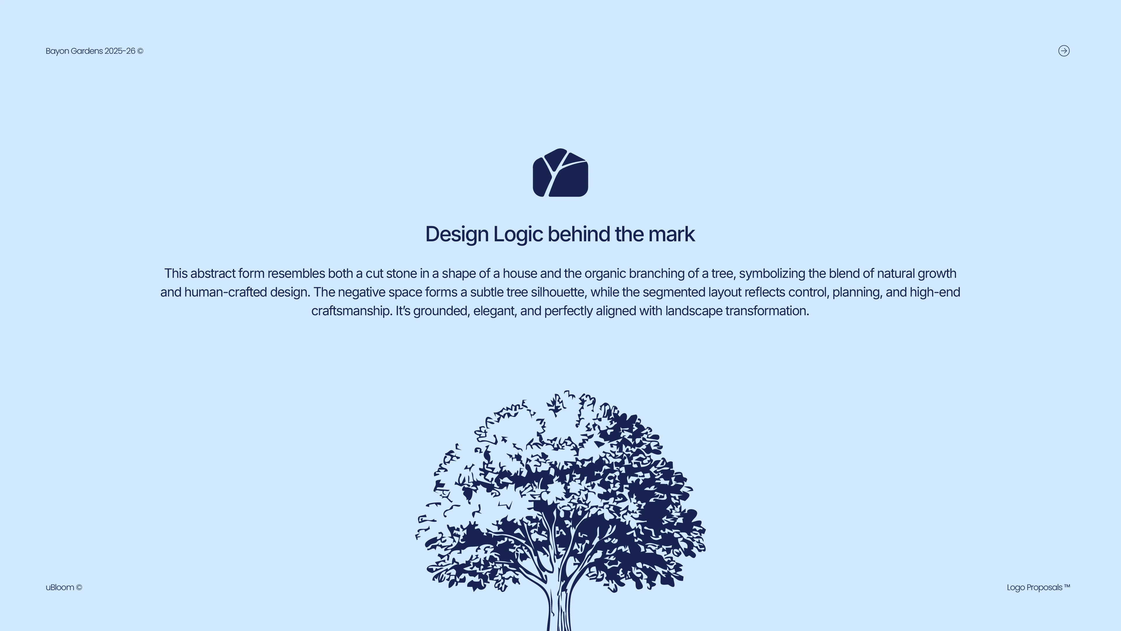
The core concept became Structural Harmony.
Where structure meets natural form.
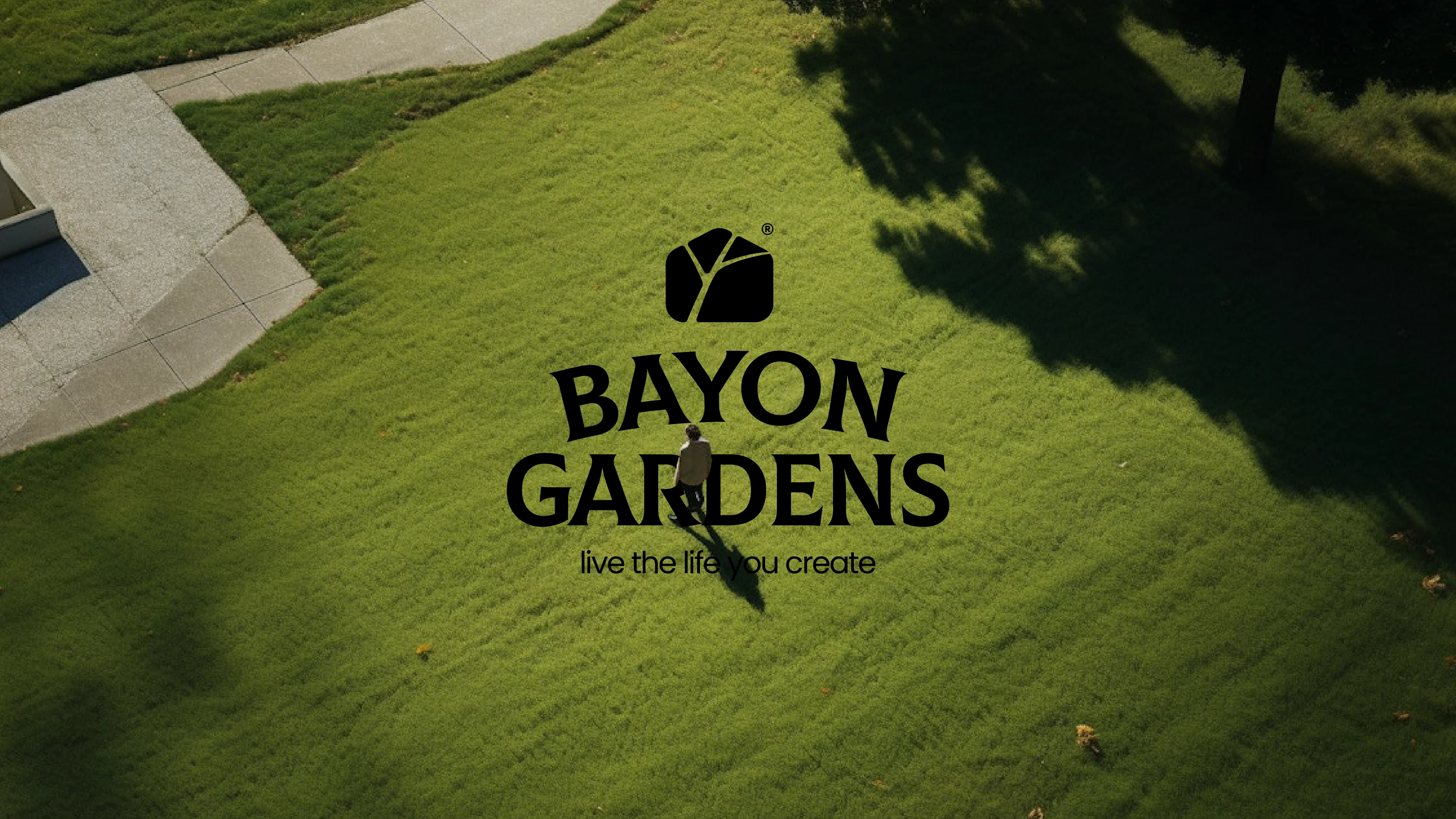
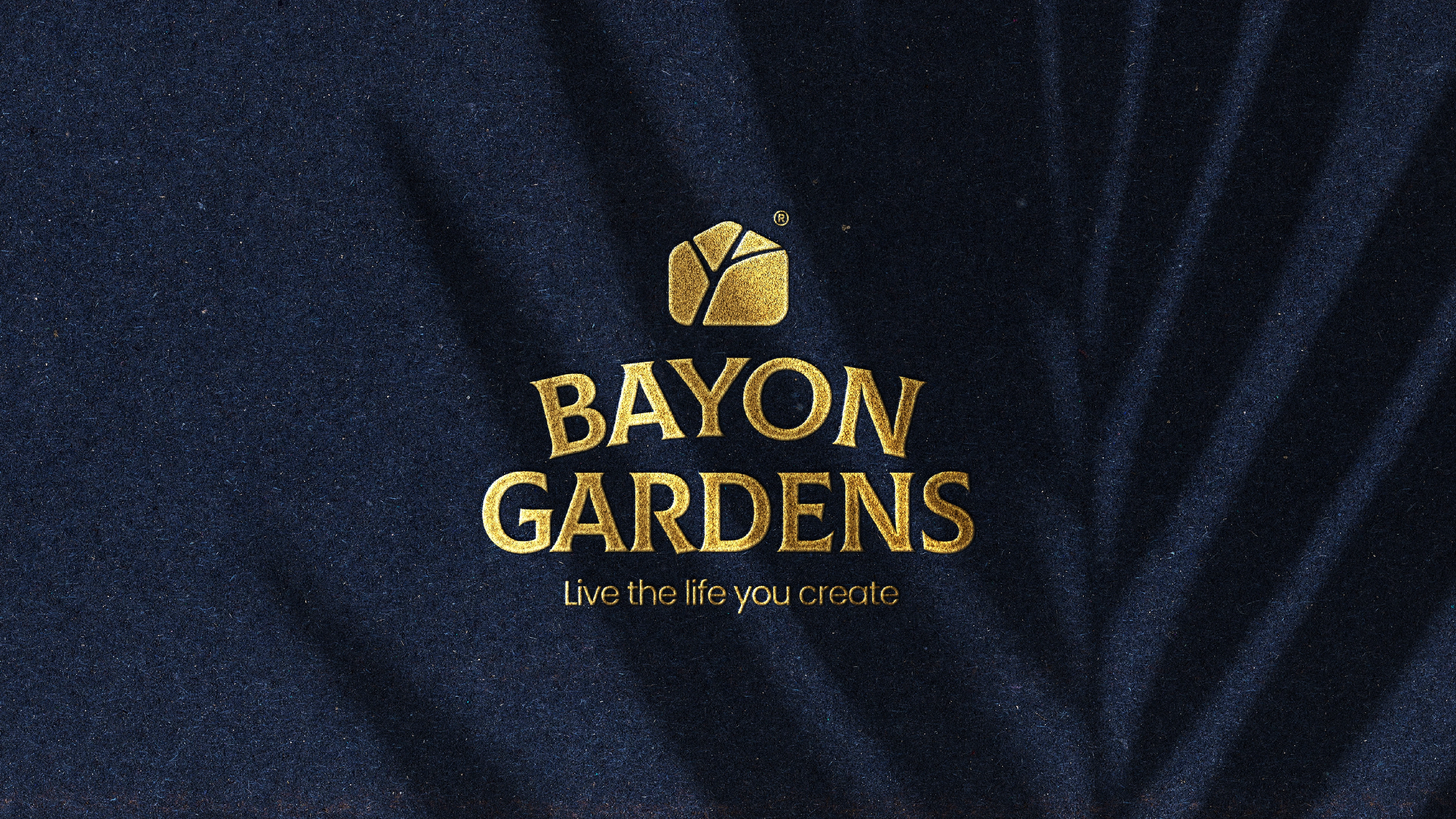
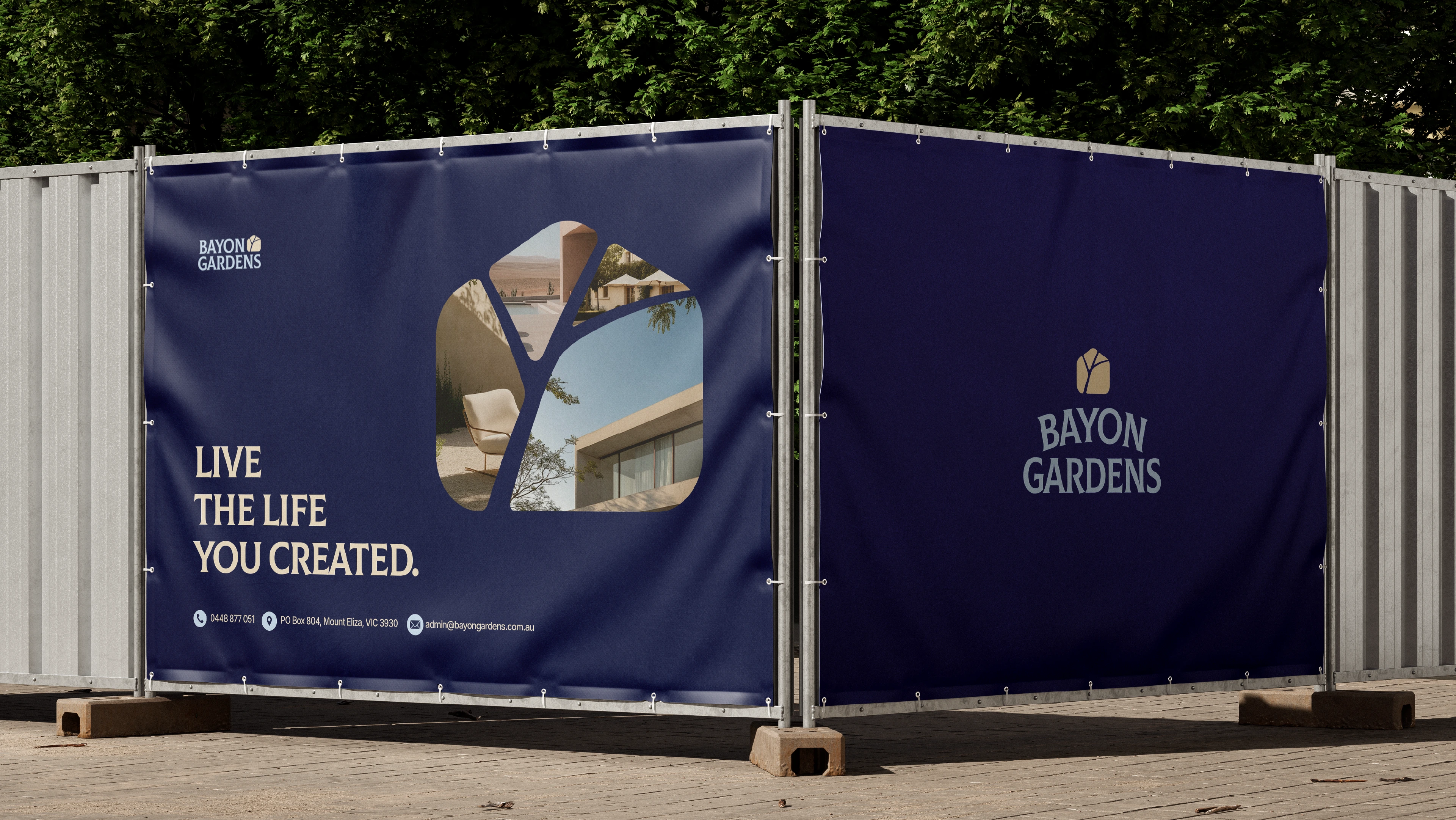
Instead of leaning into obvious leaf icons or decorative elements, the identity is built from controlled geometry and strong silhouettes. The logo subtly merges a home form, a tree canopy, and a cut-stone shape into one unified mark — representing built environments integrated with landscape.
It’s not loud.
It’s considered.
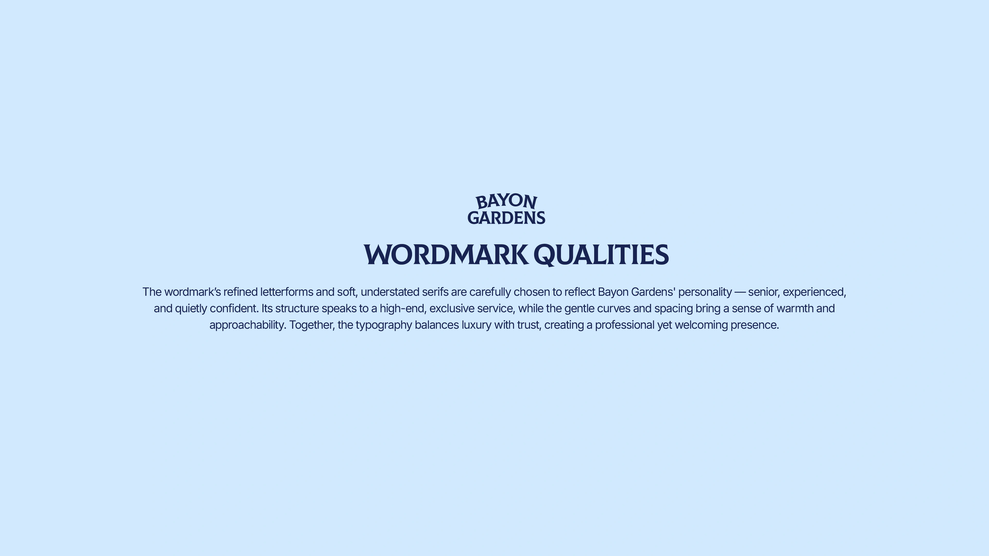
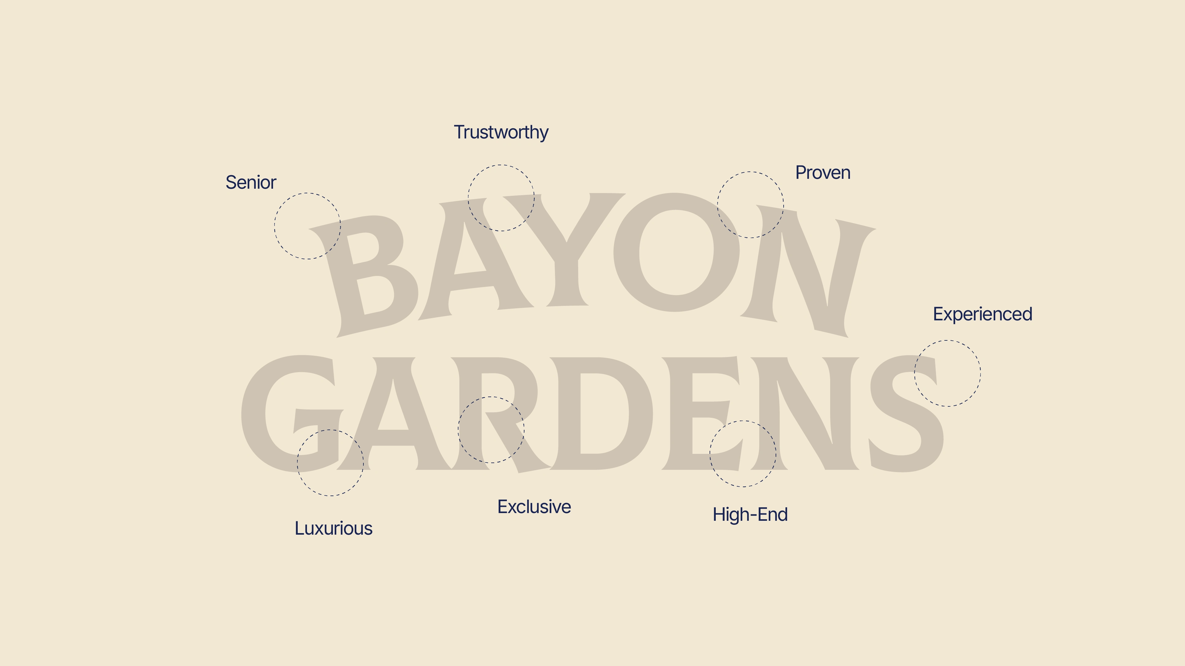
The wordmark carries weight and presence, with spacing and proportions that feel architectural and timeless.
Design logic
The System
The visual language extends from the mark: deep navy tones, warm neutrals, structured layouts, and restrained typography. The balance between softness and structure runs through everything — from brand applications to environmental signage.
Even the supporting illustrations feel intentional, never ornamental.
This is landscaping positioned as design discipline.
Logo Sistem
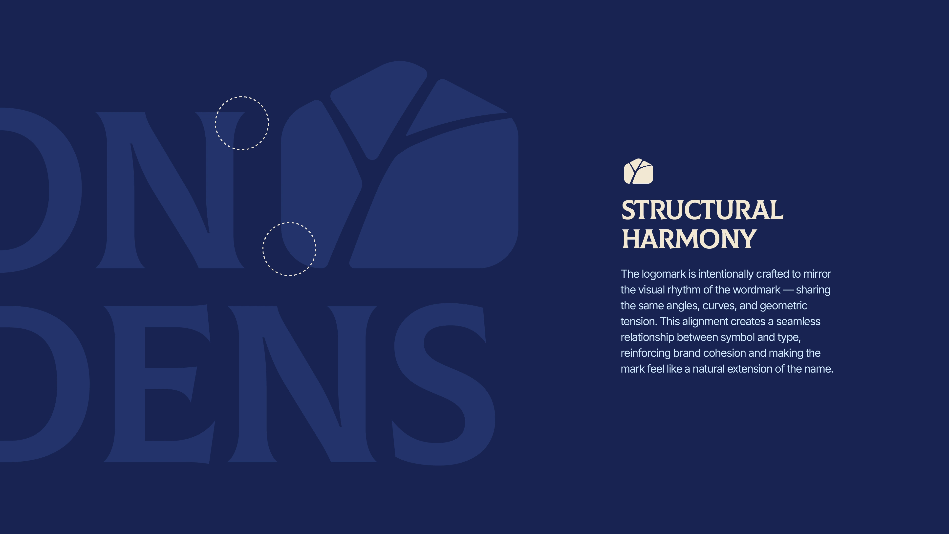
wordmark qualities
wordmark qualities
wordmark qualities
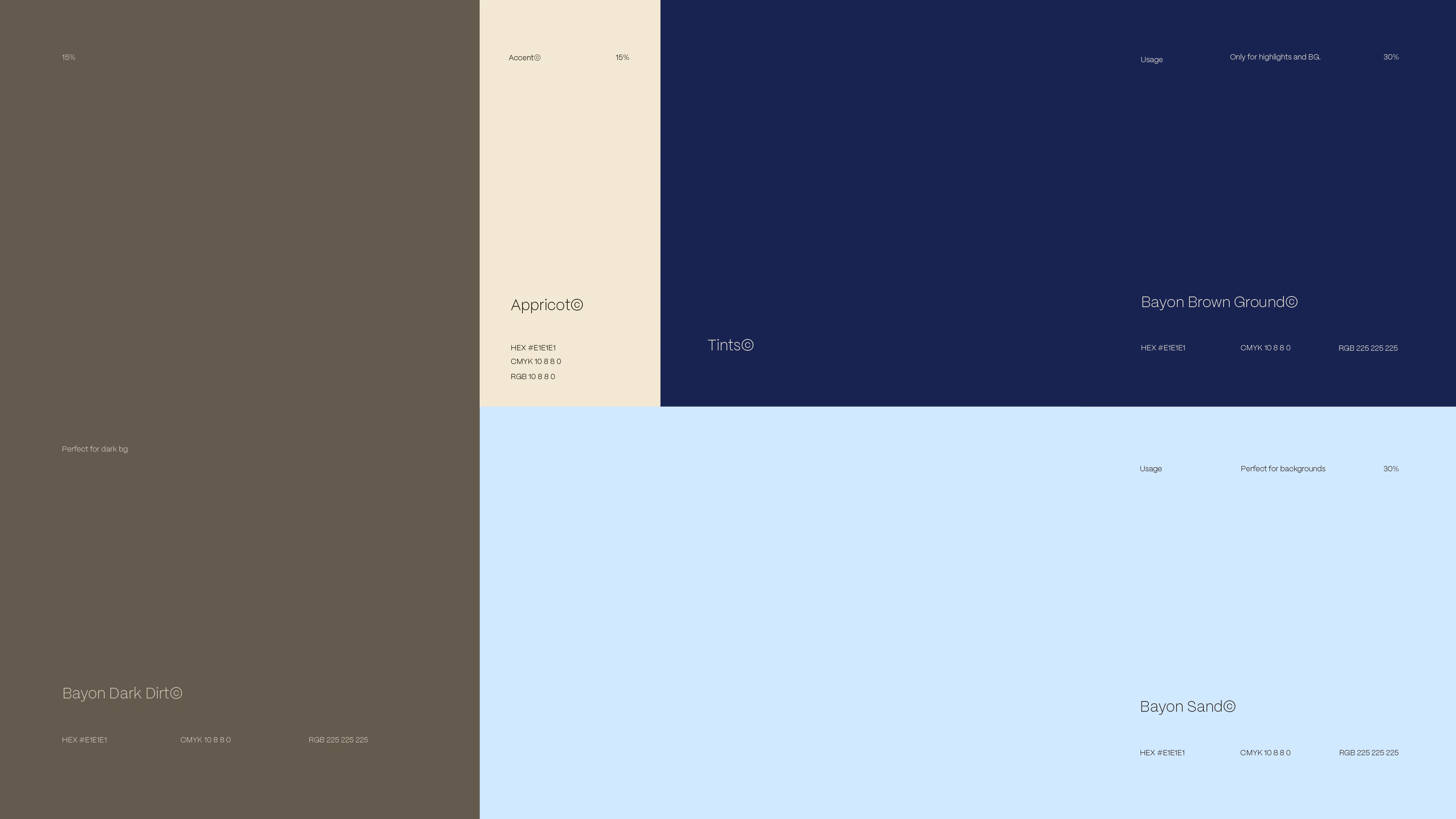
color palette
color combinations
hand-drawn illustrations
Outcome
Bayon Gardens now presents itself with clarity and confidence.
The brand feels grounded, premium, and enduring — aligned with the scale and quality of the spaces they create.
Built with intention. Designed to last.
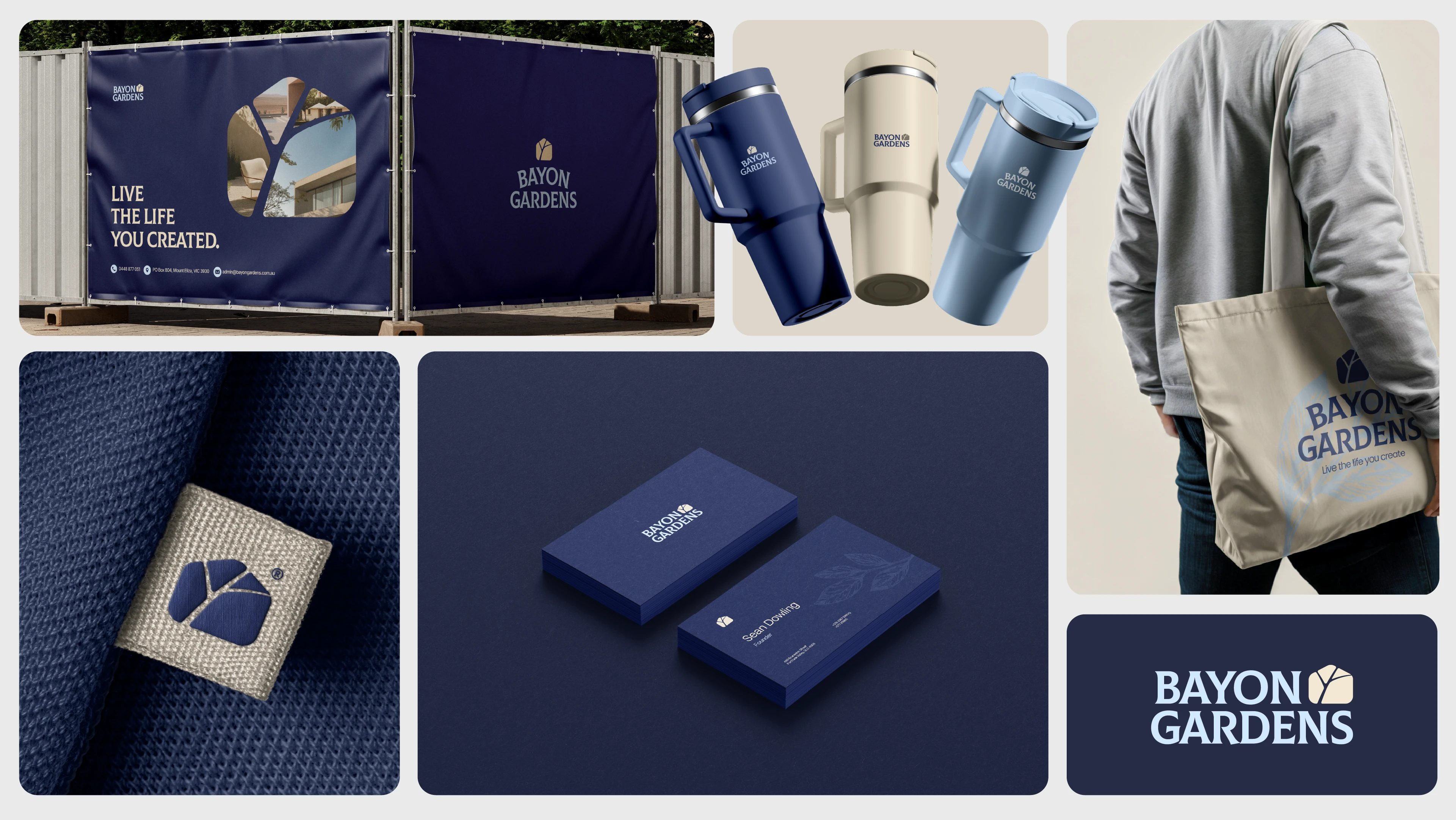
bento grid
mockup
mockup
Like this project
Posted Jun 5, 2025
Brand identity for Bayon Gardens where structure meets natural form. A calm, architectural system rooted in precision and elegance.
Likes
18
Views
134
Timeline
May 8, 2025 - Jun 1, 2025
Clients
uBloom Digital