

Brand Identity & Guidelines
Overview
ARTIQUE is an architectural studio working in the high-end residential space.
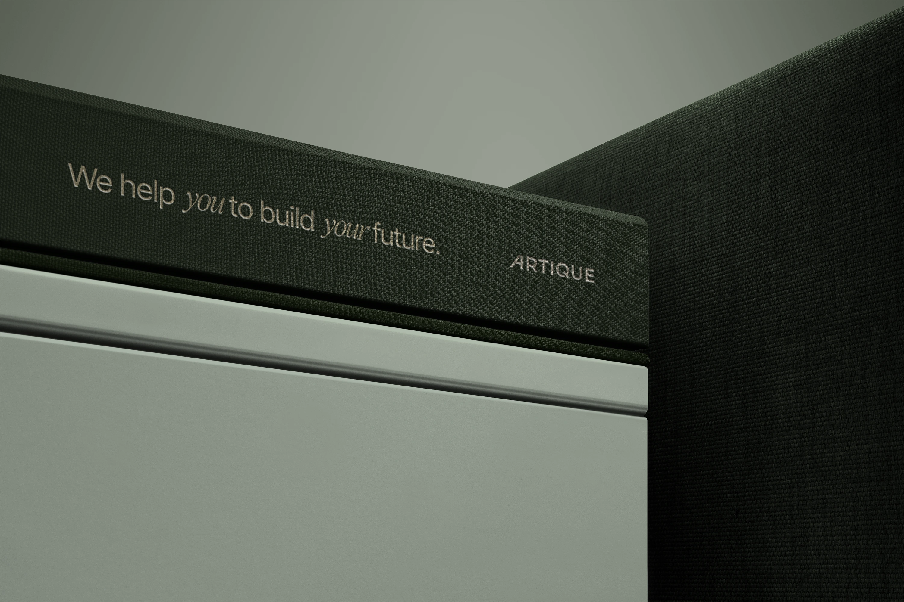
Their work is quiet, precise, and proportion-driven. The identity had to reflect that same discipline. No noise. No trend-chasing. Just structure.
This project was about building a controlled visual system — not just a logo.
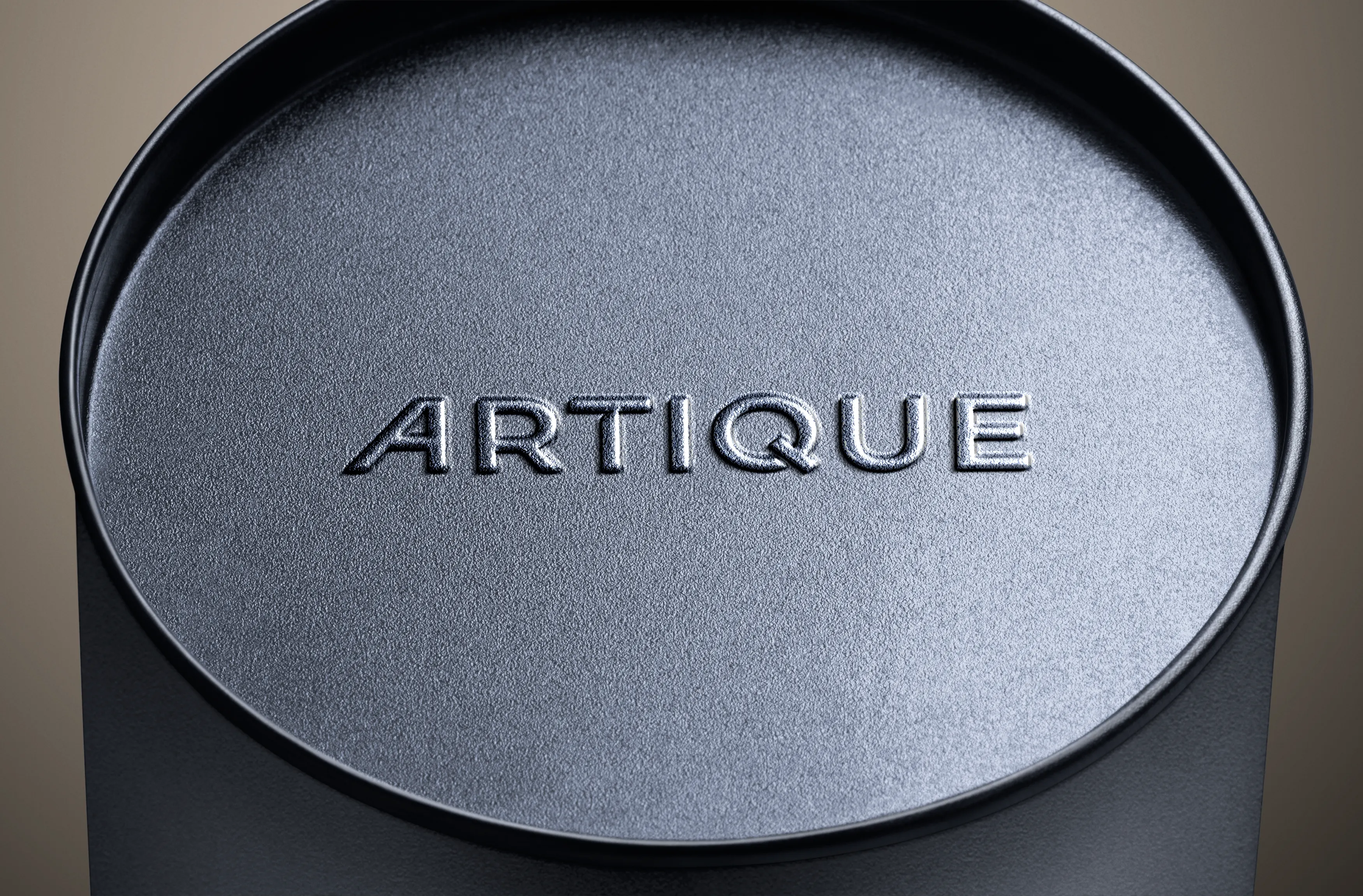
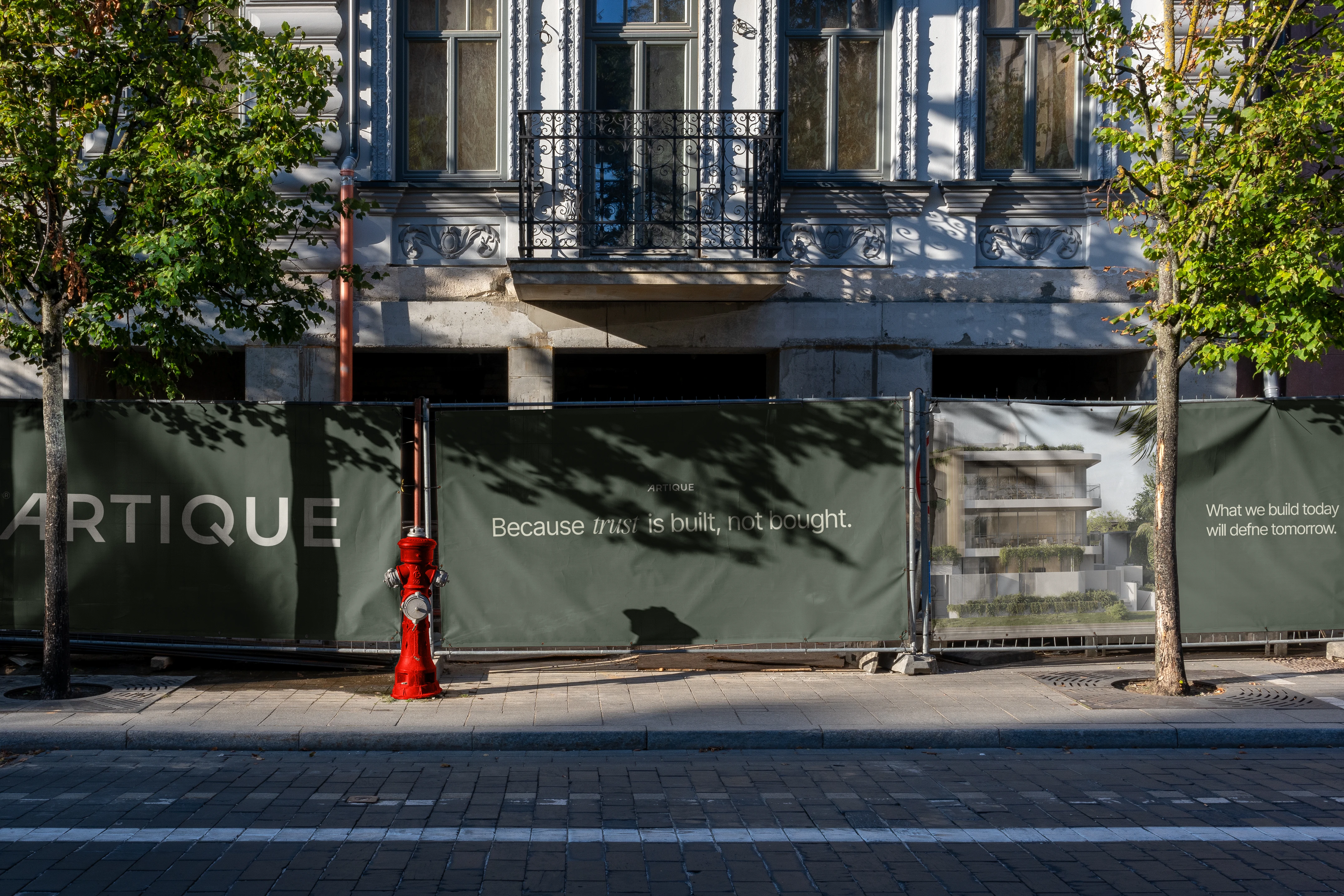
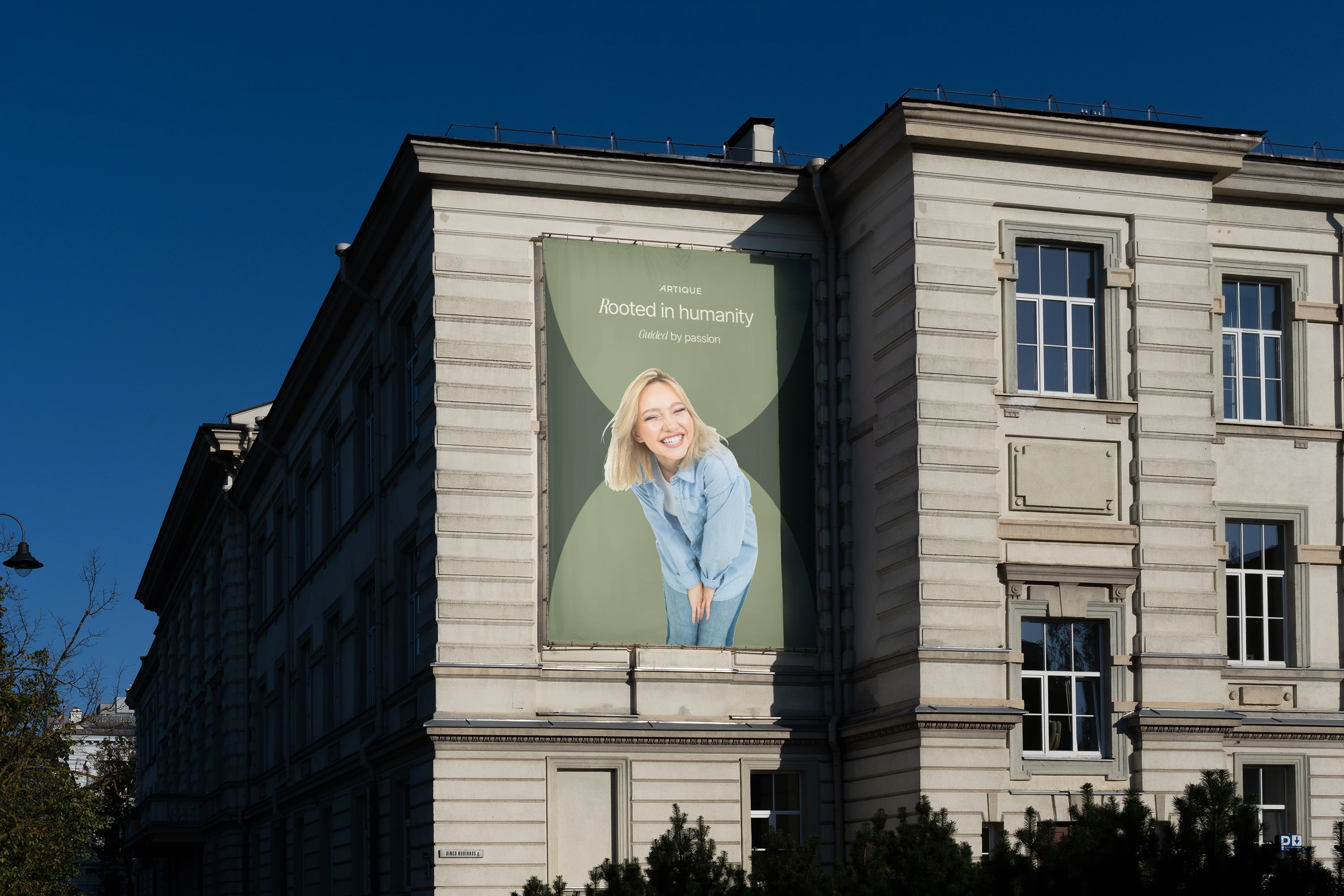
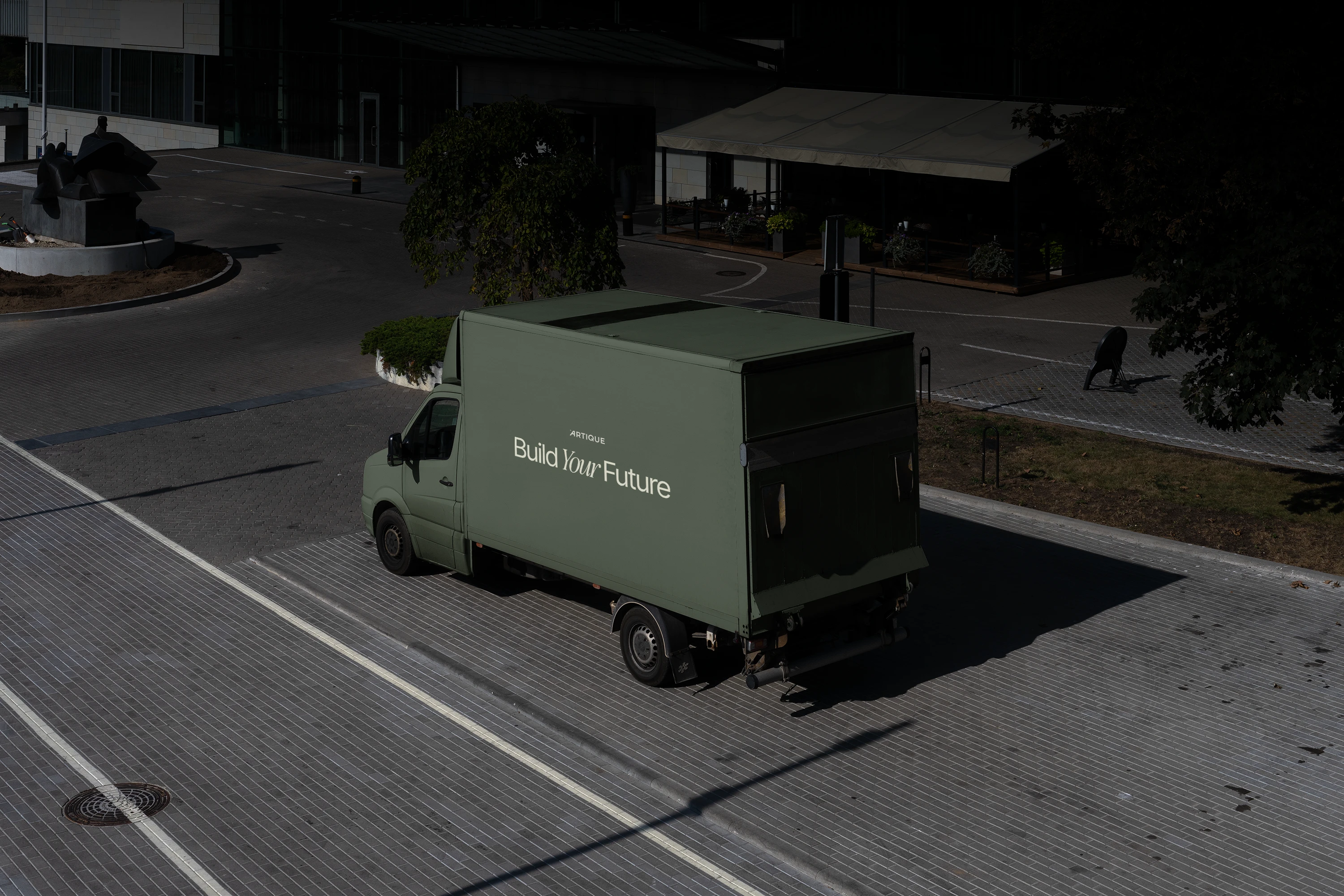
mockup
Approach
Architecture is about proportion, alignment, and restraint. The brand follows the same logic.
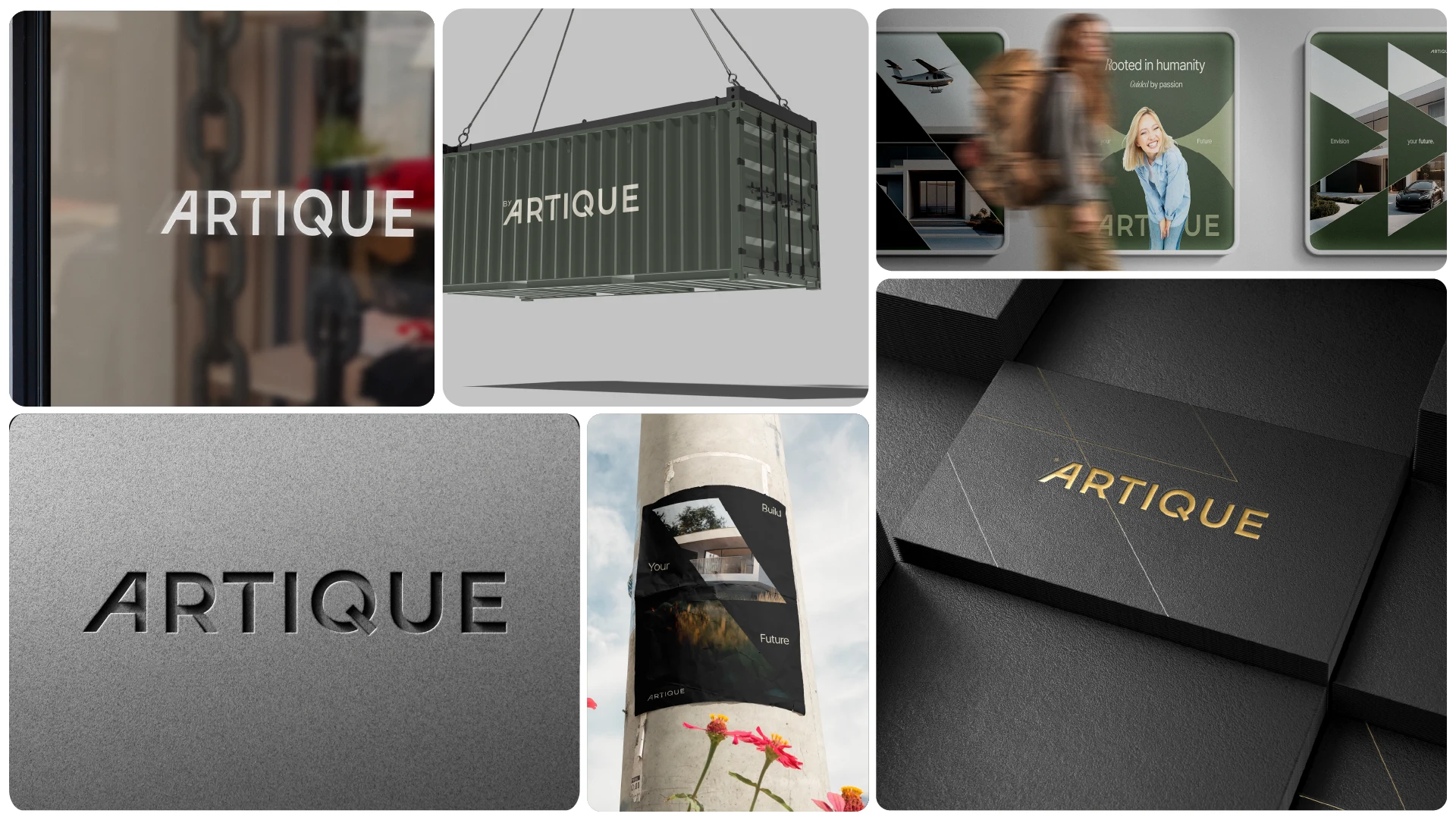
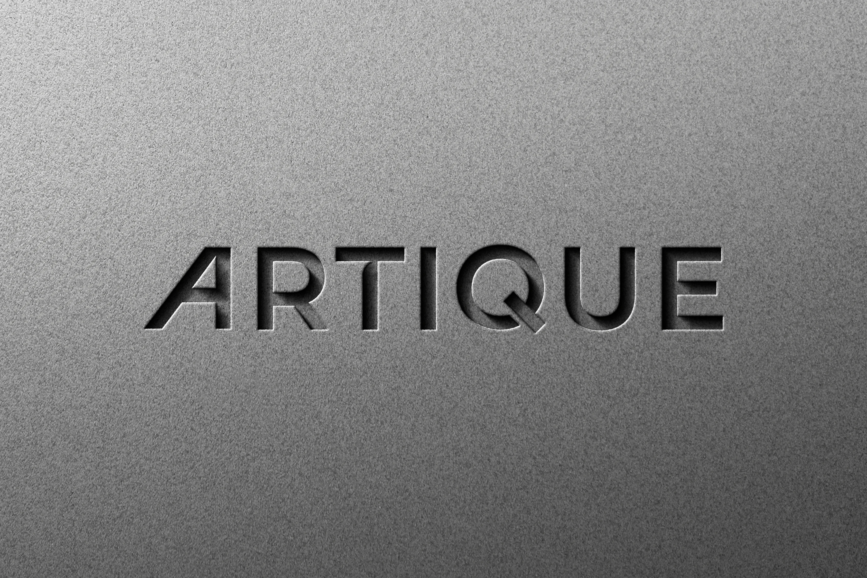
The wordmark is refined through spacing and weight adjustments rather than decoration. Subtle changes in rhythm create presence without shouting.
Everything is intentional:
the clear space, the minimum sizes, the placement logic, the tonal balance.If the architecture is measured, the identity should be too.
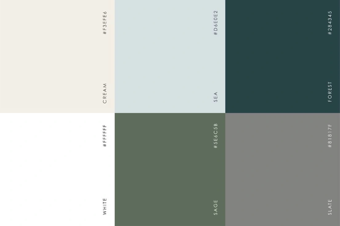
Color Palette
System Thinking
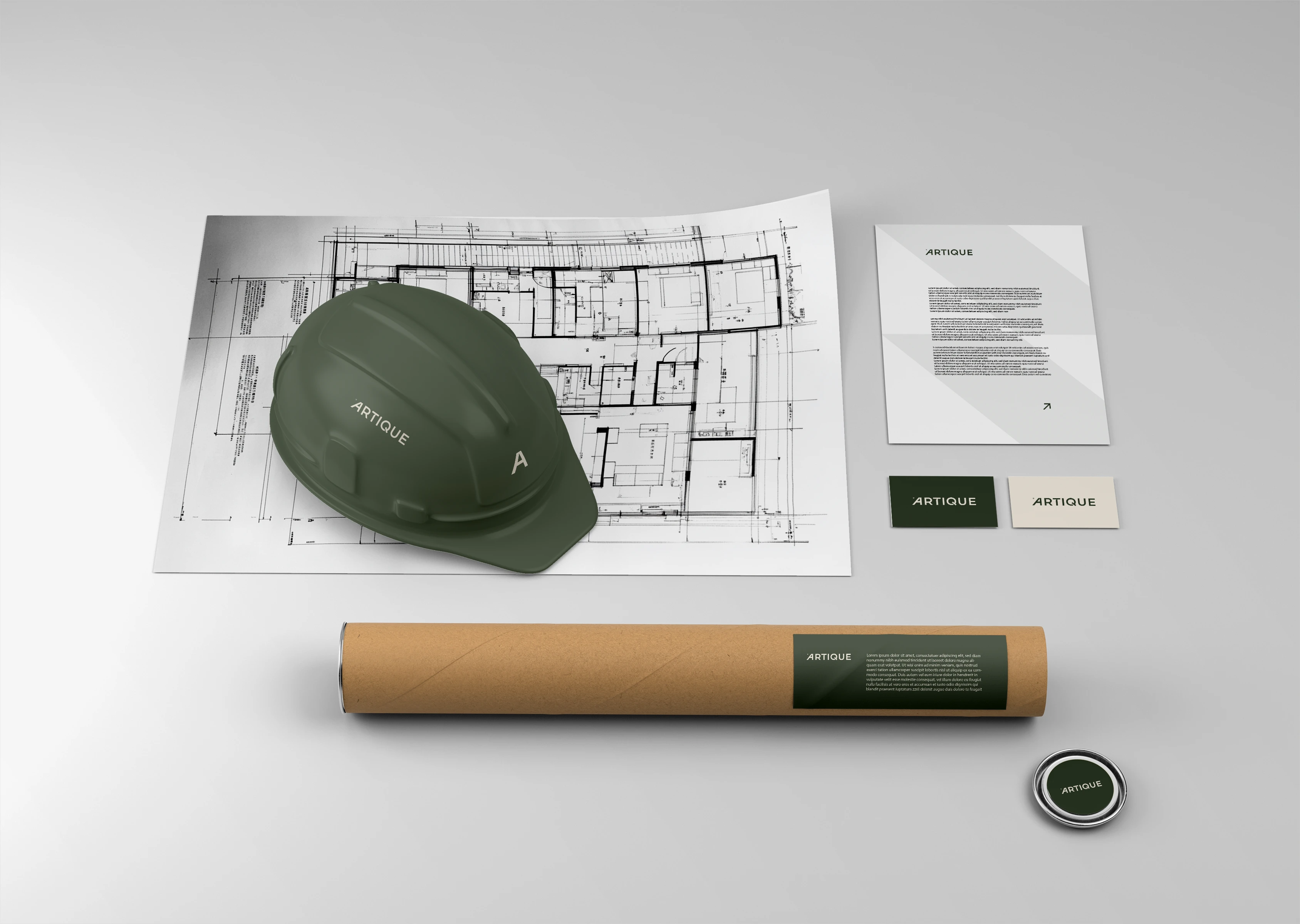
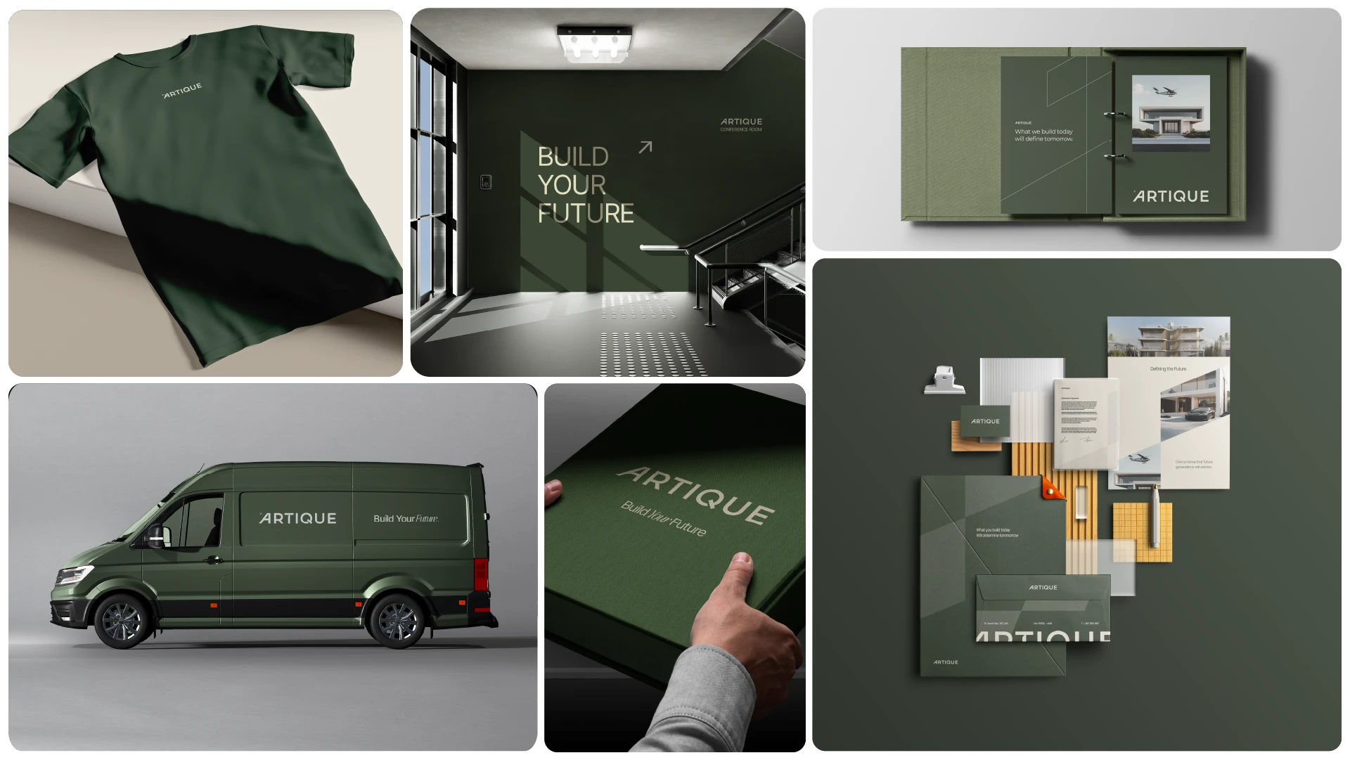
The palette leans into deep architectural greens and warm neutrals — grounded, mature, and stable.
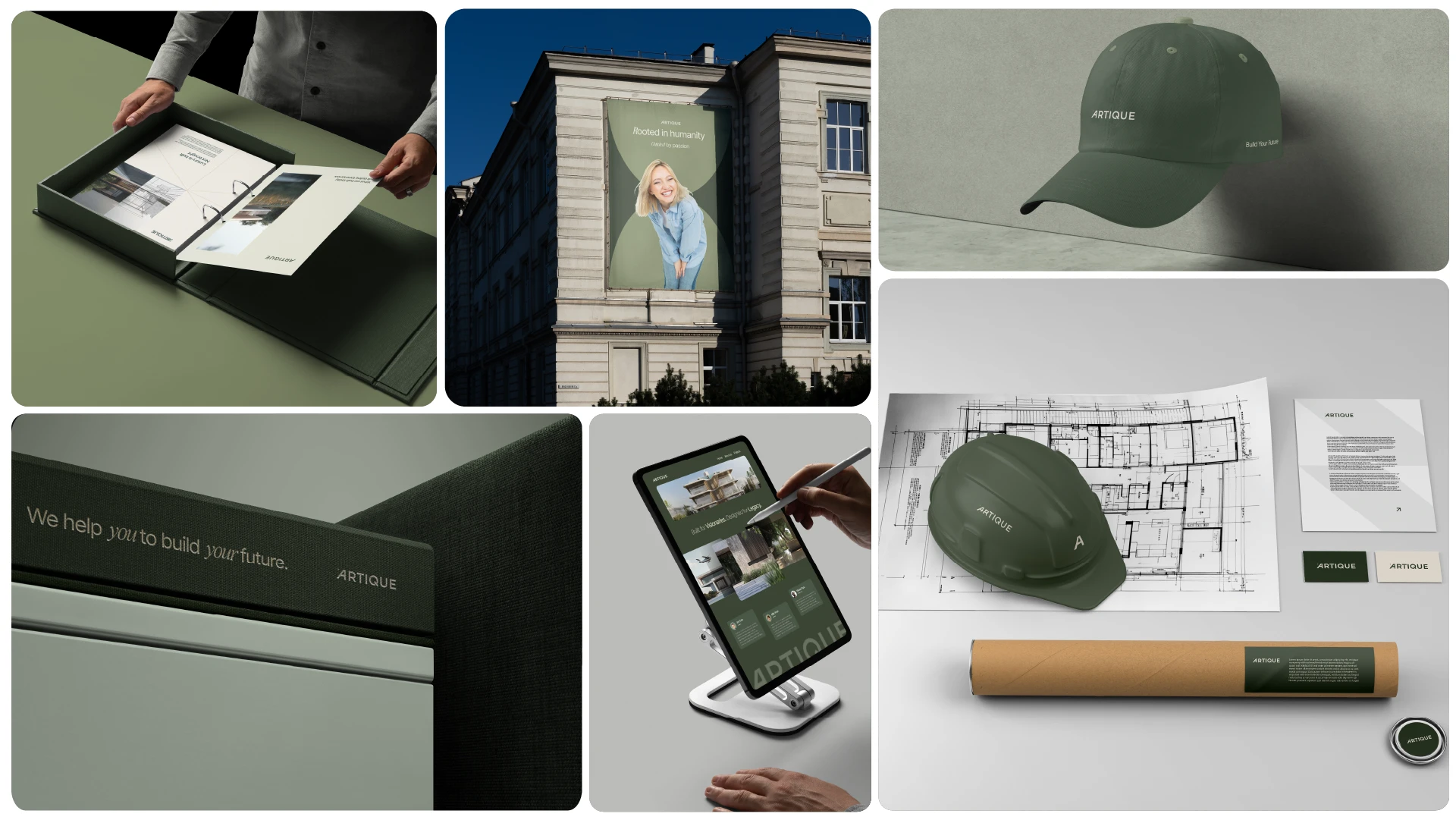
Typography is clean and structured, built to sit confidently in layouts without overpowering them.
The entire guideline document was developed like a blueprint:
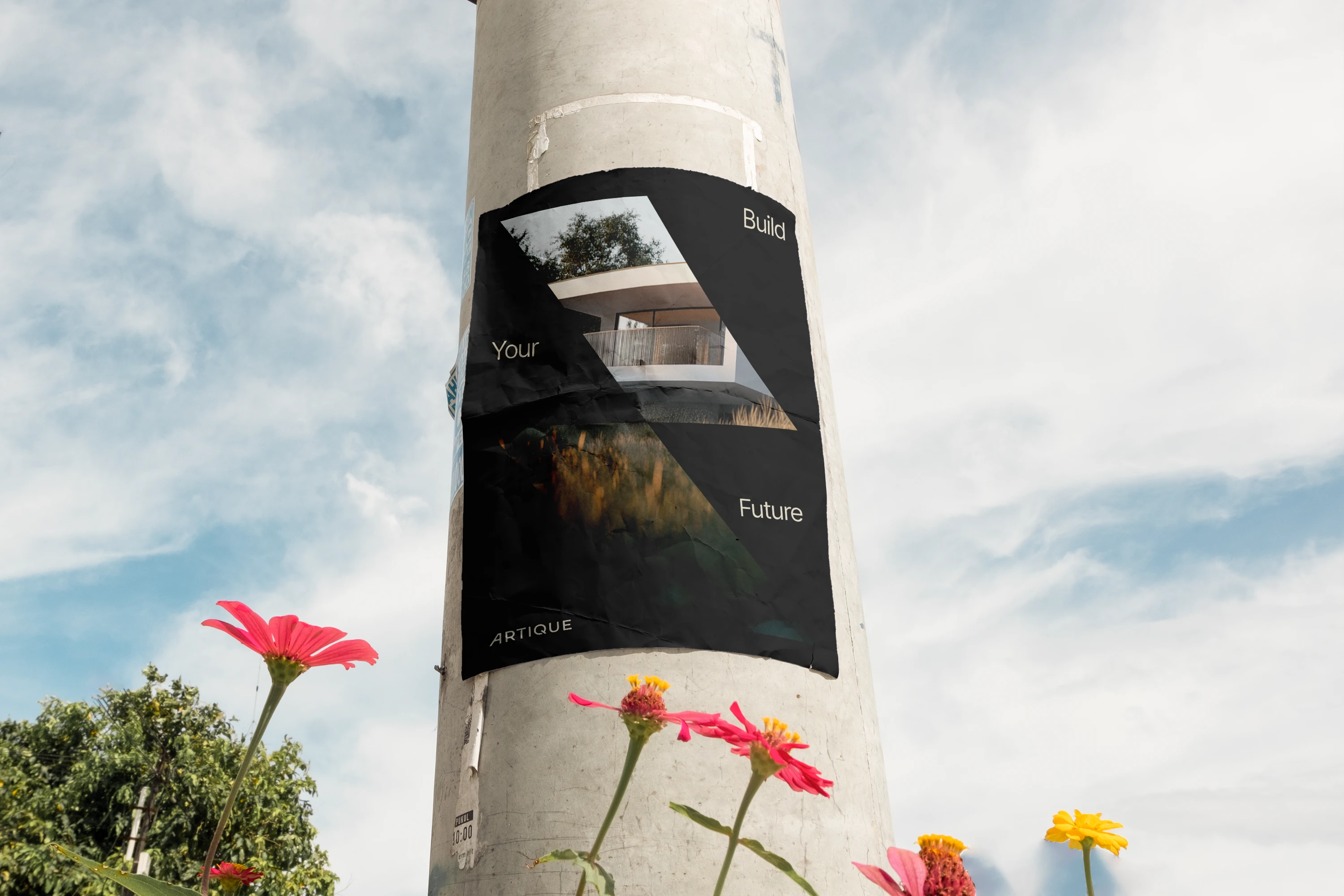
clear hierarchy, controlled usage, no ambiguity. It’s a system that scales — across print, digital, presentations, and environmental applications — without losing consistency.
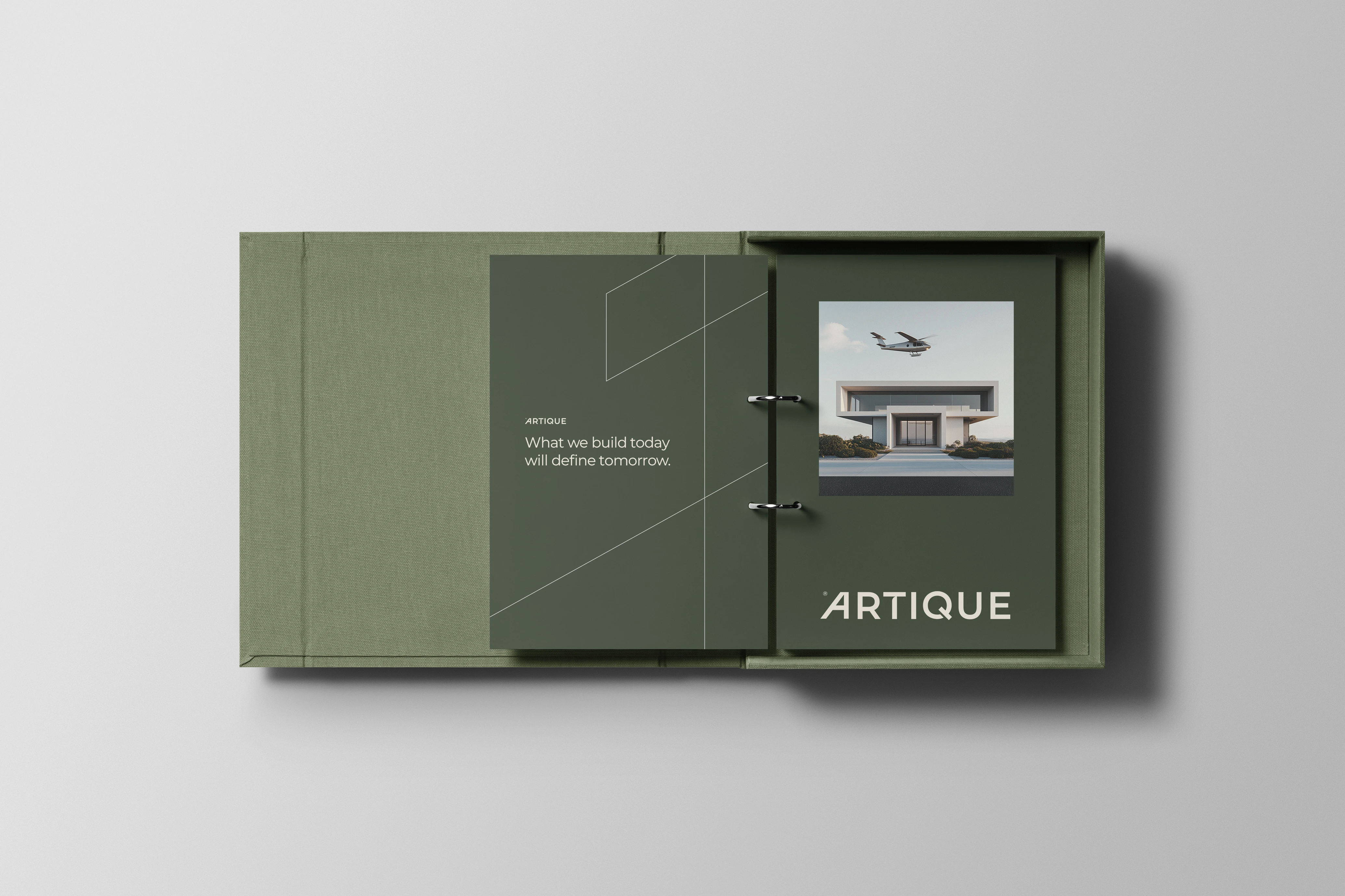
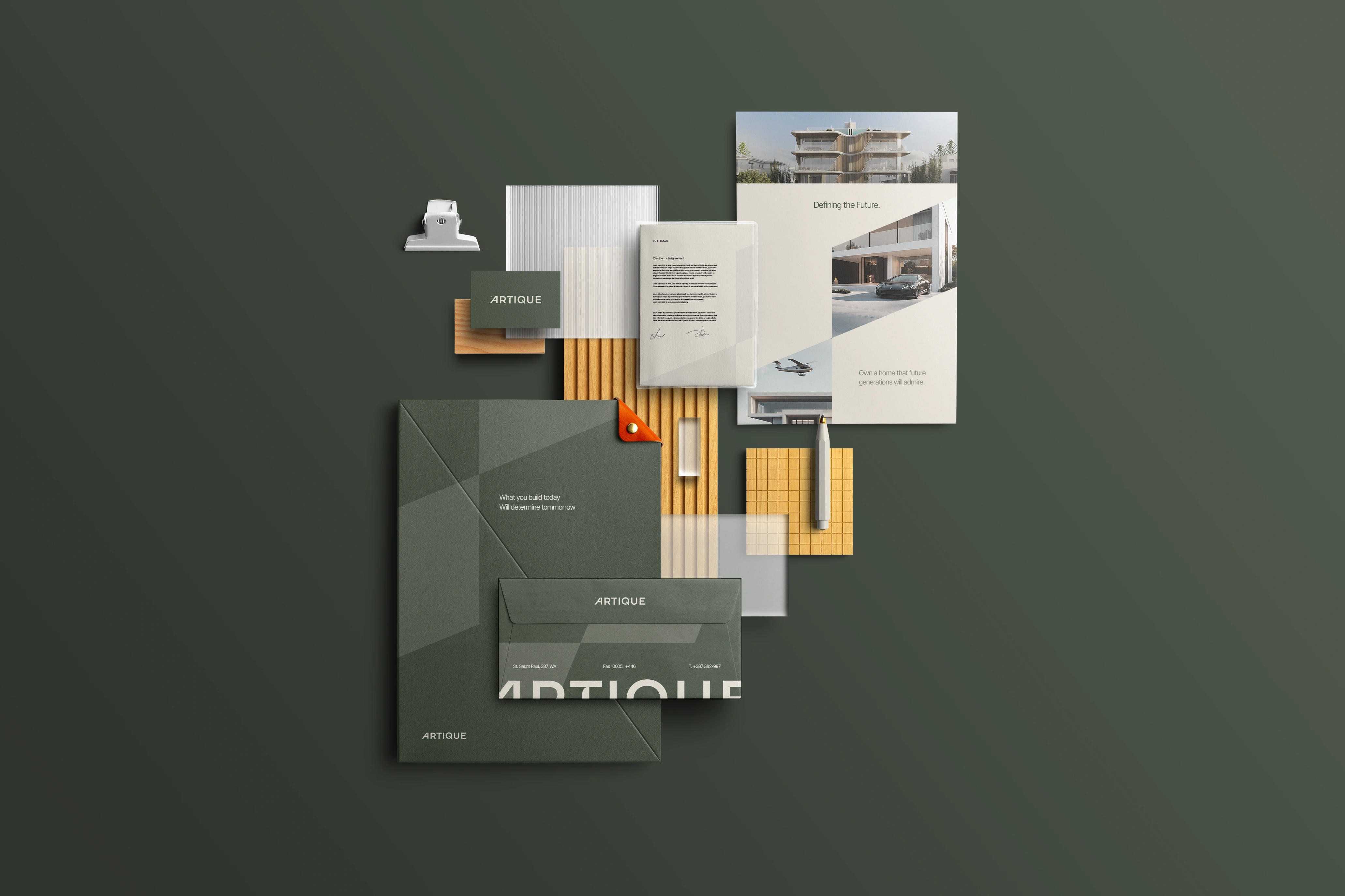
Stationary
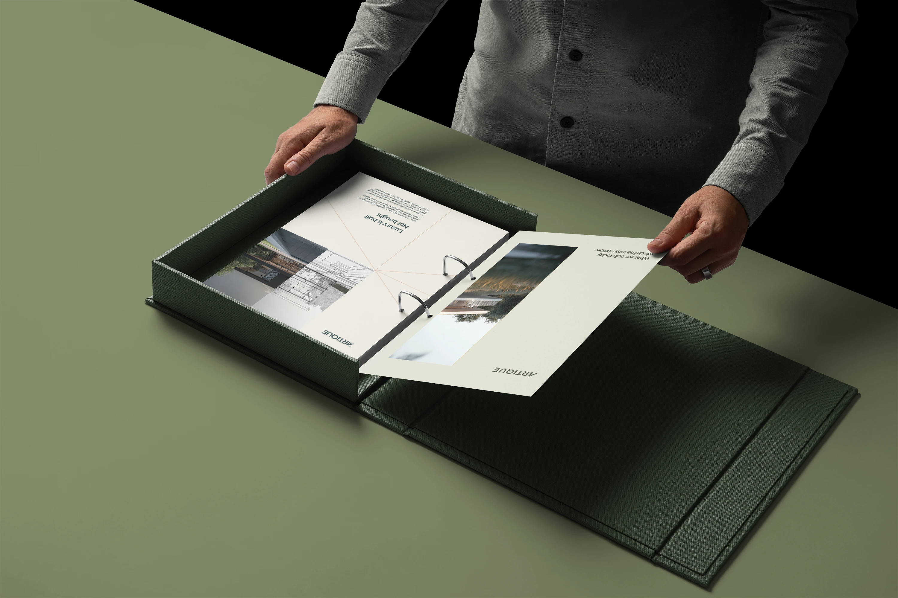
Stationary
Outcome
ARTIQUE now has a brand that feels aligned with its work.
Composed. Structured. Timeless.
Less about visual impact. More about visual integrity.
If you’re done with generic branding, we should work together. Lets talk :)
9 likes · 239 views · Mar 23, 2025
A refined brand identity for ARTIQUE, built on proportion, restraint, and architectural clarity. Designed for longevity, not trends.
Timeline
Feb 19, 2025 - Mar 22, 2025
Tags


What the client had to say
Alec is incredible at what he does and has transformed the branding side of our company. He executed on the brief perfectly and was exactly what we needed. I'd highly recommend him to anyone.


Caleb Wilson, uBloom Digital
Mar 26, 2025, Client