
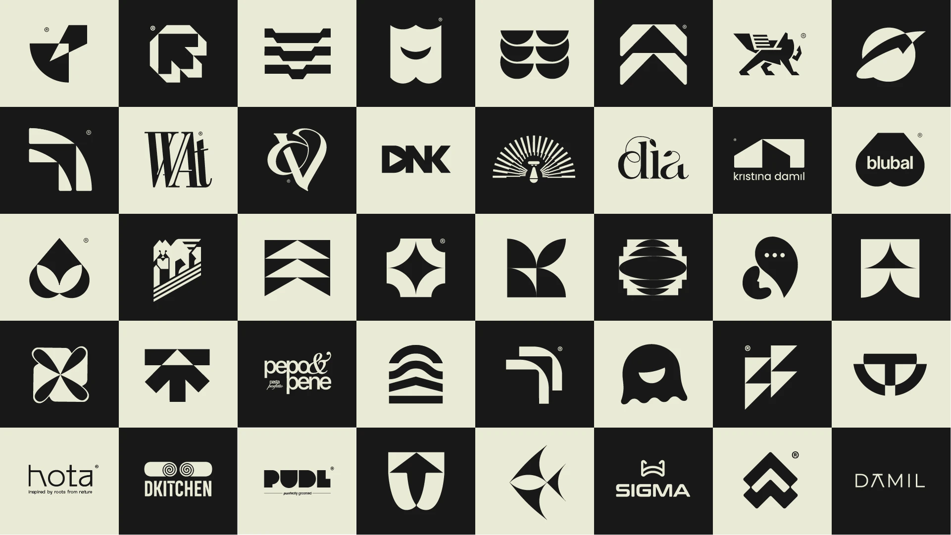
Logofolio 23/24 is a curated selection of marks built around reduction and structural precision.
Across industries, the goal remained the same — create logos that feel inevitable, scalable, and quietly confident.
Refined typography. Intentional spacing. Timeless form. Because a strong brand doesn’t start with complexity. It starts with clarity.

If your logo still feels like a placeholder, it probably is.
Let’s design something worth building on.
2 likes · 130 views · Nov 4, 2024
Most logos try too hard. These don’t. A curated logofolio exploring minimal systems, refined typography, and structural balance.

