Built with Jitter
Brand and logo Design for Sable

Samuel Lasisi


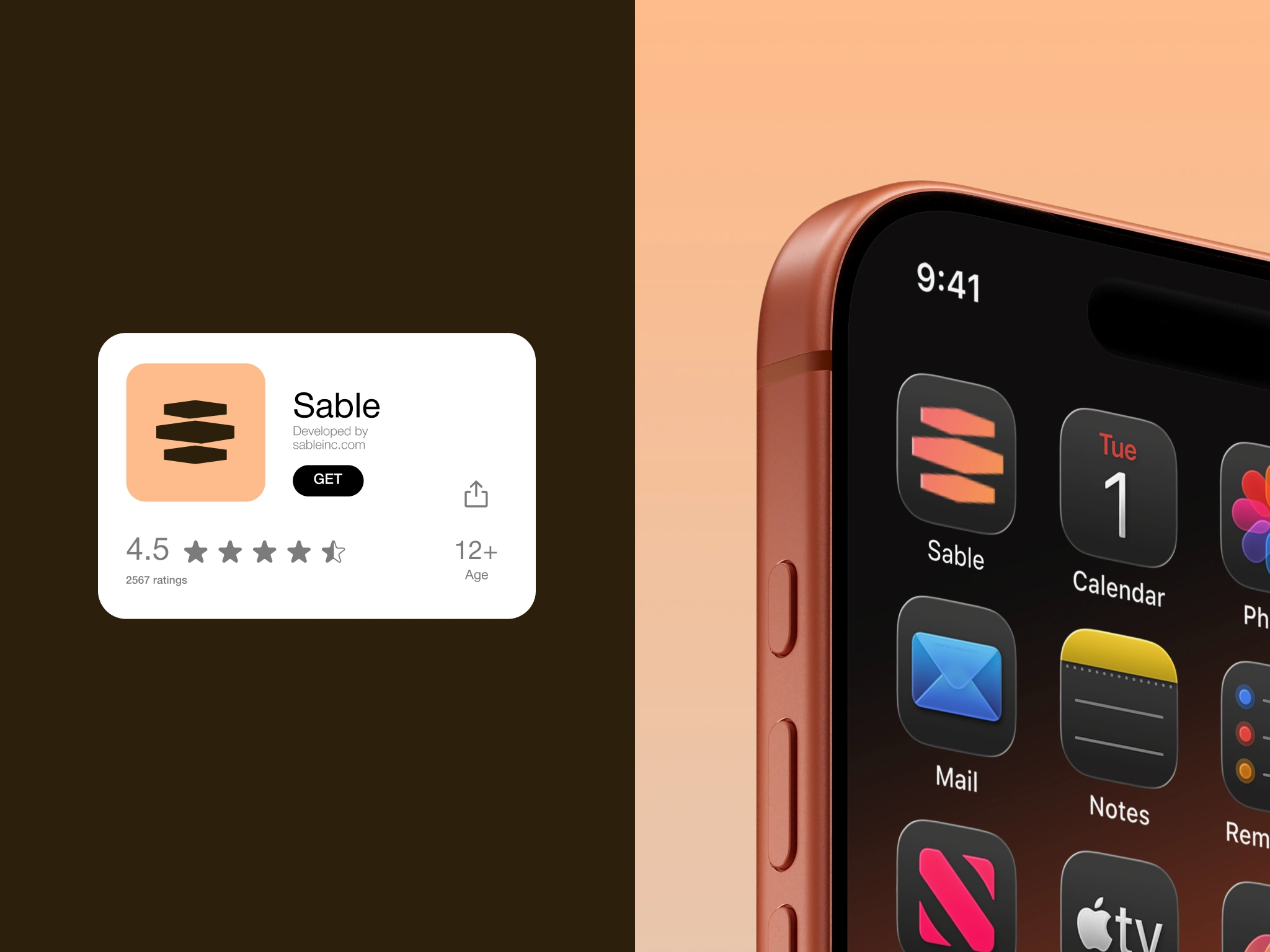
Sable: Brand identity for a calmer way to work.
Sable is a productivity platform designed to help teams stay aligned, focused and on track without the constant noise that often comes with modern work tools.
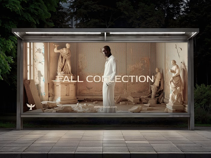
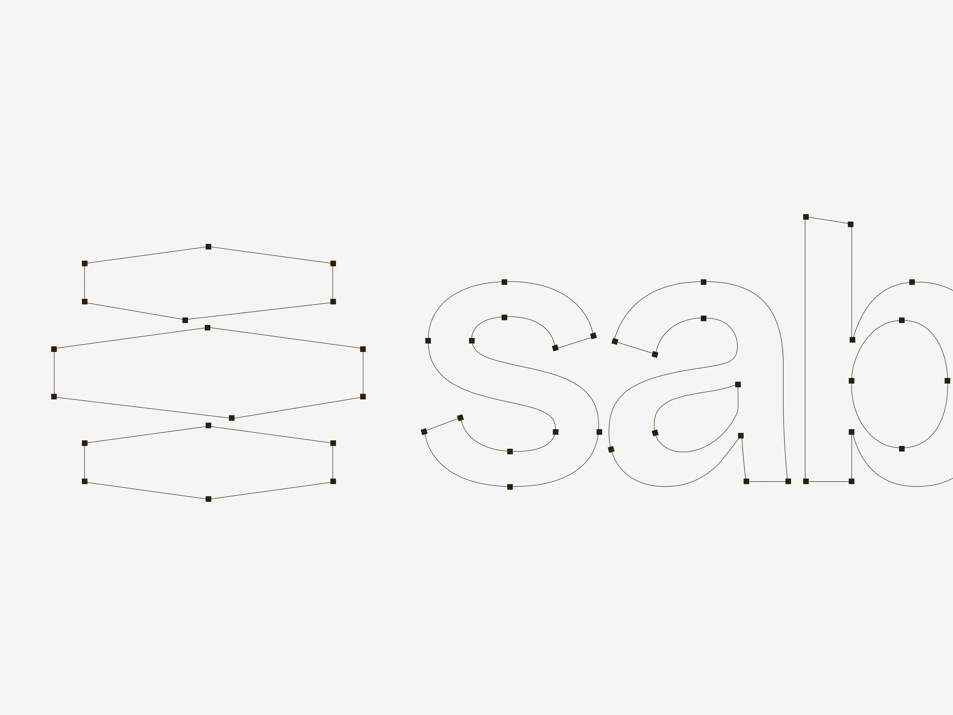
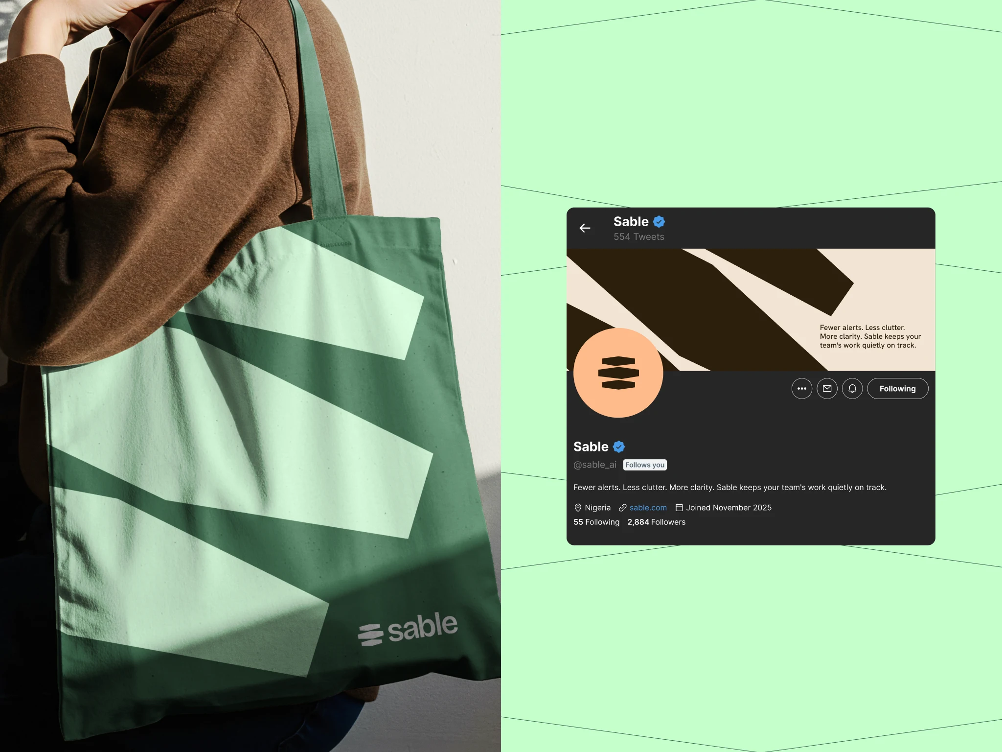
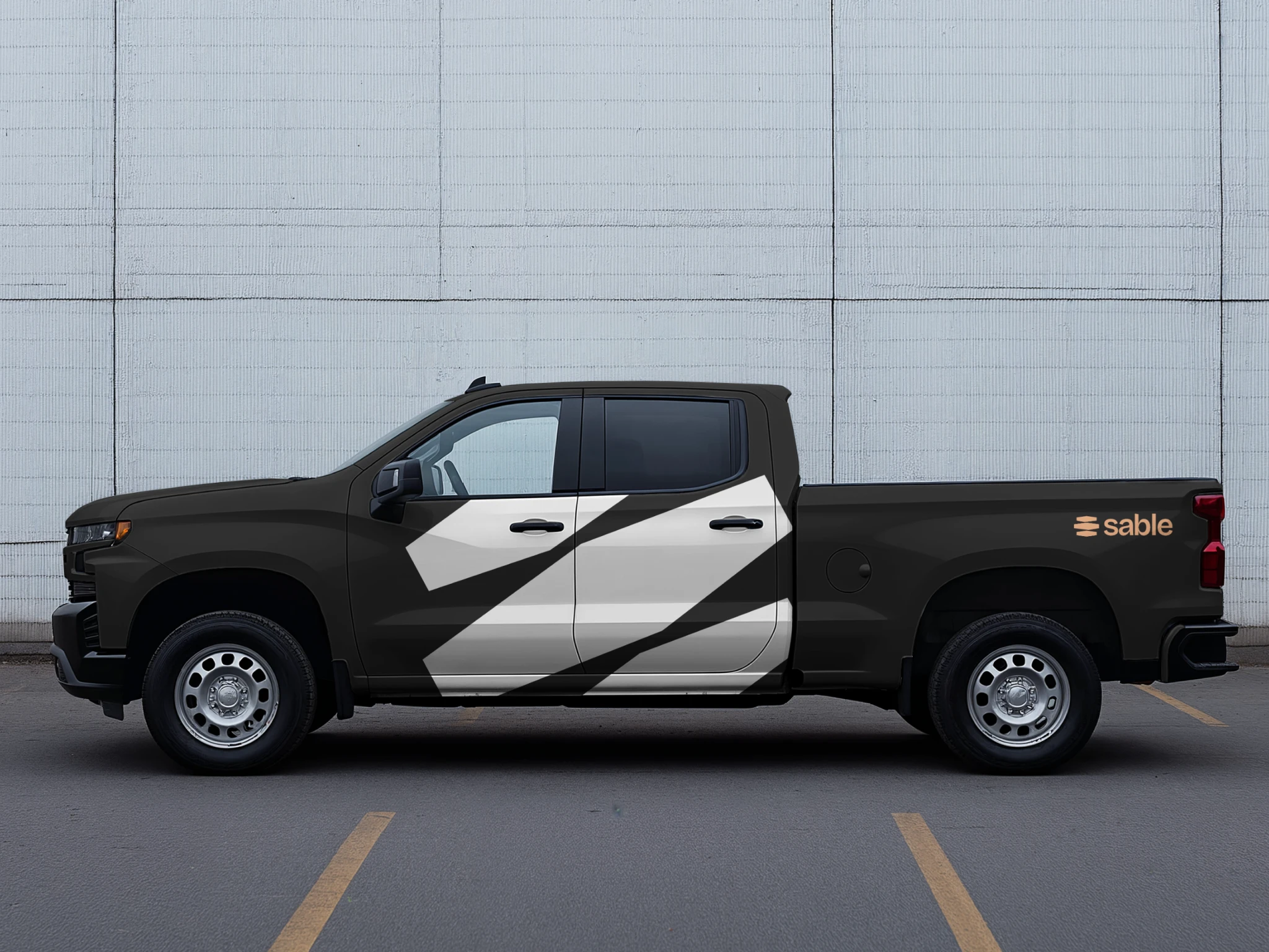
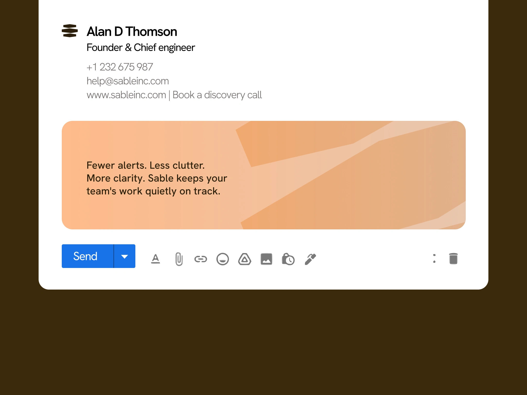
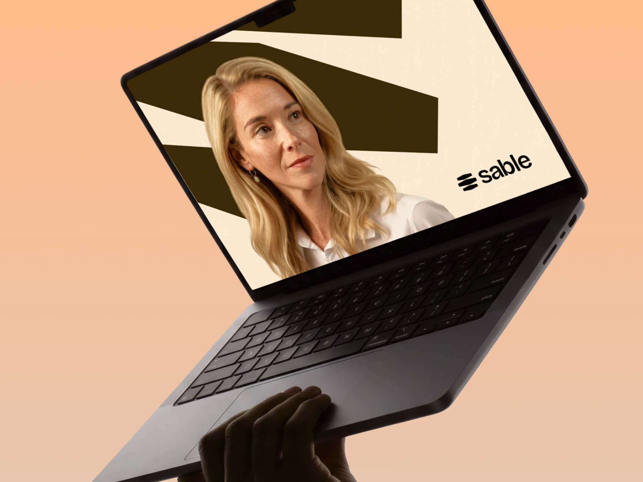
We developed a new visual identity for the platform, creating a brand system that could communicate Sable's core promise of less clutter, fewer distractions and more clarity, while still feeling distinctive enough to stand out in a crowded SaaS market.
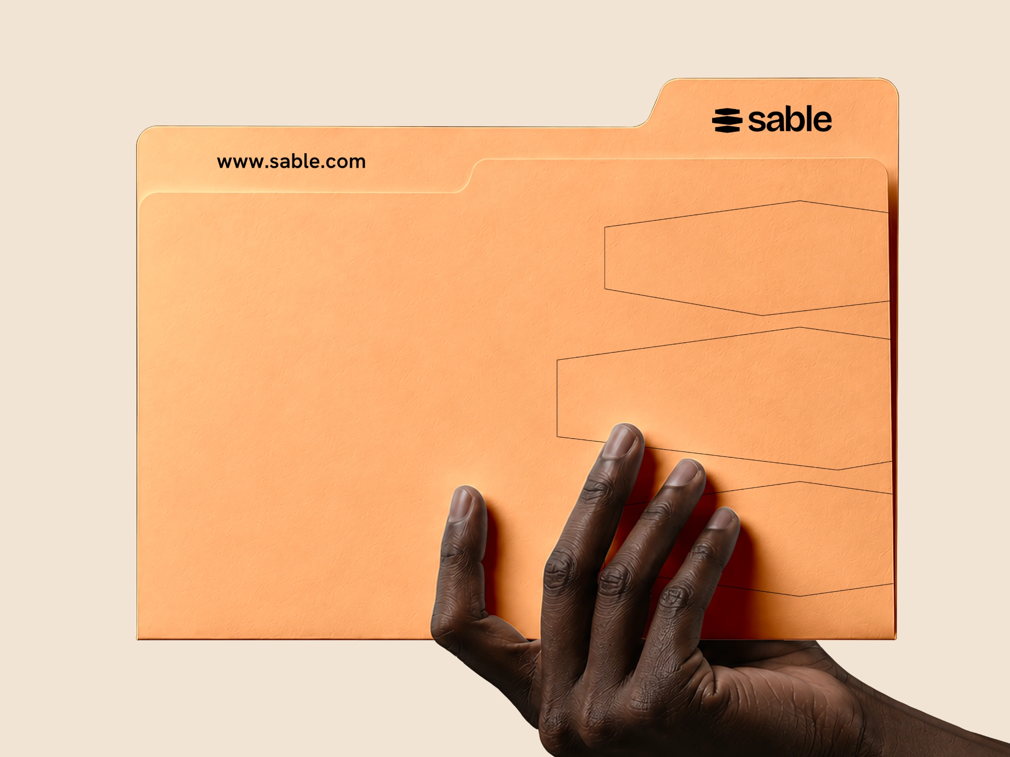
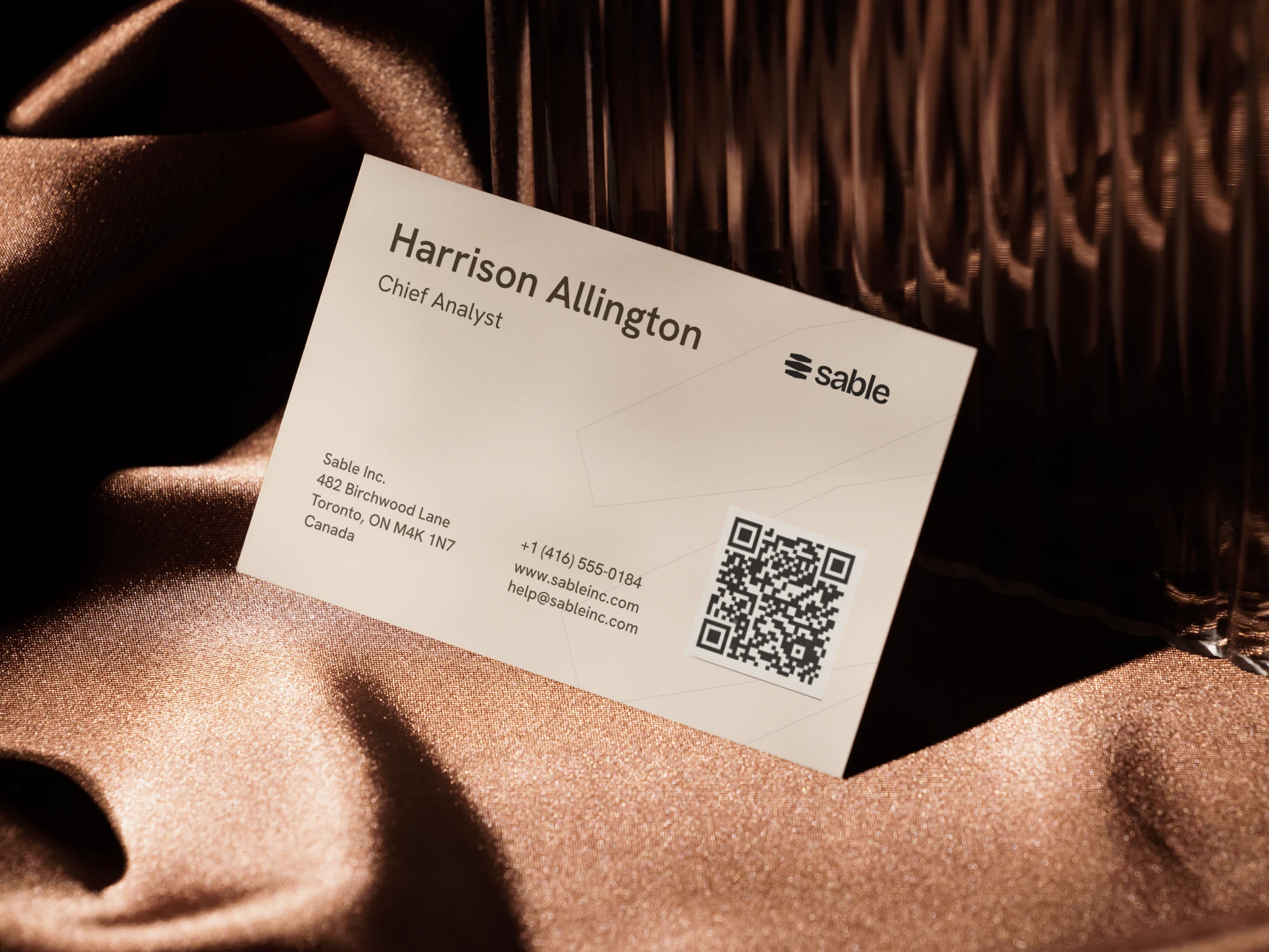
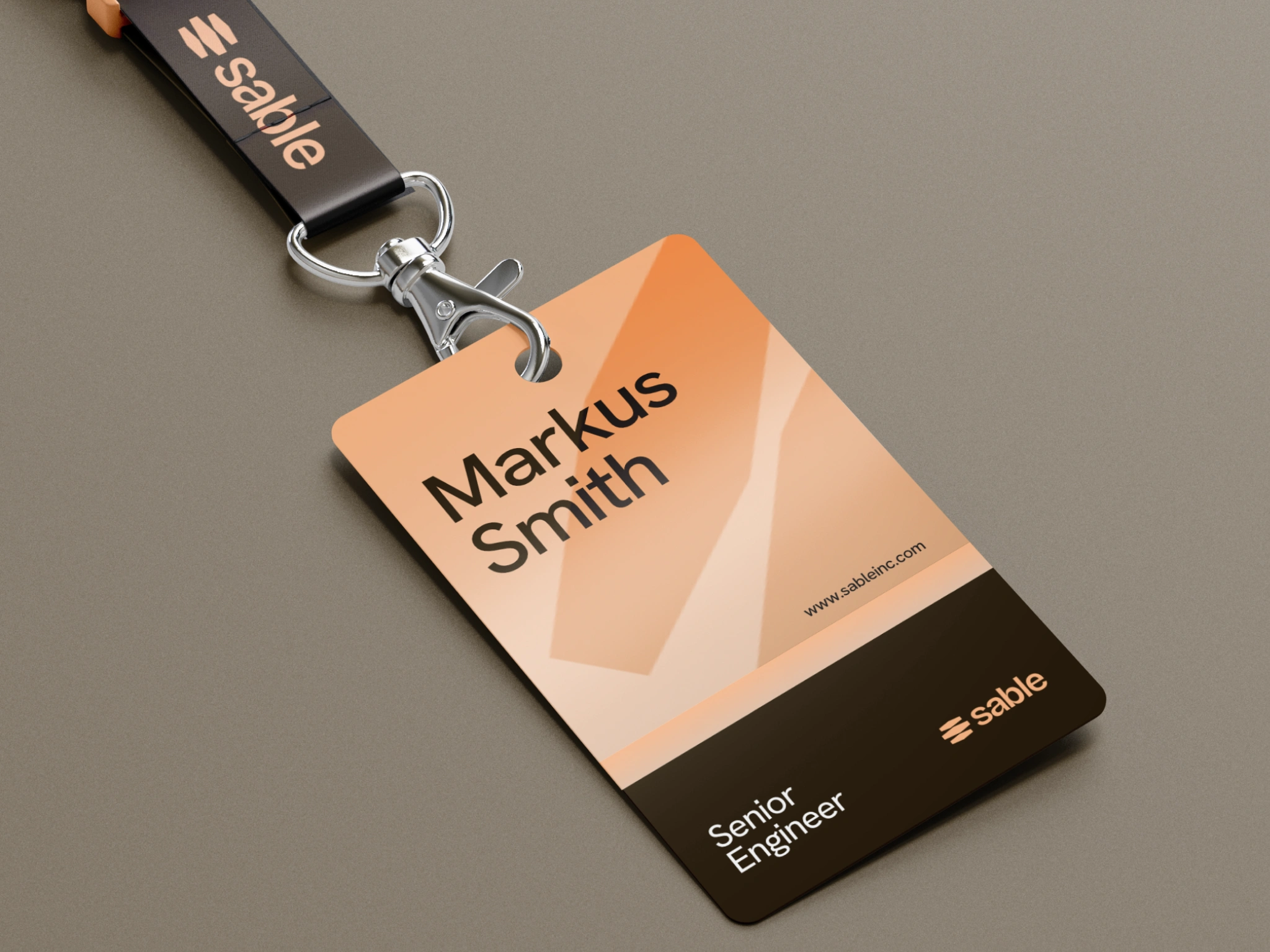
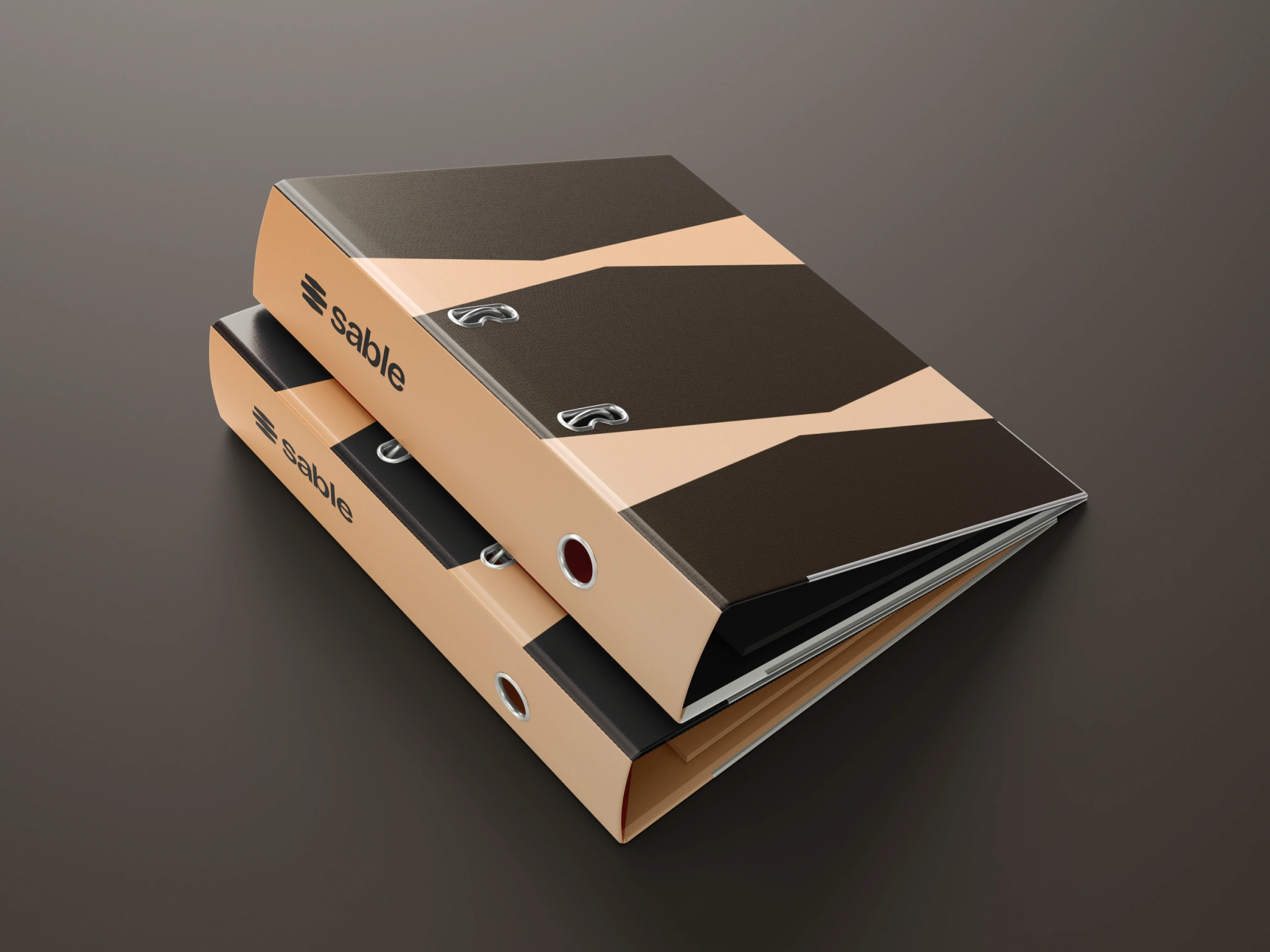
The work covered the core identity, typography, colour, visual language, digital applications and campaign direction, creating a system that could work consistently across both the Sable product and the wider brand.
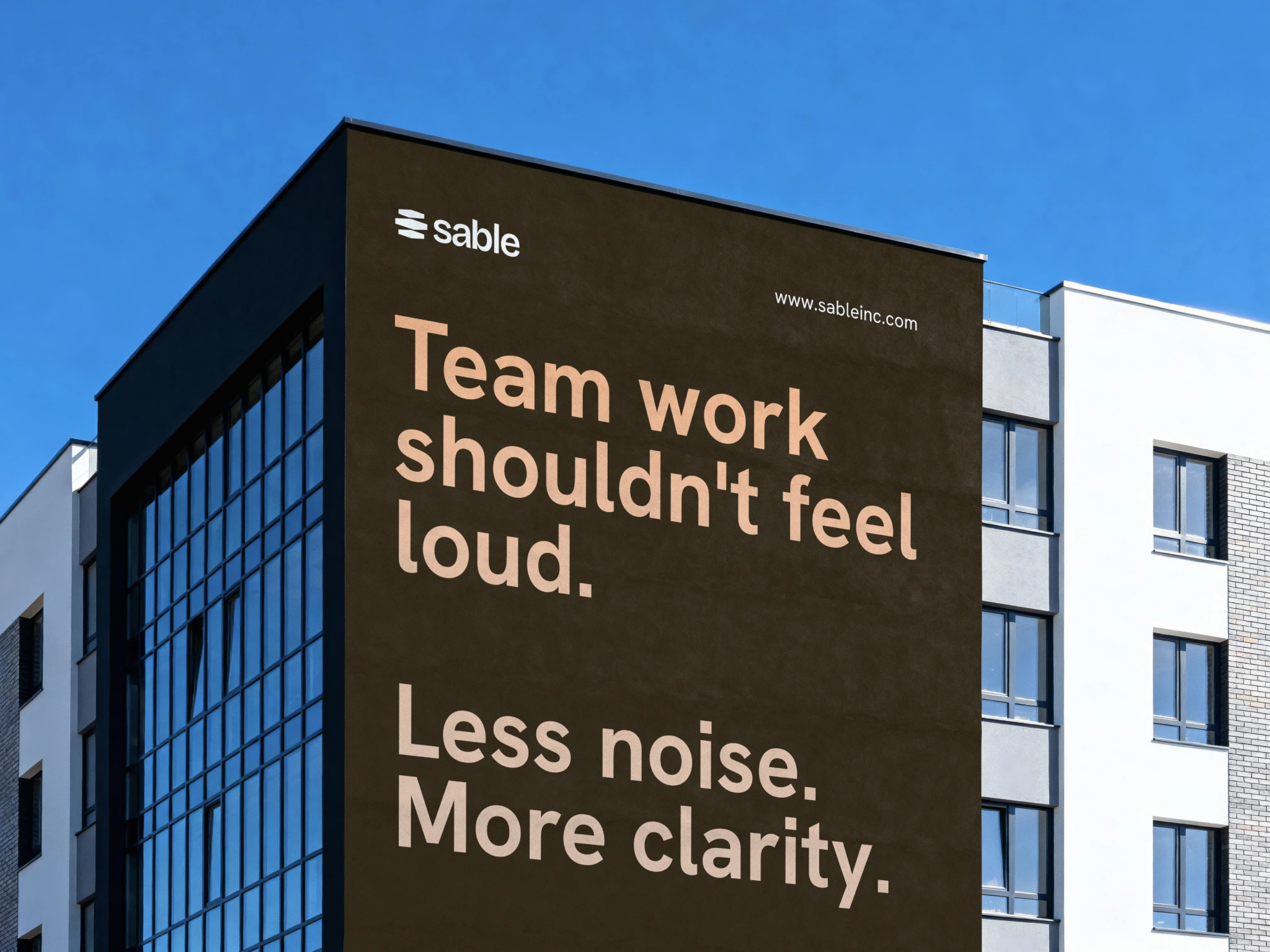
Less noise. More clarity.
Sable's product proposition became an important part of the brand language.
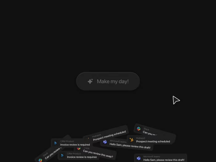
The platform is designed to help teams reduce unnecessary alerts, organise what matters and create a clearer view of the work that actually needs attention.
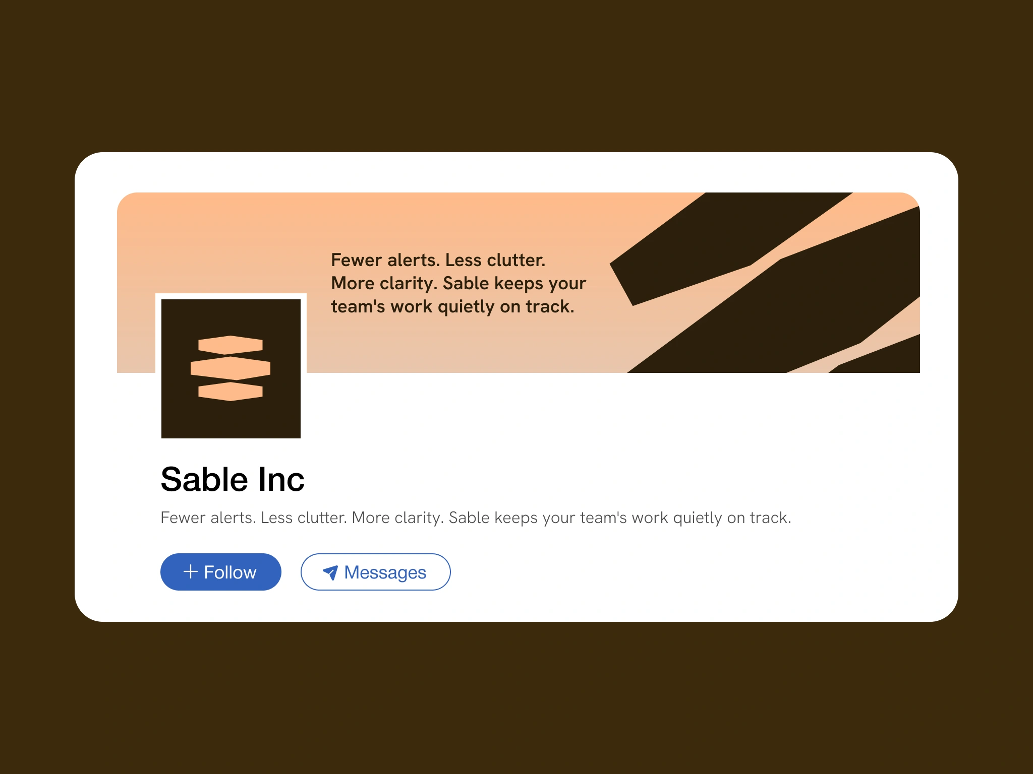
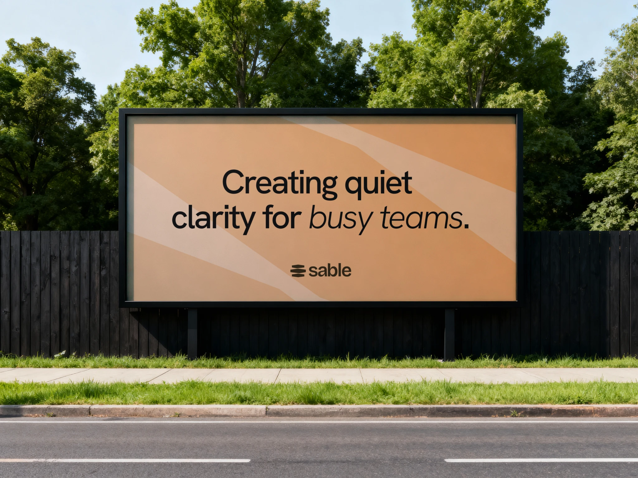
We translated that idea into a direct communication style built around simplicity, confidence and short, memorable statements.
Bringing the brand into the product
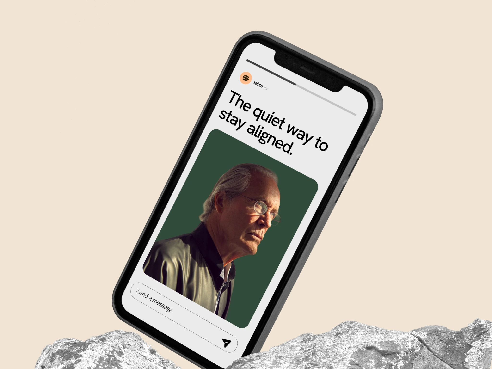
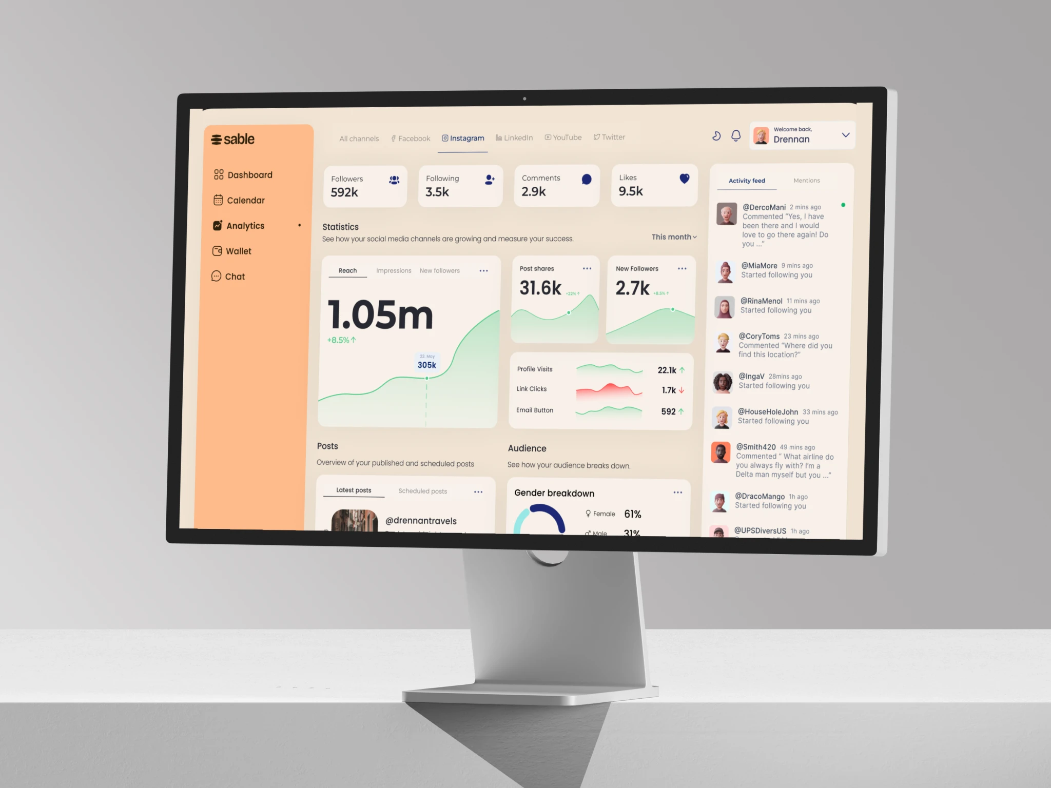
Because Sable is fundamentally a digital product, the identity had to work inside an interface as naturally as it worked in campaign material.
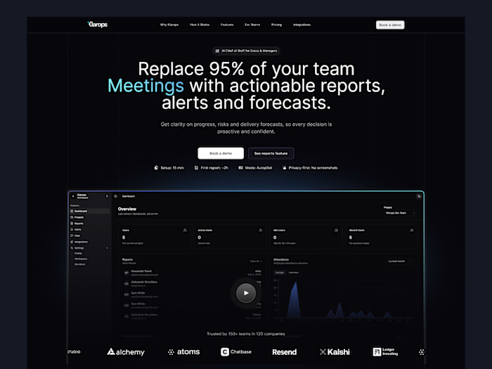
We extended the visual system across web and product touchpoints, considering hierarchy, typography, colour, spacing and component behaviour so the experience remained clear even when handling more complex information.
The goal was to create consistency between how Sable communicates and how Sable feels to use.
That final sentence is strong:
Like this project
Posted Aug 6, 2026
Brand identity and visual system for Sable, a productivity SaaS helping teams reduce clutter, stay focused, and work with greater clarity.