Snackwise Homepage Redesign
Yerassyl Nurpeissov
A redesign of Snackwise’s homepage that brings emotion and energy to a B2B food delivery brand. The goal was to create a vibrant, consumer-inspired layout that drives engagement while maintaining business credibility.
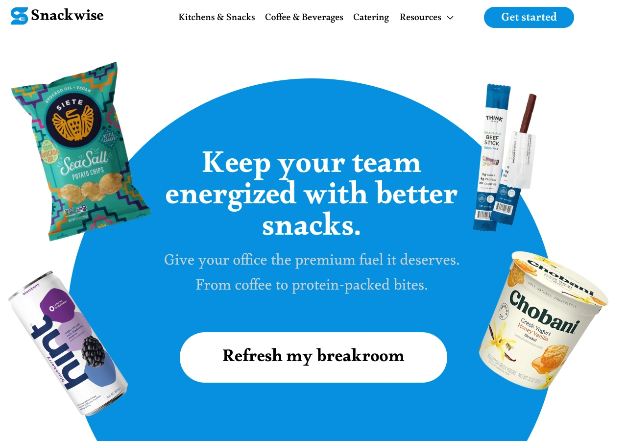
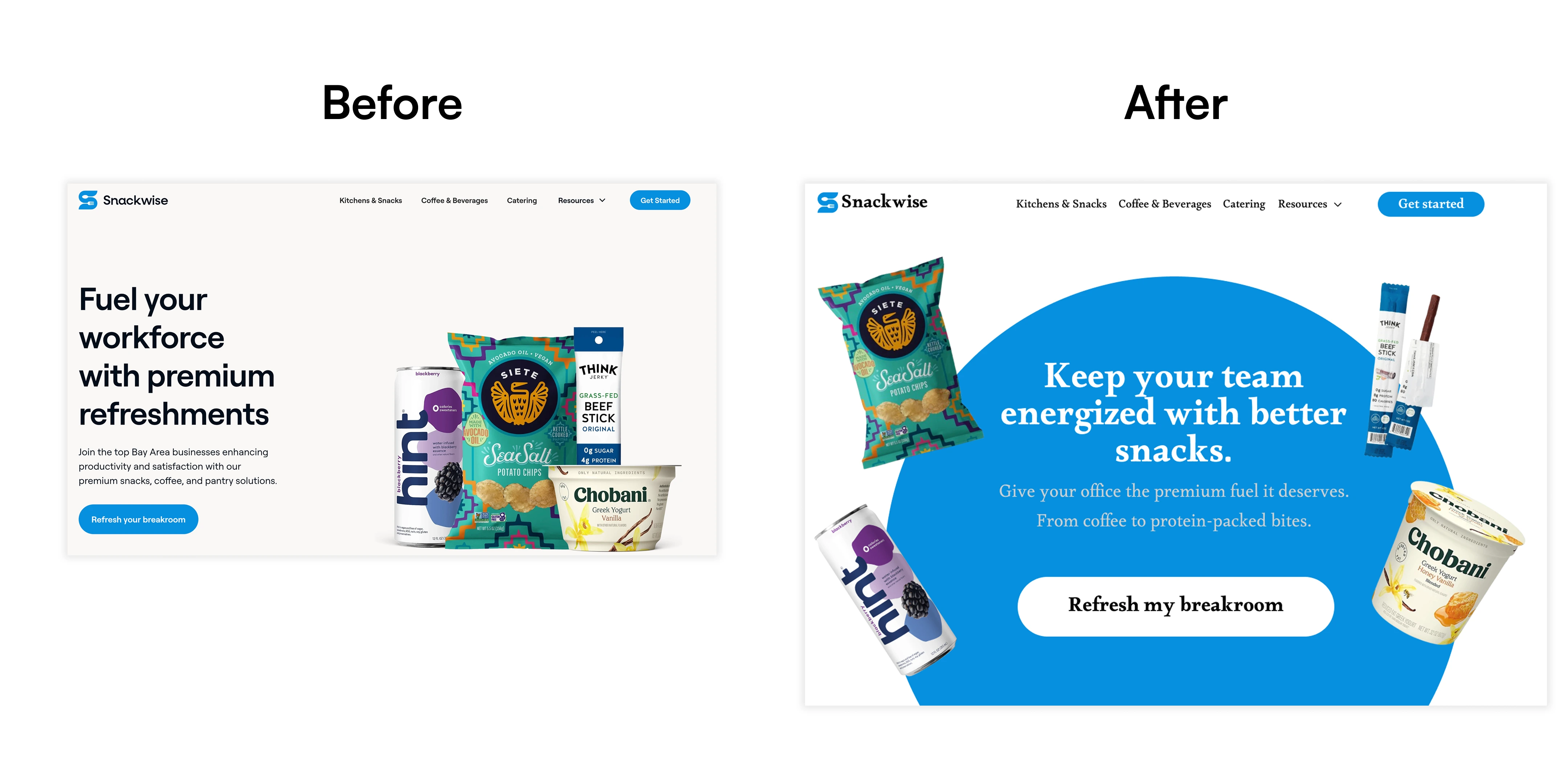
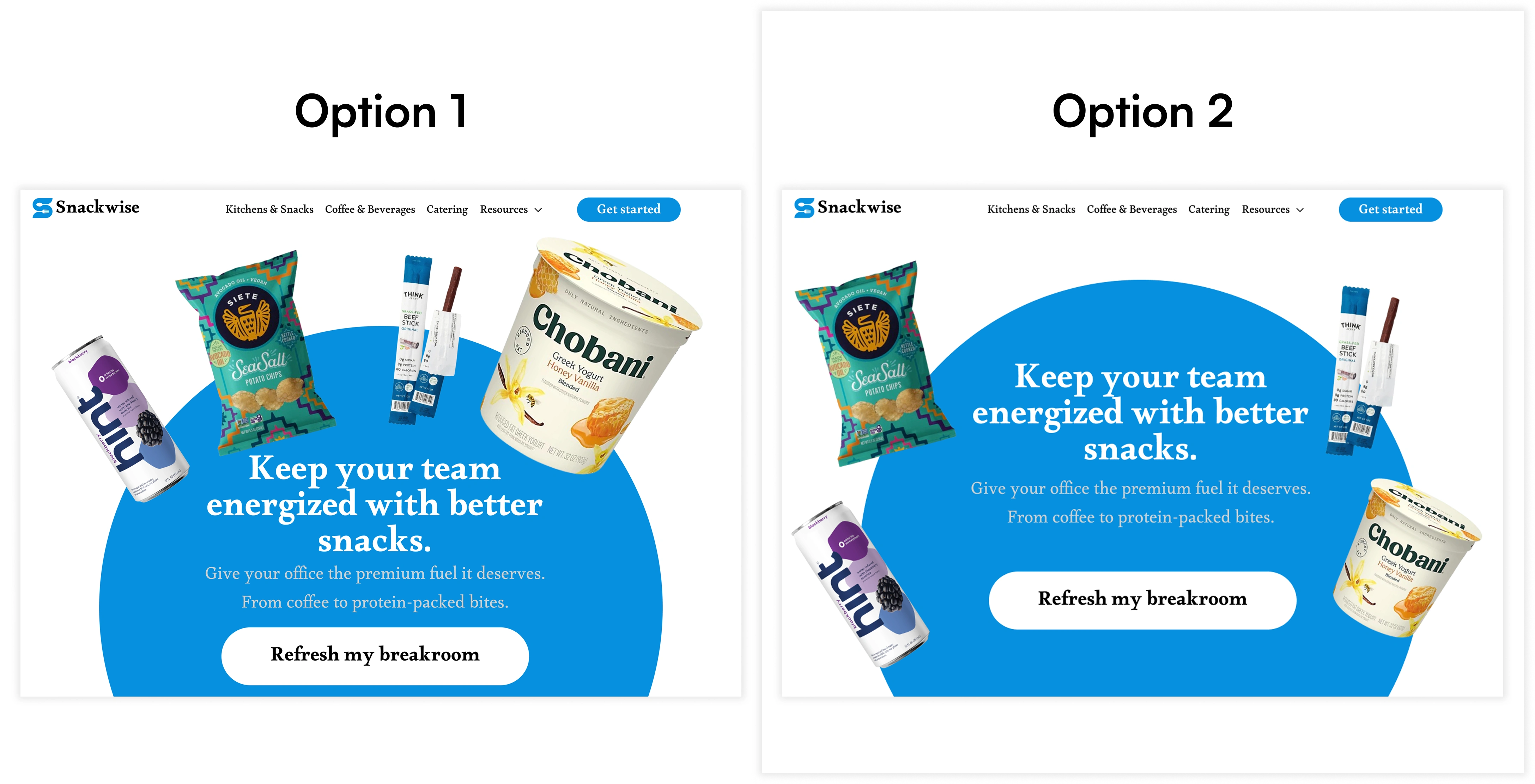
Snackwise’s previous layout delivered the information but lacked personality. My redesign centered around creating visual joy through playful product placement, curved shapes, and typography that balances authority with warmth. The CTA is direct and inviting, while the floating snacks create brand memorability. This hero section is designed to instantly communicate value while feeling delightful, especially on scroll or mobile.
Like this project
Posted Jul 22, 2025
Redesigned Snackwise's homepage to boost engagement with vibrant visuals.
Likes
0
Views
1