How Halo's UI & Atmosphere Shifted Over Two Eras
Christopher Collins
From Bungie to 343: How Halo's UI & Atmosphere Shifted Over Two Eras
Great games don’t rely on one element, they combine sound, story, visuals, and interface into a single experience. Halo has done this in ways that defined a generation of players. This case study looks at how the franchise’s menus, music, and atmosphere evolved, and what that says about the power of design to influence memory and engagement.
The Bungie Era:
Bungie’s menus made this agency immersive. Navigating felt like interacting with ancient terminals or classified files, reinforcing the immersion.
Even the smallest menu actions, selecting Campaign, scrolling through settings, were backed by feedback, pacing, and visuals that built anticipation.
The menus also took great lengths to tell a story. Typically with a sweeping view of the Halo ring, a war torn city, or a barren wasteland with ancient technology. These vignettes gave the player a sense of what to expect.
Halo is bombastic. On its surface, its a story about humanity on the back-foot fighting this alien force that is, on paper, better in every militaristic way. They game takes heavy inspiration from many different sources: cassette futurism (ala the Alien franchise), Gundam & other early sci-fi animes, and even Christianity (halos, covenants, John 117). These themes and ideas all come together to create an amazing space opera FPS that the world had never seen. However, that is just what you see and hear on the surface. Dig deeper and you will find a more subtle story, sometimes lurking, below the surface.
But you don’t have to play hours of the game or watch compilations online to get the story. Looking to Halo: CE (aka Halo 1) everything you need to know about is given to you in the first three minutes and 51 seconds of the main menu. Every twist and turn is completely set on a mysterious ring world. Even the music tells a story if you listen to it with a keen ear, but we can get into that another time.
This style of storytelling exists through all the mainline Bungie era entries. And it pulls you into the world, it isn’t there just for function, but for form. Its something completely unique and, if you’re willing to look for it, it gives a deeper appreciation for the story and the time taken to craft it.
"They call it, Halo"
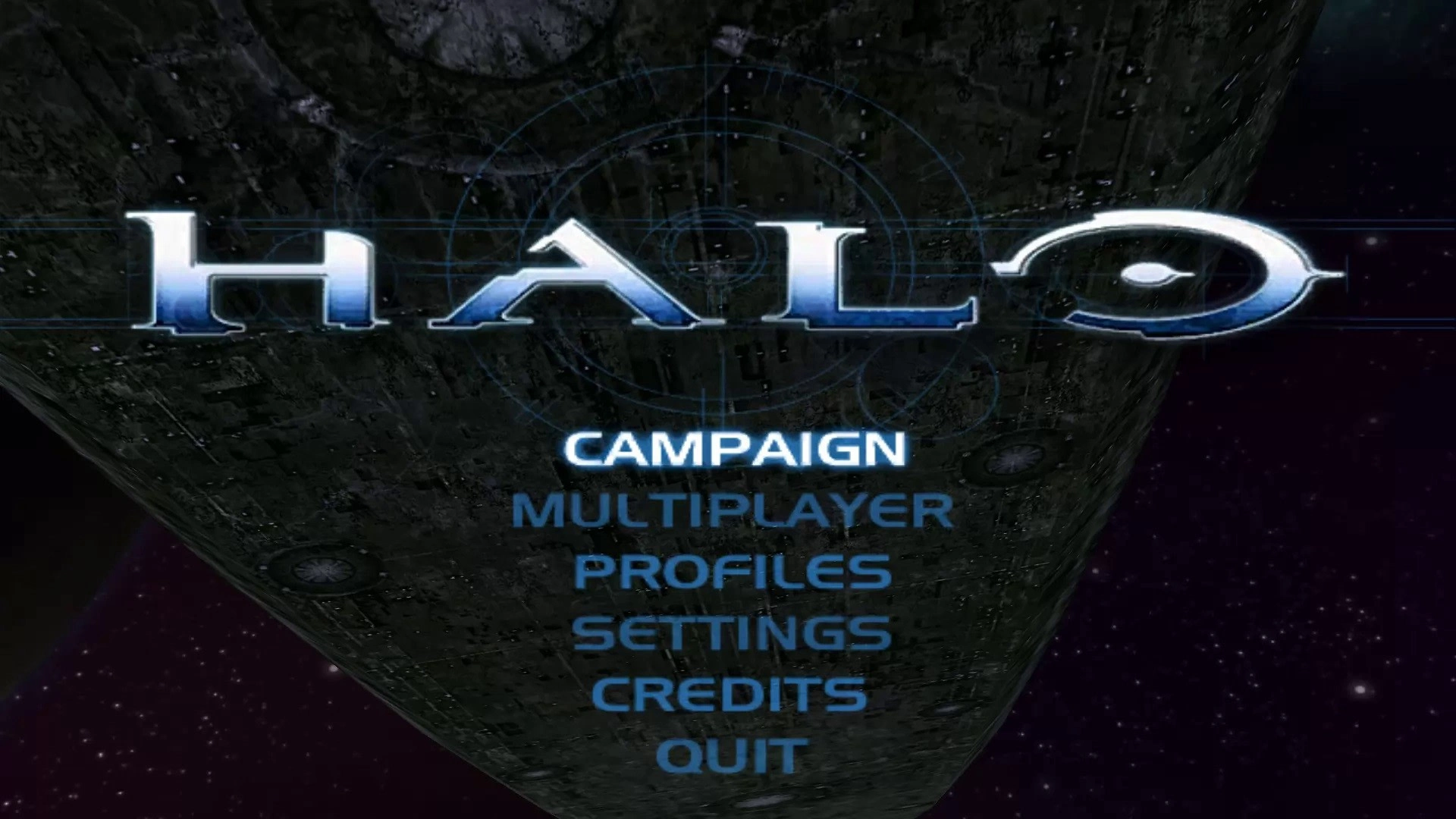
Halo’s menus have always leveraged larger than life images when first entering the main menu. Take for instance the first entry’s: immediately the player is shown an expansive ring world. The camera swoops around it revealing an even larger gas giant looming behind it. The entirity of the story (save for one mission) takes place here on this ancient ring world. And looking back, knowing how it sets up everything, its incredible to get the whole story captured in one MOV file. However, the star of the show is the simple UI interface. Simple, clean, and yet still stylized. You know where you’ll end up with each title.
“So this is what my father found...”
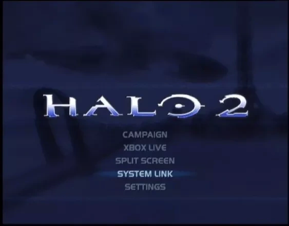
Diving into Halo 2’s main menu, it’s a remix of what came before. The ruins of New Mombassa, one of humanity’s last strongholds, are besieged by a massive Covenant supercarrier, measuring about 5.4 km (3.3 miles) long. In 2004, witnessing something like this truly set the stage for the iconic story that was about to unfold. The UI was simple, less cumbersome, and clearly laid out, guiding players to each title. The menu featured a new blue overlay, creating an immersive in-game feel. This blue tone echoed the design of the Halo ring world components, and Bungie embraced it.
“Your poet Elliot had it wrong...”
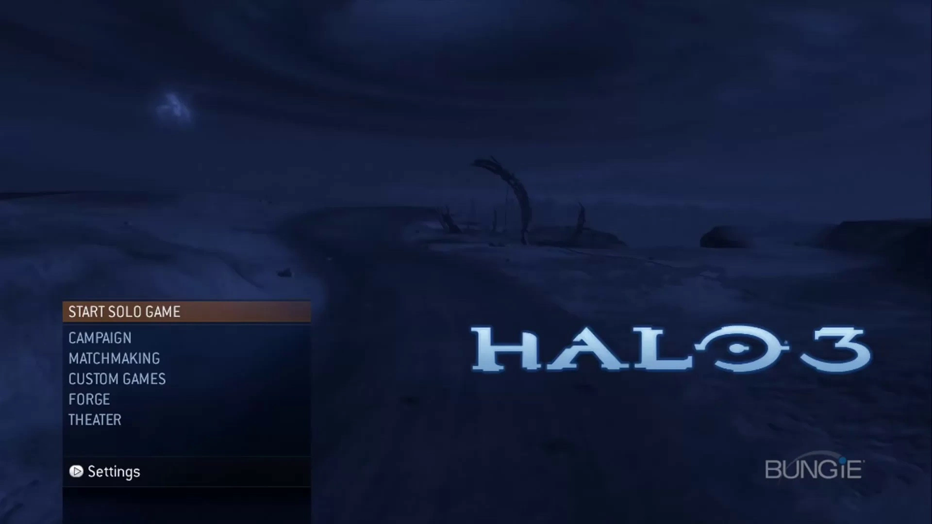
The build-up to September 27, 2007, was monumental for gaming. The world eagerly awaited Halo 3's release, which delivered. Good UI design creates patterns to keep users engaged. Halo 3’s main menu featured a blue-toned screen and sweeping vistas. The story continues from Halo 2, showcasing Covenant carriers blasting Earth. A ruined road with debris adds to the mystery, a core element of Halo.
This time though, the UI shifted: subdued fonts, a vertical layout, calmer pacing. It wasn’t just software, it was atmosphere—a log of events, like a Forerunner terminal or human field record. Mystery had always been central to Halo, and here it was woven directly into the menu itself.
The 343 Era:
Bungie’s last entry to the Halo franchise was with 2010’s Halo: Reach. A prequel that lead directly into the events of Halo: CE. Everything that had happened with their stories, tied up nicely rounded back in on itself to present its harrowing beginnings. In the famous words of George Lucas, “its like poetry, it rhymes”. It wouldn’t be another two years until the next installation would be released. For anyone who was a teen at this time, two years stretched to two decades.
But before it was announced, Halo went back (forward technically) again. A new studio, 343 Studios, had taken the reigns. Touted as a studio made of Halo fans, they had been green-lit to remaster Halo: CE, graphically speaking. You would think that updating the graphics of a, at the time 10 year old game, would be incredible step in the right direction. However, this lead to some mixed but not really mixed mostly negative responses. It was a graphical overhaul for the sake of graphical overhauls, and personally, I believe it took the atmosphere and charm out of the original 2001 version. It wasn’t a faithful recreation, but rather an in-line, “new is better”, attempted to garner excitement for 343’s next release.
The problem though is that there didn’t need to be a massive identity change to create excitement. A pervasive issue that 343 had until it transitioned into Halo Studios in mid 2025.
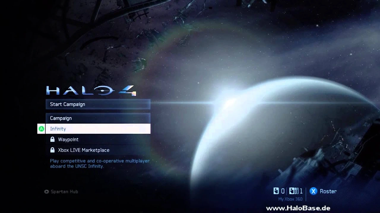
Looking back, Halo 4 had so many great aspects to it. A compelling villain, a new setting, a really deep and intimate narrative. Even the main menu was engaging, the scene of a planet eclipsing a sun, wreckage surrounding the boarders of the screen, and even the music was compelling. But something felt. Off.
The blue tint was there, but it was a colder blue, not a bold one. The vista was there, but it was static (save for the wreckage moving). The music was there and a story could be gleamed from it, but it didn’t feel cohesive. It was small elements that built up to not feeling like Halo’s identity. Even the UI felt hand hold-y. Button prompts by each menu title. The full display menus were replaced by dashboard tiles in submenu after submenu. Each menu also used familiar iconography, but they had changed. Things that didn’t need to change either.
When hovering over “start campaign” a message tucked below everything would read “experience the return of the Master Chief”. But it felt more like a distorted echo than a continuation.
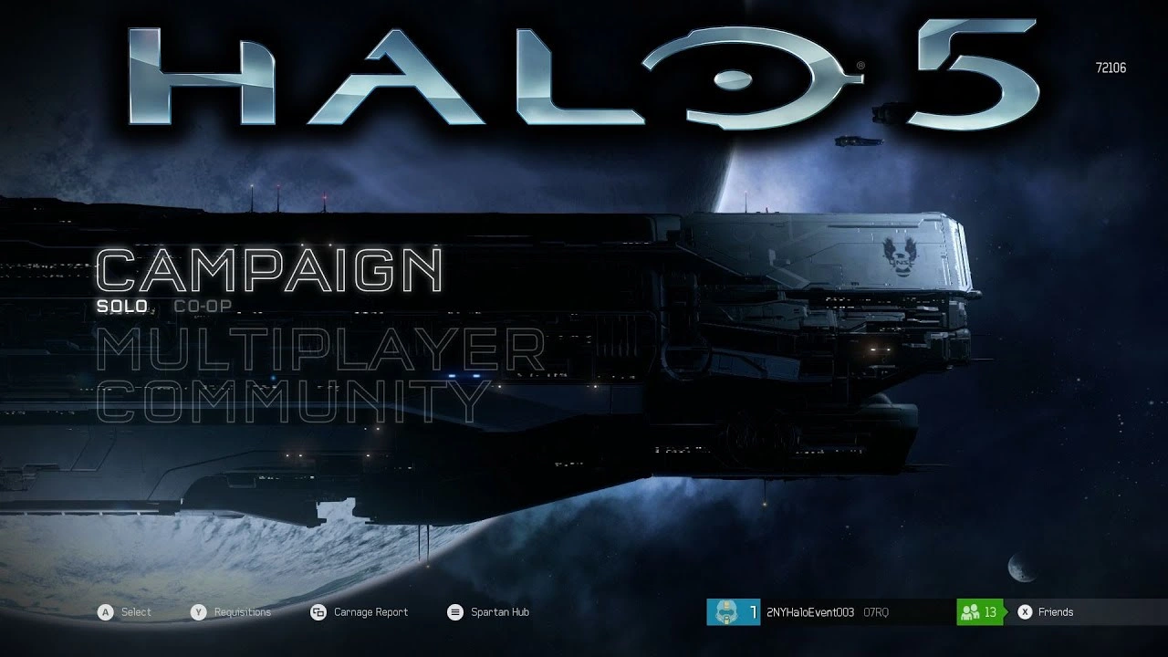
Halo 5. For any and all who have played this game, they know that it felt like a complete departure from everything that came before. While Halo 4 wasn’t perfect and probably didn’t scratch the itch of veteran Halo fans, Halo 5 seemed to be a reaction to the negative feedback to Halo 4.
Focusing on the UI and atmosphere, the main menu wasn’t telling a story related to the game’s narrative. Just a few Human ships parked on the screen with occasional bobbing of elements. The font changed to be a large outline, elements felt disjointed, and again: submenu after submenu.
Halo 5 just felt clunky, and from the first moment you enter the main menu, it gave that first impression. This goes into a larger force at play, but Halo 5 was suppose to be a very different game, but many factors came into play to divorce itself from what came before.
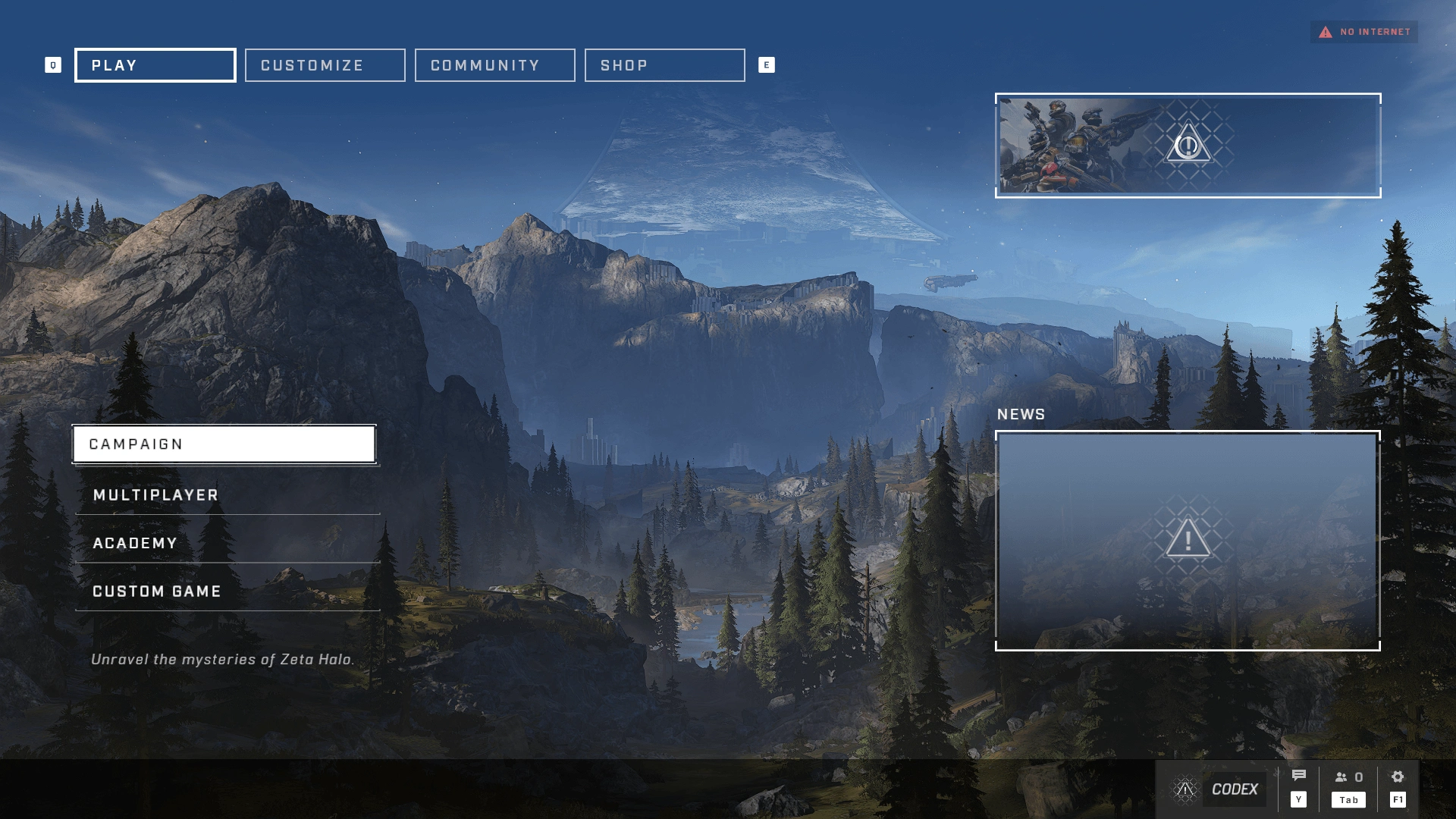
Halo Infinite is an interesting case. It was a clearly a reaction to Halo 5’s poor reception. It had gone back to familiar art styles but changed to be a semi-open world game. However, despite many good things to say, it felt a little too little too late. And it was. This was 343’s last entry before restructuring into Halo Studios. Halo Infinite got a lot right, but it also was influenced by contemporaries rather than blazing its own path.
Menus were similar to Halo 3’s but still with sub-sub menus. There also was so much on the screen at once. Which was a symptom of how the landscape has changed for video games (stores, updates, news, etc.) But again. No grand vista shots swooping through the story. music, while beautiful and truly a return to form, wasn’t placed to tell a subtle story. Many elements were placed, seemingly, because space needed to be filled. It didn’t feel intentional, it didn’t pull one into the story. It was a video game menu, not a portal into the world of Halo.
Verdict
Main menus are more than functional gateways. They’re the first point of agency a player has, and with that comes opportunity. Some menus tell stories diegetically, pulling you into a universe before gameplay begins. Others take a more restrained approach, prioritizing speed or clarity. Neither path is inherently right or wrong, what matters is intent.
The Halo franchise shows how shifts in design philosophy can shape perception. Bungie’s menus leaned atmospheric and diegetic, weaving story into even the quietest moments. 343’s iterations often mirrored broader industry trends, sometimes chasing clarity, sometimes experimenting, sometimes over-correcting. The result is a body of work that demonstrates both the strength and the risk of changing identity too often.
Trends can inspire, but strict adherence to them dilutes identity. A strong design voice comes from choosing with purpose, not chasing what’s popular. Menus shouldn’t be an afterthought. They’re a chance to set tone, reinforce narrative, and build continuity. Get them right, and they become part of the story players remember long after the credits roll.
Like this project
Posted Oct 20, 2025
Case study on Halo's UI and atmosphere evolution from Bungie to 343 eras.
Likes
0
Views
0