IoMT Changing The World
Summary
Using IoMT technology to remove the barriers of geography, access, and time not only improves patient outcomes but it lessens the operational burdens placed on health systems. The demand and opportunity for transforming the business of healthcare while also improving the overall quality of life has never been higher. Smashing Boxes, a local software design and development start-up, saw this opportunity as a chance to inform essential healthcare partners about the growing world of IoT.
Discovery & Definition
When the Smashing Boxes team and I first started, we had all the research on IoMT and the growing healthcare business close to completed. So the question became: How do we make informative materials that people will want to explore? This question could not be answered by merely mocking up a few images and calling it a day. We wanted all the information to be presented in one place.
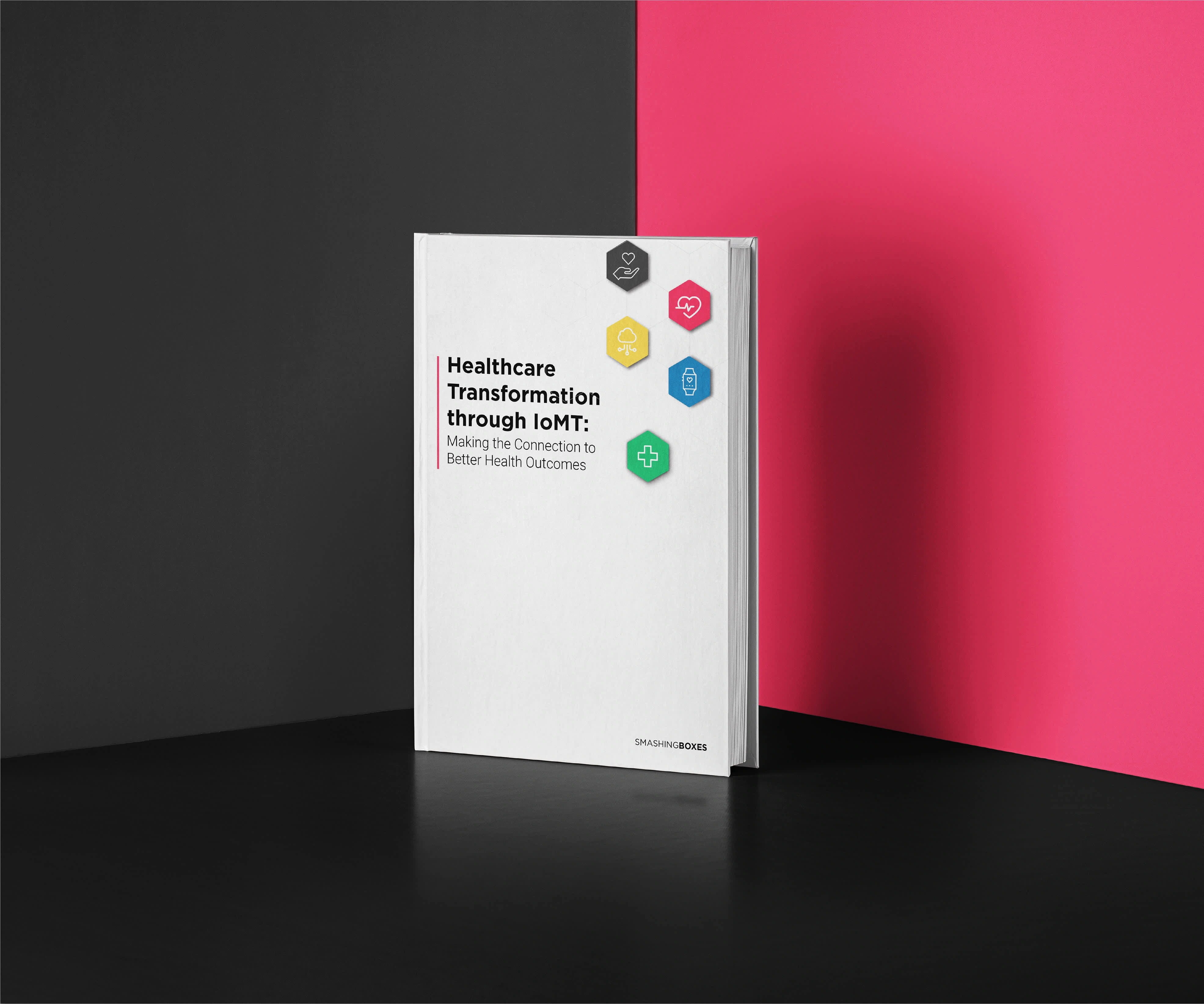
The idea for consistent presentation steamed into many ideas until we landed on building an ebook. This became our marketing objective and, ultimately, the bulk of the project creation process. Once we defined our marketing objectives, it was time to start on the ebook creation.


Action & Implementation
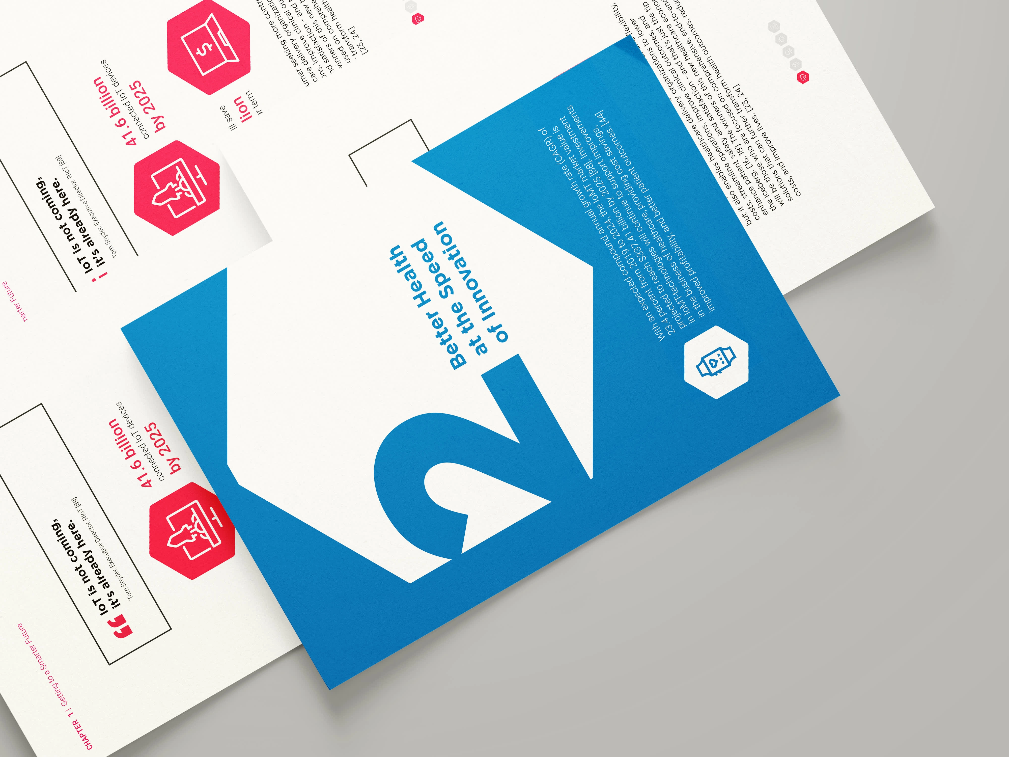
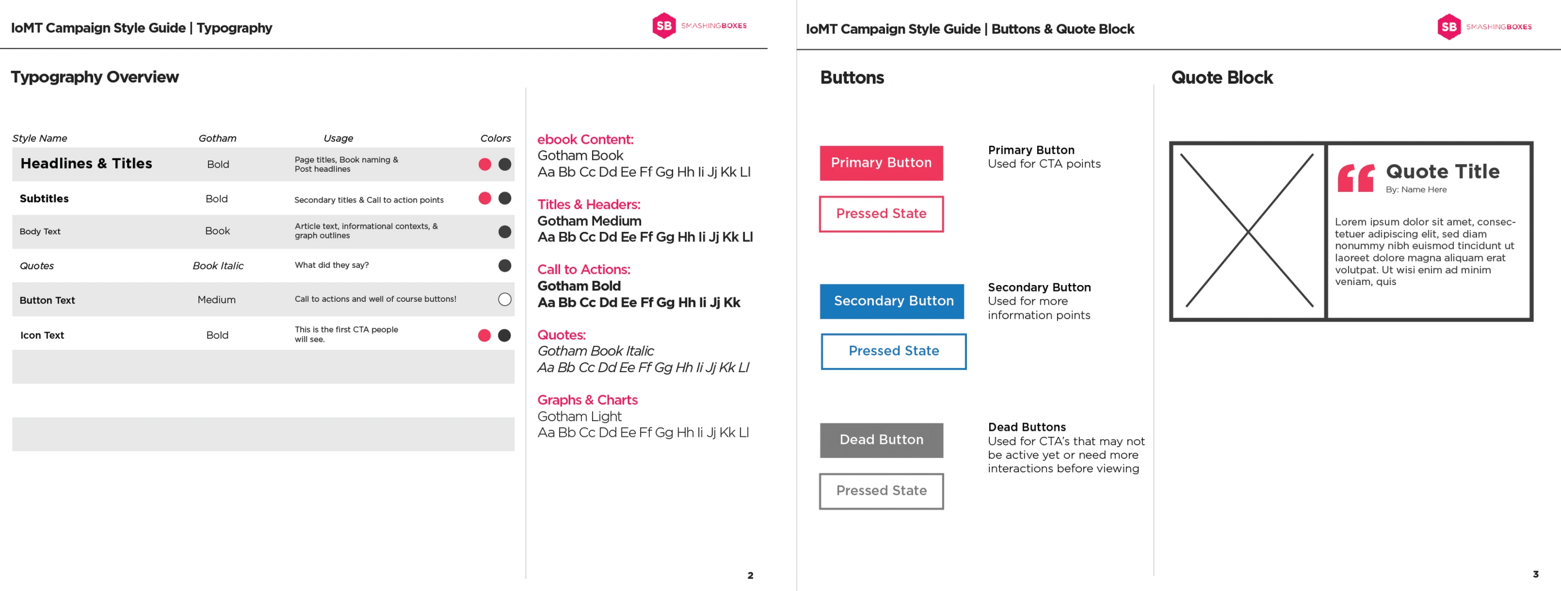
Many assets are needed to produce and design an ebook. Just like any other branded campaign, all of these assets require design consistency. After exploring each project mood board further, I defined what consistency meant to us and how we would use it to develop our ebook.
The first step was to engineer our branding attributes, meaning that we needed uniform elements to use across each asset being created. However, Smashing Boxes (SB) already has a recognizable brand. My task was to merge the two, bringing a fresh feeling to the campaign project while also not leaving the SB brand too far behind.
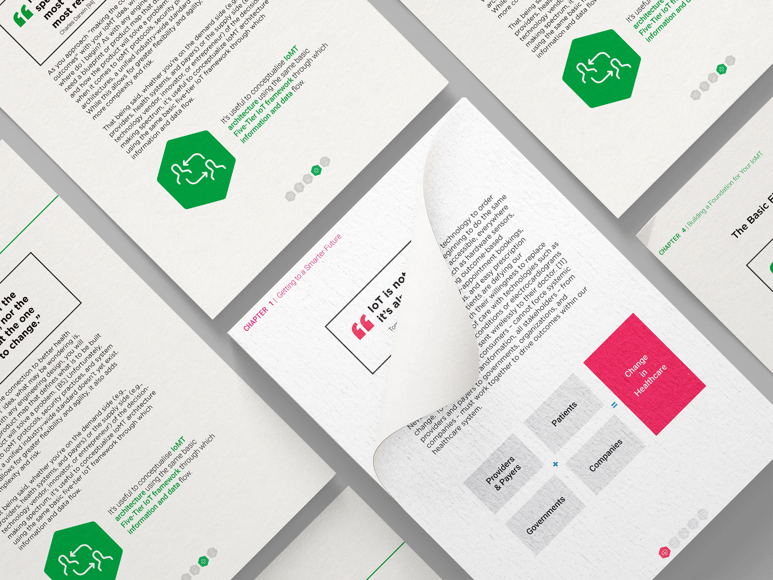
Besides colors and type, I made a series of systematic ions that helped us express the information we were explaining and give the user a break in the bulk of the reading. Special thanks to @ghost-icon for helping produce each icon!
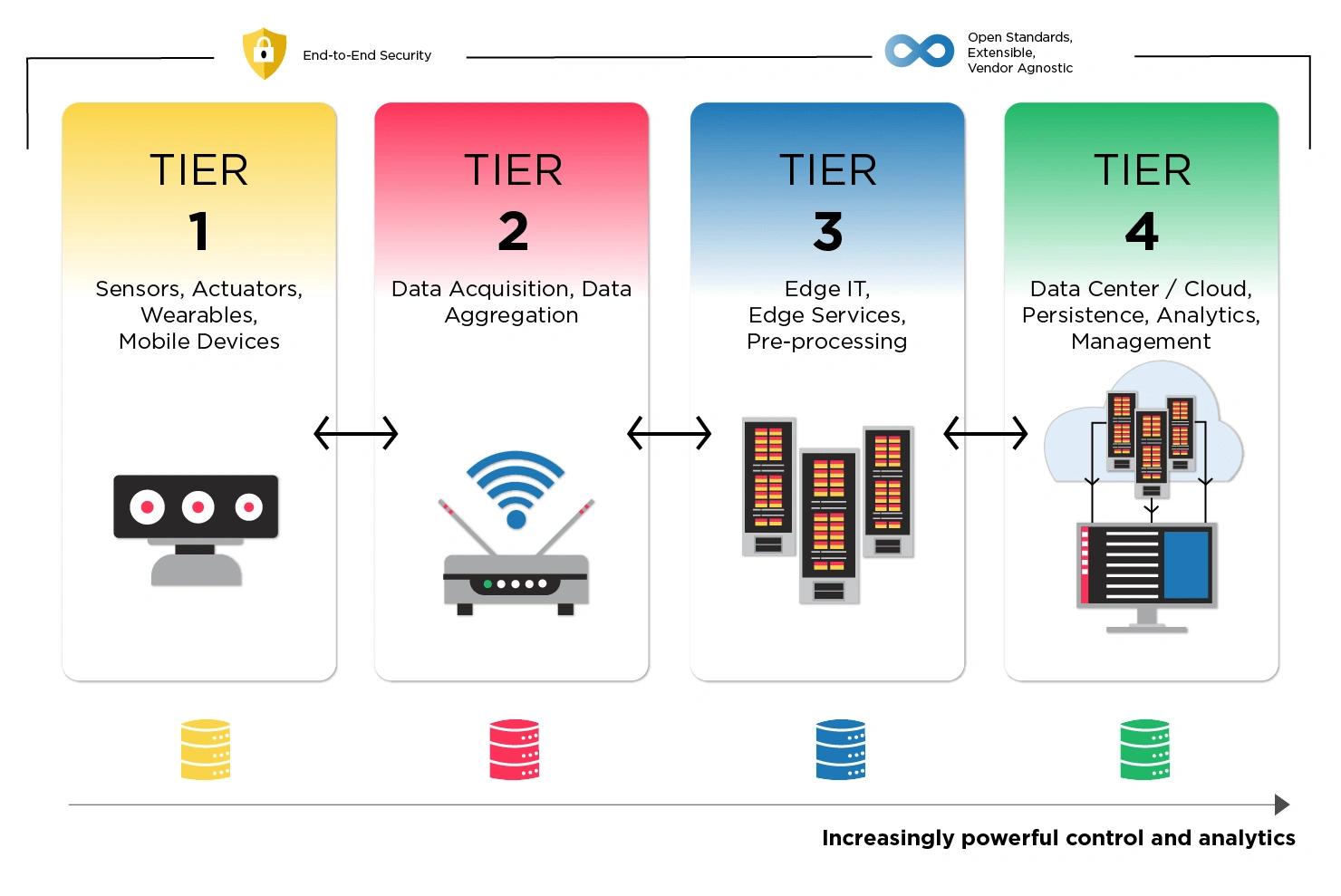
infographic created for placement inside of the ebook (created by the SB design team)
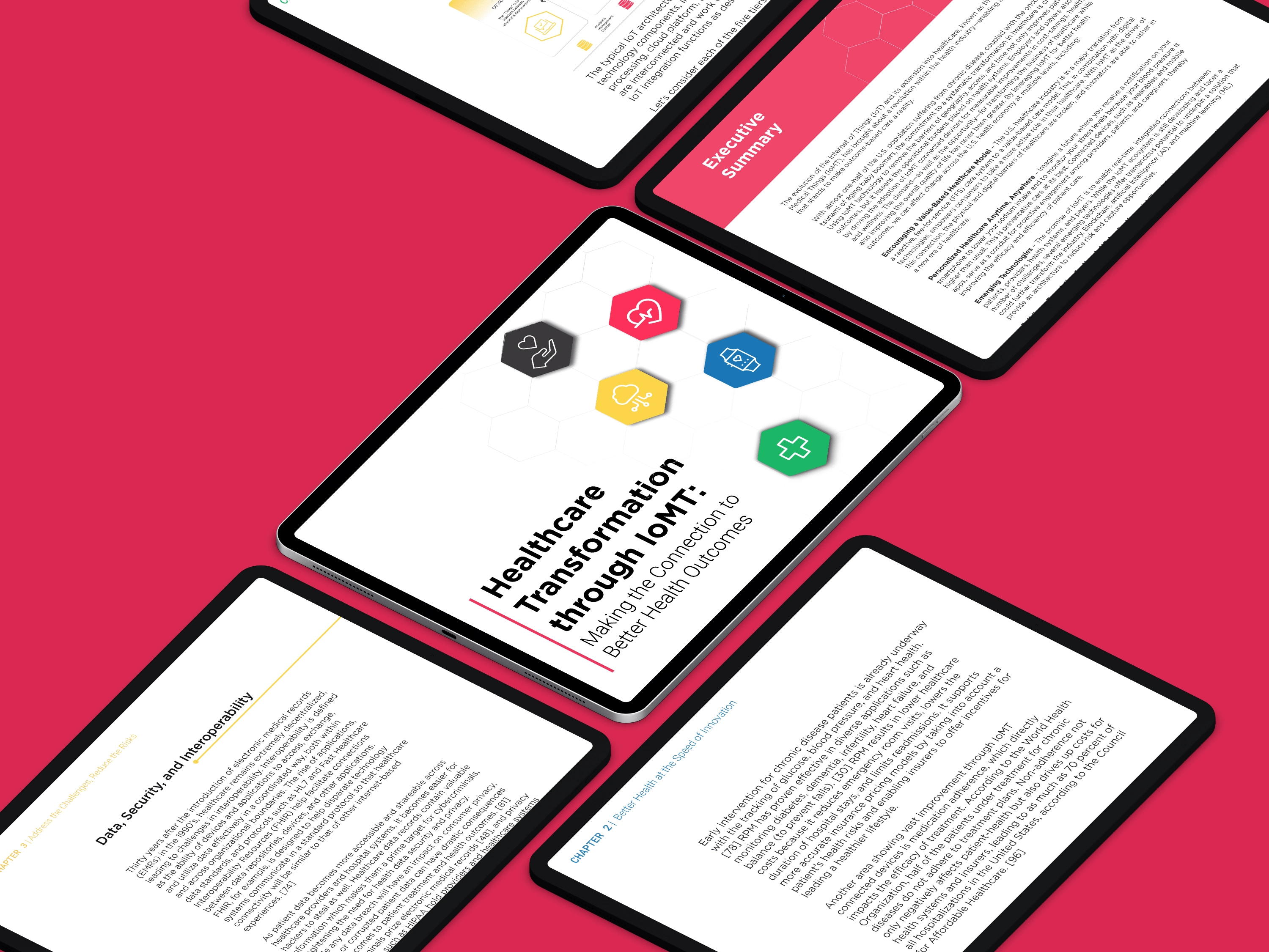
After I presented our final style guide and branding elements, it was time to make the ebook pages, covers, and image assets. My goal for the organization of the book was to make each chapter feel as if it could read separately; each section has its own design with differentiated colors and icons. Overall, the process of building SB’s newest ebook was lengthy. Untimely, I am happy with the final layouts of the book.
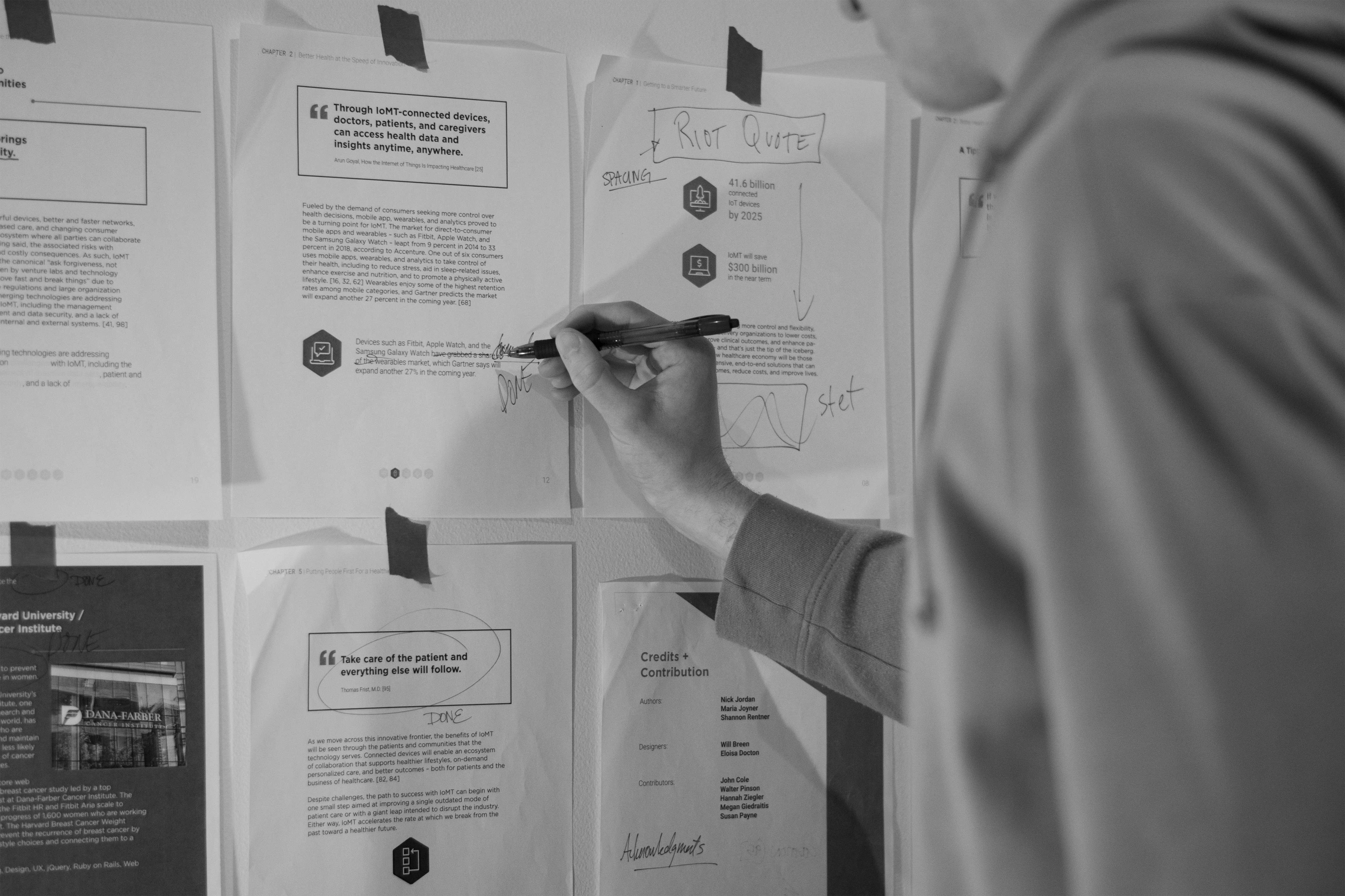
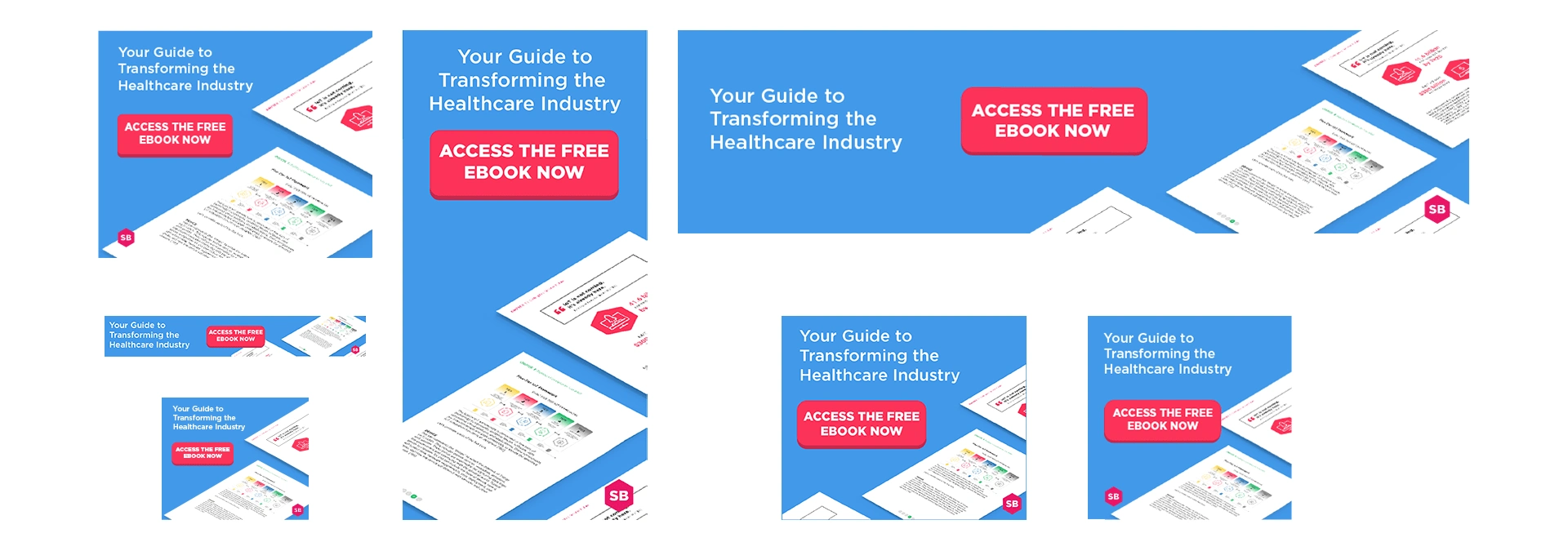
Upon completing the ebook, I started thinking about how we would market it. After thinking about advertising the book, I went to work developing the campaign’s landing pages, download page, and ad graphics to use for later posts. Each secondary item followed the campaign’s branding guidelines to give our viewers a clean and consistent view of the ebook even before they read it.
Once we launched the ads, we saw increased traffic to the landing page, resulting in 64% more downloads compared to our original organic post to the SB blog webpage. Although I cannot disclose the number of new clients SB received from the marketing campaign, I can note that they are continuing to onboard new clients for IoMT-related development projects.
Like this project
Posted Sep 21, 2024
Using IoMT technology to remove the barriers of geography, access, and time not only improves patient outcomes but it lessens the operational burdens.
Likes
0
Views
11
Clients
Smashing Boxes

